Stock Analyzer
The goal of this session is to teach you how to develop a shiny application without the use of flexdeshboard.
1 - Functions
Your second challenge is going to be developing a stock analyzer app - a fully functional stock analysis application built with shiny.
The application will be capable of showing any stocks listed in the S&P500, DOW, NASDAQ or DAX selected by the user. On top, users will be able to analyze trends with chosen parameters based on moving averages.
We’ll use the quantmod package to retrieve and manipulate stock information. There’s a lot of details behind quantmod and extensible timeseries (xts) objects, much of which is beyond the scope of this class. We’ll skim the surface to get you to a proficient level.
First, load the quantmod package and use the getSymbols() function to retrieve stock prices. This function uses a financial symbol to collect data from financial APIs (e.g. yahoo finance). Optionally, you can use the from and to arguments to limit the range of prices. auto.assign indicates whether the results should be loaded to the environment (automatically generates a new objects if TRUE) or if FALSE be returned instead (what we are used to).
library(quantmod)
library(lubridate)
getSymbols("AAPL", from = "2020-01-01", to = today("UTC"), auto.assign = F)
- The index is a column of dates. This is different from data frames, which generally do not have row names and indicies are a sequence from 1:nrow.
- The values are prices and volumes. We’ll be working primarily with the
adjusted pricewhen graphing, since this removes the effect of stock splits. This value is the closing price adjusted for any stock splits or dividends that occured during the time range.
1.0 - Setup & Workflow
I. Setup
Let’s get started! You can either use the project already created in the assignment or create your own new blank project. In RStudio click
- Click
File - Click
New Project - Select
New Directory - Name it
stock_analyzer_app. - Save it where you want
II. Workflow of our final app
As you can see in the final app linked above, we will have to implement a variety of steps to obtain a good functionality. We can think of it as a Financial Analysis Code Workflow for our app. It determines how the user is going to interact with the app and what features are available.
We need to accomplish the following steps in our analysis:
- Create a dropwdown list from that the user can select stock indices (DAX, S&P 500, DOW, NASDAQ100).
- Pull in the stock list from the selected stock index.
- The user will select one stock from the selected stock index.
- The functionality is designed to pull the past 180 days of stock data.
- Create an analysis button to start the analysis functions.
- Plot the analysis itself with ggplotly (timeseries visualization).
- We will implement two moving averages - short (fast) and long (slow)
- Output an automated commentary, that indicates positive or negative trends based on the moving averages.
- Add sliders to adjust the analysis.
- Add a date range input field to adjust the default time frame.
Before you start an app, you should always have an analysis that you’ve completed. It should be functioning separately from the web app. Let’s start with that before we implement the advanced features into our app.
You can use the following template for your analysis.
III. App Workflow - First Steps
Tip: Break up your analysis into modular functions. This will help big time in the Shiny Apps. In this section, we will build the following functions:
- Get stock lists
- Extract symbol based on user input
- Get Stock data
- Plot stock data
- Generate commentary
- Test workflow
- Save scripts (so that we can update our functions easily)
The structure for these steps is as follows: For the most functions, we prepared a Test code chunk that will help you to come up with an approach to write the function in the Modularize (function) chunk which then will be saved later. Good practice is to also test if the function works under Example function falls.
1.1 - Stock List
Get the stock list
We want to have a list of stocks, that the user can select from. We need a function that retrieves all the stocks in a given index. The following function is designed for the three major US indices and the biggest German index containing the 30 largest German blue-chip companies:
- DAX30
- SP500
- DOW30
- NASDAQ100
You can modify the list as you want. You can add any indices and ETFs to the following scheme. The function is currently built for retrieving the lists (names and symbols) from the corresponding wikipedia pages:
# 1.0 GET STOCK LIST ----
get_stock_list <- function(stock_index = "DAX") {

    # Control for upper and lower case
    index_lower <- str_to_lower(stock_index)
    # Control if user input is valid
    index_valid <- c("dax", "sp500", "dow", "nasdaq")
    if (!index_lower %in% index_valid) {stop(paste0("x must be a character string in the form of a valid exchange.",
                                                    " The following are valid options:\n",
                                                    stringr::str_c(str_to_upper(index_valid), collapse = ", ")))
    }

    # Control for different currencies and different column namings in wiki
    vars <- switch(index_lower,
                   dax    = list(wiki     = "DAX",
                                 columns  = c("Ticker symbol", "Company")),
                   sp500  = list(wiki     = "List_of_S%26P_500_companies",
                                 columns  = c("Symbol", "Security")),
                   dow    = list(wiki     = "Dow_Jones_Industrial_Average",
                                 columns  = c("Symbol", "Company")),
                   nasdaq = list(wiki     = "NASDAQ-100",
                                 columns  = c("Ticker", "Company"))
    )

    # Extract stock list depending on user input
    read_html(glue("https://en.wikipedia.org/wiki/{vars$wiki}")) %>%

        # Extract table from wiki
        html_nodes(css = "#constituents") %>%
        html_table() %>%
        dplyr::first() %>%
        as_tibble(.name_repair = "minimal") %>%
        # Select desired columns (different for each article)
        dplyr::select(vars$columns) %>%
        # Make naming identical
        set_names(c("symbol", "company")) %>%

        # Clean (just relevant for DOW)
        mutate(symbol = str_remove(symbol, "NYSE\\:[[:space:]]")) %>%

        # Sort
        arrange(symbol) %>%
        # Create the label for the dropdown list (Symbol + company name)
        mutate(label = str_c(symbol, company, sep = ", ")) %>%
        dplyr::select(label)

}
Example function calls
Let’s test the function. Default is the German DAX. To retrieve other lists, just change the argument.
stock_list_tbl <- get_stock_list()
# get_stock_list("DOW")
# get_stock_list("SP500")

stock_list_tbl
## # A tibble: 30 x 1
##    label
##    <chr>
##  1 1COV.DE, Covestro
##  2 ADS.DE, Adidas
##  3 ALV.DE, Allianz
##  4 BAS.DE, BASF
##  5 BAYN.DE, Bayer
##  6 BEI.DE, Beiersdorf
##  7 BMW.DE, BMW
##  8 CON.DE, Continental
##  9 DAI.DE, Daimler
## 10 DB1.DE, Deutsche Börse
## # … with 20 more rows
1.2 - Extract Symbol
Extract Symbol based on user input
As shown above, we need the stock symbols from the returned lists.
This could be an example user input.
user_input <- "AAPL, Apple Inc."
Build a function that extracts AAPL from that input. You can use stringr::str_split() in combination with purrr::pluck() (helps us drill into lists).
Test code
user_input %>% ... %>% ...
## [1] "AAPL"
Modularize (function)
get_symbol_from_user_input <- function(user_input) {
    user_input %>% ... %>% ...
}
Example function calls
"ADS.DE, Adidas" %>% get_symbol_from_user_input()
## [1] "ADS.DE"
"AAPL, Apple Inc." %>% get_symbol_from_user_input()
## [1] "AAPL"
1.3 - Stock Data
Get stock data
In this step we are retrieving the stock prices for a given symbol in a given time frame. Addtionally, we are adding two columns for the moving averages. In stock analysis, comparing moving averages can help determine if a stock is likely to continue going up or down. This is a simple form of a technical trading pattern:
Short (Fast) Moving Average: Uses a shorter time window (e.g. 20-days). Indicates short term trend.
Long (Slow) Moving Average: Uses a longer time window (e.g. 50-days). Indicates longterm trend.
rollmean()calculates a rolling average (vectorized) from thezoopackage (will be loaded with thequantmodpackage.)- Because there might be missing values in the retrieved data, we need to set the
fillargument toNA - By default the rolling average is being centered (there will probably show up less NA values at the beginning than expected. Example: If we took an average of the first 5 values, there should be 4 NA values at the top). We provide the argument called
alignand pass the valueright.
- Because there might be missing values in the retrieved data, we need to set the
timetk::tk_tblmakes it easy to convert thextsobject from thegetSymbols()function to atibbleobject. Similar toas_tibble().
Pull in last 180 days of stock history (default), calculate a 5-day short moving average and a 50-day long moving average. Add a new column with the currency. You can set it to “EUR” if the Symbol contains .DE and to “USD” otherwise.
Test code
Set values for testing
from   <- today() - days(180)
to     <- today() # or something int this format "2021-01-07"
# Retrieve market data
"AAPL" %>% quantmod::getSymbols(
              src         = "yahoo",
              from        = ...,
              to          = ...,
              auto.assign = FALSE) %>%

              # Convert to tibble
              timetk::tk_tbl(preserve_index = T,
              silent         = T) %>%

              # Add currency column (based on symbol)
              mutate(currency = case_when(
                    str_detect(names(.) %>% last(), "...") ~ "...",
                    TRUE                                   ~ "...")) %>%

              # Modify tibble
              set_names(c("date", "open", "high", "low", "close", "volume", "adjusted", "currency")) %>%
              drop_na() %>%

              # Convert the date column to a date object (I suggest a lubridate function)
              dplyr::... %>%

              # Add the moving averages
              # name the columns mavg_short and mavg_long
              dplyr::...(... = ...(..., ...,  fill = NA, align = "right")) %>%
              dplyr::...(... = ...(..., ...,  fill = NA, align = "right")) %>%

              # Select the date and the adjusted column
              dplyr::select(date, adjusted, mavg_short, mavg_long, currency)
Modularize (function)
Basically, you just need to copy your code from above into the function function.
get_stock_data <- function(stock_symbol,
                           from = today() - days(180),
                           to   = today(),
                           mavg_short = 20, mavg_long = 50) {

    stock_symbol %>% quantmod::getSymbols(
        ...

}
Example function calls
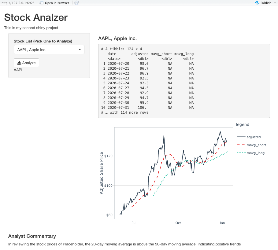
stock_data_tbl <- get_stock_data("AAPL", from = "2020-06-01", to = "2021-01-12", mavg_short = 5, mavg_long = 8)
## # A tibble: 156 x 4
##    date       adjusted mavg_short mavg_long
##    <date>        <dbl>      <dbl>     <dbl>
##  1 2020-06-01     80.2       NA        NA
##  2 2020-06-02     80.6       NA        NA
##  3 2020-06-03     81.0       NA        NA
##  4 2020-06-04     80.3       NA        NA
##  5 2020-06-05     82.6       80.9      NA
##  6 2020-06-08     83.1       81.5      NA
##  7 2020-06-09     85.7       82.5      NA
##  8 2020-06-10     87.9       83.9      82.7
##  9 2020-06-11     83.7       84.6      83.1
## 10 2020-06-12     84.4       84.9      83.6
## # … with 146 more rows
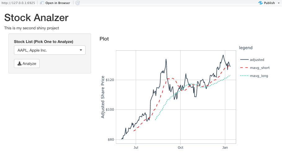
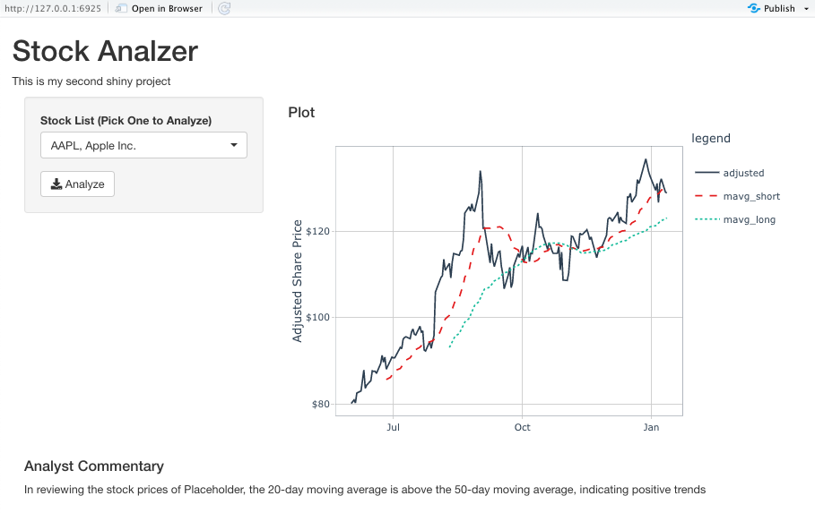
1.4 - Plot
Plot the stock data
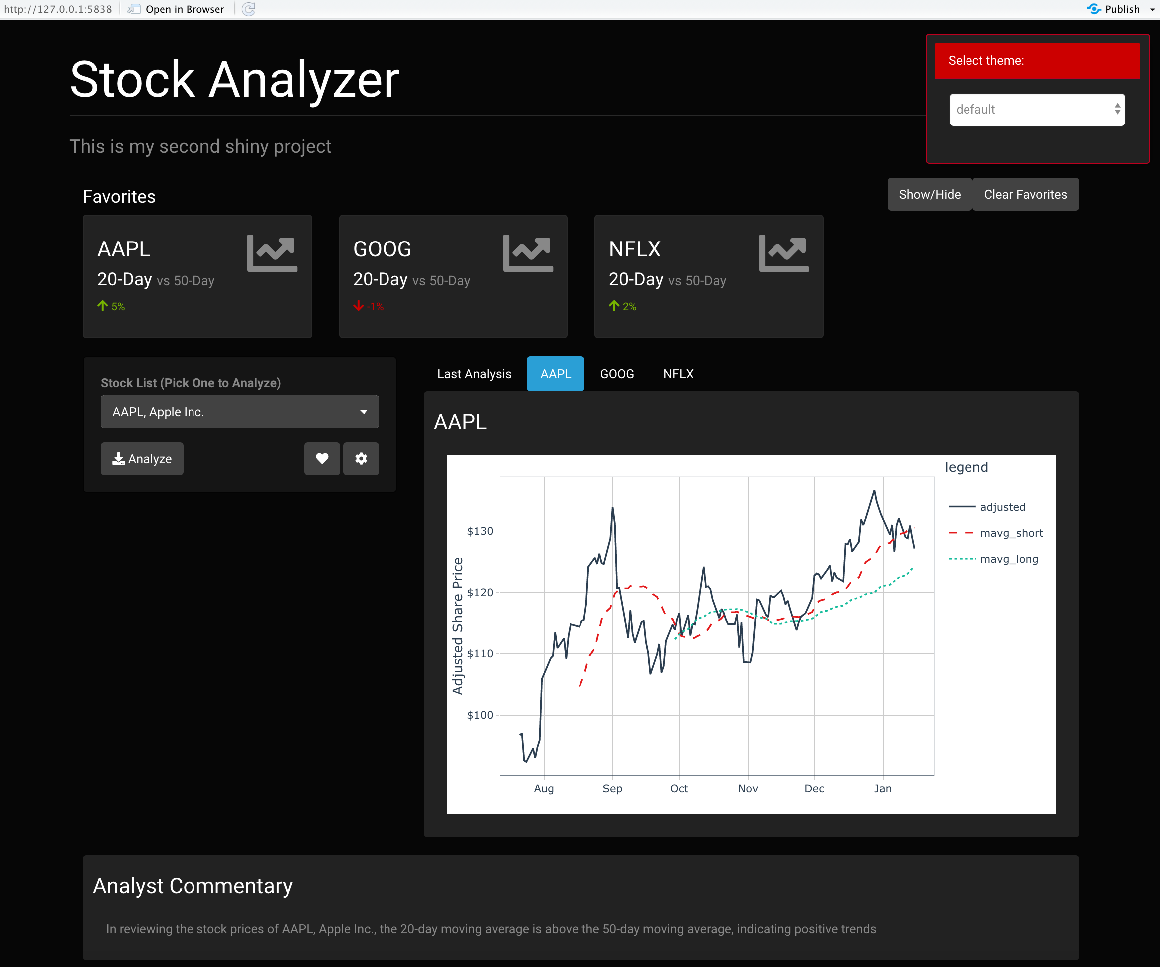
Now that we are able to pull in the data, we can easily plot a time series diagram with ggplot and ggplotly.
- Convert to long format (factors keep the order of our legend matching the order of our data columns)
- For line graphs, the data points must be grouped so that it knows which points to connect. In this case, it is simple – all points should be connected, so
group=legend. When more variables are used and multiple lines are drawn, the grouping for lines is usually done by variable. - You can add themes or change the style as you want
Test code
g <- stock_data_tbl %>%

     # convert to long format
     pivot_longer(...    = ...,
                  ...    = "legend",
                  ...    = "value",
                  names_ptypes = list(legend = factor())) %>%

     # ggplot
     ggplot(aes(..., ..., ... = ..., group = legend)) +
     geom_line(aes(linetype = legend)) +

     # Add theme possibly: theme_...
     # Add colors possibly: scale_color_..

     labs(y = "Adjusted Share Price", x = "")

ggplotly(g)
In the interactive plot you see that the currency is displayed as well.
In order to control for different currencies - € for the German stocks and $ for the US stocks - the y-axis needs to be formatted.
To do so we make use of the package scales.
Add this function to your script and insert the argument scale_y_continuous() to your plot.
currency_format <- function(currency) {

    if (currency == "dollar")
    { x <- scales::dollar_format(largest_with_cents = 10) }
    if (currency == "euro")
    { x <- scales::dollar_format(prefix = "", suffix = " €",
                                 big.mark = ".", decimal.mark = ",",
                                 largest_with_cents = 10)}
    return(x)
}

# Add this to your plot function
## + scale_y_continuous(labels = stock_data_tbl %>% pull(currency) %>% first() %>% currency_format()) +
Modularize (function)
plot_stock_data <- function(stock_data) {

     g <- stock_data %>%

     ... # add your code to create a plot

     ggplotly(g)
}
Example function calls
"ADS.DE" %>%
    get_stock_data() %>%
    plot_stock_data()
1.5 - Trend Analysis
Generate automated commentary
Automatically generate an analyst commentary based on a moving average logic:
1.5.1 Implement commentary Logic
Compare both moving averages on the last day. The logic goes as this:
- If short < long, this is a bad sign
- If short > long, this is a good sign
The intuition is that a higher short-term moving average indicates a positive trend.
Let’s try to assign warning_signal a value of TRUE when the short < long.
Remember, that a logical expression needs to be fulfilled in order to obtain the value TRUE, e.g. 2>1.
- Get last value
- Compare long and short
warning_signal <- stock_data_tbl %>%
    tail(1) %>% # Get last value
    mutate(mavg_warning_flag = ..) %>% # insert the logical expression
    pull(mavg_warning_flag)
1.5.2 Extract the moveing average days
Calculate / Extract which …-day moving average are generated (based on the number of NAs):
n_short <- stock_data_tbl %>% pull(mavg_short) %>% is.na() %>% sum() + 1
n_long  <- .. # Do the same for the long average
Create a warning signal logic:
if (warning_signal) {
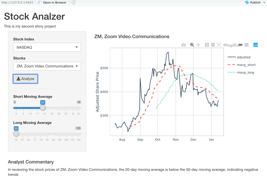
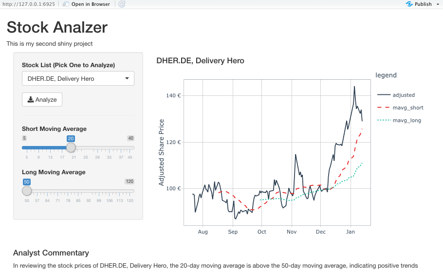
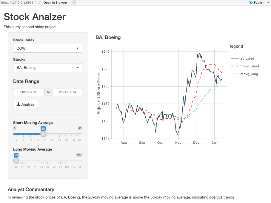
str_glue("In reviewing the stock prices of {user_input}, the {n_short}-day moving average is below the {n_long}-day moving average, indicating negative trends")
} else {
str_glue("In reviewing the stock prices of {user_input}, the {n_short}-day moving average is above the {n_long}-day moving average, indicating positive trends")
}
Modularize (function)
generate_commentary <- function(data, user_input) {
    warning_signal <- data %>% ..

    n_short <- data %>% ..
    n_long  <- data %>% ..

    if (..) {
        str_glue(".. {user_input} .. {n_long} .. negative..")
    } else {
        str_glue(".. {user_input} .. {n_short} .. positive")

    }
}

generate_commentary(stock_data_tbl, user_input = user_input)
1.6 - Test
Let’s test our whole workflow.
# get_stock_list("DAX")
"ADS.DE, Adidas" %>%
    get_symbol_from_user_input() %>%
    get_stock_data(from = from, to = to ) %>%
    # plot_stock_data() %>%
    generate_commentary(user_input = "ADS.DE, Adidas")
## In reviewing the stock prices of ADS.DE, Adidas, the 20-day moving average is above the 50-day moving average, indicating positive trends
1.7 - Save
Because we want to reference our functions later, we need to save them. The following code allows you to override your functions every time you add changes to them:
fs::dir_create("00_scripts") #create folder

# write functions to an R file
dump(
    list = c("get_stock_list", "get_symbol_from_user_input", "get_stock_data", "plot_stock_data", "currency_format", "generate_commentary"),
    file = "00_scripts/stock_analysis_functions.R",
    append = FALSE) # Override existing
2 Layout
Now that we have all of our functions, we can start to build our app. Let’s start with building the layout first. The layout refers to the User Interface (Design & Structure of our App). You can download the following template:
RStudio IDE will alter it’s functionality once it recognizes we are building a Shiny App (there appears a Run App button at top right of the window to start your app).
There are 3 components of a Shiny App
- UI
ui: A function that is built using nested HTML components. More importantly, this function controls to look & appearance of our web application. +fluidPage()creates a Web Page that we can add elements to.
- Server
server: A special function that is setup with an input, output & session. More important, this is where reactive code is run.
- shinyApp()
shinyApp(): Connects the UI with the server functionality
Our script needs to have at least the following components:
# UI ----
ui <- fluidPage(title = "Stock Analyzer")

# SERVER ----
server <- function(input, output, session) {

}

# RUN APP ----
shinyApp(ui = ui, server = server)
Run App Button –> Result in Viewer
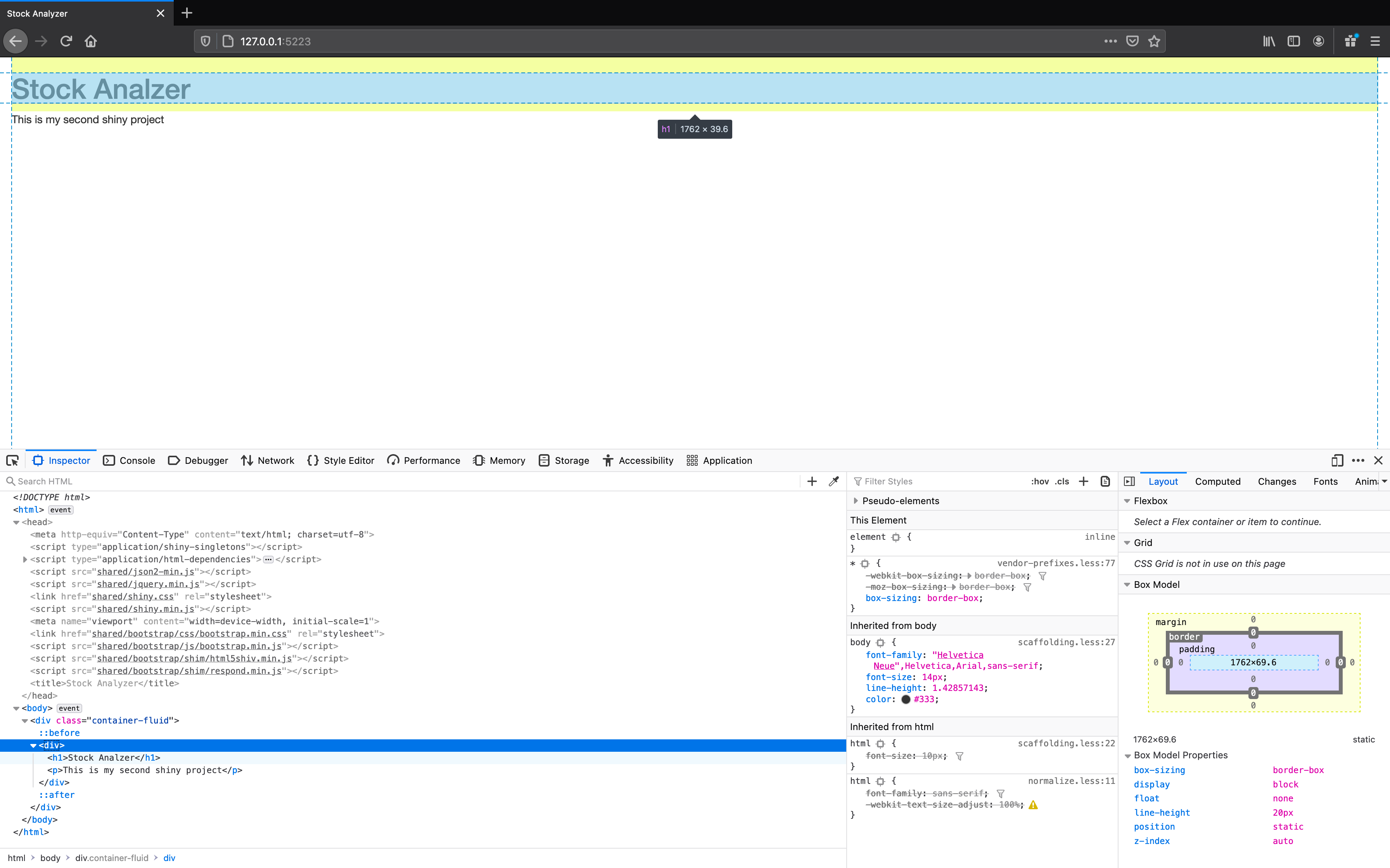
As for now you only see the title in the tab. If you inspect the HTML file (right click –> Inspect Element), you will see the <title> node in the <head> node as well as pretty much an empty body (the container-fluid division). You can see for yourself what the function fluidPage() creates. This function just produces some HTML code with an empty division <div></div>:
fluidPage(title = "Stock Analyzer")
## <div class="container-fluid"></div>
Now let’s assemble every necessary part of our layout.
2.1 - Header
Making the Header of our web app
First we want to start playing around with this fluidPage() function. This is how shiny allows us to build applications by changing the underlying HTML code.
ui <- fluidPage(
    title = "Stock Analyzer",

    # 0.0 Test ----
    "Learning Shiny... I'm building my first App"
)
Add new components (divisions, headers and paragraphs). Keep your app organized with comments. Use the outline to navigate your app.
div(): Creates an HTML division. It’s used to create sections in your app (<div></div>).h1(): Creates an H1 Header (largest size of header) (<h1></h1>).p(): Creates an paragraph HTML tag (<p></p>)
# 1.0 HEADER ----
div(
    h1("Stock Analzer"),
    p("This is my second shiny project")
)
2.2 - Main Section
Adding the Main Application UI Section
Essentially we are building a website, that contains different sections. Let’s add sections for the input (dropdown list etc.) and the output (plot).
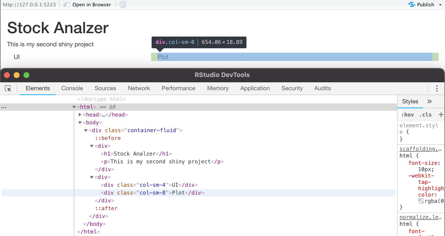
column()generates a bootstrap (= open-source CSS framework) grid column with width specified in units up to 12 units wide
We could split our layout like this: 4 units on the left (input) and 8 units on the right (output). If you dragged your website, it would adjust the content automatically. We call that a Responsive layout (= Depending on the width of your screen, bootstrap adjusts the columns), that helps apps look good on Mobile, Tablet & Desktop devices.
# 2.0 APPLICATION UI -----
div(
    column(width = 4, "UI"),
    column(width = 8, "Plot")
)
Shiny has a lot of HTML Helpers: These are bootstrap components that Shiny has turned into functions. We want to add a wellPanel() and a pickerInput().
wellPanel(): Creates a Bootstrap Well. This is just a division that has a gray background: <div class="well”></div>pickerInput(): A shinywidgets widget that creates a UI dropdown
Use the functionrunApp() if the “Reload App” button gets hung up. Note that runApp() looks for a file called “app.R”. If your app has a file name that is different, just put it in quotes inside of the function (runApp("01_stock_analyzer_layout.R")).
# 2.0 APPLICATION UI -----
div(
  column(
    width = 4,
    wellPanel(

    # Add content here
    pickerInput(inputId = "stock_selection",
                choices = 1:10)

    )
  ),
  column(
    width = 8,
    div(

    # Add content here

    )
  )
)
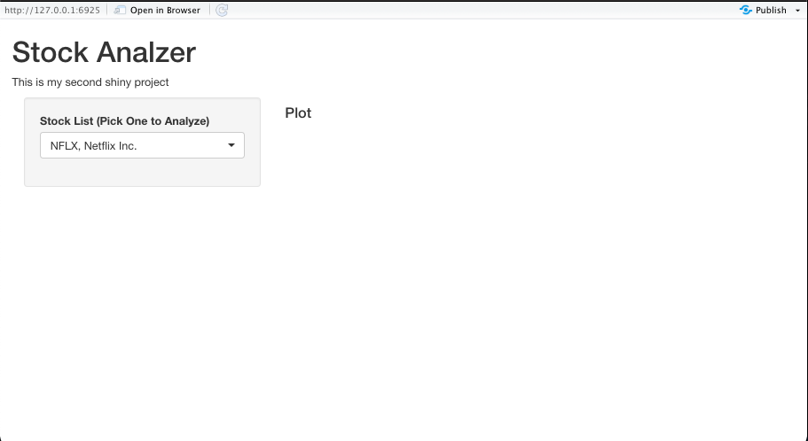
2.3 - Dropdown List
Generating the S&P500 Stock List Dropdown
Some calculations only need to be performed once. Typically, those are added to the top of the application (or in a file that we can source()). For example we need get_stock_list() for our initial set up only once and can place it on top of our script (above the ### UI section).
Let’s modify the above added pickerInput() for our use case (the stock list dropdown selection). Check out the shinyWidgets documentation for more information on available widgets like pickerInput() and their options. Also run ?pickerOptions for explanations of the arguments.
Steps:
- Change the choices to
stock_list_tbl$label(stock_list_tblis obtained from function callget_stock_list()) - Set
multiple = F - selected = Optional
- set further arguments to the options argument:
actionsBox = FALSE,liveSearch = TRUEsize = 10
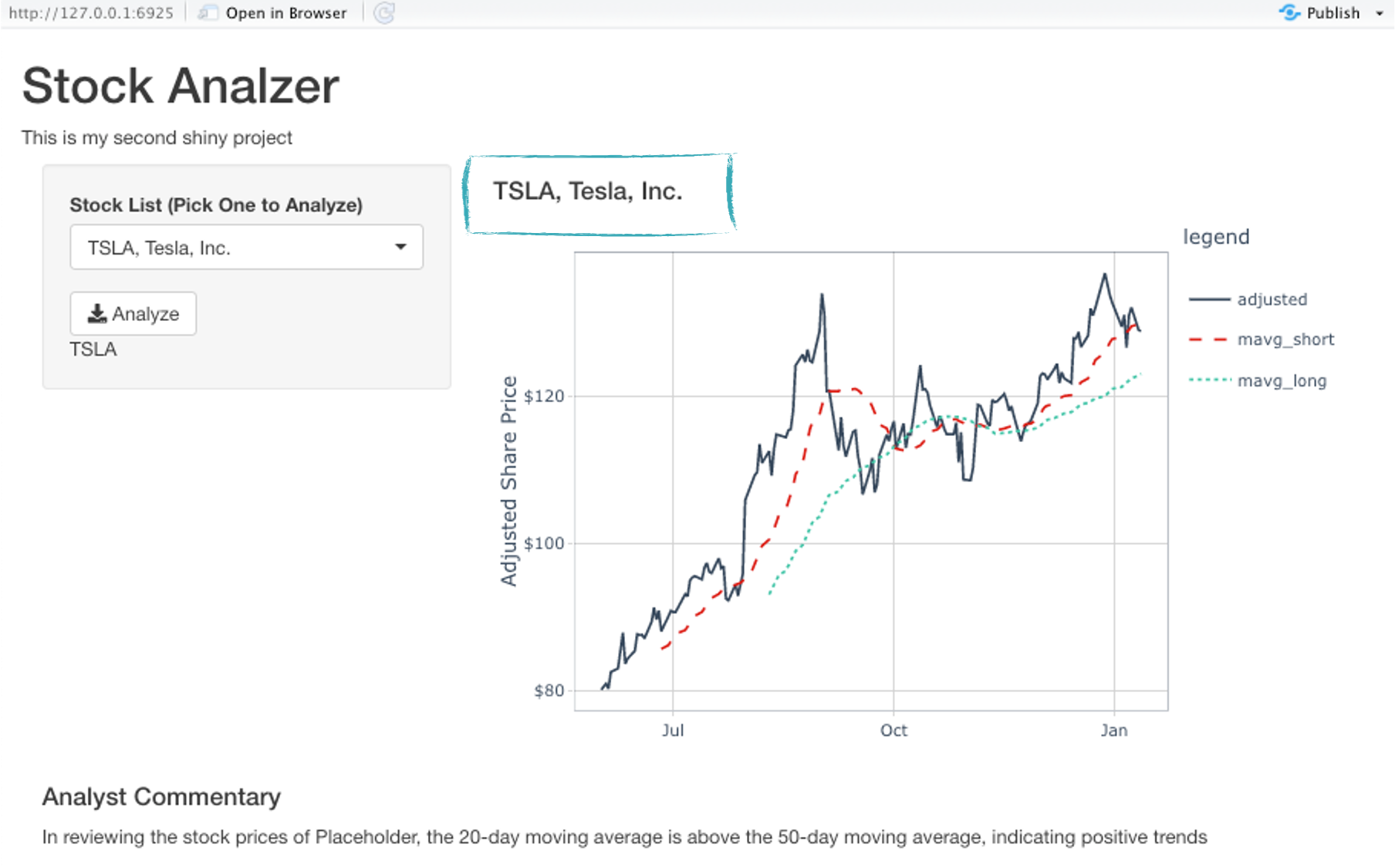
2.4 - Button
Adding the Analyze button
actionButton(): A button that generates a click event. Give it the IDanalyze.icon()let’s us use Font Awesome icons (e.g. “download” icon). Use it inside theiconargument.
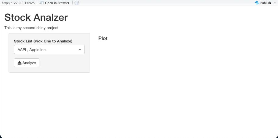
If your run the app and press the button nothing will happen, because we don’t have set up any server logics yet.
2.5 - Plot
Inserting the Interactive Time Series Plot into our UI
Add two divisions for the title and for the plot
- div(h4())
- div(get_stock_data(), plot_stock_data())
For testing purposes you could store the data again at the top of the script (like the index list). Now we should have the plot in there. We cannot link our stock from the dropdown list with the plot yet.
2.6 - Commentary
Adding the Analyst Commentary
Suggested values:
- width = 12
- generate_commentary(user_input = “Placeholder”)
3. Server
Adding Server Functionality
Let’s start filling the server function. A helpful documentation is the Shiny cheat sheet (Part Server Operations (Reactivity)).
3.1 Symbol Extraction
Reactive Symbol Extraction
Now you can comment out / remove the stock_data_tbl object at the top, because that is going to be updated depending on the user input. Everything what is needed, is in our source file. We just need to figure out how to use these.
We delay Reactions eventReactive(). This function generates a reactive value only when an event happens. That is good for creating reactive values following button clicks. Let’s start with plotting out the symbol that the user selects when clicking the analyze Button (input$analyze):
- Print the symbol that the user is selecting (inputId = “analyze”)
- Use
renderText()andtextOutput()together. These are used to generate HTML text for inside H-tags (headers) and p-tags (paragraphs).
    # Stock Symbol ----
    stock_symbol <- eventReactive(input$analyze, {
        input$stock_selection
    })

    output$selected_symbol <- renderText({stock_symbol()})
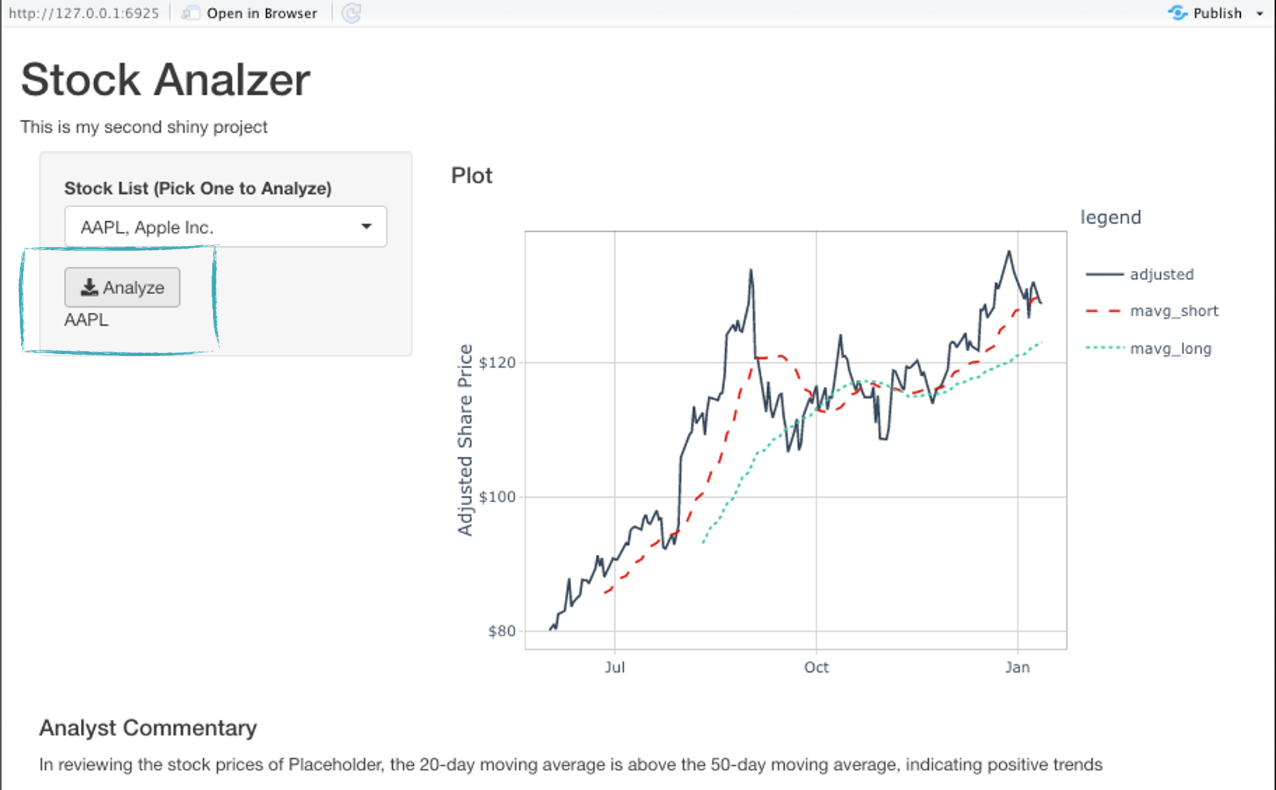
You can see that clicking Analyze outputs the symbol of the chosen stock.
3.2 - Plot Header
Reactively Generate the Plot Header - On Button Click
- output$plot_header <- renderText(stock_symbol())
- The
eventReactive()should includeignoreNULL = FALSEto allow the App to run on load.
3.3 - Import Stock Data
Reactively Import Stock Data - On Symbol Extraction
- When
stock_symbol()changes it will react (reactive()), stock_data_tbl()) - Use renderPrint() + verbatimTextOutput() when developing your app. It helps to see how the app is processing your code
verbatimTextOutput(outputId = "stock_data")renderPrint(stock_data_tbl())
# Get Stock Data ----
stock_data_tbl <- reactive({

  stock_symbol() %>%
        get_stock_data(from = today() - days(180),
                       to   = today(),
                       mavg_short = 20,
                       mavg_long  = 50)

})

output$stock_data <- renderPrint({stock_data_table()})
3.4 - Render Plot
Reactively Render the Interactive Time Series Plot - On Stock Data Update
Instead of rendering the plot data, we want to render the plot when stock_data_tbl changes.
renderPlotly()andplotlyOutput()got together.renderPlotly()will render the interactive plot on the serverplotlyOutput()plots in the UISet the ID
plotly_plot
3.5 - Render Analyst Commentary
Reactively Render the Analyst Commentary - On Stock Data Update + Action Button Event
Same as above.
3.6 - Index selection
Add Index selection
Until now, we were just able to display stocks from one particular index. In order to extend our app, we want to include other indices as well and let the user select his preferred index using a dropdown menu.
A few changes in our app are necessary:
UI section
In the UI Section, the pickerInput() should now allow to choose from our different indices.
uiOutput("indices"), which should be added directly after that, will display the list of stocks in the selected index.
# Changes in UI
pickerInput(..), # select index

uiOutput("indices"), # only stock from selected index are shown (computation in server)
Server section
In the server section, the application generates the picker input for the stocks based on the selected index.
First, you have to define stock_list_tbl which reacts to the index selection and then extract the stock labels.
Having those, you can again use the picker input for the stocks (although this time in the server section.)
# Create stock list ----
output$indices <- renderUI({
        choices = stock_list_tbl() %>% purrr::pluck("label")
        pickerInput(
        ...
        )
})
3.7 - Moving average sliders
Add moving average sliders to your Stock Analyzer
- You can use
hr()to add a horizontal line (e.g., horizontal rule). - Add Moving Average Functionality
- UI Placement:
- Add a horizontal rule between the Analyze button and the new UI.
- Place the Sliders below the button and horizontal rule
- Short MAVG Requirements: Starting value of 20, min of 5, max of 40
- Long MAVG Requirements: Starting value of 50, min of 50, max of 120
- Server requirements: Update immediately on change. We don’t need
eventReactive()but the changes in the slider input should be directly have an impact onstock_data_tbl().
3.8 - Date Range
Add Date Range input
As for the moving average, we want the plot to update immediately when we change the date (without clicking Analyze).
3.9 - App Cleanup
- Don’t forget to remove everything that is not needed for the app. Commented out stuff, the
textOutputs(), intermediate results for testing purposes etc … - Order the server functions as consistent as possible with your anaylsis workflow. This makes it easier to debug your app and make updates to your app as your analysis changes over time
- It does not has a lot of theme and functions to it, it just looks like a basic website. You could make it look really cool though and add further functions with bootstrap. But this is beyond the scope of this class. You can use this website https://getbootstrap.com/docs/5.0/getting-started/introduction/ for further information.
Challenge
Your challenge is to complete the app as explained above and publish it on shinyapps.io!
Please provide use with the link to your application in the following submission form!
Submission
Please share your URLs and your student information with us: