Data Visualization
Data visualization is the second most important skill of a data scientist (after data wrangling). By the end of this session, you will be able to use the package ggplot2 to build different data graphics and to craft effective visualizations, which answer questions like these:
Top N Customers. Which customers have the most purchasing power?
Heatmap of purchasing habits. Which customers prefer which products?
To get to these advanced plots, you need to learn everything from the ggplot2 package:
- Learn the
anatomyof a ggplot object - Learn the
geometriesof a ggplot object including- Scatter plots (2D Relationships)
- Line plots (Time series)
- Bar / Column plots (category vs. numeric)
- Histograms, Faceted Histograms, Density Plots (Univariate & within-feature distributions)
- Box plots & Violon plots (Distributions by category)
- Text & Label geometries (Adding textual mappings)
Formattinga ggplot object- Colors & Color palettes
- Aesthetic feature mappings (color, fill, size)
- Faceted plots (investigate categories)
- Position adjustments
- Scales (Continuous & discrete features)
- Labels & legends
- themes
Theory Input
Think of ggplots like building layers of a cake. Each layer is added on top. Building a plot is a 3-step process:
- Create a canvas defined by mapping to columns in your data.
- Add 1 or more geometries (geoms)
- Add formatting features (scales, themes, facets etc.)
We can specify the different parts of the plot, and combine them together using the + operator (Note that the + operator is similar to the %>% pipe operator but is not interchangeable!. If you want a similar look, you can also use %+%).
(0) Data preparation
We are working with our bike data. You can read your rds file or recreate the data again. Before we disucss the anatomy of ggplot, we have to prepare the data appropriately and get it in the right format. The key to a good ggplot is knowing how to format the data for a ggplot. Let’s start by visualizing the sales over the years. So we only need the price and the date column and group and summarize those accordingly (just like we did in the second session).
One of the most difficult parts of any graphics package is scaling, converting from data values to perceptual properties. The inverse of scaling, making guides (legends and axes) that can be used to read the graph, is often even harder! The scales packages provides the internal scaling infrastructure used by ggplot2, and gives you tools to override the default breaks, labels, transformations and palettes. Scales is installed when you install ggplot2 or the tidyverse.
The most common use of the scales package is to customise to control the appearance of axis and legend labels. Use a break_ function to control how breaks are generated from the limits, and a label_ function to control how breaks are turned in to labels. We will discuss this in the formatting section.
As for now, we only need the scales::dollar() function. This function will format a vector of values as currency (round to nearest cent and display dollar sign). These are the default arguments:
dollar(x, accuracy = NULL, scale = 1, prefix = "$", suffix = "",
          big.mark = ",", decimal.mark = ".", trim = TRUE,
          largest_with_cents = 1e+05, negative_parens = FALSE, ...)
To create Euro values, we have to adjust the arguments:
dollar(x, prefix = "", suffix = " €",
          big.mark = ".", decimal.mark = ",")

scales::dollar(100, prefix = "", suffix = " €",
                    big.mark = ".", decimal.mark = ",")
## "100 €"
Let’s do the data wrangling:
library(tidyverse) # loads ggplot2
library(lubridate)

bike_orderlines_tbl <- read_rds("02_data_wrangling/bike_orderlines.rds")

# 1.0 Anatomy of a ggplot ----

# 1.1 How ggplot works ----

# Step 1: Format data ----

sales_by_year_tbl <- bike_orderlines_tbl %>%

  # Selecting columns to focus on and adding a year column
  select(order_date, total_price) %>%
  mutate(year = year(order_date)) %>%

  # Grouping by year, and summarizing sales
  group_by(year) %>%
  summarize(sales = sum(total_price)) %>%
  ungroup() %>%

  # € Format Text
  mutate(sales_text = scales::dollar(sales,
                                     big.mark     = ".",
                                     decimal.mark = ",",
                                     prefix       = "",
                                     suffix       = " €"))

sales_by_year_tbl
## # A tibble: 5 x 3
##    year    sales sales_text
##   <dbl>    <dbl> <chr>
## 1  2015  9930282 9.930.282 €
## 2  2016 10730507 10.730.507 €
## 3  2017 14510291 14.510.291 €
## 4  2018 12241853 12.241.853 €
## 5  2019 15017875 15.017.875 €
Now that we have our data formatted, we can begin our ggplot by piping our data into the ggplot() function. All ggplot2 plots begin with a call to ggplot(), supplying default data and aesthethic mappings, specified by aes(). You then add layers, scales, coords and facets with + or %+%.
(1) Canvas
Aesthetic mappings describe how variables/ columns in the data are mapped to visual properties (aesthetics) of geometries (e.g. scatterplot. See next step). They represent something you can see in the final plot. There are all sorts of different mappings:
- position (i.e., on the x and y axes)
- color (“outside” color)
- fill (“inside” color)
- alpha (opacity)
- shape (of points)
- line type
- size
Aesthetic mappings are set with the aes() function and take properties of the data and use them to influence visual characteristics. All aesthetics for a plot are specified in the aes() function call in the beginning (in the next section you will see that each geom layer can have its own aes specification). Our plot requires aes mappings for x and y. Each visual characteristic can encode an aspect of the data and be used to convey information. Thus, we can add a mapping for the revenue to a color characteristic as well:
# Step 2: Plot ----
sales_by_year_tbl %>%

      # Canvas
      ggplot(aes(x = year, y = sales, color = sales))

# Without piping
ggplot(data = sales_by_year_tbl,
       aes(x     = year,
           y     = sales,
           color = sales))
If you run this, just the canvas in the viewer pane will be created. The canvas is the 1st layer that is just a blank slate with the axes. But any subsequent geoms that we add will utilize those mappings.
Note that using the aes() function will cause the visual channel to be based on the data specified in the argument. For example, using aes(color = “blue”) won’t cause the geometry’s color to be “blue”, but will instead cause the visual channel to be mapped from the vector c(“blue”) — as if we only had a single type of engine that happened to be called “blue”. This will become more clear in the next steps.
(2) Geometries
General
See page 1 of the visualization Cheatsheet
The 2nd layer generates a visual depiction of the data using geometry types. Geometries are the fundamental way to represent data in your plot. They are the actual marks we put on a plot and hence determine the plot type: Histograms, scatter plots, box plots etc. Building on these basics, ggplot2 can be used to build almost any kind of plot you may want. The most obvious distinction between plots is what geometric objects (geoms) they include. Examples include:
- points (
geom_point, for scatter plots, dot plots, etc) - lines (
geom_line, for time series, trend lines, etc) - boxplot (
geom_boxplot, for, well, boxplots!) - … and many more (examples below)!
Each of these geometries will leverage the aesthetic mappings supplied although the specific visual properties that the data will map to will vary. For example, you can map data to the shape of a geom_point (e.g., if they should be circles or squares), or you can map data to the linetype of a geom_line (e.g., if it is solid or dotted), but not vice versa. Each type of geom accepts only a subset of all aesthetics (examples follow in the formatting section). Almost all geoms require an x and y mapping at the bare minimum. Refer to the geom help pages to see what mappings each geom accepts (e.g. ?geom_line). A plot should have at least one geom, but there is no upper limit. You can add a geom to a plot using the + operator to create complex graphics showing multiple aspects of your data. To get a list of available geometric objects use the code below (or simply type geom_<tab> in RStudio to see a list of functions starting with geom_):
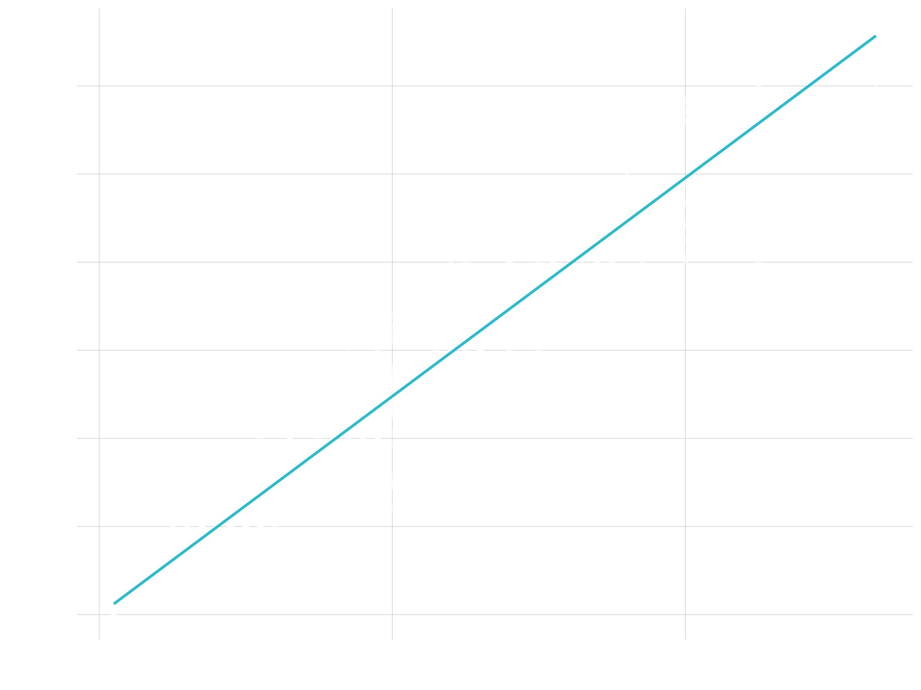
help.search("geom_", package = "ggplot2")Now that we know about geometric objects and aesthetic mapping, we’re ready to make our first ggplot: a line with dots (instead of a bar plot like in session 2). We’ll use combination of geom_line and geom_point to do this, which requires aes mappings for x and y. The color for revenue is optional. We can set the size / thickness of the points / line with the size argument. Additionally, we can insert a trendline based on the dots using geom_smooth(). The arguments lm stands for linear regression. With se = FALSE we remove the display of the standard errors. Note, that colors in the shown plots do not necessarily match with colors used in the code but are chosen such that the website looks appealing. Feel free to play with colours in your own code.
sales_by_year_tbl %>%

  # Canvas
  ggplot(aes(x = year, y = sales, color = sales)) +

  # Geometries
  geom_line(size = 1) +
  geom_point(size = 5) +
  geom_smooth(method = "lm", se = FALSE)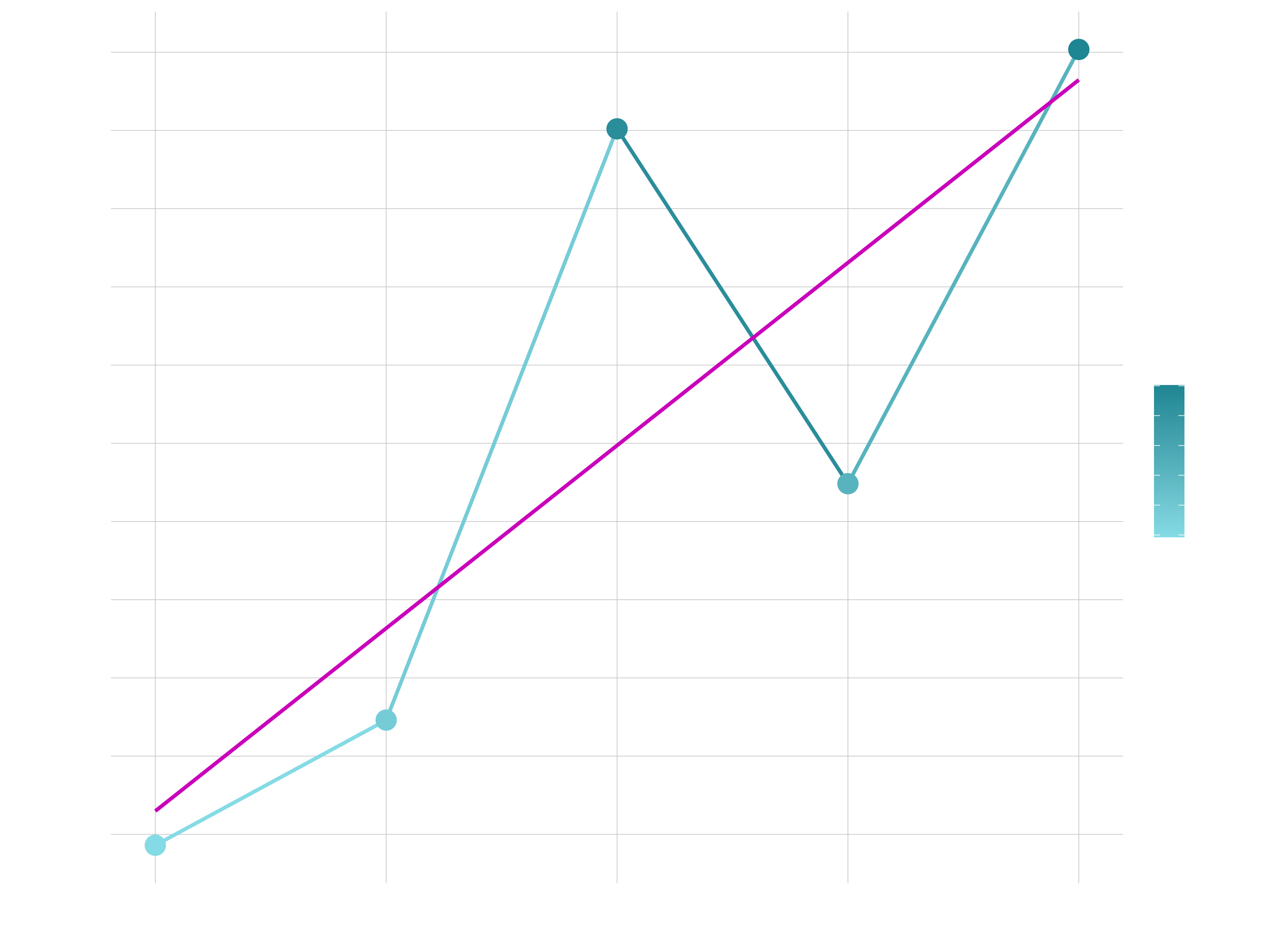
As mentioned earlier, if we specify an aesthetic within ggplot() it will be passed on to each geom that follows. But each geom layer can have its own aes specification by wrapping the attributes in the geoms into aes(). This will map these variables to other aesthetics e.g. the revenue to the size of the dots geom_point(aes(size = sales)). You will see that the size of the dots varies then based on the amount of revenue and we will get another legend. This allows us to only show certain characteristics for that specific layer. If you wish to apply an aesthetic property to an entire geometry, you can set that property as an argument to the geom method, outside of the aes() call: geom_point(color = "blue") or geom_point(size = 5).
In summary, variables are mapped to aesthetics with the aes() function, while fixed visual cues are set outside the aes() call. This sometimes leads to confusion, as in this example:
base_plot +

  # not what you want because 2 is not a variable
  geom_point(aes(size = 2),

  # this is fine -- turns all points red
  color = "red")
Examples of geometries:
Point / Scatter Plots
- Great for Continuous vs Continuous
- Also good for Lollipop Charts (more on this later)
- Goal: Explain relationship between order value and quantity of bikes sold
# Data Manipulation
order_value_tbl <- bike_orderlines_tbl %>%

    select(order_id, order_line, total_price, quantity) %>%

    group_by(order_id) %>%
    summarize(
        total_quantity = sum(quantity),
        total_price    = sum(total_price)
    ) %>%
    ungroup()

# Scatter Plot
order_value_tbl %>%

    ggplot(aes(x = total_quantity, y = total_price)) +

    geom_point(alpha = 0.5, size = 2) +
    geom_smooth(method = "lm", se = FALSE)
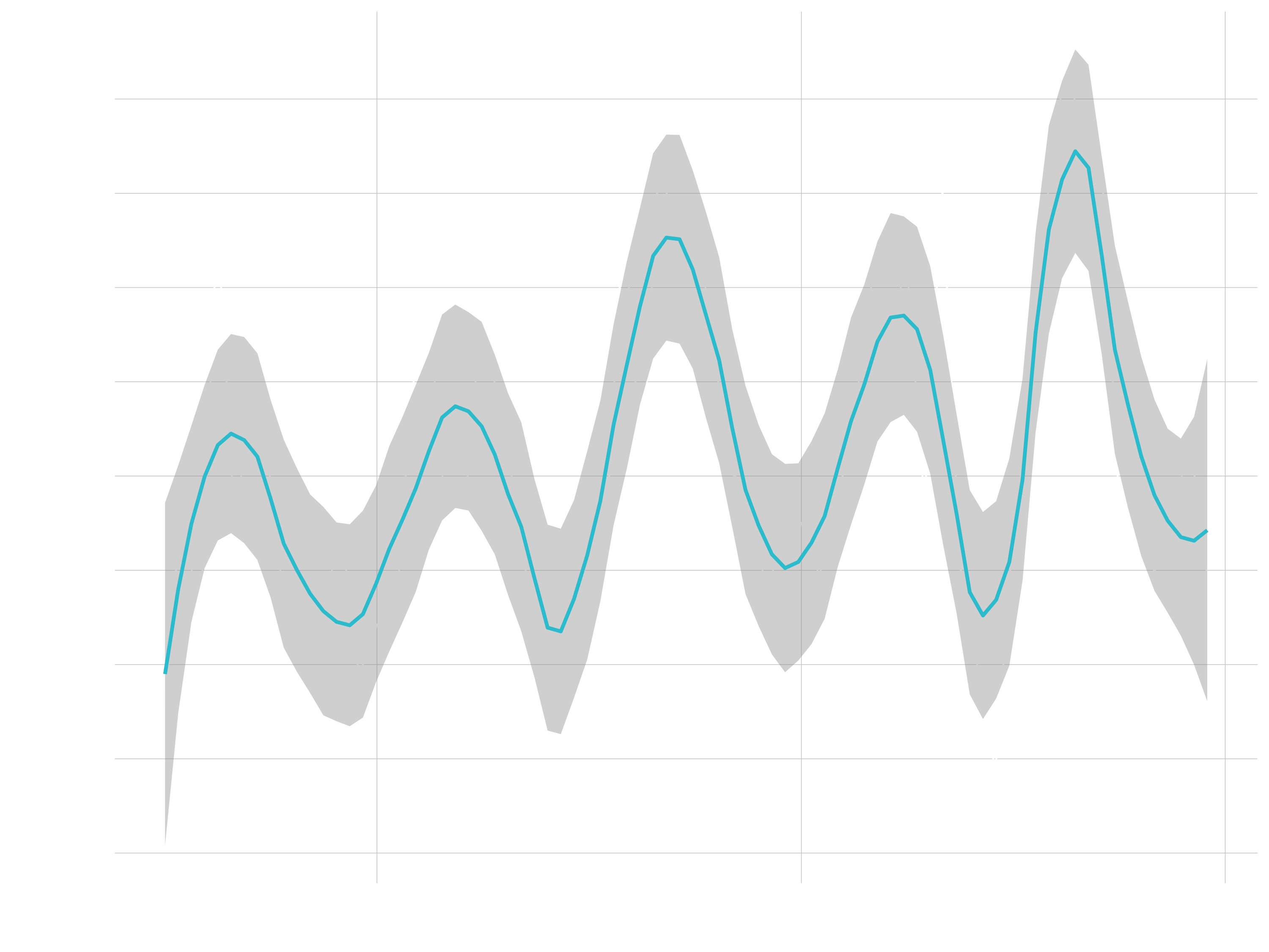
Line Plots
- Great for time series
- Goal: Describe revenue by month, expose cyclic nature
# Data Manipulation
revenue_by_month_tbl <- bike_orderlines_tbl %>%

    select(order_date, total_price) %>%

    mutate(year_month = floor_date(order_date, "months") %>% ymd()) %>%

    group_by(year_month) %>%
    summarize(revenue = sum(total_price)) %>%
    ungroup()

# Line Plot
revenue_by_month_tbl %>%

    ggplot(aes(year_month, revenue)) +

    geom_line(size = 0.5, linetype = 1) +
    geom_smooth(method = "loess", span = 0.2)
Bar / Column Plots
- Great for categories
- Goal: Sales by Descriptive Category
# Data Manipulation
revenue_by_category_2_tbl <- bike_orderlines_tbl %>%

    select(category_2, total_price) %>%

    group_by(category_2) %>%
    summarize(revenue = sum(total_price)) %>%
    ungroup()

# Bar Plot
revenue_by_category_2_tbl %>%

    mutate(category_2 = category_2 %>% as_factor() %>% fct_reorder(revenue)) %>%

    ggplot(aes(category_2, revenue)) +

    geom_col(fill = "#2c3e50") +
    coord_flip()
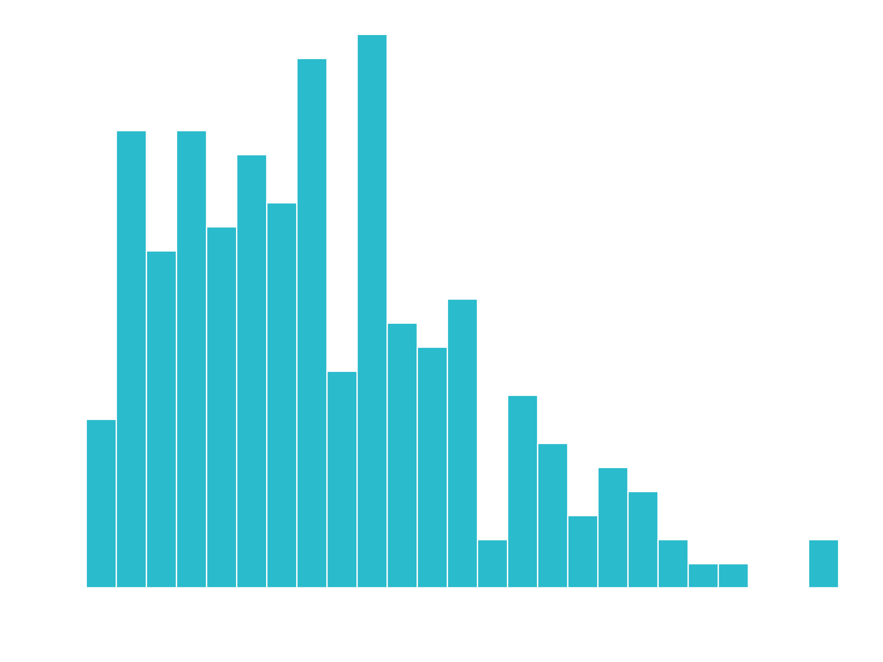
Histogram / Density Plots
- Great for inspecting the distribution of a variable
- Goal: Unit price of bicycles
# Histogram

bike_orderlines_tbl %>%

    distinct(model, price) %>%

    ggplot(aes(price)) +

    geom_histogram(bins = 25, fill = "blue", color = "white")
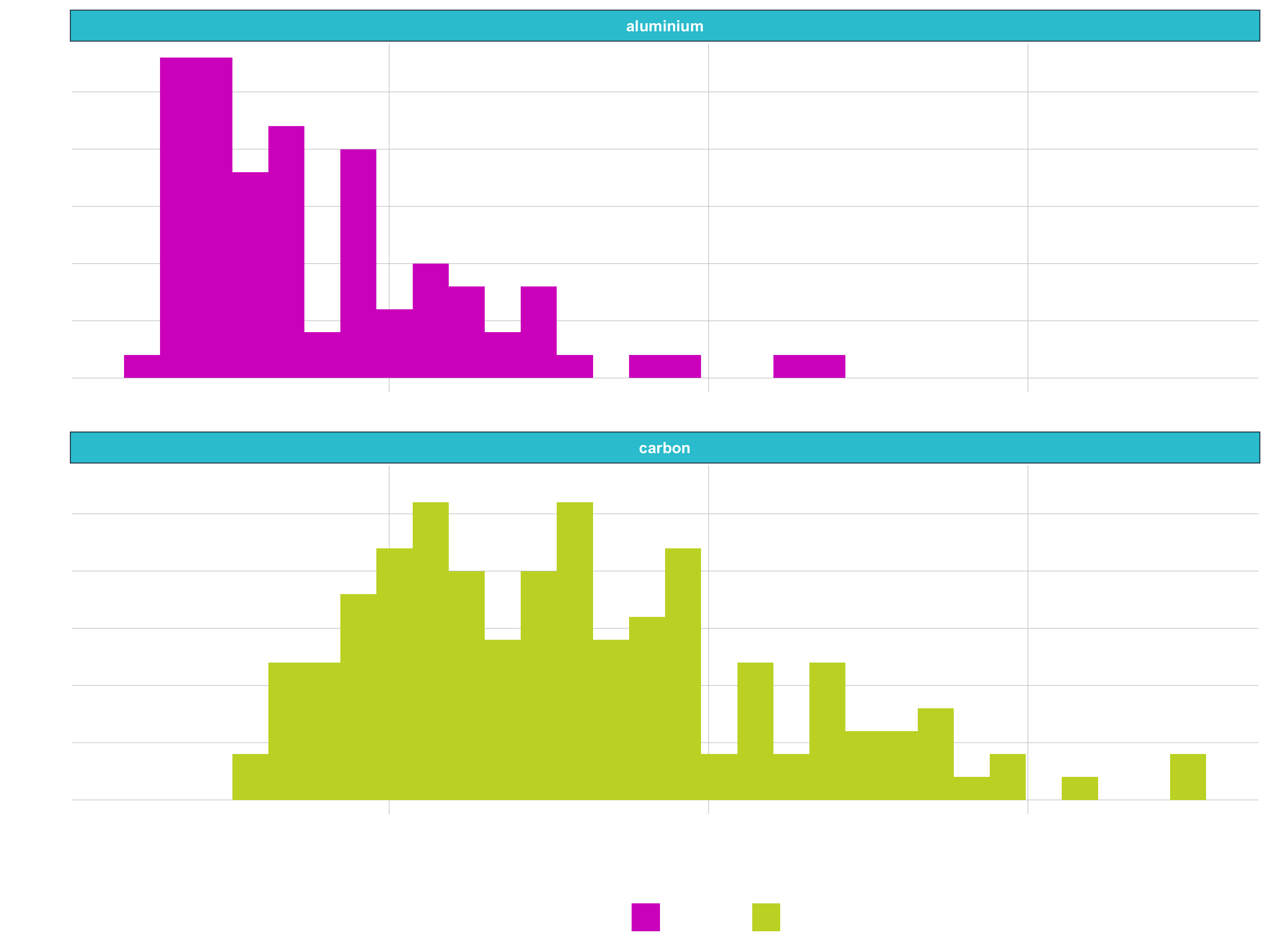
- Goal: Unit price of bicylce, segmenting by frame material
# Histogram
bike_orderlines_tbl %>%

    distinct(price, model, frame_material) %>%

    ggplot(aes(price, fill = frame_material)) +

    geom_histogram() +

    facet_wrap(~ frame_material, ncol = 1)
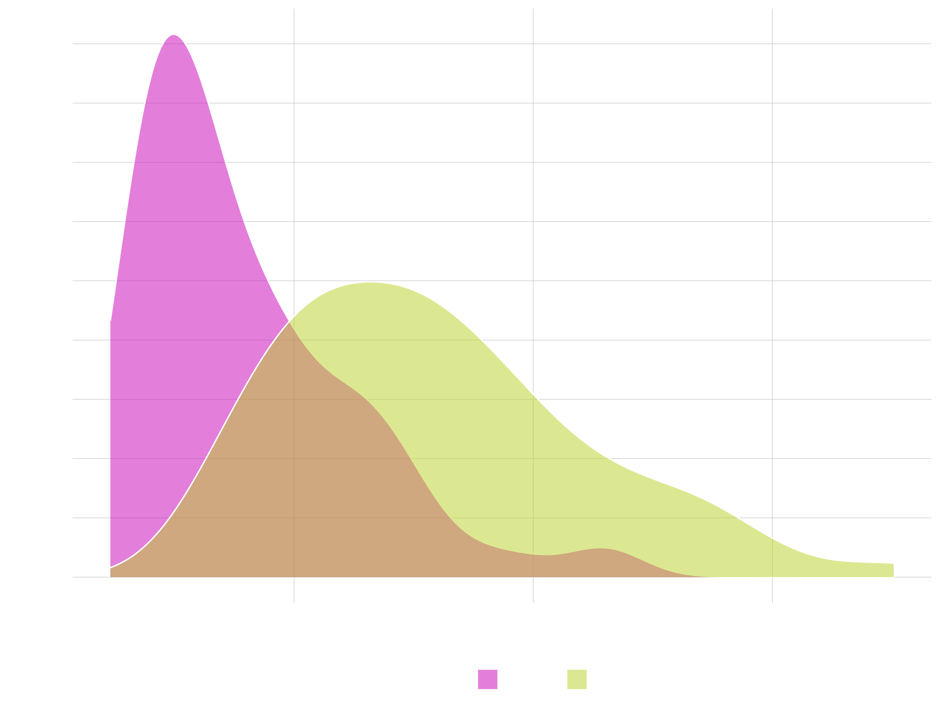
# Density
bike_orderlines_tbl %>%

    distinct(price, model, frame_material) %>%

    ggplot(aes(price, fill = frame_material)) +

    geom_density(alpha = 0.5) +
    # facet_wrap(~ frame_material, ncol = 1) +

    theme(legend.position = "bottom")
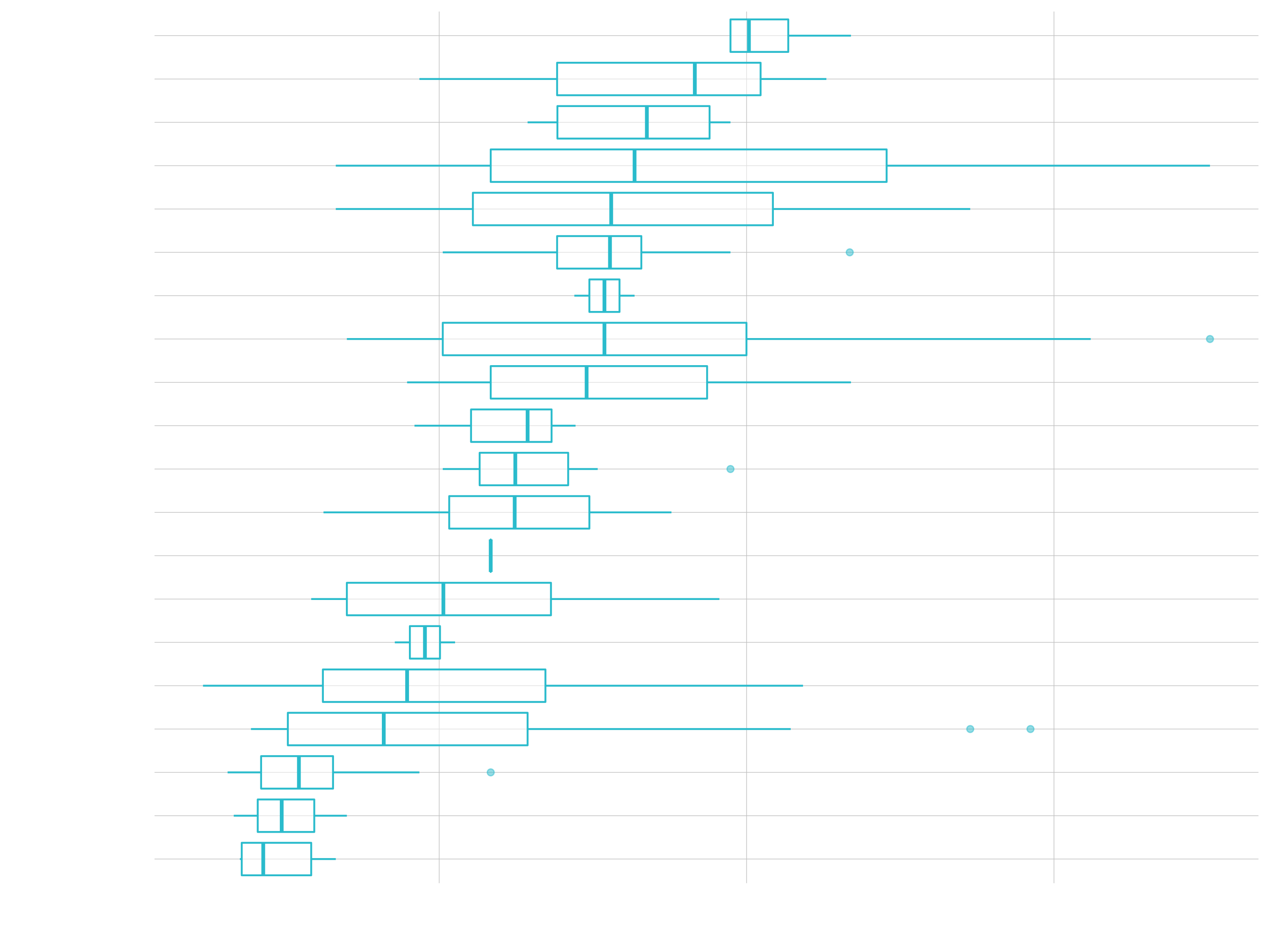
Box Plot / Violin Plot
- Great for comparing distributions
- Goal: Unit price of model, segmenting by category 2
# Data Manipulation
unit_price_by_cat_2_tbl <- bike_orderlines_tbl %>%

    select(category_2, model, price) %>%
    distinct() %>%

    mutate(category_2 = as_factor(category_2) %>% fct_reorder(price))

# Box Plot
unit_price_by_cat_2_tbl %>%

    ggplot(aes(category_2, price)) +

    geom_boxplot() +
    coord_flip()
# Violin Plot & Jitter Plot

unit_price_by_cat_2_tbl %>%

    ggplot(aes(category_2, price)) +

    geom_jitter(width = 0.15, color = "#2c3e50") +
    geom_violin(alpha = 0.5) +

    coord_flip()
Text & Labels
- Goal: Exposing sales over time, highlighting outlier
# Data Manipulation

revenue_by_year_tbl <- bike_orderlines_tbl %>%

    select(order_date, total_price) %>%

    mutate(year = year(order_date)) %>%

    group_by(year) %>%
    summarize(revenue = sum(total_price)) %>%
    ungroup()

# Adding text to bar chart
# Filtering labels to highlight a point

revenue_by_year_tbl %>%

    ggplot(aes(year, revenue)) +

    geom_col(fill = "#2c3e50") +
    geom_smooth(method = "lm", se = FALSE) +

    geom_text(aes(label =  scales::dollar(revenue,
                                          scale  = 1e-6,
                                          prefix = "",
                                          suffix = "M")),
              vjust = 1.5, color = "white") +

    geom_label(label =  "Major Demand This Year",
               vjust = -0.5,
               size  = 5,
               fill  = "#1f78b4",
               color = "white",
               fontface = "italic",
               data = revenue_by_year_tbl %>%
                   filter(year %in% c(2019))) +

    expand_limits(y = 2e7)
(3) Formatting
See page 2 of the visualization Cheatsheet
Once we have that, we can get into the formatting:
Range of your plot
To expand the range of a plot you can use expand_limit(). As arguments set y and/or x either to single values or a vector containing the upper and the lower limit (e.g. expand_limit(y = 0)). If you want to zoom into a certain area use coord_cartesian(ylim = c(ymin, ymax), xlim = c(xmin, xmax)) and set the values accordingly. If you don’t wrap ylim and xlim into coord_cartesian the values out of range will be dropped.
Scales
Aesthetic mapping (i.e., with aes()) only says that a variable should be mapped to an aesthetic. It doesn’t say how that should happen. For example, when mapping a variable to shape with aes(shape = categories) you don’t say what shapes should be used. Similarly, aes(color = revenue) doesn’t say what colors should be used. Describing what colors/shapes/sizes etc. to use is done by modifying the corresponding scale. In ggplot2, scales include:
- position
- color, fill, and alpha
- size
- shape
- linetype
ggplot automatically adds a particular scale for each mapping/ every aestethic to the plot to determine the range of values that the data should map to. This is the same as above with explicit scales:
sales_by_year_tbl %>%

  # Canvas
  ggplot(aes(x = year, y = sales, color = sales)) +

  # Geometries
  geom_line(size = 1) +
  geom_point(size = 5) +
  geom_smooth(method = "lm", se = FALSE) +

  # same as above, with explicit scales
  scale_x_continuous() +
  scale_y_continuous() +
  scale_colour_continuous()
Scales are modified with a series of functions using a scale_<aesthetic>_<type> naming scheme. Try typing scale_<tab> to see a list of scale modification functions. A continuous scale will handle things like numeric data (where there is a continuous set of numbers), whereas a discrete scale will handle things like categories. While the default scales will work fine, it is possible to explicitly add different scales to replace the defaults. The following arguments are common to most scales in ggplot2:
- name: the first argument specifies the axis or legend title
- limits: the minimum and maximum of the scale
- breaks: the points along the scale where labels should appear
- labels: the text that appear at each break
Specific scale functions may have additional arguments; for example, the scale_color_continuous() function has arguments low and high for setting the colors at the low and high end of the scale.
Let’s do the following formatting:
- Let the y-axis start at 0.
- change the color for revenue to a red-black-gradient (from the default dark-blue to light-blue gradient)
- update the labels to the dollar format and make it to millions (using
scales::dollar_format())
sales_by_year_tbl %>%

  # Canvas
  ggplot(aes(x = year, y = sales, color = sales)) +

  # Geometries
  geom_line(size = 1) +
  geom_point(size = 5) +
  geom_smooth(method = "lm", se = FALSE, color = "#d62dc6") +

  # Formatting
  expand_limits(y = 0) +
  # You can also type "red", "black" etc. for the colors
  scale_color_continuous(low    = "#95E1EA", high = "#2097A3",
                         labels = scales::dollar_format(scale  = 1/1e6,
                                                        prefix = "",
                                                        suffix = "M €")) +
  scale_y_continuous(labels = scales::dollar_format(scale  = 1/1e6,
                                                    prefix = "",
                                                    suffix = "M €")) +
Labels
The title and axis labels can be changed using the labs() function with title, x and y arguments. Another option is to use the ggtitle(), xlab() and ylab().
Let’s do the following formatting:
- Add labels
labs(
    title = "Revenue",
    subtitle = "Sales are trending up and to the right!",
    x = "",
    y = "Sales (Millions)",
    color = "Rev (M €)",
    caption = "What's happening?\nSales numbers showing year-over-year growth."
  )
Themes
ggplot comes with several complete themes which control all non-data display in a predfined way. Just add them as another layer. Examples are theme_bw, theme_light(), theme_dark(), theme_minimal(). See here for the list of the complete themes of ggplot2. There are also multiple other packages, that contain themes (e.g. ggthemes). Theme elements like the legend can be adjusted with the theme() function.
Exercise: Let’s do the following formatting:
- Format the data: Sales for each month in 2015
- Add a theme
theme_economist() - Change the position and the direction of the legend
theme(legend.position = "right", legend.direction = "vertical") - You can change the breaks on the x-axis with
scale_x_continuous(breaks = ..., labels = ...) - You can change the angle of the axis labels with
theme(axis.text.x = element_text(angle = 45))
library(ggthemes)
## DATA PREPARATION
sales_by_month_2015 <- bike_orderlines_tbl %>%

  # Selecting columns to focus on and adding a month column
  select(order_date, total_price) %>%
  mutate(year  = year(order_date)) %>%
  mutate(month = month(order_date)) %>%

  filter(year == "2015") %>%

  # Grouping by month, and summarizing sales
  group_by(month) %>%
  summarize(sales = sum(total_price)) %>%
  ungroup() %>%

  # $ Format Text
  mutate(sales_text = scales::dollar(sales, big.mark = ".",
                                     decimal.mark    = ",",
                                     prefix          = "",
                                     suffix          = " €"))

## PLOTTING
  # Canvas
  sales_by_month_2015 %>%
      ggplot(aes(x = month, y = sales, color = sales)) +

  # Geometries
  geom_line(size = 1) +
  geom_point(size = 5) +
  geom_smooth(method = "lm", se = FALSE) +

  # Formatting
  expand_limits(y = 0) +
  scale_color_continuous(low = "red", high = "black",
                         labels = scales::dollar_format(scale = 1/1e6,
                                                        prefix = "",
                                                        suffix = "M €")) +
  scale_x_continuous(breaks = sales_by_month_2015$month,
                     labels = month(sales_by_month_2015$month, label = T)) +
  scale_y_continuous(labels = scales::dollar_format(scale = 1/1e6,
                                                    prefix = "",
                                                    suffix = "M")) +
  labs(
    title = "Monthly sales (2015)",
    subtitle = "April is the strongest month!",
    x = "",
    y = "Sales (Millions)",
    color = "Rev (M €)",
    caption = "What's happening?\nSales numbers are dropping towards the end of the year."
  )  +
  theme_economist() +
  theme(legend.position  = "right",
        legend.direction = "vertical",
        axis.text.x = element_text(angle = 45))
By assigning the code to g for example and running View(g) you see, that g is basically just a list containing all the information we just provided.
Examples of formatting:
Let’s create a new subset of the data for some examples of formatting:
# Data Manipulation

sales_by_year_category_1_tbl <- bike_orderlines_tbl %>%
    select(order_date, category_1, total_price) %>%

    mutate(order_date = ymd(order_date)) %>%
    mutate(year = year(order_date)) %>%

    group_by(category_1, year) %>%
    summarize(revenue = sum(total_price)) %>%
    ungroup() %>%

    # Convert character vectors to factors
    # Arrange by year and revenue
    mutate(category_1 = fct_reorder2(category_1, year, revenue))

sales_by_year_category_1_tbl

# Uncover the factor levels (just for demonstration)
# sorted by years and the highest revenues
sales_by_year_category_1_tbl %>%
    mutate(category_1_num = as.numeric(category_1)) %>%
    arrange(category_1_num)
Colors
R comes with a bunch of named colors. These are just character names (e.g. “cornflowerblue”). You can use those named colors, but you can also use RGB (specifying color values as combinations of Red - Green - Blue, e.g. white = 255 - 255 - 255) and Hex codes (specifiyng color by hexidecimal, e.g. white = #FFFFFF).
# Named Colors. This returns a long list of colors that can be used by name
colors()

# Example
sales_by_year_category_1_tbl %>%

    ggplot(aes(year, revenue)) +

    geom_col(fill = "slateblue")

# To RGB
col2rgb("slateblue")

col2rgb("#2C3E50")

# To HEX (this function should be provided to a geom)
rgb(44, 62, 80, maxColorValue = 255)### Brewer. Comes with basic R.
#Primarly for discrete data.
# We can use those palletes by just calling their names (e.g. "Blues")
# Display the colors
RColorBrewer::display.brewer.all()
# Get information
RColorBrewer::brewer.pal.info
# Get the HEX codes
RColorBrewer::brewer.pal(n = 8, name = "Blues")[1]
# Example
sales_by_year_category_1_tbl %>%
ggplot(aes(year, revenue)) +
geom_col(fill = RColorBrewer::brewer.pal(n = 8, name = "Blues")[8])
### Viridis
viridisLite::viridis(n = 20)
# The last two characters indicate the transparency (e.g. FF makes it 100% transparent)
# Example
sales_by_year_category_1_tbl %>%
ggplot(aes(year, revenue)) +
geom_col(fill = viridisLite::viridis(n = 20)[10])
Aesthetic Mappings
All possible aestehetics for each geom, can be found in the corresponding help pages (e.g. ?geom_point).
sales_by_year_category_1_tbl %>%

    # Put the aes color mapping here, to apply it to geom_line and geom_point
    ggplot(aes(year, revenue, color = category_1)) +

    # Or you could do it locally in each geom
    # (aes mapping only necessary if you map it to a column)
    geom_line(size = 1) + # geom_line(aes(color = category_1))
    geom_point(color = "dodgerblue", size = 5)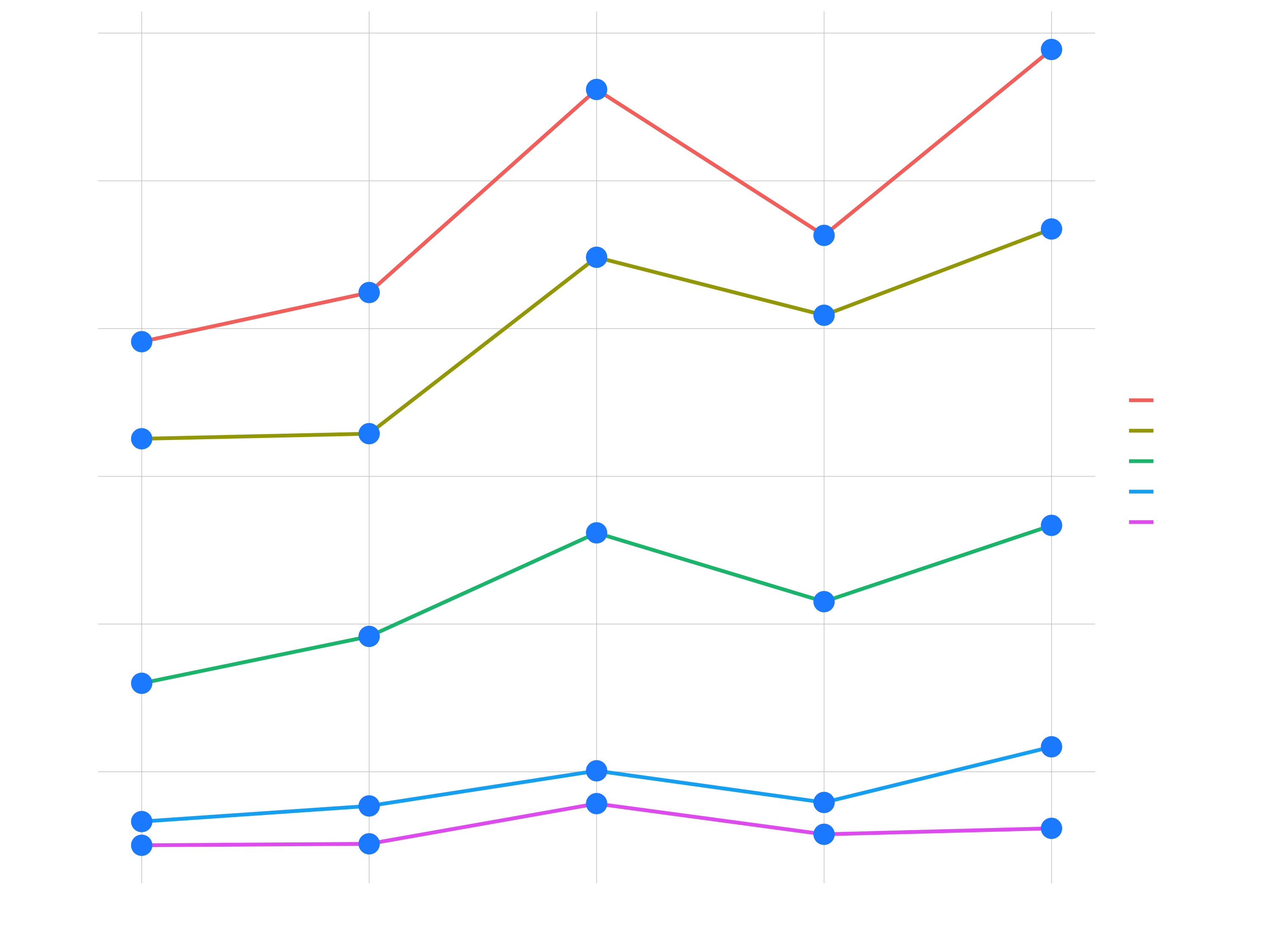
sales_by_year_category_1_tbl %>%

    ggplot(aes(year, revenue)) +
    geom_col(aes(fill = category_1))
    # You could use color = ... to color the outlines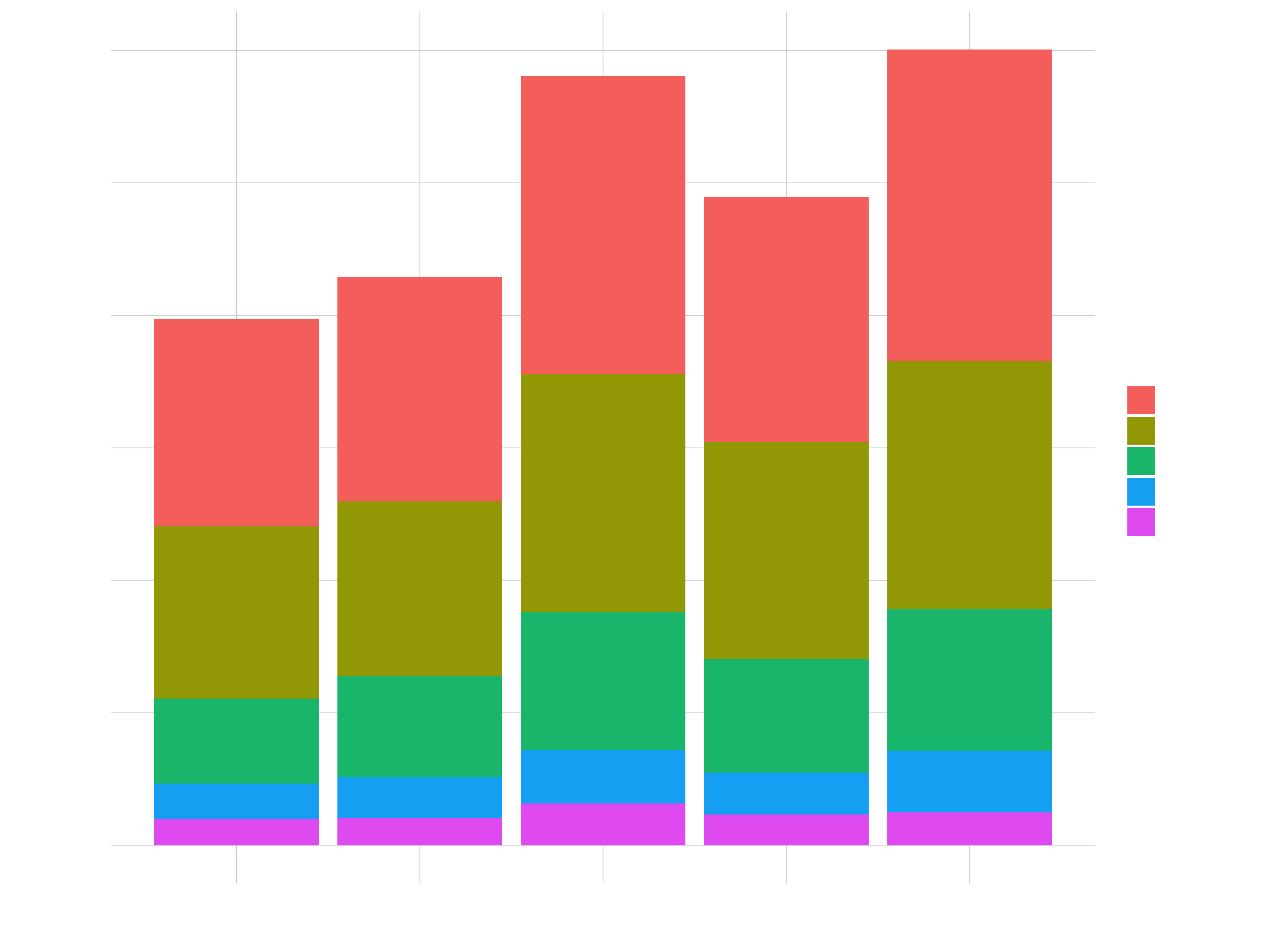
sales_by_year_category_1_tbl %>%

    ggplot(aes(year, revenue, size = revenue)) +

    # The local size overrides the global size
    geom_line(aes(color = category_1), size = 1) +
    geom_point()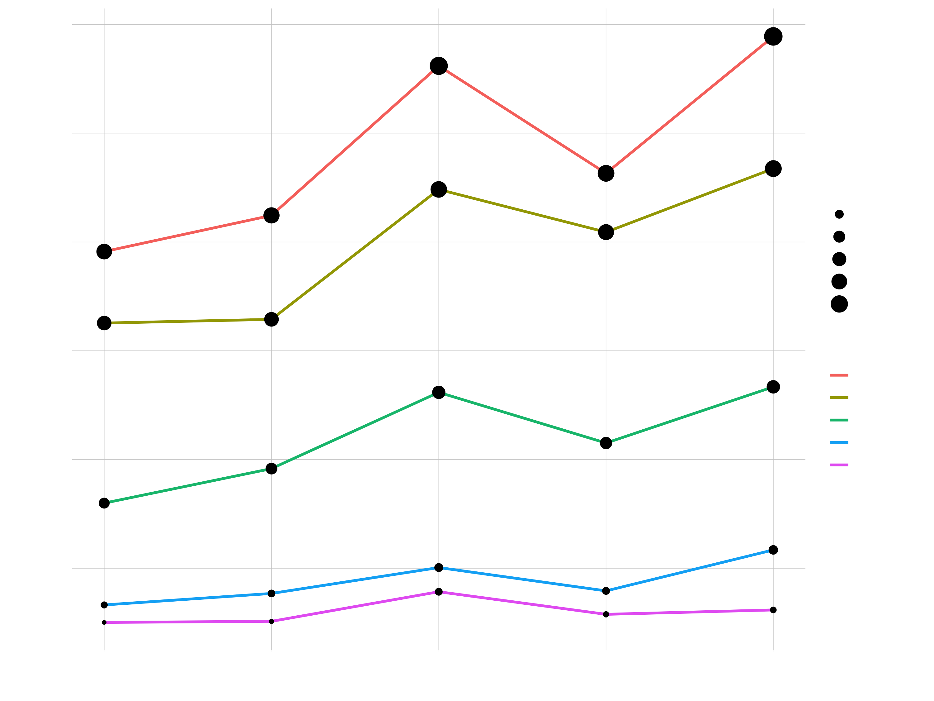
Faceting
facet_wrap()separates a plot with groups into multiple plots (aka facets)- Great way to tease out variation by category
- Goal: Sales annual sales by category 1
sales_by_year_category_1_tbl %>%

    ggplot(aes(year, revenue, color = category_1)) +
    geom_line(color = "black") +
    geom_smooth(method = "lm", se = FALSE) +

    # Break out stacked plot
    facet_wrap(~ category_1, ncol = 3, scales = "free_y") +

    expand_limits(y = 0)
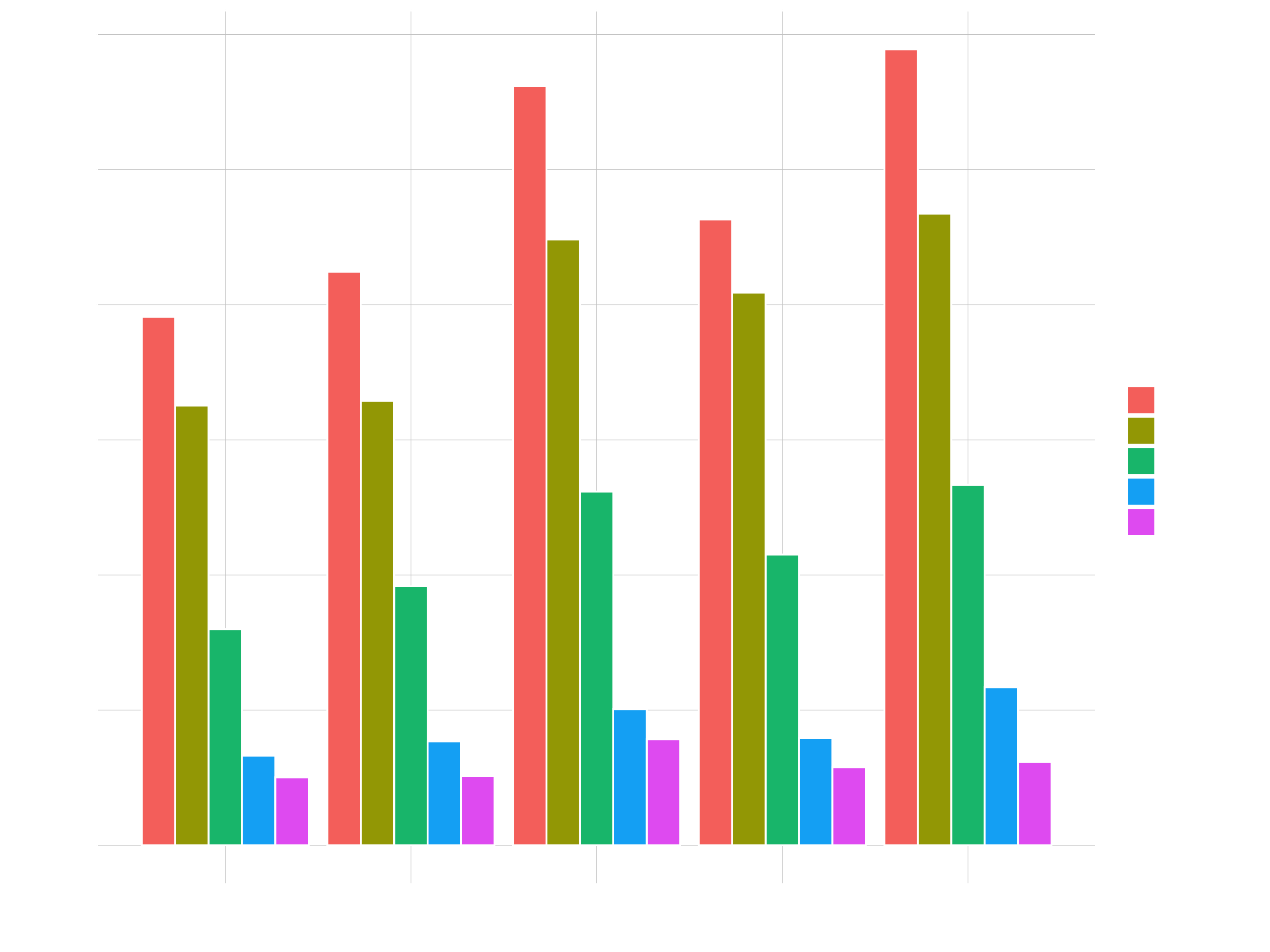
Position Adjustments (Stack & Dodge)
Using the position argument to plot Stacked Bars & Side-By-Side Bars
sales_by_year_category_1_tbl %>%

    ggplot(aes(year, revenue, fill = category_1)) +
    # geom_col(position = "stack") # default
    # geom_col(position = "dodge")
    geom_col(position = position_dodge(width = 0.9), color = "white")
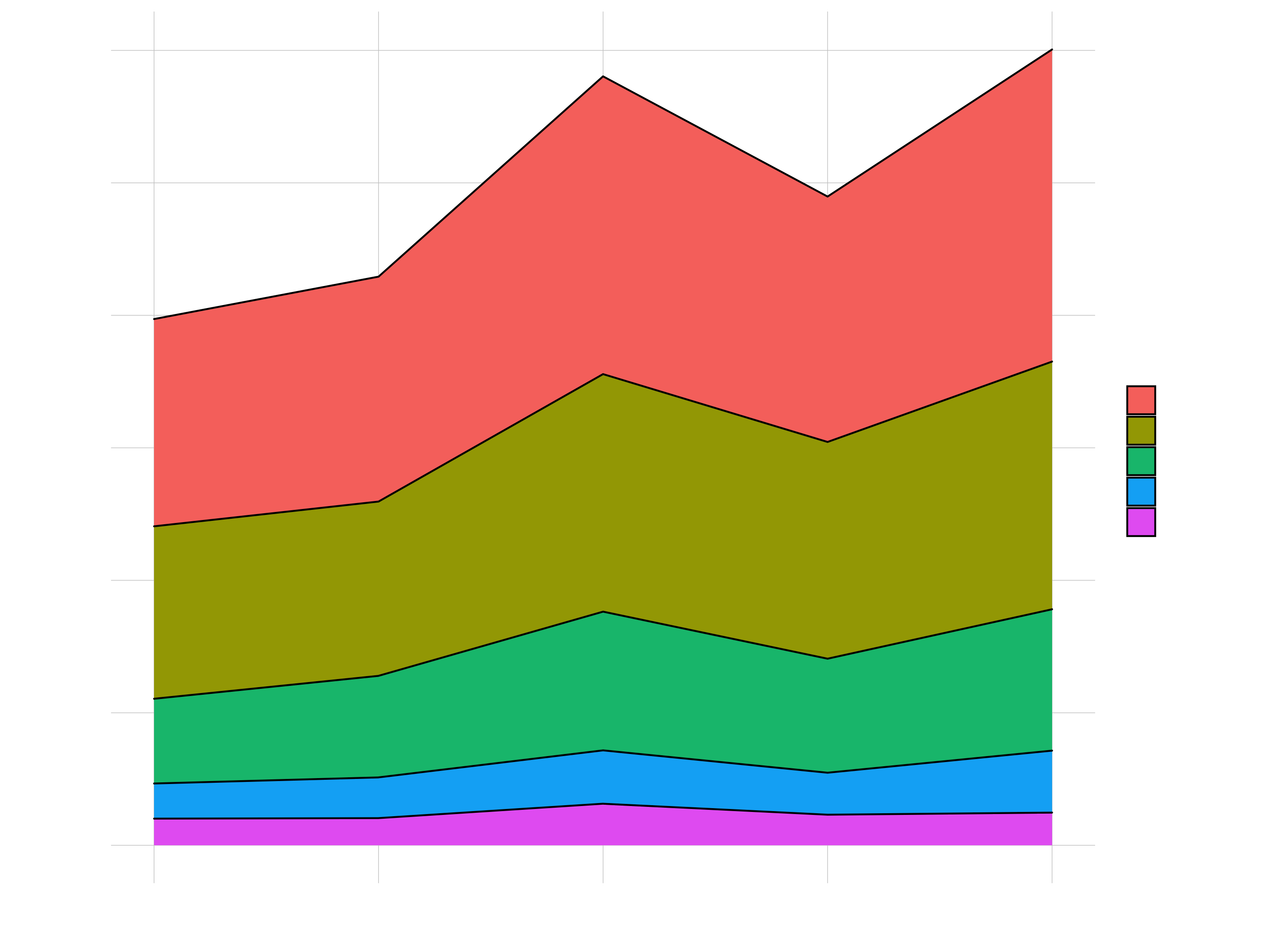
# Stacked Area

sales_by_year_category_1_tbl %>%

    ggplot(aes(year, revenue, fill = category_1)) +
    geom_area(color = "black")
Scales (Colors, Fills, Axis)
1 Plot Starting Points
- Continuous (e.g. Revenue): Changes color via gradient palette
- Categorical (e.g. category_2): Changes color via discrete palette
g_facet_continuous <- sales_by_year_category_1_tbl %>%

    ggplot(aes(year, revenue, color = revenue)) +
    geom_line(size = 1) +
    geom_point(size = 3) +

    facet_wrap(~ category_1, scales = "free_y") +
    expand_limits(y = 0) +

    theme_minimal()

g_facet_continuous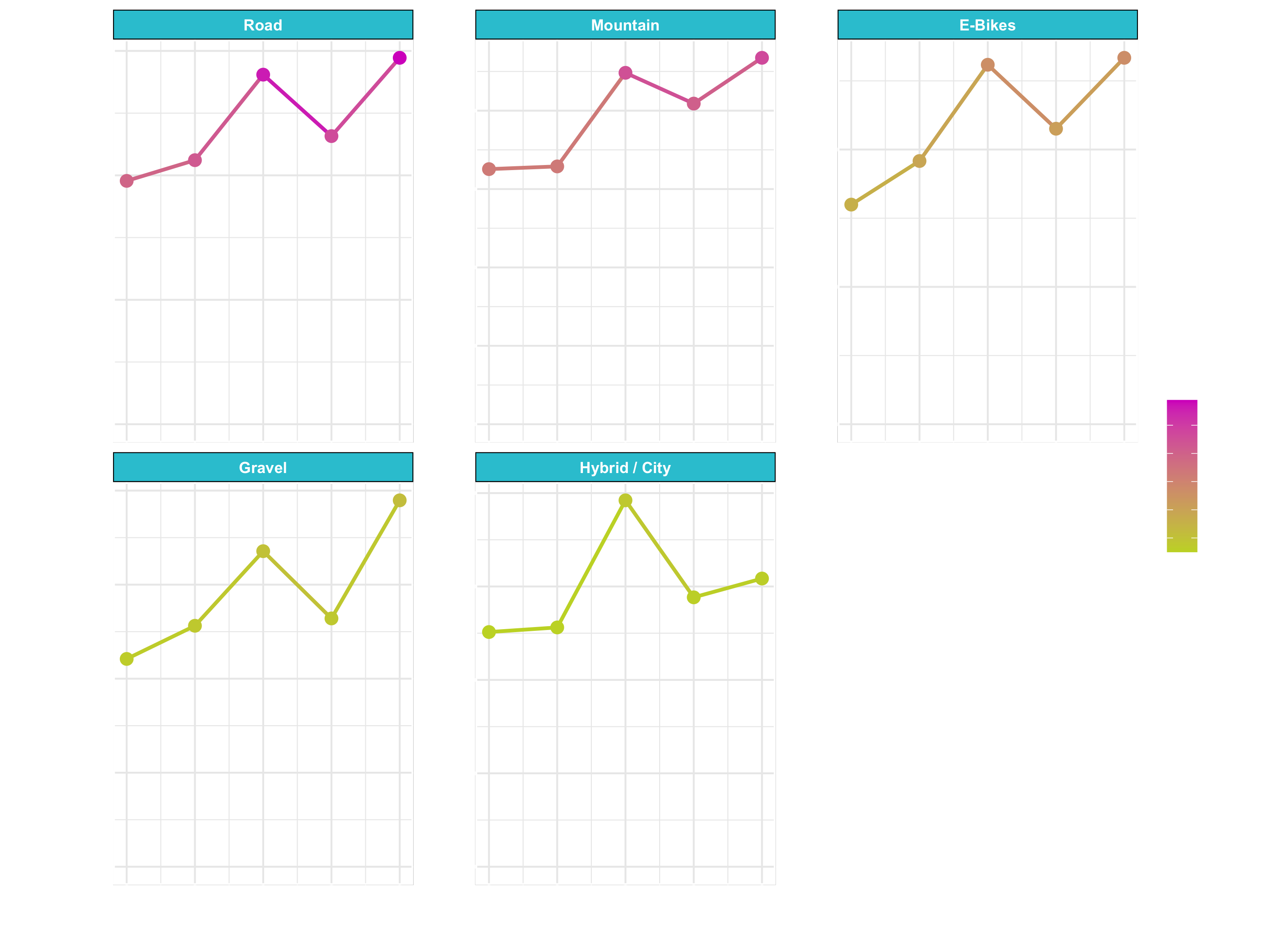
g_facet_discrete <- sales_by_year_category_1_tbl %>%

    ggplot(aes(year, revenue, color = category_1)) +
    geom_line(size = 1) +
    geom_point(size = 3) +

    facet_wrap(~ category_1, scales = "free_y") +
    expand_limits(y = 0) +

    theme_minimal()

g_facet_discrete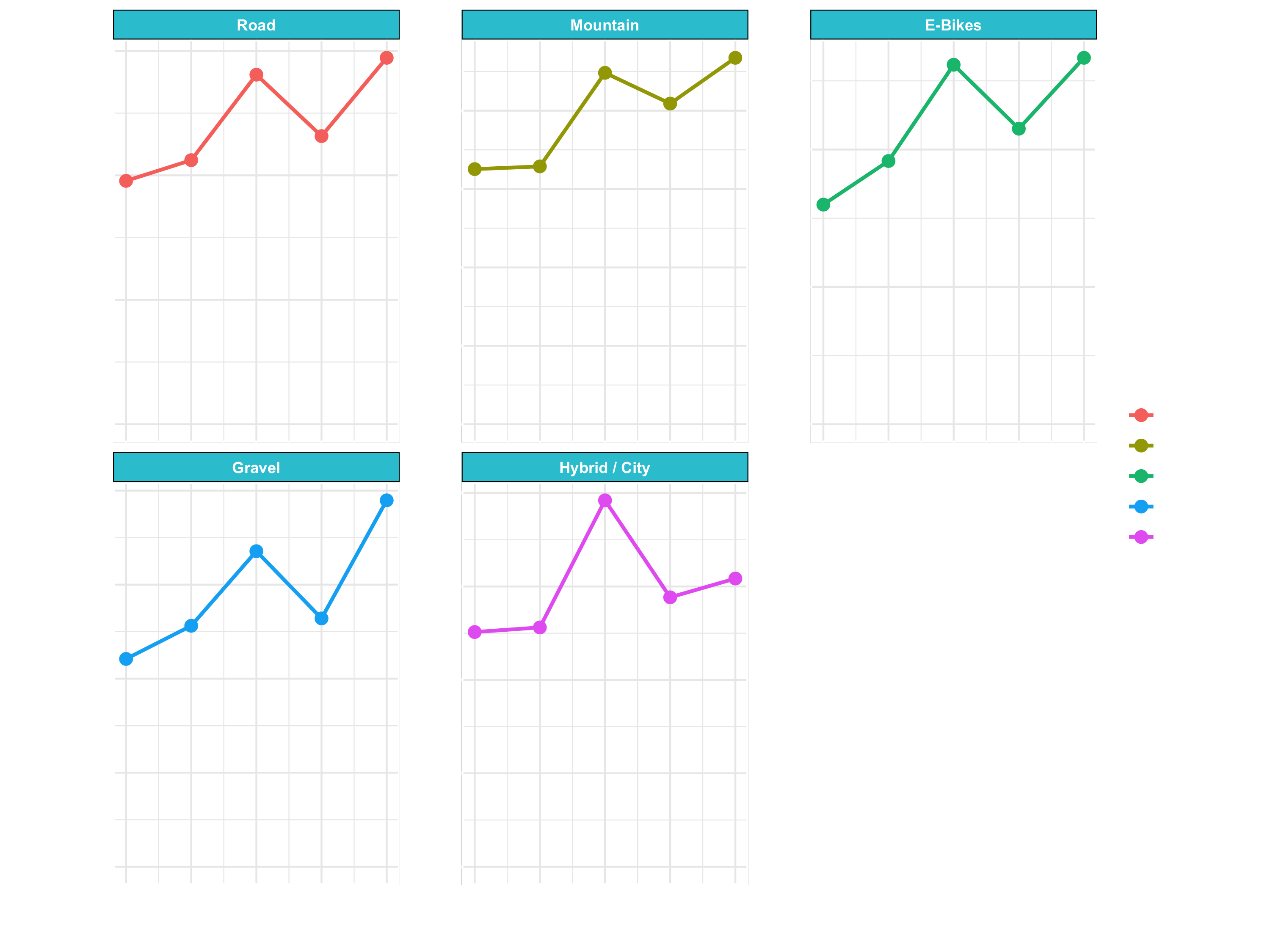
g_area_discrete <- sales_by_year_category_1_tbl %>%

    ggplot(aes(year, revenue, fill = category_1)) +
    geom_area(color = "black") +

    theme_minimal()

g_area_discrete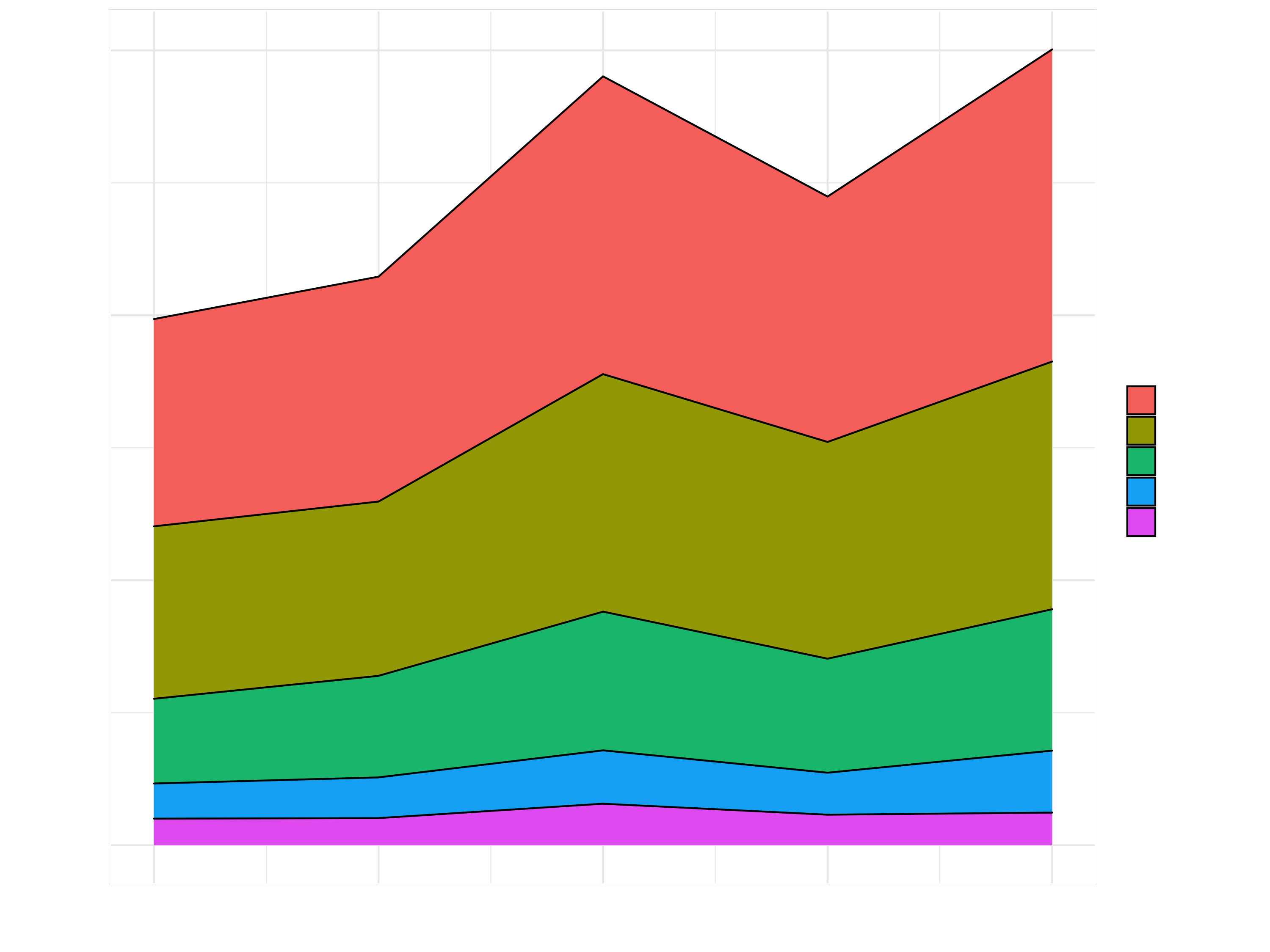
From here on, we are going to use those plots for further formatting:
2 Scale Colors & Fills
Awesome way to show variation by groups (discrete) and by values (continuous).
g_facet_continuous +

    # scale_color_continuous(
    #     low   = "black",
    #     high  = "cornflowerblue"
    # )
    # This is basically like adding a theme
scale_color_viridis_c(option = "E", direction = -1)RColorBrewer::display.brewer.all()
RColorBrewer::brewer.pal.info
RColorBrewer::brewer.pal(n = 8, name = "Blues")
g_facet_discrete +
scale_color_brewer(palette = "Set3") +
theme_dark()
g_facet_discrete +
scale_color_viridis_d(option = "D") +
theme_dark()g_area_discrete +
scale_fill_brewer(palette = "Set3")
g_area_discrete +
scale_fill_viridis_d()3 Axis Scales
g_facet_continuous +
    scale_x_continuous(breaks = seq(2015, 2019, by = 2)) +
    scale_y_continuous(labels = scales::dollar_format(scale = 1e-6,
                                                      preix = "",
                                                      suffix = "M"))
Labels
g_facet_continuous +

    scale_x_continuous(breaks = seq(2011, 2015, by = 2)) +
    scale_y_continuous(labels = scales::dollar_format(scale = 1e-6,
                                                      suffix = "M")) +

    geom_smooth(method = "lm", se = FALSE) +

    scale_color_viridis_c() +
    theme_dark() +

    labs(
        title = "Bike Sales",
        subtitle = "Sales are trending up",
        caption = "5-year sales trends\ncomes from our ERP Database",
        x = "Year",
        y = "Revenue (M €)",
        color = "Revenue" # Legend text
    )
Themes
Run View(g_facet_continuous) and expand theme to see which elements of the plots can be changed with theme().
g_facet_continuous +

    theme_light() +

    theme(
        axis.text.x = element_text(
            angle = 45,
            hjust = 1
        ),
        strip.background = element_rect(
            color = "black",
            fill  = "cornflowerblue",
            size  = 1
        ),
        strip.text = element_text(
            face  = "bold",
            color = "white"
        )
    )
Example graph: Putting It All Together
sales_by_year_category_1_tbl %>%

    ggplot(aes(year, revenue, fill = category_1)) +

    geom_area(color = "black") +

    # Scales
    scale_fill_brewer(palette = "Blues", direction = -1) +
    scale_y_continuous(labels = scales::dollar_format(prefix = "", suffix = " €")) +

    # Labels
    labs(
        title = "Sales Over Year by Category 1",
        subtitle = "Sales Trending Upward",
        x = "",
        y = "Revenue (M €)",
        fill = "2nd Category",
        caption = "Bike sales trends look strong heading into 2020"
    ) +

    # Theme
    theme_light() +
    theme(
        title = element_text(face = "bold", color = "#08306B")

    )
Factors
In the business case we are working with the data structure factors. R uses factors to handle categorical variables, variables that have a fixed and known set of possible values. Factors are also helpful for reordering character vectors to improve display. The goal of the forcats package is to provide a suite of tools that solve common problems with factors, including changing the order of levels or the values. forcats is part of the core tidyverse, so you can load it with library(tidyverse) or library(forcats).
Take a look at the following example:
library(tidyverse)
starwars %>%
  filter(!is.na(species)) %>%
  count(species, sort = TRUE)
## # A tibble: 37 x 2
##    species      n
##    <chr>    <int>
##  1 Human       35
##  2 Droid        6
##  3 Gungan       3
##  4 Kaminoan     2
##  5 Mirialan     2
##  6 Twi'lek      2
##  7 Wookiee      2
##  8 Zabrak       2
##  9 Aleena       1
## 10 Besalisk     1
## # … with 27 more rows
The function fct_lump() collapses the least/most frequent values of a factor into “other”. A positive value for the argument n preserves the most common n values. Negative n preserves the least common -n values. The argument w accepts an optional numeric vector giving weights for frequency of each value (not level) in f.
starwars %>%
     filter(!is.na(species)) %>%
     mutate(species = as_factor(species) %>%
                          fct_lump(n = 3)) %>%
     count(species)
## # A tibble: 4 x 2
##   species     n
##   <fct>   <int>
## 1 Human      35
## 2 Droid       6
## 3 Gungan      3
## 4 Other      39
Other useful functions are:
fct_reorder():Reordering a factor by another variable.
f <- factor(c("a", "b", "c", "d"), levels = c("b", "c", "d", "a"))
f
## a b c d
## Levels: b c d a

fct_reorder(f, c(2,3,1,4))
## a b c d
## Levels: c a b dfct_relevel(): allows you to move any number of levels to any location.
fct_relevel(f, "a")
## a b c d
## Levels: a b c d
fct_relevel(f, "b", "a")
## a b c d
## Levels: b a c d

# Move to the third position
fct_relevel(f, "a", after = 2)
## a b c d
## Levels: b c a d

# Relevel to the end
fct_relevel(f, "a", after = Inf)
## a b c d
## Levels: b c d a
fct_relevel(f, "a", after = 3)
## a b c d
## Levels: b c d a
For further information, see chapter Factors from R for Data Science.
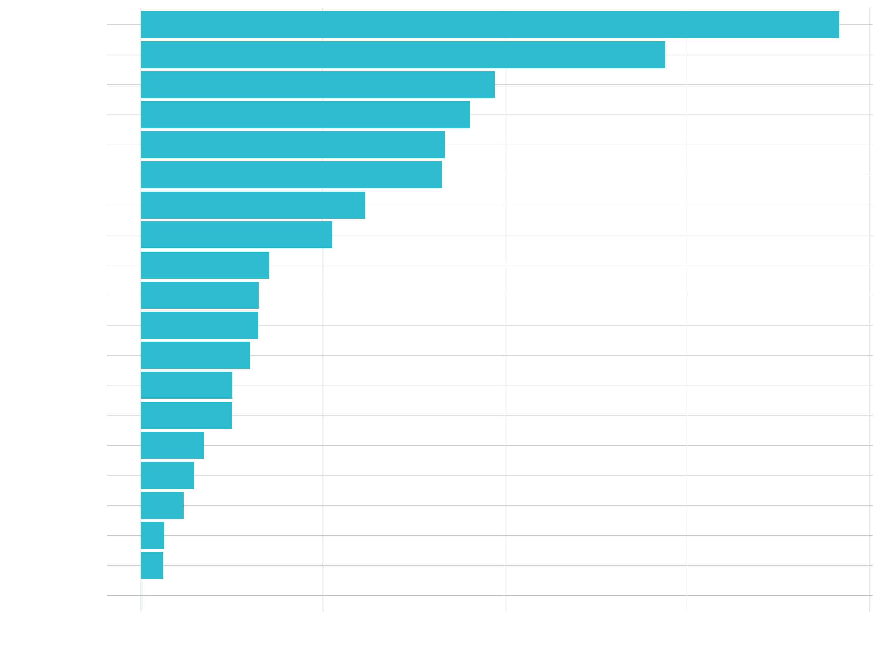
Business case
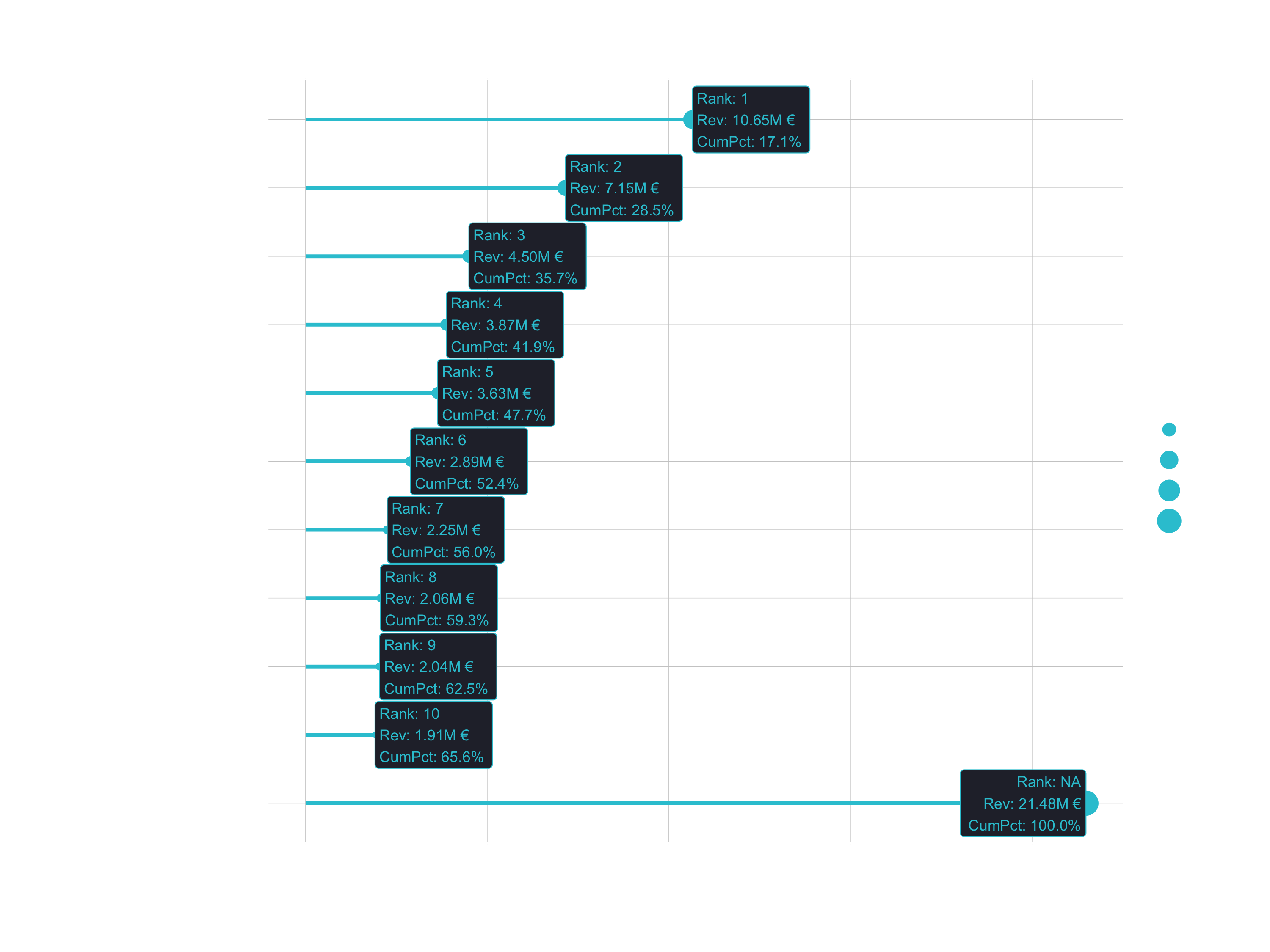
Case 1
- Question: How much purchasing power is in top 5 customers (bikeshops)?
- Goal: Lollipop Chart. Visualize top N customers in terms of Revenue, include cumulative percentage.
1. Load libraries and data
# 1.0 Lollipop Chart: Top N Customers ----
library(tidyverse)
library(lubridate)

bike_orderlines_tbl <- read_rds("00_data/01_bike_sales/02_wrangled_data/bike_orderlines.rds")
2. Data manipluation
n <- 10
# Data Manipulation
top_customers_tbl <- bike_orderlines_tbl %>%

    # Select relevant columns
    select(bikeshop, total_price) %>%

    # Collapse the least frequent values into “other”
    mutate(bikeshop = as_factor(bikeshop) %>% fct_lump(n = n, w = total_price)) %>%

    # Group and summarize
    group_by(bikeshop) %>%
    summarize(revenue = sum(total_price)) %>%
    ungroup() %>%

    # Reorder the column customer_city by revenue
    mutate(bikeshop = bikeshop %>% fct_reorder(revenue)) %>%
    # Place "Other" at the beginning
    mutate(bikeshop = bikeshop %>% fct_relevel("Other", after = 0)) %>%
    # Sort by this column
    arrange(desc(bikeshop)) %>%

    # Add Revenue Text
    mutate(revenue_text = scales::dollar(revenue,
                                         scale  = 1e-6,
                                         prefix = "",
                                         suffix = "M €")) %>%

    # Add Cumulative Percent
    mutate(cum_pct = cumsum(revenue) / sum(revenue)) %>%
    mutate(cum_pct_text = scales::percent(cum_pct)) %>%

    # Add Rank
    mutate(rank = row_number()) %>%
    mutate(rank = case_when(
        rank == max(rank) ~ NA_integer_,
        TRUE ~ rank
    )) %>%

    # Add Label text
    mutate(label_text = str_glue("Rank: {rank}\nRev: {revenue_text}\nCumPct: {cum_pct_text}"))
3. Data visualization
# Data Visualization
top_customers_tbl %>%

    # Canvas
    ggplot(aes(revenue, bikeshop)) +

    # Geometries
    geom_segment(aes(xend = 0, yend = bikeshop),
                 color = RColorBrewer::brewer.pal(n = 11, name = "RdBu")[11],
                 size  = 1) +

    geom_point(aes(size = revenue),
               color = RColorBrewer::brewer.pal(n = 11, name = "RdBu")[11]) +

    geom_label(aes(label = label_text),
               hjust = "inward",
               size  = 3,
               color = RColorBrewer::brewer.pal(n = 11, name = "RdBu")[11]) +

    # Formatting
    scale_x_continuous(labels = scales::dollar_format(scale = 1e-6,
                                                      prefix = "",
                                                      suffix = "M €")) +
    labs(
        title = str_glue("Top {n} Customers"),
        subtitle = str_glue(
              "Start: {year(min(bike_orderlines_tbl$order_date))}
               End:  {year(max(bike_orderlines_tbl$order_date))}"),
        x = "Revenue (M €)",
        y = "Customer",
        caption = str_glue("Top 6 customers contribute
                           52% of purchasing power.")
    ) +

    theme_minimal() +
    theme(
        legend.position = "none",
        plot.title = element_text(face = "bold"),
        plot.caption = element_text(face = "bold.italic")
    )
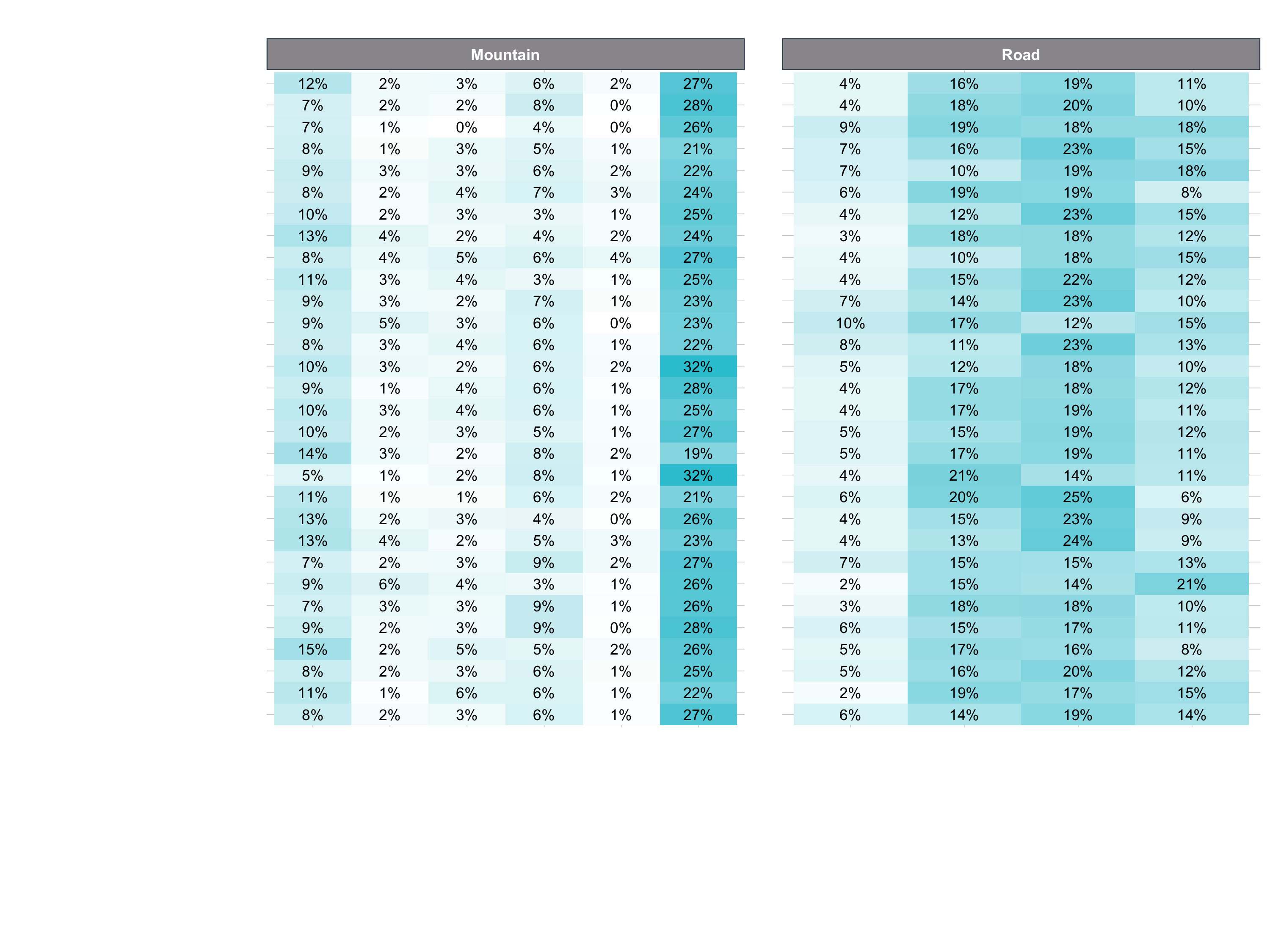
Case 2
- Question: Do specific customers have a purchasing preference?
- Goal: Visualize heatmap of proportion of sales by Secondary Product Category
1. Data manipluation
# Select columns and filter categories
pct_sales_by_customer_tbl <- bike_orderlines_tbl %>%

    select(bikeshop, category_1, category_2, quantity) %>%
    filter(category_1 %in% c("Mountain","Road")) %>%

    # Group by category and summarize
    group_by(bikeshop, category_1, category_2) %>%
    summarise(total_qty = sum(quantity)) %>%
    ungroup() %>%

    # Add missing groups (not necessarily mandatory, but we'd get holes in the plot)
    # complete() creates NAs. We need to set those to 0.
    complete(bikeshop, nesting(category_1, category_2)) %>%
    mutate(across(total_qty, ~replace_na(., 0))) %>%

    # Group by bikeshop and calculate revenue ratio
    group_by(bikeshop) %>%
    mutate(pct = total_qty / sum(total_qty)) %>%
    ungroup() %>%

    # Reverse order of bikeshops
    mutate(bikeshop = as.factor(bikeshop) %>% fct_rev()) %>%
    # Just to verify
    mutate(bikeshop_num = as.numeric(bikeshop))
2. Data visualization
# Data Visualization
  pct_sales_by_customer_tbl %>%

    ggplot(aes(category_2, bikeshop)) +

    # Geometries
    geom_tile(aes(fill = pct)) +
    geom_text(aes(label = scales::percent(pct, accuracy = 1L)),
              size = 3) +
    facet_wrap(~ category_1, scales = "free_x") +

    # Formatting
    scale_fill_gradient(low = "white", high = "#2C3E50") +
    labs(
      title = "Heatmap of Purchasing Habits",
      x = "Bike Type (Category 2)",
      y = "Customer",
      caption = str_glue(
        "Customers that prefer Road:
        To be discussed ...

        Customers that prefer Mountain:
        To be discussed ...")
    ) +

    theme(
      axis.text.x = element_text(angle = 45, hjust = 1),
      legend.position = "none",
      plot.title = element_text(face = "bold"),
      plot.caption = element_text(face = "bold.italic")
    )
Challenge
The challenge deals with the covid data from last session. This time I recommend to use the tidyverse to wrangle the data…
library(tidyverse)
covid_data_tbl <- read_csv("https://opendata.ecdc.europa.eu/covid19/casedistribution/csv")
… but of course you can also use the data.table library.
Challenge 1
Goal: Map the time course of the cumulative Covid-19 cases! Your plot should look like this:
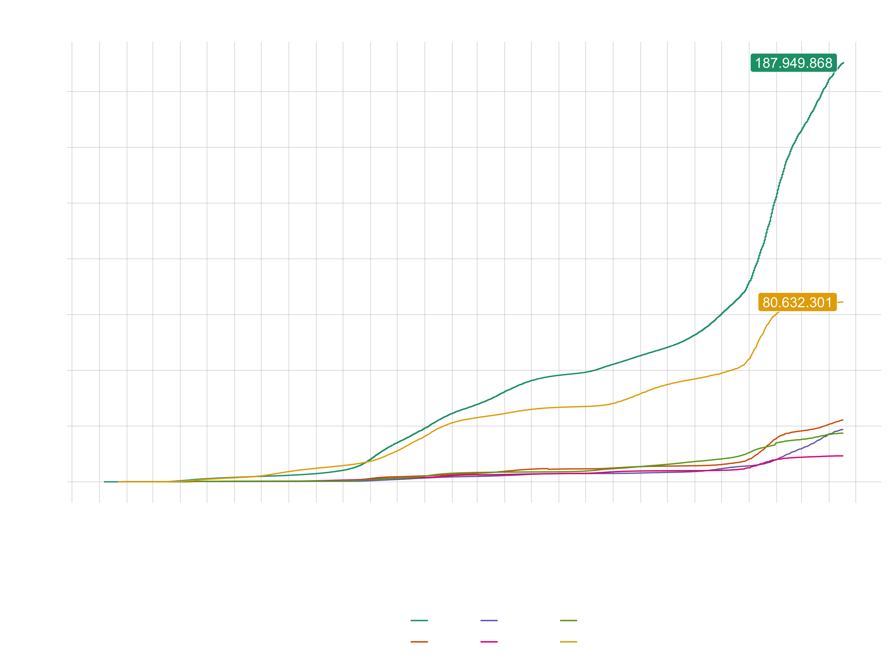
Adding the cases for Europe is optional. You can choose your own color theme, but don’t use the default one. Don’t forget to scale the axis properly. The labels can be added with geom_label() or with geom_label_repel() (from the package ggrepel).
Challenge 2
Goal: Visualize the distribution of the mortality rate (deaths / population) with geom_map(). The necessary longitudinal and lateral data can be accessed with this function:
world <- map_data("world")
This data has also to be put in the map argument of geom_map():
plot_data %>% ggplot( ... ) +
  geom_map(aes(map_id = ..., ... ), map = world, ... ) +
  ...
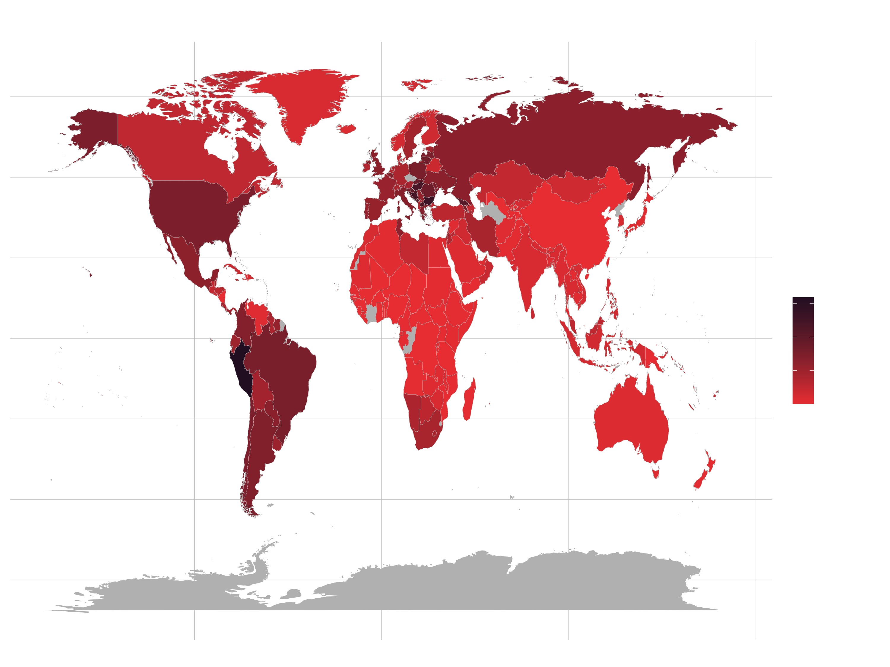
Hint (data wrangling):
  ... %>%
  mutate(across(countriesAndTerritories, str_replace_all, "_", " ")) %>%
  mutate(countriesAndTerritories = case_when(

    countriesAndTerritories == "United Kingdom" ~ "UK",
    countriesAndTerritories == "United States of America" ~ "USA",
    countriesAndTerritories == "Czechia" ~ "Czech Republic",
    TRUE ~ countriesAndTerritories

  ))