Machine Learning Fundamentals
Now we can finally start to talk about modeling. You’ll use your new tools of data wrangling and programming, to fit many models and understand how they work. The goal of a model is to provide a simple low-dimensional summary of a dataset. Ideally, the model will capture true “signals” (i.e. patterns generated by the phenomenon of interest), and ignore “noise” (i.e. random variation that you’re not interested in). Before we can start using models on datasets, you need to understand the basics of how models work. Machine learning foundations are from statistical theory and learning.
Theory Input
The content is based on explanations from Hadley Wickham and Andriy Burkov.
Modeling Basics in R
There are two parts to a model:
First, you define a family of models that express a precise, but generic, pattern that you want to capture. For example, the pattern might be a straight line, or a quadratic curve. You will express the model family as an equation like $y = a_{1}x + a_{2}$ or $y = a_{1}x^{a_{2}}$. Here, $x$ and $y$ are known variables from your data, and $a_{1}$ and $a_{2}$ are parameters that can vary to capture different patterns.
Next, you generate a fitted model by finding the model from the family that is the closest to your data. This takes the generic model family and makes it specific, like $y = 3x + 7$ or $y = 9x^{2}$.
It’s important to understand that a fitted model is just the closest model from a family of models. That implies that you have the “best” model (according to some criteria); it doesn’t imply that you have a good model and it certainly doesn’t imply that the model is “true”. George Box puts this well in his famous aphorism:
All models are wrong, but some are useful.
It’s worth reading the fuller context of the quote:
Now it would be very remarkable if any system existing in the real world could be exactly represented by any simple model. However, cunningly chosen parsimonious models often do provide remarkably useful approximations. For example, the law PV = RT relating pressure P, volume V and temperature T of an “ideal” gas via a constant R is not exactly true for any real gas, but it frequently provides a useful approximation and furthermore its structure is informative since it springs from a physical view of the behavior of gas molecules.For such a model there is no need to ask the question “Is the model true?”. If “truth” is to be the “whole truth” the answer must be “No”. The only question of interest is “Is the model illuminating and useful?”.
The goal of a model is not to uncover truth, but to discover a simple approximation that is still useful.
A simple model
Lets take a look at the simulated dataset sim1, included with the modelr package (click here if you have no experience installing packages). It contains two continuous variables, x and y. Let’s plot them to see how they’re related:
library(tidyverse)
library(modelr)
ggplot(sim1, aes(x, y)) +
  geom_point(size = 2, colour = "#2DC6D6")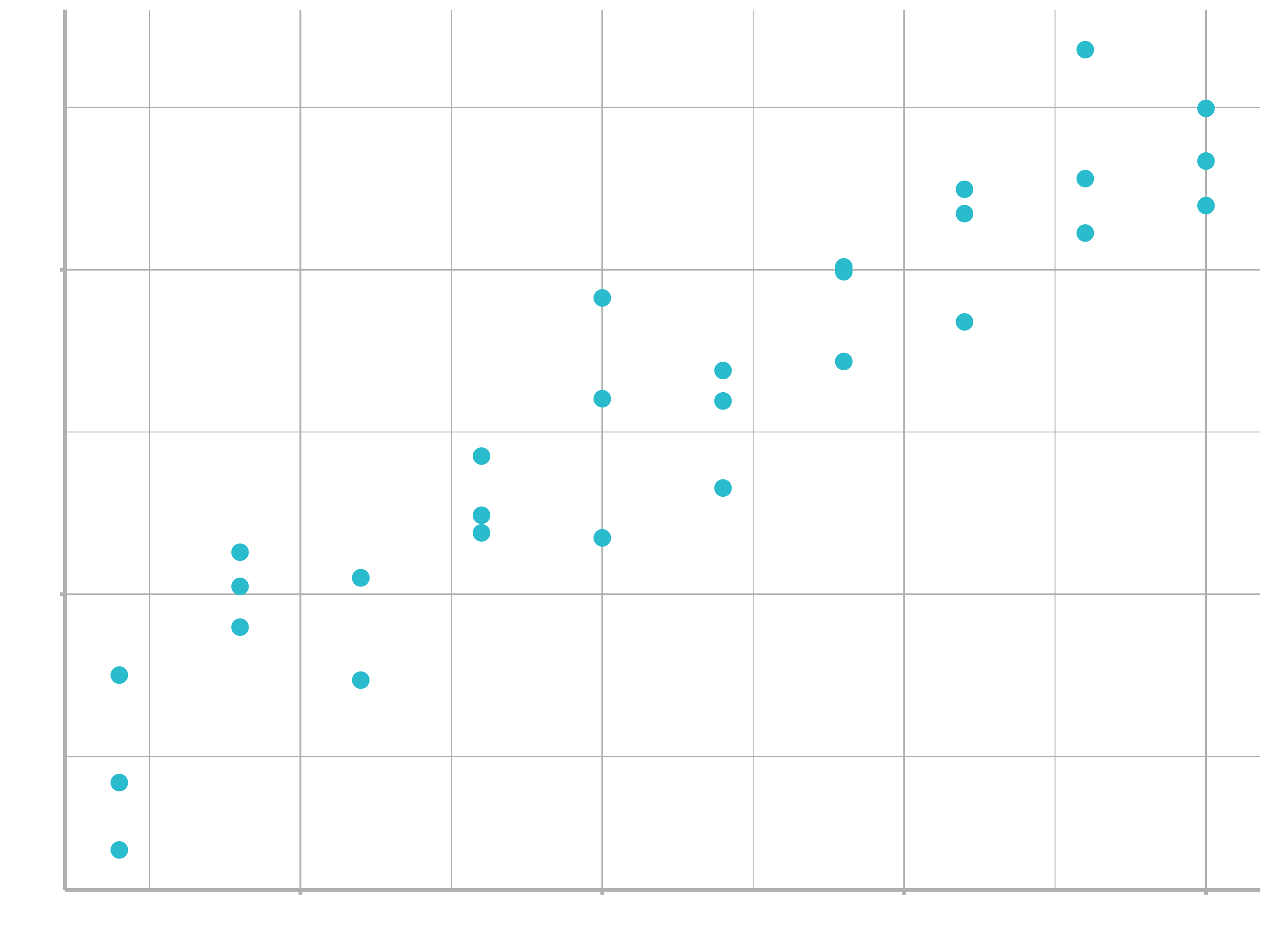
You can see a strong pattern in the data. Let’s use a model to capture that pattern and make it explicit. It’s our job to supply the basic form of the model. In this case, the relationship looks linear, i.e. $y = a_{0} + a_{1} * x$. Let’s start by getting a feel for what models from that family look like by randomly generating a few and overlaying them on the data. For this simple case, we can use geom_abline() which takes a slope and intercept as parameters. Later on we’ll learn more general techniques that work with any model.
models <- tibble(
  a1 = runif(250, -20, 40),
  a2 = runif(250, -5, 5)
)
ggplot(sim1, aes(x, y)) +
  geom_abline(aes(intercept = a1, slope = a2), data = models, alpha = 1/4) +
  geom_point()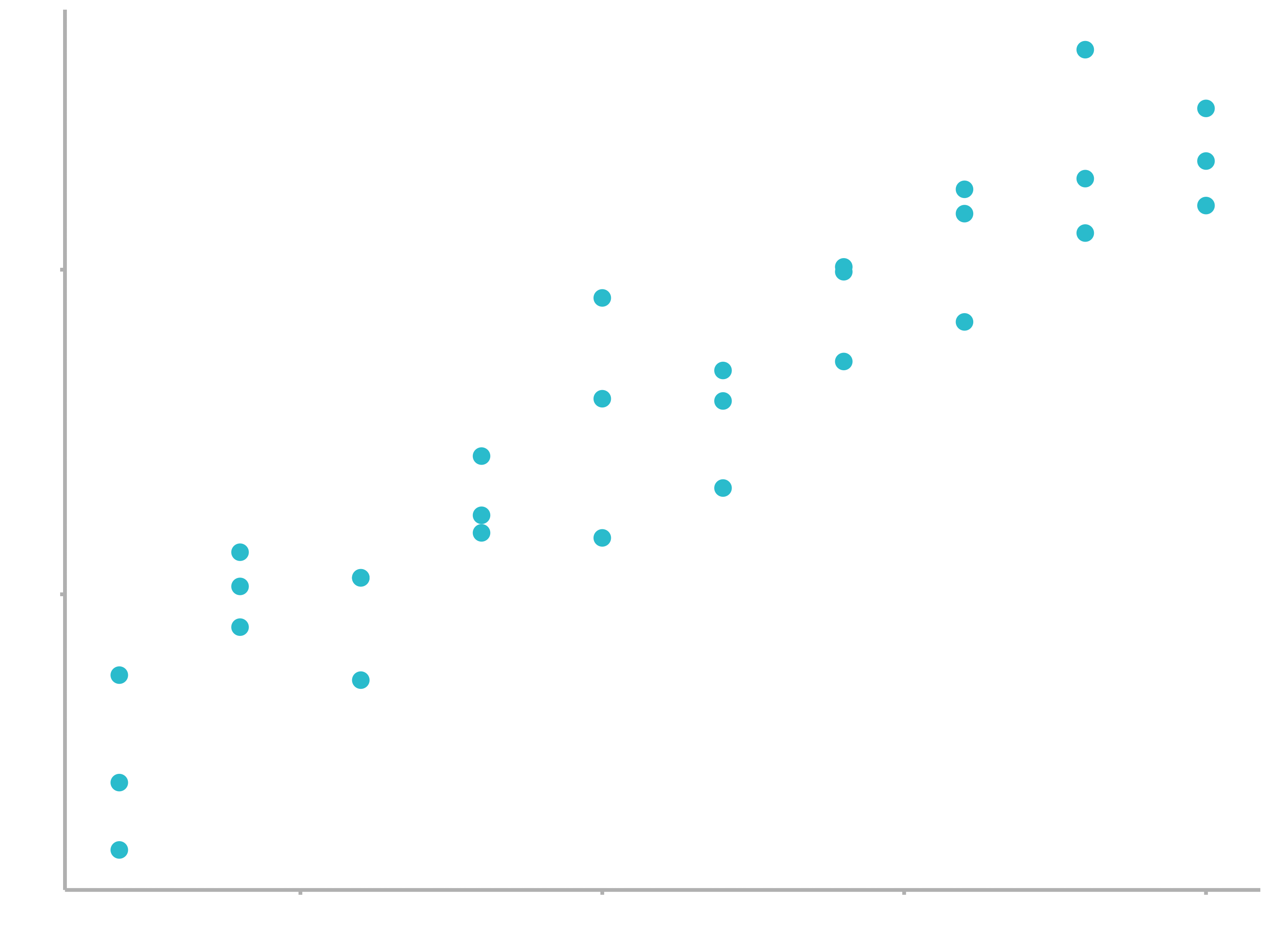
There are 250 models on this plot, but a lot are really bad! We need to find the good models by making precise our intuition that a good model is “close” to the data. We need a way to quantify the distance between the data and a model. Then we can fit the model by finding the value of $a_{0}$ and $a_{1}$ that generate the model with the smallest distance from this data.
One easy place to start is to find the vertical distance between each point and the model, as in the following diagram. (Note that the x values are slightly shifted so you can see the individual distances.)
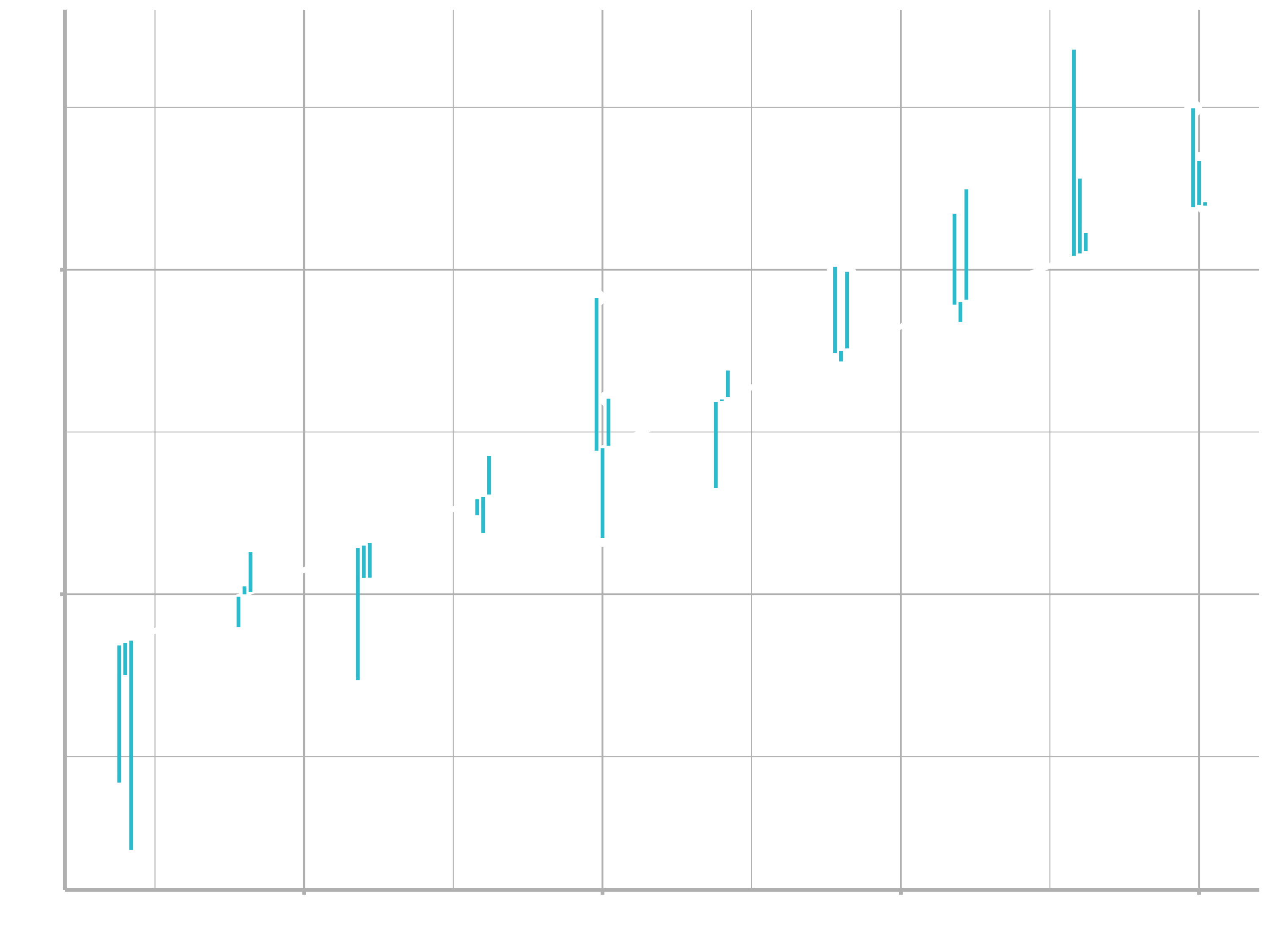
This distance is just the difference between the $\hat{y}$ value given by the model (the prediction), and the actual $y$ value in the data (the response).
To compute this distance, we first turn our model family into an R function. This takes the model parameters and the data as inputs, and gives values predicted by the model as output:
model1 <- function(a, data) {
  a[1] + data$x * a[2]
}
model1(c(7, 1.5), sim1)
##  [1]  8.5  8.5  8.5 10.0 10.0 10.0 11.5 11.5 11.5 13.0 13.0 13.0 14.5 14.5 14.5
## [16] 16.0 16.0 16.0 17.5 17.5 17.5 19.0 19.0 19.0 20.5 20.5 20.5 22.0 22.0 22.0
Next, we need some way to compute an overall distance between the predicted and actual values. In other words, the plot above shows 30 distances: how do we collapse that into a single number?
One common way to do this in statistics to use the root-mean-squared deviation. We compute the difference between actual and predicted, square them, average them, and the take the square root. Squaring ensures that positive and negative deviations do not balance each other out.
measure_distance <- function(mod, data) {
  diff <- data$y - model1(mod, data)
  sqrt(mean(diff ^ 2))
}
measure_distance(c(7, 1.5), sim1)
## [1] 2.67
Now we can use purrr to compute the distance for all the models defined above. We need a helper function because our distance function expects the model as a numeric vector of length 2.
sim1_dist <- function(a1, a2) {
  measure_distance(c(a1, a2), sim1)
}
models <- models %>%
  mutate(dist = purrr::map2_dbl(a1, a2, sim1_dist))
models
## # A tibble: 250 x 3
##       a1      a2  dist
##
## 1 -15.2   0.0889  30.8
## 2  30.1  -0.827   13.2
## 3  16.0   2.27    13.2
## 4 -10.6   1.38    18.7
## 5 -19.6  -1.04    41.8
## 6   7.98  4.59    19.3
## # … with 244 more rows
Next, let’s overlay the 10 best models on to the data. I’ve coloured the models by -dist: this is an easy way to make sure that the best models (i.e. the ones with the smallest distance) get the brighest colours.
ggplot(sim1, aes(x, y)) +
  geom_point(size = 2, colour = "grey30") +
  geom_abline(
    aes(intercept = a1, slope = a2, colour = -dist),
    data = filter(models, rank(dist) <= 10)
  ) +
  scale_color_continuous(low = "#2097A3", high = "#95E1EA")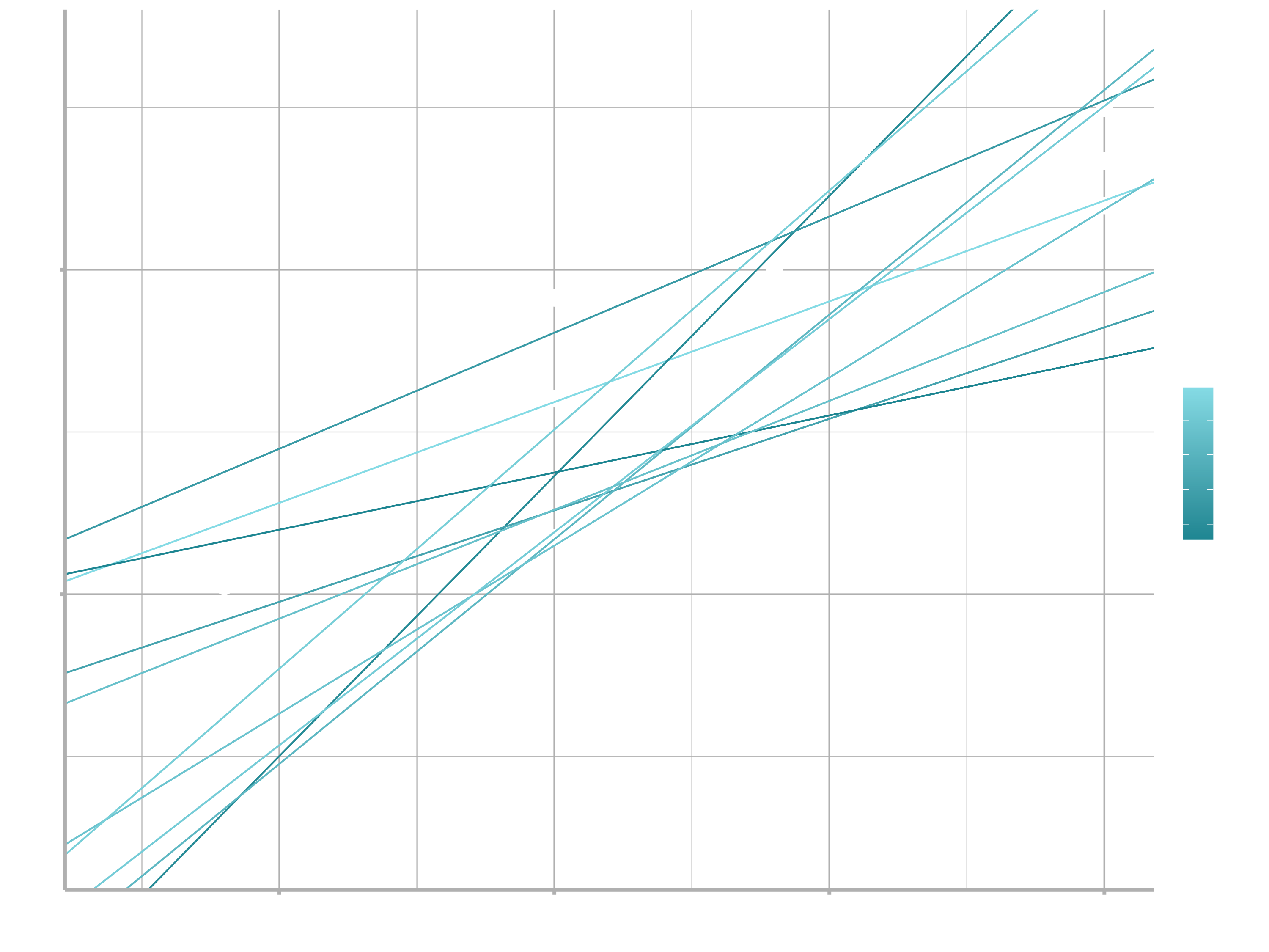
We can also think about these models as observations, and visualising with a scatterplot of $a_{1}$ vs $a_{2}$, again coloured by -dist. We can no longer directly see how the model compares to the data, but we can see many models at once. Again, I’ve highlighted the 10 best models, this time by drawing red circles underneath them.
ggplot(models, aes(a1, a2)) +
  geom_point(data = filter(models, rank(dist) <= 10), size = 4, colour = "red") +
  geom_point(aes(colour = -dist)) +
  scale_color_continuous(low = "#2097A3", high = "#95E1EA")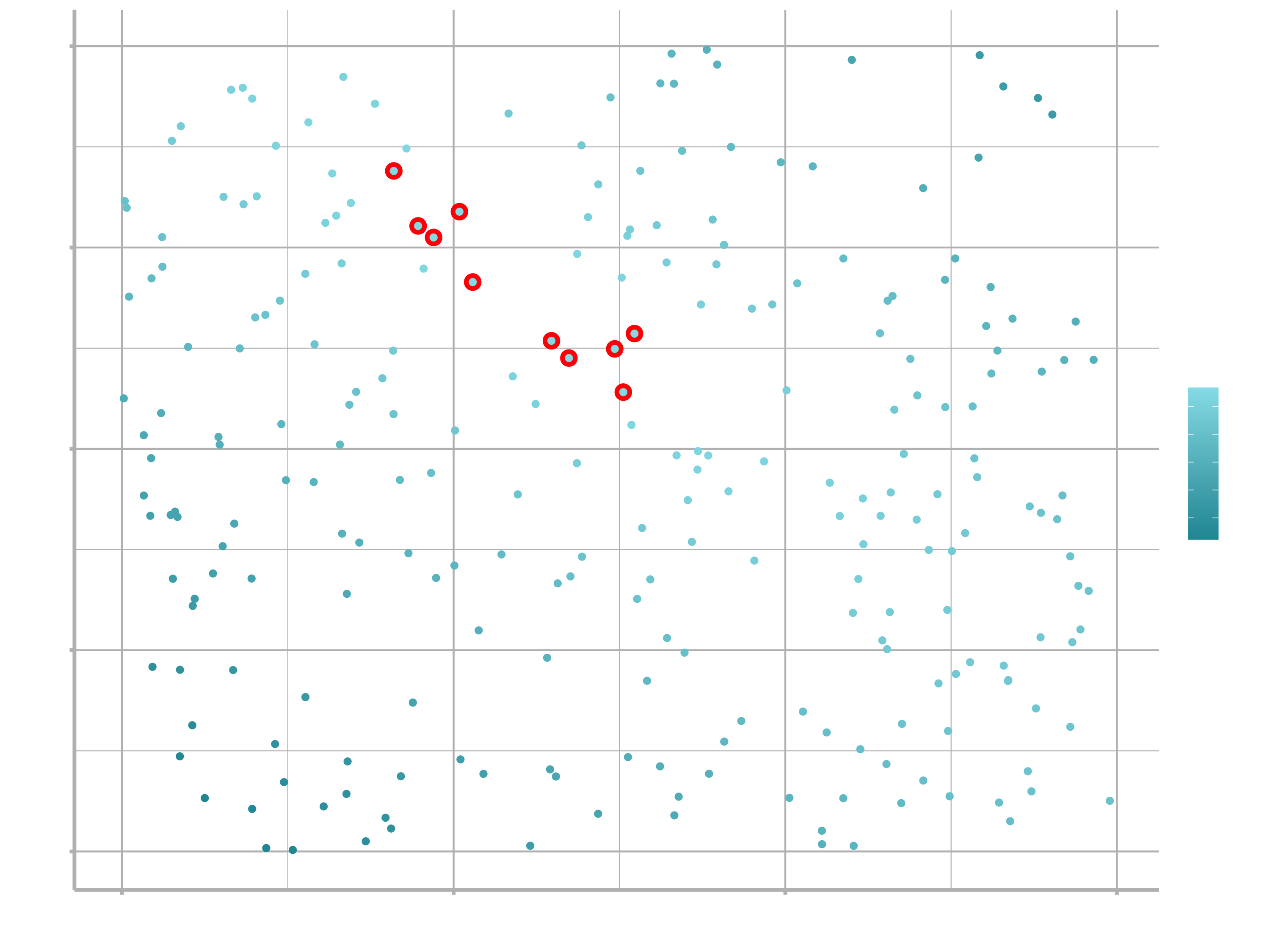
Instead of trying lots of random models, we could be more systematic and generate an evenly spaced grid of points (this is called a grid search). I picked the parameters of the grid roughly by looking at where the best models were in the plot above.
grid <- expand_grid(
  a1 = seq(-5, 20, length = 25),
  a2 = seq(1, 3, length = 25)
  ) %>%
  mutate(dist = purrr::map2_dbl(a1, a2, sim1_dist))
grid %>%
  ggplot(aes(a1, a2)) +
  geom_point(data = filter(grid, rank(dist) <= 10), size = 4, colour = "red") +
  geom_point(aes(colour = -dist))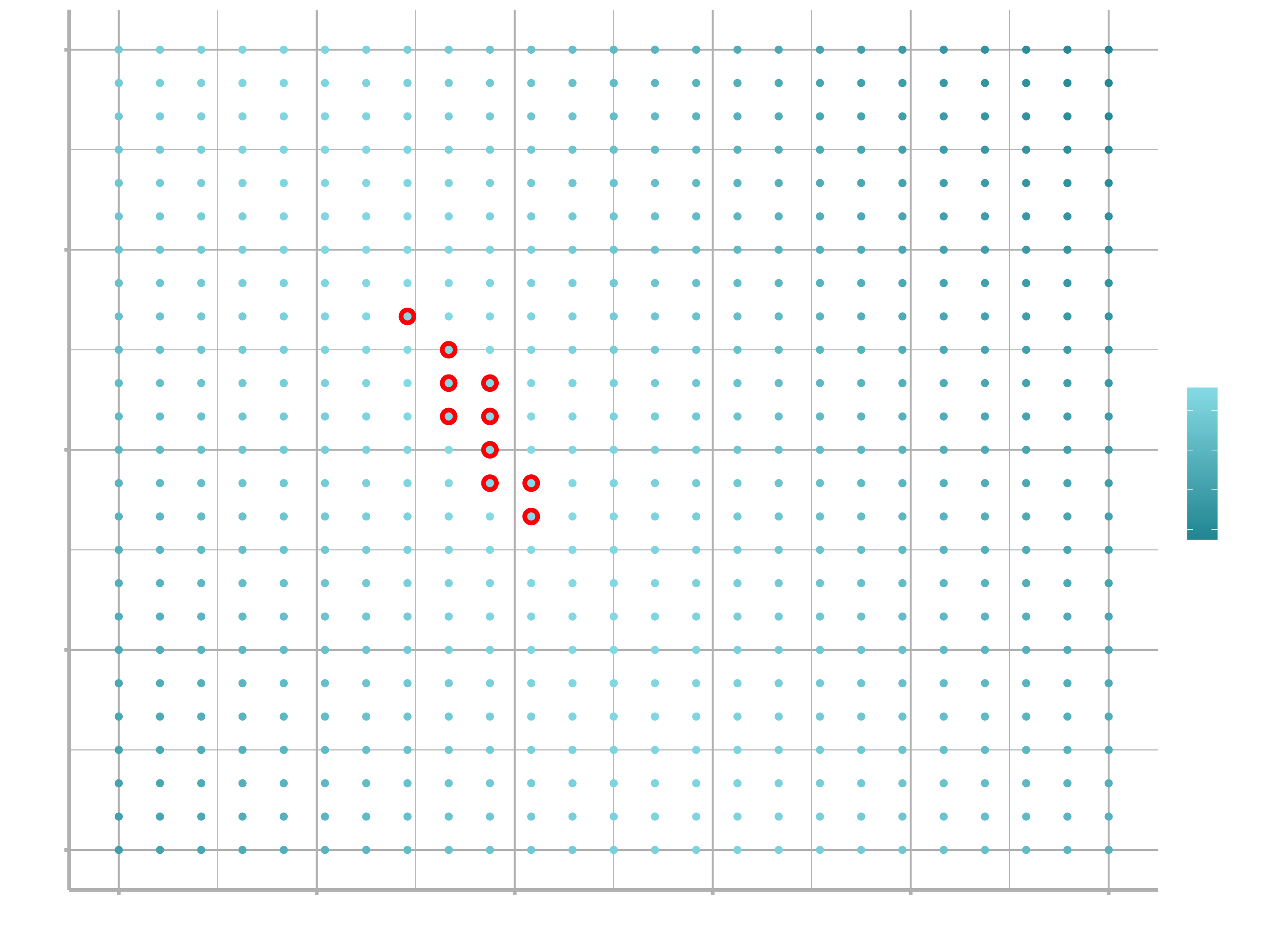
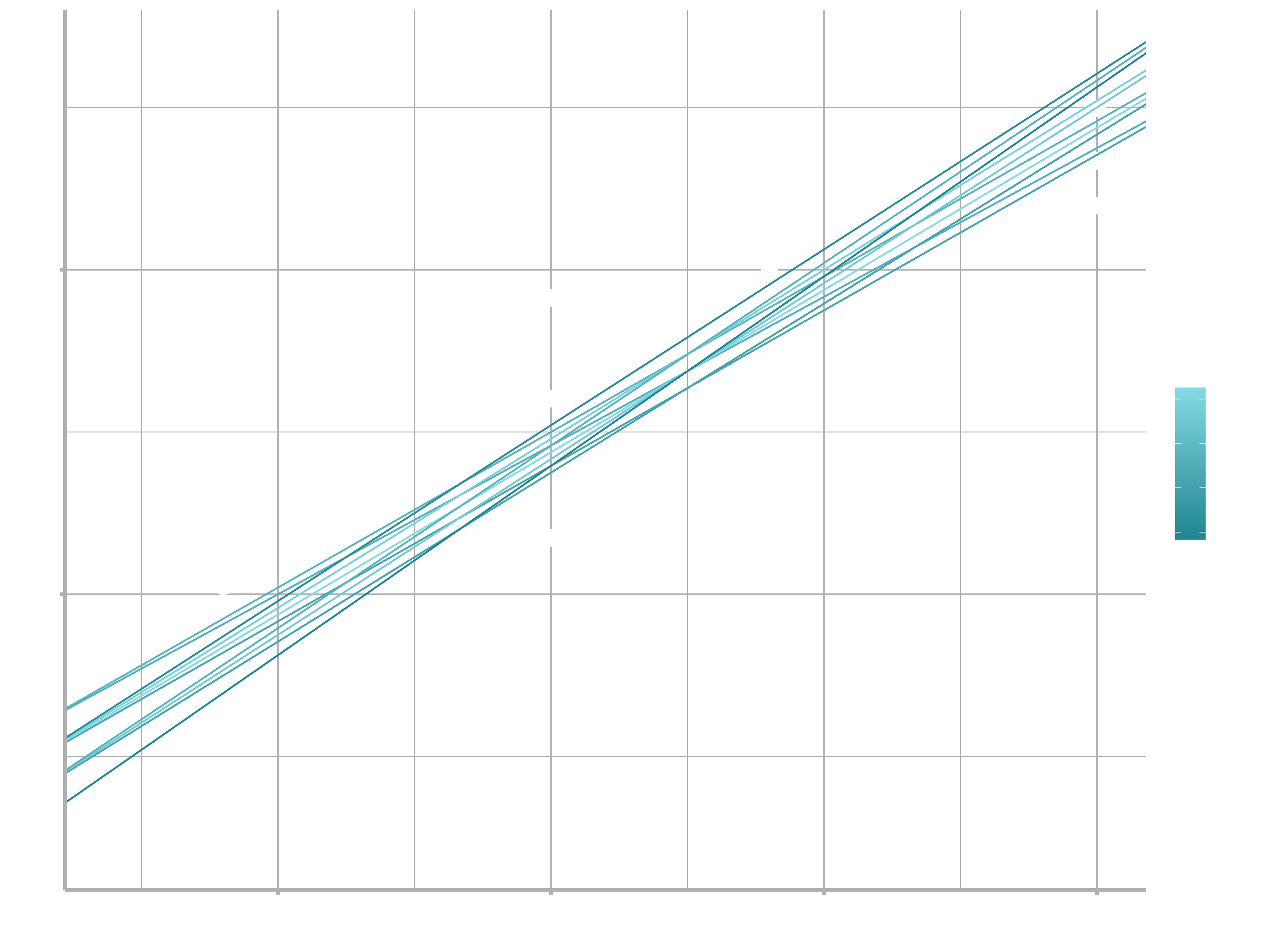
When you overlay the best 10 models back on the original data, they all look pretty good:
ggplot(sim1, aes(x, y)) +
  geom_point(size = 2, colour = "grey30") +
  geom_abline(
    aes(intercept = a1, slope = a2, colour = -dist),
    data = filter(grid, rank(dist) <= 10)
  )
You could imagine iteratively making the grid finer and finer until you narrowed in on the best model. But there’s a better way to tackle that problem: a numerical minimization tool called Newton-Raphson search. The intuition of Newton-Raphson is pretty simple: you pick a starting point and look around for the steepest slope. You then ski down that slope a little way, and then repeat again and again, until you can’t go any lower. In R, we can do that with optim():
best <- optim(c(0, 0), measure_distance, data = sim1)
best$par
## [1] 4.22 2.05
ggplot(sim1, aes(x, y)) +
  geom_point(size = 2, colour = "grey30") +
  geom_abline(intercept = best$par[1], slope = best$par[2])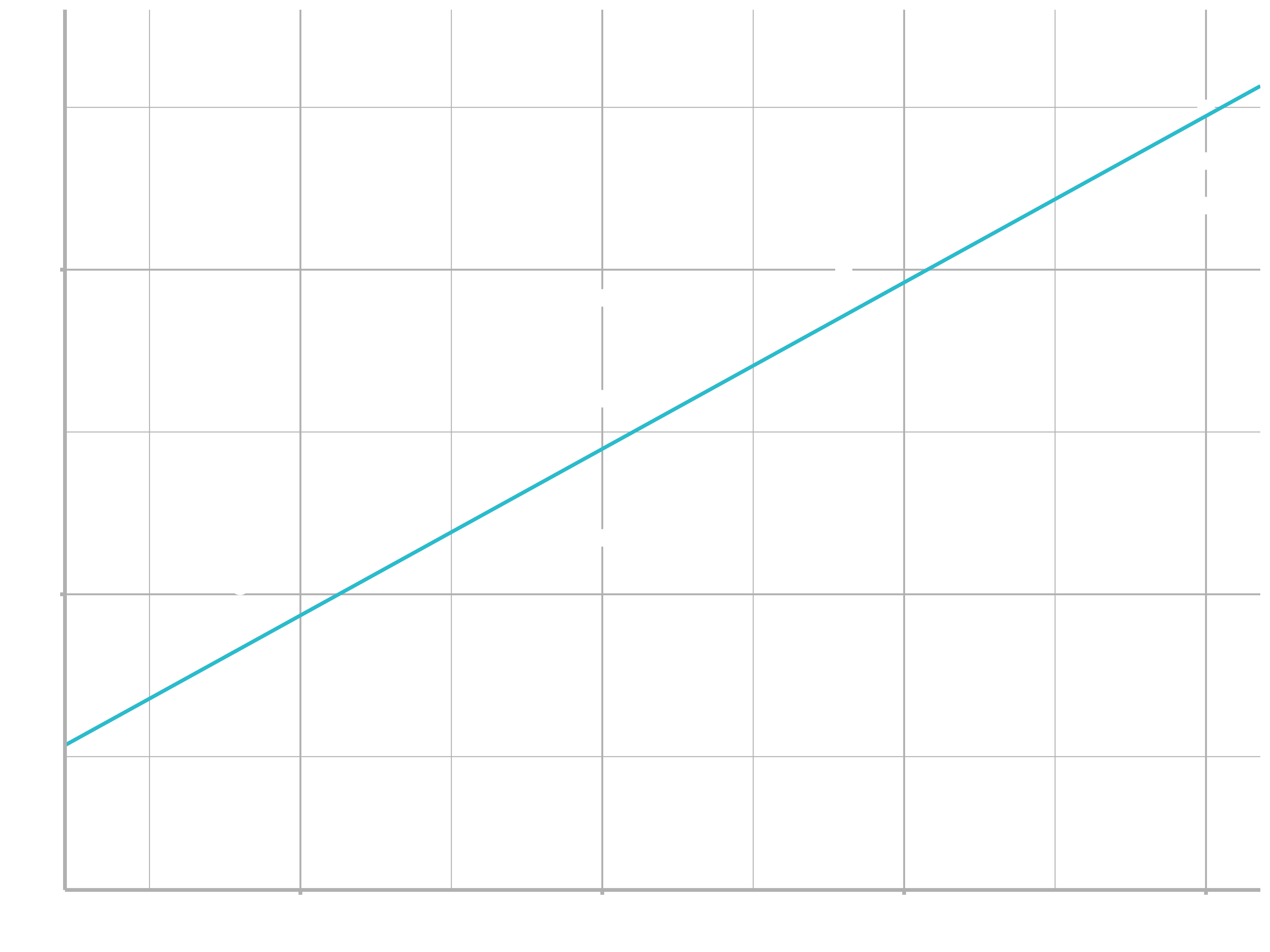
Don’t worry too much about the details of how optim() works. It’s the intuition that’s important here. If you have a function that defines the distance between a model and a dataset, an algorithm that can minimise that distance by modifying the parameters of the model, you can find the best model. The neat thing about this approach is that it will work for any family of models that you can write an equation for.
There’s one more approach that we can use for this model, because it’s a special case of a broader family: linear models. A linear model has the general form:
$$y = a_{1} + a_{2} * x_{1} + a_{3} * x_{2} + … + a_{n} * x_{(n - 1)}$$
So this simple model is equivalent to a general linear model where $n$ is 2 and $x_{1}$ is $x$. R has a tool specifically designed for fitting linear models called lm(). It has a special way to specify the model family: formulas. Formulas look like y ~ x, which lm() will translate to a function like $y = a_{1} + a_{2} * x$. We can fit the model and look at the output:
sim1_mod <- lm(y ~ x, data = sim1)
coef(sim1_mod)
## (Intercept)           x
##        4.22        2.05
These are exactly the same values we got with optim(). Behind the scenes lm() doesn’t use optim() but instead takes advantage of the mathematical structure of linear models. Using some connections between geometry, calculus, and linear algebra, lm() actually finds the closest model in a single step, using a sophisticated algorithm. This approach is both faster, and guarantees that there is a global minimum.
This section has focused exclusively on the class of linear models, which assume a relationship of the form stated above. Linear models additionally assume that the residuals have a normal distribution, which we haven’t talked about. There are a large set of model classes that extend the linear model in various interesting ways. Some of them are:
Generalised linear models, e.g.
stats::glm(). Linear models assume that the response is continuous and the error has a normal distribution. Generalised linear models extend linear models to include non-continuous responses (e.g. binary data or counts). They work by defining a distance metric based on the statistical idea of likelihood.Generalised additive models, e.g.
mgcv::gam(), extend generalised linear models to incorporate arbitrary smooth functions. That means you can write a formula likey ~ s(x)which becomes an equation like $y = f(x)$ and letgam()estimate what that function is (subject to some smoothness constraints to make the problem tractable).Penalised linear models, e.g.
glmnet::glmnet(), add a penalty term to the distance that penalises complex models (as defined by the distance between the parameter vector and the origin). This tends to make models that generalise better to new datasets from the same population.Robust linear models, e.g.
MASS::rlm(), tweak the distance to downweight points that are very far away. This makes them less sensitive to the presence of outliers, at the cost of being not quite as good when there are no outliers.Trees, e.g.
rpart::rpart(), attack the problem in a completely different way than linear models. They fit a piece-wise constant model, splitting the data into progressively smaller and smaller pieces. Trees aren’t terribly effective by themselves, but they are very powerful when used in aggregate by models like random forests (e.g.randomForest::randomForest()) or gradient boosting machines (e.g.xgboost::xgboost.)
These models all work similarly from a programming perspective. Once you’ve mastered linear models, you should find it easy to master the mechanics of these other model classes. Being a skilled modeller is a mixture of some good general principles and having a big toolbox of techniques. Don’t worry if you did not understand everything yet.
Machine Learning
Machine learning is a subfield of computer science that is concerned with building algorithms which, to be useful, rely on a collection of examples of some phenomenon. These examples can come from nature, be handcrafted by humans or generated by another algorithm. Machine learning can also be defined as the process of solving a practical problem by 1) gathering a dataset, and 2) algorithmically building a statistical model based on that dataset. That statistical model is assumed to be used somehow to solve the practical problem.
Machine Learning can be supervised, semi-supervised, unsupervised or reinforcement.
Supervised Learning
In supervised learning, the dataset is the collection of labeled examples $\{(x_{i}, y_{i})\}_{i=1}^N$. Each element $x_{i}$ among $N$ is called a feature vector. A feature vector is a vector in which each dimension $j= 1,…,D$ contains a value that describes the example somehow. That value is called a feature and is denoted as
$x^{(j)}$. For instance, if each example $x$ in our collection represents a person, then the first feature, $x^{(1)}$, could contain height in cm, the second feature, $x^{(2)}$, could contain weight in kg, $x^{(3)}$ could contain gender, and so on. For all examples in the dataset, the feature at position $j$ in the feature vector always contains the same kind of information. It means that if $x_{i}^{(2)}$ contains weight in kg in some example $x_{i}$, then $x_{k}^{(2)}$ will also contain weight in kg in every example $x_{k}, k=1,…,N$. The label $y_{i}$ can be either an element belonging to a finite set of classes $\{1,2,…,C\}$, or a real number, or a more complex structure, like a vector, a matrix, a tree, or a graph. Unless otherwise stated, in this class $y_{i}$ is either one of a finite set of classes or a real number. You can see a class as a category to which an example belongs. For instance, if your examples are email messages and your problem is spam detection, then you have two classes $\{spam, notspam\}$.
The goal of a supervised learning algorithm is to use the dataset to produce a model that takes a feature vector $x$ as input and outputs information that allows deducing the label for this feature vector. For instance, the model created using the dataset of people could take as input a feature vector describing a person and output a probability that the person has cancer.
Unsupervised Learning
In unsupervised learning, the dataset is a collection of unlabeled examples $\{x_{i}\}_{i=1}^N$. Again, $x$ is a feature vector, and the goal of an unsupervised learning algorithm is to create a model that takes a feature vector $x$ as input and either transforms it into another vector or into a value that can be used to solve a practical problem. For example, in clustering, the model returns the id of the cluster for each feature vector in the dataset. In dimensionality reduction, the output of the model is a feature vector that has fewer features than the input $x$; in outlier detection, the output is a real number that indicates how $x$ is different from a “typical” example in the dataset.
Semi-Supervised Learning
In semi-supervised learning, the dataset contains both labeled and unlabeled examples. Usually, the quantity of unlabeled examples is much higher than the number of labeled examples. The goal of a semi-supervised learning algorithm is the same as the goal of the supervised learning algorithm. The hope here is that using many unlabeled examples can help the learning algorithm to find (we might say “produce” or “compute”) a better model.
It could look counter-intuitive that learning could benefit from adding more unlabeled examples. It seems like we add more uncertainty to the problem. However, when you add unlabeled examples, you add more information about your problem: a larger sample reflects better the probability distribution the data we labeled came from. Theoretically, a learning algorithm should be able to leverage this additional information.
Reinforcement Learning
Reinforcement learning is a subfield of machine learning where the machine “lives” in an environment and is capable of perceiving the state of that environment as a vector of features. The machine can execute actions in every state. Different actions bring different rewards and could also move the machine to another state of the environment. The goal of a reinforcement learning algorithm is to learn a policy.
A policy is a function (similar to the model in supervised learning) that takes the feature vector of a state as input and outputs an optimal action to execute in that state. The action is optimal if it maximizes the expected average reward.
Reinforcement learning solves a particular kind of problem where decision making is sequential, and the goal is long-term, such as game playing, robotics, resource management, or logistics. Here, emphasis is put on one-shot decision making where input examples are independent of one another and the predictions made in the past. Reinforcement learning is out of the scope of this class.
Theory - Supervised learning
In this section, I briefly explain how supervised learning works so that you have the picture of the whole process before we go into detail. I decided to use supervised learning as an example because it’s the type of machine learning most frequently used in practice.
The supervised learning process starts with gathering the data. The data for supervised learning is a collection of pairs (input, output). Input could be anything, for example, email messages, pictures, or sensor measurements. Outputs are usually real numbers, or labels (e.g. “spam”, “not_spam”, “cat”, “dog”, “mouse”, etc). In some cases, outputs are vectors (e.g., four coordinates of the rectangle around a person on the picture), sequences (e.g. [“adjective”, “adjective”, “noun”] for the input “big beautiful car”), or have some other structure.
Let’s say the problem that you want to solve using supervised learning is spam detection. You gather the data, for example, 10,000 email messages, each with a label either “spam” or “not_spam” (you could add those labels manually or pay someone to do that for you). Now, you have to convert each email message into a feature vector.
The data analyst decides, based on their experience, how to convert a real-world entity, such as an email message, into a feature vector. One common way to convert a text into a feature vector, called bag of words, is to take a dictionary of English words (let’s say it contains 20,000 alphabetically sorted words) and stipulate that in our feature vector:
- the first feature is equal to 1 if the email message contains the word “a”; otherwise, this feature is 0;
- the second feature is equal to 1 if the email message contains the word “aaron”; otherwise, this feature equals 0;
- …
- the feature at position 20,000 is equal to 1 if the email message contains the word “zulu”; otherwise, this feature is equal to 0.
You repeat the above procedure for every email message in our collection, which gives us 10,000 feature vectors (each vector having the dimensionality of 20,000) and a label (“spam”/“not_spam”).
Now you have machine-readable input data, but the output labels are still in the form of human-readable text. Some learning algorithms require transforming labels into numbers. For example, some algorithms require numbers like 0 (to represent the label “not_spam”) and 1 (to represent the label “spam”). The algorithm I use to illustrate supervised learning is called Support Vector Machine (SVM). This algorithm requires that the positive label (in our case it’s “spam”) has the numeric value of +1 (one), and the negative label (“not_spam”) has the value of −1 (minus one).
At this point, you have a dataset and a learning algorithm, so you are ready to apply the learning algorithm to the dataset to get the model.
SVM sees every feature vector as a point in a high-dimensional space (in our case, space is 20,000-dimensional). The algorithm puts all feature vectors on an imaginary 20,000- dimensional plot and draws an imaginary 19,999-dimensional line (a hyperplane) that separates examples with positive labels from examples with negative labels. In machine learning, the boundary separating the examples of different classes is called the decision boundary.
The equation of the hyperplane is given by two parameters, a real-valued vector $w$ of the same dimensionality as our input feature vector $x$, and a real number $b$ like this:
$$wx − b = 0,$$
where the expression $wx$ means $w^{(1)}x^{(1)} + w^{(2)}x^{(2)} + … + w^{(D)}x^{(D)}$, and $D$ is the number of dimensions of the feature vector $x$.
Don’t worry if some equations aren’t clear to you right now. If a understanding of the math and statistical concepts will be necessary, we will revisit them at some points. For the moment, try to get an intuition of what’s happening here.
Now, the predicted label for some input feature vector $x$ is given like this:
$$y = sign(wx − b),$$
where sign is a mathematical operator that takes any value as input and returns +1 if the input is a positive number or −1 if the input is a negative number.
The goal of the learning algorithm — SVM in this case — is to leverage the dataset and find the optimal values $w^{∗}$ and $b^{∗}$ for parameters $w$ and $b$. Once the learning algorithm identifies these optimal values, the model $f(x)$ is then defined as:
$$f(x) = sign(w^{∗}x − b^{∗})$$
Therefore, to predict whether an email message is spam or not spam using an SVM model, you have to take the text of the message, convert it into a feature vector, then multiply this vector by w∗, subtract b∗ and take the sign of the result. This will give us the prediction (+1 means “spam”, −1 means “not_spam”).
Now, how does the machine find $w^{∗}$ and $b^{∗}$? It solves an optimization problem. Machines are good at optimizing functions under constraints.
So what are the constraints we want to satisfy here? First of all, we want the model to predict the labels of our 10,000 examples correctly. Remember that each example $i = 1,…,10000$ is given by a pair $(x_{i}, y_{i})$, where $x_{i}$ is the feature vector of example $i$ and $y_{i}$ is its label that takes values either −1 or +1. So the constraints are naturally:
$$wx_{i} − b ≥ +1 \quad if \quad y_{i} = +1,$$ $$wx_{i} − b ≤ −1 \quad if \quad y_{i} = −1.$$
We would also prefer that the hyperplane separates positive examples from negative ones with the largest margin. The margin is the distance between the closest examples of two classes, as defined by the decision boundary. A large margin contributes to a better generalization, that is how well the model will classify new examples in the future. To achieve that, we need to minimize the Euclidean norm of $w$ denoted by $||w||$ and given by $\sqrt{\sum_{j=1}^{D}(w^{(j)})^{2}}$.
So, the optimization problem that we want the machine to solve looks like this: Minimize $||w||$ subject to $y_{i}(wx_{i} − b) ≥ 1$ for $i = 1,…,N$ . The expression $y_{i}(wx_{i} − b) ≥ 1$ is just a compact way to write the above two constraints.
The solution of this optimization problem, given by $w^{∗}$ and $b^{∗}$, is called the statistical model, or, simply, the model. The process of building the model is called training.
For two-dimensional feature vectors, the problem and the solution can be visualized as shown in the following Figure:
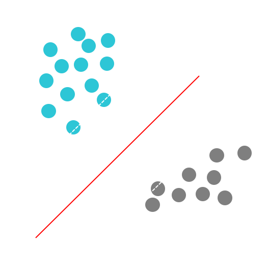
The turquoise and grey circles represent, respectively, positive and negative examples, and the line given by $wx − b = 0$ is the decision boundary.
Why, by minimizing the norm of $w$, do we find the highest margin between the two classes? Geometrically, the equations $wx − b = 1$ and $wx − b = −1$ define two parallel hyperplanes, as you see in the above figure. The distance between these hyperplanes is given by $\frac{2}{||w||}$, so the smaller the norm $||w||$, the larger the distance between these two hyperplanes.
That’s how Support Vector Machines work. This particular version of the algorithm builds the so-called linear model. It’s called linear because the decision boundary is a straight line (or a plane, or a hyperplane). SVM can also incorporate kernels that can make the decision boundary arbitrarily non-linear. In some cases, it could be impossible to perfectly separate the two groups of points because of noise in the data, errors of labeling, or outliers (examples very different from a “typical” example in the dataset). Another version of SVM can also incorporate a penalty hyperparameter for misclassification of training examples of specific classes. We study the SVM algorithm in more detail in the following chapters.
At this point, you should retain the following: any classification learning algorithm that builds a model implicitly or explicitly creates a decision boundary. The decision boundary can be straight, or curved, or it can have a complex form, or it can be a superposition of some geometrical figures. The form of the decision boundary determines the accuracy of the model (that is the ratio of examples whose labels are predicted correctly). The form of the decision boundary, the way it is algorithmically or mathematically computed based on the training data, differentiates one learning algorithm from another. In practice, there are two other essential differentiators of learning algorithms to consider: speed of model building and prediction processing time. In many practical cases, you would prefer a learning algorithm that builds a less accurate model quickly. Additionally, you might prefer a less accurate model that is much quicker at making predictions.
Why is a machine-learned model capable of predicting correctly the labels of new, previously unseen examples?
To understand that, look at the plot in the above figure. If two classes are separable from one another by a decision boundary, then, obviously, examples that belong to each class are located in two different subspaces which the decision boundary creates.
If the examples used for training were selected randomly, independently of one another, and following the same procedure, then, statistically, it is more likely that the new negative example will be located on the plot somewhere not too far from other negative examples. The same concerns the new positive example: it will likely come from the surroundings of other positive examples. In such a case, our decision boundary will still, with high probability, separate well new positive and negative examples from one another. For other, less likely situations, our model will make errors, but because such situations are less likely, the number of errors will likely be smaller than the number of correct predictions.
Intuitively, the larger is the set of training examples, the more unlikely that the new examples will be dissimilar to (and lie on the plot far from) the examples used for training. To minimize the probability of making errors on new examples, the SVM algorithm, by looking for the largest margin, explicitly tries to draw the decision boundary in such a way that it lies as far as possible from examples of both classes.
We will be using the SVM algorithm at some later point during this class. In this session we will start using the k-means algorithm.
Business case
The tools and techniques that we discuss in this section are complex by nature from a theoretical perspective. Further adding to complexity is the sheer number of algorithms available. The goal is to streamline your education and focus on application since this is where the rubber hits the road. However, for those that want to learn the theory, I will recommend several resources that have helped me understand various topics.
I’m going to lean on a gentleman by the name of Josh Starmer who runs a YouTube Channel called StatQuest. He also has a website called StatQuest with a great Video Index. I find his videos are great for explaining the theory in a manageable way.
The business case and the challenge will be about Clustering (with K-Means) and Dimensionality Reduction (using UMAP). After this session you will be able to use these advanced techniques to complete a marketing report. The goal of the business case is the segmentation of customer whereas you will do company segmentation with stock prices in the challenge.
I. Clustering
K-Means
Hierarchical ClusteringII. Dimensionality ReductionPCA - Principle Component Analysis
t-SNE UMAP is very similar to t-SNE except faster and more scalable!- GOAL: Mine customer purchase history for similarity to other “like” customers
- TECHNIQUES: K-Means clustering, UMAP 2D Projection
You can find some information about the data set we are going to use here. You can download the required dataset from here: Data
We are using the following clustering workflow:
Collect data -> Standardize / Normalize -> Spread to User-Item Format
Having the User-Item format we can obtain the cluster assignments with K-Means and make a 2D projection with UMAP.
K-Means Clustering
Customer Segmentation with K-Means Clustering: Please note that in our case ‘stores’ will be the ‘customers’. Based on the data we will try to identify stores that purchase similar products and can be seen as similar.
library(readxl)
library(tidyverse)
library(broom)
library(umap)
library(ggrepel) # Addon for ggplot, so that the labels do not overlap

stores_tbl      <- read_excel(path  = "breakfast_at_the_frat.xlsx",
                              sheet = "dh Store Lookup",
                              skip  = 1)
products_tbl    <- read_excel(path  = "breakfast_at_the_frat.xlsx",
                              sheet = "dh Products Lookup",
                              skip  = 1)
transaction_tbl <- read_excel(path  = "breakfast_at_the_frat.xlsx",
                              sheet = "dh Transaction Data",
                              skip  = 1)

orderlines_tbl <- transaction_tbl %>%
                    left_join(products_tbl) %>%
                    left_join(stores_tbl, by = c("STORE_NUM" = "STORE_ID"))
We load the libraries we need for the following task and read the excel file.
If you want to better understand what the tables look like, you can use functions like head(), glimpse() and View().
Then, we join all tables to obtain one table containing the relevant information. Remember that if you want to learn more about a specific function you can always use ?left_join (as an example).
Step 1: Analyzing customer trends & the User-Item Matrix1.1: Get customer trends
Each row of the orderlines_tbl represents how many units of a UPC were purchased in a week. This is too granular for us and would be difficult fot he k-means algorithm. Aggregating purchasing trends to customer & products is typically the way to go.
When understanding customer trends, it’s important to collect:
- The unique customer name
- Attributes related to the product
- A value to measure (e.g. quantity or total price)
We convert to customer trends by
- first aggregating within customer-product-groups and then
- normalizing within customer groups to get percentages of product purchases by customer
as shown in the next lines.
# 1.1 Get Customer Trends ----
customer_trends_tbl <- orderlines_tbl %>%

    mutate(BRANDED = ifelse(MANUFACTURER == "PRIVATE LABEL", "no", "yes")) %>%
    select(STORE_NAME, PRICE, UPC, DESCRIPTION, CATEGORY, SUB_CATEGORY, BRANDED, UNITS) %>%

    # Summarization and group by
    group_by(STORE_NAME, PRICE, UPC, DESCRIPTION, CATEGORY, SUB_CATEGORY, BRANDED) %>%
    summarise(QUANTITY_PURCHASED = sum(UNITS)) %>%
    ungroup() %>%

    # Proportion
    group_by(STORE_NAME) %>%
    mutate(PROP_OF_TOTAL = QUANTITY_PURCHASED / sum(QUANTITY_PURCHASED)) %>%
    ungroup()
1.2: Convert to User-Item Format (or Customer-Product)
# 1.2 Convert to User-Item Format (e.g. Customer-Product) ----

customer_product_tbl <- customer_trends_tbl %>%

    select(STORE_NAME, UPC, PROP_OF_TOTAL) %>%
    pivot_wider(names_from = UPC, values_from = PROP_OF_TOTAL, values_fill = 0) %>%
    ungroup()
The values in the result are the proportions of products purchased by a customer (or sold by a store in this case.) The value in the upper left corner indicates for example that the store “15TH & MADISON”” has purchased 3.53 % of the UPC 1111009477 (PL MINI TWIST PRETZELS). This allows us to compare the customers to the products using the proportion of the products that they are buying. This is the ultimate goal so that the K-Means algorithms can mine these purchasing trends for clusters or segments.
Step 2: Modeling2.1: Performing K-Means for customer segmentation
K-Means is an unsupervised algorithm. Unsupervised is, when we don’t know exactly how many groups to label these customers into. We are kind of guessing. We define the “k” in k-means (i.e. how many groups to find) and figure out which is the best by looking at some parameters, which the algorithm will output.
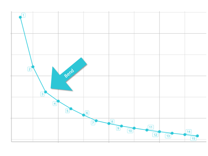
So for the k-means algorithm to work, we provide them a number of different centers (or k-groups) to choose from and then compute the tot.withinss (Total within-cluster sum of squares). Basically this is a distance measure, that measures the compactness (i.e goodness) of the clustering and we want it to be as small as possible. We will visualize and evaluate it in a so called skree plot (it shows the “tot.withinss” for each number of centers we select). As we add more groups (centers), the tot.withinss decreases. The skree plot helps us see the bend where adding more groups has little effect on tot.withinss. So we have diminishing returns after adding more groups at this point.
We will be using purrr for iteration, so that we can run kmeans() iteratively with changing number of centers.
To return the tot.withinss in a tidy format we will use the package broom.
Let’s perform kmeans for 3 centers:
# 2.0 MODELING: K-MEANS CLUSTERING ----

# 2.1 Performing K-Means ----
?kmeans

kmeans_obj <- customer_product_tbl %>%
    select(-STORE_NAME) %>%
    kmeans(centers = 3, nstart = 100)

# The group that each product is assigned to for each product
kmeans_obj$cluster
- centers: The argument centers tells
kmeans()how many groups to look for - nstart: K-Means picks a random starting point and then iteratively finds the best location for the centers. Choosing nstart > 1 ensures higher likelihood that a good center is found.
2.2: Let’s tidy the kmeans() output with the package broom. We could do it by ourselves, but it makes it a lot easier. broom summarizes key information about models in tidy tibbles. broom provides three verbs to make it convenient to interact with model objects:
tidy()summarizes information about model componentsglance()reports information about the entire modelaugment()adds informations about observations to a dataset
# 2.2 Tidying a K-Means Object ----
# return the centers information for the kmeans model
broom::tidy(kmeans_obj) %>% glimpse()

# return the overall summary metrics for the model
# Including the tot.withinss for the skree plot
broom::glance(kmeans_obj)

# Add the clusters to the data
broom::augment(kmeans_obj, customer_product_tbl) %>%
    select(STORE_NAME, .cluster)
2.3: Let’s determine how many centers to use. The goal is the scree plot. To create it, we need to calculate tot.withinss for many centers. The iteration can be done with purrr::map().
2.3.1 Create a function that can be iterated.
# 2.3 How many centers (customer groups) to use? ----

# Functions that works on 1 element
# Setting default centers to 3
kmeans_mapper <- function(centers = 3) {

    customer_product_tbl %>%
        select(-STORE_NAME) %>%
        kmeans(centers = centers, nstart = 100)
}

3 %>% kmeans_mapper() %>% glance()
2.3.2 Implement purrr row-wise. We can apply broom::glance() row-wise with mutate() + map().
# Mapping the function to many elements
kmeans_mapped_tbl <- tibble(centers = 1:15) %>%
    mutate(k_means = centers %>% map(kmeans_mapper)) %>%
    mutate(glance  = k_means %>% map(glance))
2.3.3 The glance column contains tibbles that can be unnested. The final data can be used for the scree plot.
kmeans_mapped_tbl %>%
    unnest(glance) %>%
    select(centers, tot.withinss)
2.4: Skree plot. Will help us determine how many centers to use.
# 2.4 Skree Plot ----

kmeans_mapped_tbl %>%
    unnest(glance) %>%
    select(centers, tot.withinss) %>%

    # Visualization
    ggplot(aes(centers, tot.withinss)) +
    geom_point(color = "#2DC6D6", size = 4) +
    geom_line(color = "#2DC6D6", size = 1) +
    # Add labels (which are repelled a little)
    ggrepel::geom_label_repel(aes(label = centers), color = "#2DC6D6") +

    # Formatting
    labs(title = "Skree Plot",
    subtitle = "Measures the distance each of the customer are from the closes K-Means center",
    caption = "Conclusion: Based on the Scree Plot, we select 3 clusters to segment the customer base.")
UMAP
UMAP: High Performance Dimension Reduction
Step 3.0 Visualization: UMAP
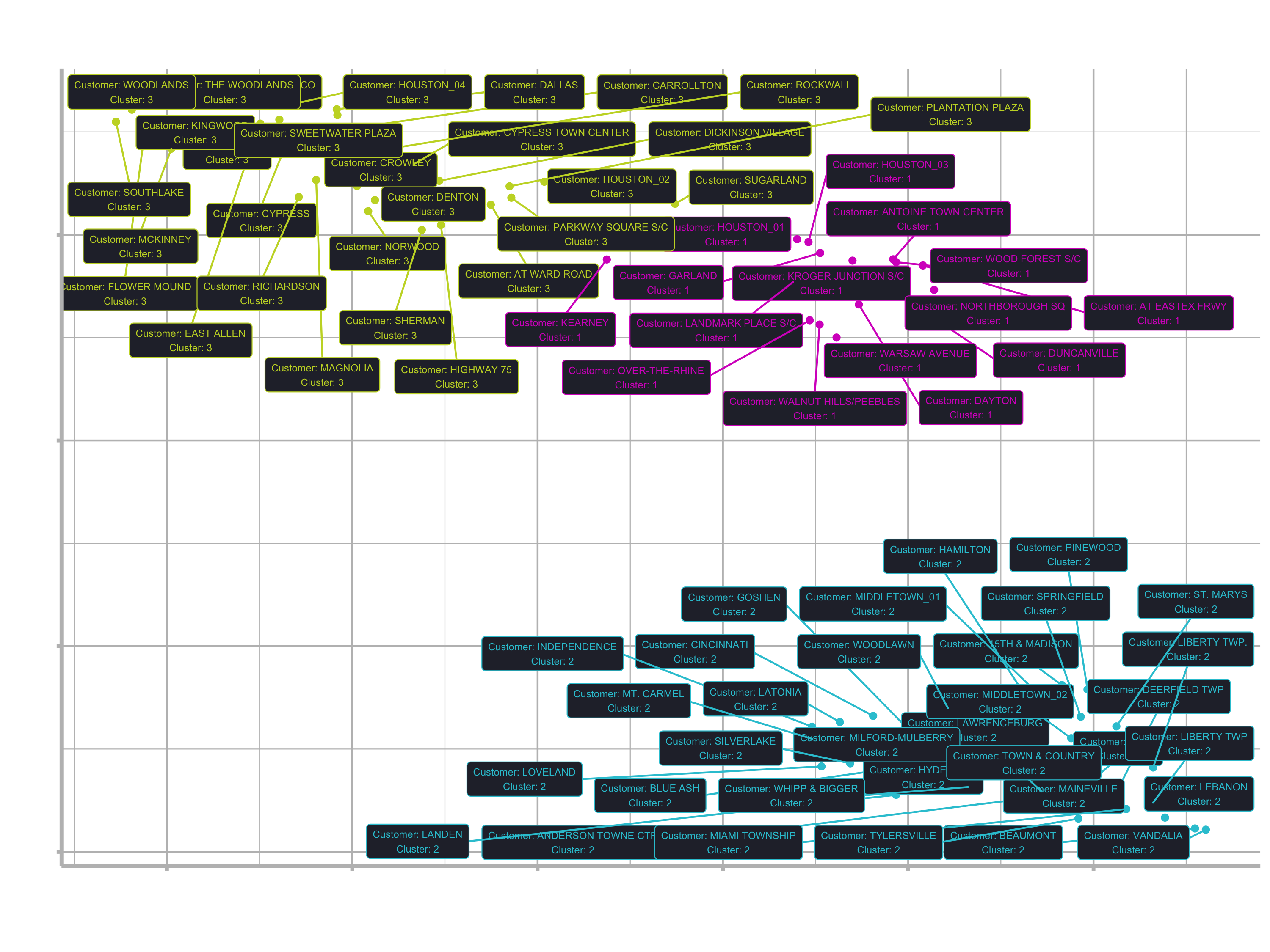
Once K-Means clustering is performed, we can use UMAP to help visualize.
The Scree plot tells us how many K-Means groups (clusters) to use. However, we want to visualize the cluster assignment. UMAP allows us to project the user-item (customer-product) matrix into 2D space. It converts the high dimensional space to a 2D representation. In other words: UMAP is a dimensionality reduction technique that captures the structure of a high-dimension data set (many numeric columns) in a two column (x and y) data set.
3.1 Basically, all we need to do is to pipe our matrix into the umap() function. There are not many arguments to use. We can just use the defaults.
# 3.0 VISUALIZATION: UMAP ----

# 3.1 Use UMAP to get 2-D Projection ----
?umap

umap_obj <- customer_product_tbl %>%
    select(-STORE_NAME) %>%
    umap()
If you take a look at the object View(umap_object) you see that it is a list of length 4. It has got a layout, the data, kNN (k nearest neighbors) and config. config provides settings that can be overwritten such as number of components, number of neighbors, distance measurement, and more. Check out the vignette to learn more: https://cran.r-project.org/web/packages/umap/vignettes/umap.html.
kNN and config are a little beyond the scope. I just want to point you to the layout element, which is just a matrix. This is basically the data we want to be plotting. Before, we want to do a little manipulation:
umap_results_tbl <- umap_obj$layout %>%
    as_tibble(.name_repair = "unique") %>% # argument is required to set names in the next step
    set_names(c("x", "y")) %>%
    bind_cols(
        customer_product_tbl %>% select(STORE_NAME)
    )

umap_results_tbl %>%
    ggplot(aes(x, y)) +
    geom_point() +
    geom_label_repel(aes(label = STORE_NAME), size = 3)
3.2 In order to color the plot according to the clusters, we need to add the kmeans cluster assignments to the umap data.
pull(): When used on the k_means column, will pull the “list” of k-means objectspluck(): Allows us to extract an element from a list using a number (kind of likeslice()for lists)
# 3.2 Use K-Means to Add Cluster Assignments ----
umap_results_tbl

# Get the data for the third element (which we have chosen in the skree plot)
kmeans_3_obj <- kmeans_mapped_tbl %>%
    pull(k_means) %>%
    pluck(3)

# Convert it to a tibble with broom
kmeans_3_clusters_tbl <- kmeans_3_obj %>%
    augment(customer_product_tbl) %>%
    # Select the data we need
    select(STORE_NAME, .cluster)

# Bind data together
umap_kmeans_3_results_tbl <- umap_results_tbl %>%
    left_join(kmeans_3_clusters_tbl)
3.3 Let’s visualize again:
# 3.3 Visualize UMAP'ed Projections with Cluster Assignments ----

umap_kmeans_3_results_tbl %>%
    mutate(label_text = str_glue("Customer: {STORE_NAME}
                                 Cluster: {.cluster}")) %>%

    ggplot(aes(x, y, color = .cluster)) +

    # Geometries
    geom_point() +
    geom_label_repel(aes(label = label_text), size = 2, fill = "#282A36") +

    # Formatting
    scale_color_manual(values=c("#2d72d6", "#2dc6d6", "#2dd692")) +
    labs(title = "Customer Segmentation: 2D Projection",
    subtitle = "UMAP 2D Projection with K-Means Cluster Assignment",
    caption = "Conclusion: 3 Customer Segments identified using 2 algorithms") +
    theme(legend.position = "none")
Customer Segment purchasing trends
Now that we have a nice looking plot and know which customers are related, we want to know why some customers are clustered together and what their preferences are. So we still need to figure out what each group is buying. The next step is to relate the clusters to products. We need the information from the customer_trends_tbl data (like price, category etc.). Instead of having the data associated with the stores, we want to associate it with the clusters.
Step 4: Analyze purchasing trends
4.1 Joining clusters to customer_trends_tbl
# 4.0 ANALYZE PURCHASING TRENDS ----

# pipe part 1
cluster_trends_tbl <- customer_trends_tbl %>%

    # Join Cluster Assignment by store name
    left_join(umap_kmeans_3_results_tbl) %>%
    ### continued in pipe part 2 ###
4.2 Binning price. Transform the numerical value to “low”, “medium” and “high” with the quantile() function. quantile() returns values for binning numeric vectors by user assigned probabilities.
?quantile
customer_trends_tbl %>%
    pull(PRICE) %>%
    quantile(probs = c(0, 0.33, 0.66, 1))
##   0%  33%  66% 100%
## 1.30 2.77 4.05 7.50
# pipe part 2
    mutate(price_bin = case_when(
        PRICE <= 2.77 ~ "low",
        PRICE <= 4.05 ~ "medium",
        TRUE ~ "high"
    ))  %>%
4.3 Rearranging columns and getting rid of the store_name column
# pipe part 3
    select(.cluster, UPC, DESCRIPTION, contains("PRICE"),
           CATEGORY:QUANTITY_PURCHASED) %>%
4.4 Aggregation with group_by_at(). group_by_at() is a scoped variant of group_by() that allows us to select columns with tidy_select helpers (e.g. contains(), col_name1:col_nameN. etc.)
# pipe part 4
    # Aggregate quantity purchased by cluster and product attributes
    group_by_at(.vars = vars(.cluster:BRANDED)) %>%
    summarise(TOTAL_QUANTITY = sum(QUANTITY_PURCHASED)) %>%
    ungroup() %>%
4.5 Normalization
# pipe part 5
    # Calculate Proportion of Total
    group_by(.cluster) %>%
    mutate(PROP_OF_TOTAL = TOTAL_QUANTITY / sum(TOTAL_QUANTITY)) %>%
    ungroup()

cluster_trends_tbl
4.6 Analyze Cluster
Filter the cluster and take a look at the most sold products for each cluster to label them accordingly.
# Cluster 1
cluster_trends_tbl %>%
    filter(.cluster == 1) %>%
    arrange(desc(PROP_OF_TOTAL)) %>%
    mutate(CUM_PROP = cumsum(PROP_OF_TOTAL)) %>%
    View()
# Create function and do it for each cluster
get_cluster_trends <- function(cluster = 1) {

    cluster_trends_tbl %>%
        filter(.cluster == cluster) %>%
        arrange(desc(PROP_OF_TOTAL)) %>%
        mutate(cum_prop = cumsum(PROP_OF_TOTAL))

}

get_cluster_trends(cluster = 1)
get_cluster_trends(cluster = 2)
get_cluster_trends(cluster = 3)
Unfortunately the clusters / stores can’t be distinguished easily. The top products are pretty much the same. At first glance I saw mainly the following features for each cluster (your clusters might be different, because there is a randomness in the k-means algorithm):
Cluster 1
- Branded: yes
- Cat: Cold cereal
- price: low / medium
Cluster 2 & 3
- Branded: yes / no
- Cat: Cold cereal & Pretzels
- price: low / medium
If you desire, you can then update the labels with the description for the clusters like this:
# Update Visualization

cluster_label_tbl <- tibble(
    .cluster = 1:3,
    .cluster_label = c(
        "Low/Medium Price, Cold cereal, Branded products",
        "Low/Medium Price, Cold cereal & Pretzels, Branded & non branded products",
        "Low/Medium Price, Cold cereal & Pretzels, Branded & non branded products"
    )
) %>%
    # Numeric data cannot be directly convert to factor.
    # Numeric must be converted to character first before converting to factor.
    mutate(.cluster = as_factor(as.character(.cluster)))

cluster_label_tbl

umap_kmeans_3_results_tbl %>%
    left_join(cluster_label_tbl) %>%
    mutate(label_text = str_glue("Customer: {STORE_NAME}
                                 Cluster: {.cluster}
                                 {.cluster_label}
                                 ")) %>%

    ggplot(aes(x, y, color = .cluster)) +

    ...
To do a better customer segmentation, we would have needed more and better data. But I hope you have now understood the idea of segmentation and its applications in business.
Segmentation & Clustering summary
- Common Applications in Business: Can be used for finding segments within Customers, Companies, etc.
- Key Concept: Transform data into a matrix enabling trends to be compared across units of measure (e.g. user-item matrix)
- Gotchas: Data must be normalized or standardized to enable comparison. This often requires calculation proportions of values by customer, company, etc. to ensure the larger values do not dominate the trend mining operation.
- How Many Components/Clusters? Use a Scree Plot to determine the proportion of variance explained or total withinsum of squares
Clustering
Popular methods
- K-Means
- hierarchical clustering.
Uses
- Methods use a measure of similarity (e.g. Euclidian distance) to detect groups within data sets.
Dimensionality Reduction
Popular methods
- PCA
- UMAP
- tSNE.
UMAP can sometimes be more useful than PCA as PCA is linear and UMAP is nonlinear. And compared to tSNE,it is faster.
Uses
- Reduce width of data: Performing Machine Learning on wide data can drastically increase the time for algorithms to converge. Dimensionality reduction can be applied as a preprocessing step to reduce the width (number of columns) of the data but still maintain a high proportion of the overall structure.
- Visualization: Visualizing the first two components as X and Y often can enable cluster vizualization. Combining with clustering techniques can provide a useful method of visualization.
Challenge
Company Segmentation with Stock Prices
In your assignment folder you will find a .Rmd file that contains all instructions and also intermediate results in case you get stuck. You can knit the .Rmd file to a html/pdf file by clicking the knit button.
You can download the required dataset from here: Data