Automated Machine Learning with H20 (I)
In the next chapters, we learn H2O, an advanced open source machine learning tool available in R. The algorithm we focus on is Automated Machine Learning (AutoML). In the next chapters, you will learn:
- How to generate high performance models using
h2o.automl() - What the
H2O Leaderboardis and how to inspect its models visually - How to select and extract H2O models from the leaderboard by name and by position
- How to make predictions using the H2O AutoML models
We show you how to assess performance and visualize model quality in a way that executives and other business decision makers understand.
The next sessions are arranged according to the CRISP-DM process model. CRISP-DM breaks the process of data analysis into six major phases:
- Business Understanding
- Data Understanding
- Data Preparation
- Modeling
- Evaluation
- Deployment
This session focuses mainly on the first two steps. I will show you sturctured and flexible ways to review your data, so that you can communicate them easily with your stakeholders. This will be a good basis for preparing our data and to build models with H2O (next session)
Theory Input
H20
H2O is the scalable, open-source Machine Learning library that features AutoML.
H2O AutoML automates the machine learning workflow, which includes automatic training and tuning of many models. This allows you to spend your time on more important tasks like feature engineering and understanding the problem.
The most popular algorithms are incorporated including:
- XGBoost
- GBM
- GLM
- Random Forest
- and more.
AutoML ensembles (combines) these models to provide superior performance.
Setup
H2O requires Java. If you do not already have Java installed, install it from
java.com before installing H2O. Supported versions include: Java 8, 9, 10, 11, 12, 13, 14. Don’t use Version 15! To load a recent H2O package from CRAN, run: install.packages("h2o"). After H2O is installed on your system, verify the installation completed successfully by initializing H2O:
library(h2o)

# To launch H2O locally with default initialization arguments, use the following:
h2o.init()
We can ignore the warning, that the h2o cluster version is too old.
Data preparation
Although it may seem like you are manipulating the data in R, once the data has been passed to H2O, all data munging occurs in the H2O instance. The information is passed to R through JSON APIs. You are limited by the total amount of memory allocated to the H2O instance, not by R’s ability to handle data. To process large datasets, make sure to allocate enough memory.
Because we will not use H20 in this session yet, I won’t go into any more detail about h2o at this point. This will be part of the next session. But feel free to click on the logo above to get further information about h2o.
Tidy Eval
rlang is a toolkit for working with core R and tidyverse features, and hosts the tidy evaluation concepts and tools. Tidy Evaluation (Tidy Eval) is not a package, but a framework for doing non-standard evaluation (i.e. delayed evaluation) that makes it easier to program with tidyverse functions.
Let’s consider a simple example of calculating summary statistics with the built in mtcars dataset. Below we calculate maximum and minimum horsepower (hp) by the number of cylinders (cyl) using the group_by and summarize functions from dplyr.
library(tidyverse)
hp_by_cyl <- mtcars %>%
  group_by(cyl) %>%
  summarize(min_hp=min(hp),
            max_hp=max(hp))
hp_by_cyl
## # A tibble: 3 x 3
##     cyl min_hp max_hp
##   <dbl>  <dbl>  <dbl>
## 1     4     52    113
## 2     6    105    175
## 3     8    150    335
Now let’s say we wanted to repeat this calculation multiple times while changing which variable we group by.
A brute force method to accomplish this would be to copy and paste our code as many times as necessary and modify the group by variable in each iteration. However, this is inefficient especially if our code gets more complicated, requires many iterations, or requires further development.
To avoid this inelegant solution you might think to store the name of a variable inside of another variable like this groupby_var <- "vs". Then you could attempt to use your newly created groupby_var variable in your code: group_by(groupby_var). However, if you try this you will find it doesn’t work. The group_by function expects the name of the variable you want to group by as an input, not the name of a variable that contains the name of the variable you want to group by.
groupby_var <- "vs"

hp_by_vs <- mtcars %>%
              group_by(groupby_var) %>%
              summarize(min_hp=min(hp),
                        max_hp=max(hp))
## Error: Must group by variables found in `.data`.
## * Column `groupby_var` is not found.
## Run `rlang::last_error()` to see where the error occurred.
This is the kind of headache that tidy evaluation can help you solve. In the example below we use the quo() function and the bang-bang !! operator to set vs (engine type, 0 = automatic, 1 = manual) as our group by variable. The quo() function allows us to store the variable name in our groupby_var variable and !! extracts the stored variable name.
groupby_var <- quo(vs)

hp_by_vs <- mtcars %>%
              group_by(!!groupby_var) %>%
              summarize(min_hp=min(hp),
                        max_hp=max(hp))
hp_by_vs
## # A tibble: 2 x 3
## vs min_hp max_hp
## <dbl>  <dbl>  <dbl>
## 1     0     91    335
## 2     1     52    123
The code above provides a method for setting the group by variable by modifying the input to the quo() function when we define groupby_var. This can be useful, particularly if we intend to reference the group by variable multiple times. However, if we want to use code like this repeatedly in a script then we should consider packaging it into a function. This is what we will do next.
To use tidy evaluation in a function, we will still use the !! operator as we did above, but instead of quo() we will use the enquo() function. Our new function below takes the group by variable and the measurement variable as inputs so that we can now calculate maximum and minimum values of any variable we want.
Note two new optional features, that are introduced in this function:
- The
as_label()function extracts the string value of themeasure_varvariable (“hp” in this case). We use this to set the value of the “measure_var” column. - The
walrus operator :=is used to create a column named after the variable name stored in themeasure_varargument (“hp” in the example). The walrus operator allows you to use strings and evaluated variables (such as “measure_var” in our example) on the left hand side of an assignment operation (where there would normally be a “=” operator) in functions such as “mutate” and “summarize”.
car_stats <- function(groupby_var, measure_var) {

    groupby_var <- enquo(groupby_var)
    measure_var <- enquo(measure_var)

    ret <- mtcars %>%

             group_by(!!groupby_var) %>%
             summarize(min = min(!!measure_var), max = max(!!measure_var)) %>%

             # Optional: as_label() and "walrus operator" :=
             mutate(
               measure_var = as_label(measure_var), !!measure_var := "test"
               )

    return(ret)

}
car_stats(am,hp)
## # A tibble: 2 x 5
##      am   min   max measure_var hp
##   <dbl> <dbl> <dbl> <chr>       <chr>
## 1     0    62   245 hp          test
## 2     1    52   335 hp          test

car_stats(gear,cyl)
## # A tibble: 3 x 5
##    gear   min   max measure_var cyl
##   <dbl> <dbl> <dbl> <chr>       <chr>
## 1     3     4     8 cyl         test
## 2     4     4     6 cyl         test
## 3     5     4     8 cyl         test
We now have a flexible function that contains a dplyr workflow. You can experiment with modifying this function for your own purposes.
We can use this approach also for plotting the data with ggplot:
scatter_plot <- function(data, x_var, y_var) {

  x_var <- enquo(x_var)
  y_var <- enquo(y_var)

  ret <- data %>%
           ggplot(aes(x = !!x_var, y = !!y_var)) +
           geom_point() +
           geom_smooth() +
           ggtitle(str_c(as_label(y_var), " vs. ",as_label(x_var)))

  return(ret)
}
scatter_plot(mtcars, disp, hp)
As you can see, you’ve plotted the hp (horsepower) variable against disp (displacement) and added a regression line. Now, instead of copying and pasting ggplot code to create the same plot with different datasets and variables, we can just call our function. We will see application of this framework in the business case.
Business case
Business problem
Let’s begin this business case by introducing you the employee attrition problem.
Attrition is a problem that impacts all businesses, irrespective of geography, industry and size of the company. Employee attrition leads to significant costs for a business, including the cost of business disruption, hiring new staff and training new staff. As such, there is great business interest in understanding the drivers of, and minimizing staff attrition.
In this context, the use of classification models to predict if an employee is likely to quit could greatly increase the HR’s ability to intervene on time and remedy the situation to prevent attrition. While this model can be routinely run to identify employees who are most likely to quit, the key driver of success would be the human element of reaching out the employee, understanding the current situation of the employee and taking action to remedy controllable factors that can prevent attrition of the employee.
The following data set presents an employee survey from IBM, indicating if there is attrition or not. The data set contains approximately 1500 entries. Given the limited size of the data set, the model should only be expected to provide modest improvement in indentification of attrition vs a random allocation of probability of attrition.
While some level of attrition in a company is inevitable, minimizing it and being prepared for the cases that cannot be helped will significantly help improve the operations of most businesses. As a future development, with a sufficiently large data set, it would be used to run a segmentation on employees, to develop certain “at risk” categories of employees. This could generate new insights for the business on what drives attrition, insights that cannot be generated by merely informational interviews with employees.1
The True Cost Of Employee Attrition
Core to analyzing any business problem is being able to tie a financial figure to it. You will see how the process works specifically for employee turnover, and even get an Excel Calculator that can be sent to your boss and your bosses boss to communicate the size of the problem financially. An organization that loses 200 productive employees per year could have a hidden cost of $15M/year in lost productivity. And the problem… most organizations don’t realize it because productivity is a hidden cost! Many business owners have the belief that you turn on a tap and a staff member is automatically profitable. Sadly, this is not the case. In all business, new staff have so much to learn, understand and integrate that the first 3 months are usually a negative on the business. This is because you have to take some of your productive time (if you don’t have other staff to train them) to get them up to speed. After this time, they become a truly productive member of your team and fly forward to give you the success you want.
A Excel Employee Turnover Cost Calculator is a great way to show others in your organization the true cost of losing good employees. It’s simple to use and most business professionals have Excel, so you can easily review your organization’s cost of turnover with them. You will find plenty of employee turnover cost calculator templates by using google.
CRISP Data Science framework
We will organize and execute this analysis project following a data analysis process called CRISP-DM. According to Wikipedia: CRISP-DM is a Cross-Industry Standard Process for Data Mining — an open standard process model that describes common approaches used by data mining experts.
More information can be found here:
https://www.the-modeling-agency.com/crisp-dm.pdf
Following CRISP-DM guidelines, we start with a Business Understanding. It is an astoundingly common mistake to start projects without first properly defining the problem and objectives. This mistake is not specific to data analysis but is common to all types of problem-solving activities. As a result, all major problem-solving methodologies, including 8-D, six-sigma DMAIC and, of course, CRISP-DM, place first and stress the importance of Problem Definition or Business Understanding.
In the end, we want to use h2o to determine the probability of a certain employee to fall into the condition of Attrition and thus its high risk of leaving the company. Before we are able to do that we need a profound understanding of the business and the data.
1. Business Understanding
- Determine Business objective
- Assess Situation
- Determine Data Mining Goals
- Produce Project Plan
IBM has gathered information on employee satisfaction, income, seniority and some demographics. It includes the data of 1470 employees. It can be found on kaggle or just download it here:
The definition table will be needed later as well:
| Name | Description |
|---|---|
| AGE Numerical Value | |
| ATTRITION | Employee leaving the company (0=no, 1=yes) |
| BUSINESS TRAVEL | (1=No Travel, 2=Travel Frequently, 3=Tavel Rarely) |
| DAILY RATE | Numerical Value - Salary Level |
| DEPARTMENT | (1=HR, 2=R&D, 3=Sales) |
| DISTANCE FROM HOME | Numerical Value - THE DISTANCE FROM WORK TO HOME |
| EDUCATION | Numerical Value |
| EDUCATION FIELD | (1=HR, 2=LIFE SCIENCES, 3=MARKETING, 4=MEDICAL SCIENCES, 5=OTHERS, 6= TEHCNICAL) |
| EMPLOYEE COUNT | Numerical Value |
| EMPLOYEE NUMBER | Numerical Value - EMPLOYEE ID |
| ENVIROMENT SATISFACTION | Numerical Value - SATISFACTION WITH THE ENVIROMENT |
| GENDER | (1=FEMALE, 2=MALE) |
| HOURLY RATE | Numerical Value - HOURLY SALARY |
| JOB INVOLVEMENT | Numerical Value - JOB INVOLVEMENT |
| JOB LEVEL | Numerical Value - LEVEL OF JOB |
| JOB ROLE | (1=HC REP, 2=HR, 3=LAB TECHNICIAN, 4=MANAGER, 5= MANAGING DIRECTOR, 6= REASEARCH DIRECTOR, 7= RESEARCH SCIENTIST, 8=SALES EXECUTIEVE, 9= SALES REPRESENTATIVE) |
| JOB SATISFACTION | Numerical Value - SATISFACTION WITH THE JOB |
| MARITAL STATUS | (1=DIVORCED, 2=MARRIED, 3=SINGLE) |
| MONTHLY INCOME | Numerical Value - MONTHLY SALARY |
| MONTHY RATE | Numerical Value - MONTHY RATE |
| NUMCOMPANIES WORKED | Numerical Value - NO. OF COMPANIES WORKED AT |
| OVER 18 | (1=YES, 2=NO) |
| OVERTIME | (1=NO, 2=YES) |
| PERCENT SALARY HIKE | Numerical Value - PERCENTAGE INCREASE IN SALARY |
| PERFORMANCE RATING | Numerical Value - ERFORMANCE RATING |
| RELATIONS SATISFACTION | Numerical Value - RELATIONS SATISFACTION |
| STANDARD HOURS | Numerical Value - STANDARD HOURS |
| STOCK OPTIONS LEVEL | Numerical Value - STOCK OPTIONS |
| TOTAL WORKING YEARS | Numerical Value - TOTAL YEARS WORKED |
| TRAINING TIMES LAST YEAR | Numerical Value - HOURS SPENT TRAINING |
| WORK LIFE BALANCE | Numerical Value - TIME SPENT BEWTWEEN WORK AND OUTSIDE |
| YEARS AT COMPANY | Numerical Value - TOTAL NUMBER OF YEARS AT THE COMPNAY |
| YEARS IN CURRENT ROLE | Numerical Value -YEARS IN CURRENT ROLE |
| YEARS SINCE LAST PROMOTION | Numerical Value - LAST PROMOTION |
| YEARS WITH CURRENT MANAGER | Numerical Value - YEARS SPENT WITH CURRENT MANAGER |
# Load data
employee_attrition_tbl <- read_csv("datasets-1067-1925-WA_Fn-UseC_-HR-Employee-Attrition.csv")
Let’s start with creating a subset and analyzing the attrition in terms of Department and Job Roles. Keep in mind that the overall objective is to retain high performers:
# Business & Data Understanding: Department and Job Role

# Data subset
dept_job_role_tbl <- employee_attrition_tbl %>%
  select(EmployeeNumber, Department, JobRole, PerformanceRating, Attrition)

dept_job_role_tbl %>%

  group_by(Attrition) %>%
  summarize(n = n()) %>%
  ungroup() %>%
  mutate(pct = n / sum(n))
## # A tibble: 2 x 3
##   Attrition     n   pct
##   <chr>     <int> <dbl>
## 1 No         1233 0.839
## 2 Yes         237 0.161
We have around 16 % Attrition. We need to find out whether or not that is a bad thing.
In our case we want to examine the drivers:
- Investigate objectives: 16 % Attrition
- Synthesize outcomes: High Counts and High percentages
- Hypothesize drivers: Job Role and Departments
We have different departments and different Job roles. These are common cohorts (Group within a population that often has specific sub-population trends). We need to investigate the counts and percents of attrition within each cohort.
# Attrition by department
dept_job_role_tbl %>%

  # Block 1
  group_by(Department, Attrition) %>%
  summarize(n = n()) %>%
  ungroup() %>%

  # Block 2: Caution: It's easy to inadvertently miss grouping when creating counts & percents within groups
  group_by(Department) %>%
  mutate(pct = n / sum(n))
## # A tibble: 6 x 4
## # Groups:   Department [3]
##   Department             Attrition     n   pct
##   <chr>                  <chr>     <int> <dbl>
## 1 Human Resources        No           51 0.810
## 2 Human Resources        Yes          12 0.190
## 3 Research & Development No          828 0.862
## 4 Research & Development Yes         133 0.138
## 5 Sales                  No          354 0.794
## 6 Sales                  Yes          92 0.206
There might be something going on by department. Next thing is Attrition by job role.
# Attrition by job role
dept_job_role_tbl %>%

  # Block 1
  group_by(Department, JobRole, Attrition) %>%
  summarize(n = n()) %>%
  ungroup() %>%

  # Block 2
  group_by(Department, JobRole) %>%
  mutate(pct = n / sum(n)) %>%
  ungroup() %>%

  # Block 3
  filter(Attrition %in% "Yes")
## # A tibble: 10 x 5
##    Department             JobRole                   Attrition     n    pct
##    <chr>                  <chr>                     <chr>     <int>  <dbl>
##  1 Human Resources        Human Resources           Yes          12 0.231
##  2 Research & Development Healthcare Representative Yes           9 0.0687
##  3 Research & Development Laboratory Technician     Yes          62 0.239
##  4 Research & Development Manager                   Yes           3 0.0556
##  5 Research & Development Manufacturing Director    Yes          10 0.0690
##  6 Research & Development Research Director         Yes           2 0.025
##  7 Research & Development Research Scientist        Yes          47 0.161
##  8 Sales                  Manager                   Yes           2 0.0541
##  9 Sales                  Sales Executive           Yes          57 0.175
## 10 Sales                  Sales Representative      Yes          33 0.398
Sales Representatives and Laboratory Technician stand out.
After determining the drivers, we need to measure the drivers by devoloping Key performance indicators (KPIs). A KPI is a metric that is developed to monitor critical performance measures within an organization such as those related to cost, quality, lead time and so on. Typically these relate directly to business needs of satisfied customers and profitability. A KPI is always your organization’s goal for how the business should run. KPI’s are usually based on data, which can be external (industry data) or internal (customer feedback).
We develop a KPI by collecting information on employee attrition. We will use industry KPIs as a benchmark. Just google some, but they may vary as they are not a static value. Let’s use 8.8 % as comparison. 8.8 % may be conservative compared to the Bureau of LAbor statistics. For our purposes, consider this a conservative KPI that indicate a major problem if exceeded.
Let’s see which Departments/Job Role have attrition above/below the industry average. Just add the mutate() and case_when() function to the last piece of code.
# Develop KPI

dept_job_role_tbl %>%

  # Block 1
  group_by(Department, JobRole, Attrition) %>%
  summarize(n = n()) %>%
  ungroup() %>%

  # Block 2
  group_by(Department, JobRole) %>%
  mutate(pct = n / sum(n)) %>%
  ungroup() %>%

  # Block 3
  filter(Attrition %in% "Yes") %>%
  arrange(desc(pct)) %>%
  mutate(
    above_industry_avg = case_when(
      pct > 0.088 ~ "Yes",
      TRUE ~ "No"
    )
  )
Now that we know which specific Job Roles are above the industry average we need to uncover the problems and opportunities. How much is turnover costing the organization? Look at Excel sheet above and convert it to a function in R, that calculates the attrition cost. Assign default values for all input values.
Solution
# Function to calculate attrition cost
calculate_attrition_cost <- function(

  # Employee
  n                    = 1,
  salary               = 80000,

  # Direct Costs
  separation_cost      = 500,
  vacancy_cost         = 10000,
  acquisition_cost     = 4900,
  placement_cost       = 3500,

  # Productivity Costs
  net_revenue_per_employee = 250000,
  workdays_per_year        = 240,
  workdays_position_open   = 40,
  workdays_onboarding      = 60,
  onboarding_efficiency    = 0.50

) {

  # Direct Costs
  direct_cost <- sum(separation_cost, vacancy_cost, acquisition_cost, placement_cost)

  # Lost Productivity Costs
  productivity_cost <- net_revenue_per_employee / workdays_per_year *
    (workdays_position_open + workdays_onboarding * onboarding_efficiency)

  # Savings of Salary & Benefits (Cost Reduction)
  salary_benefit_reduction <- salary / workdays_per_year * workdays_position_open

  # Estimated Turnover Per Employee
  cost_per_employee <- direct_cost + productivity_cost - salary_benefit_reduction

  # Total Cost of Employee Turnover
  total_cost <- n * cost_per_employee

  return(total_cost)

}

calculate_attrition_cost()
## [1] 78483.33
calculate_attrition_cost(200)
## [1] 15696667
Now add this newly created function with a mutate() function to our code above to calculate the attrition for each Department/Job Role. Except for the argument n, use the default arguments. We can leave the salary at 80000 for now:
Solution
dept_job_role_tbl %>%

  # Block 1
  group_by(Department, JobRole, Attrition) %>%
  summarize(n = n()) %>%
  ungroup() %>%

  # Block 2
  group_by(Department, JobRole) %>%
  mutate(pct = n / sum(n)) %>%
  ungroup() %>%

  # Block 3
  filter(Attrition %in% "Yes") %>%
  arrange(desc(pct)) %>%
  mutate(
    above_industry_avg = case_when(
      pct > 0.088 ~ "Yes",
      TRUE ~ "No"
    )
  ) %>%

  # Block 4. Set salaray to 80000 for now
  mutate(
    cost_of_attrition = calculate_attrition_cost(n = n, salary = 80000)
  )
You see that cost can be high even if the percentage is not that high.
Let’s optimize our workflow and streamline our code further. The first block can be replaced with the count() function:
# Instead of
dept_job_role_tbl %>%

  group_by(Department, JobRole, Attrition) %>%
  summarize(n = n())
Solution
# Use this
dept_job_role_tbl %>%

  count(Department, JobRole, Attrition)
The second block can be transformed in a rather generalized function, which accepts different number of grouping variables as arguments. Remember the tidy eval framework (quos() and enquos())
The dots (…) enable passing multiple, un-named arguments to a function. Because the dots are not preselected, the user can flexibly add variables and the function will adapt! The first arugment of “tidy” functions is always data, so that we can chain everything together.
#Instead of

  group_by(Department, JobRole) %>%
  mutate(pct = n / sum(n))
# Use this
# Function to convert counts to percentages.
count_to_pct <- function(data, ..., col = n) {

  # capture the dots
  grouping_vars_expr <- quos(...)
  col_expr <- enquo(col)

  ret <- data %>%
    group_by(!!! grouping_vars_expr) %>%
    mutate(pct = (!! col_expr) / sum(!! col_expr)) %>%
    ungroup()

  return(ret)

}

# This is way shorter and more flexibel
dept_job_role_tbl %>%
  count(JobRole, Attrition) %>%
  count_to_pct(JobRole)

dept_job_role_tbl %>%
  count(Department, JobRole, Attrition) %>%
  count_to_pct(Department, JobRole)
Let’s write a function for the third block to assess attrition versus a baseline. Remember, enquo() caputres a column name as an expression and !! evaluates the expression inside a dplyr function. We need the Attrition column, the attrition value (“yes” or “no”) and the baseline value as arguments:
assess_attrition <- function(data, attrition_col, attrition_value, baseline_pct) {

  attrition_col_expr <- enquo(attrition_col)

  data %>%

    # Use parenthesis () to give tidy eval evaluation priority
    filter((!! attrition_col_expr) %in% attrition_value) %>%
    arrange(desc(pct)) %>%
    mutate(
      # Function inputs in numeric format (e.g. baseline_pct = 0.088 don't require tidy eval)
      above_industry_avg = case_when(
        pct > baseline_pct ~ "Yes",
        TRUE ~ "No"
      )
    )

}
Alltogether (you can put the functions in a separate R file and load them to your environment with the source() function. With our new code it is very easy to assess the attrition for multiple grouping variables or just for one.
source("assess_attrition.R")
dept_job_role_tbl %>%

  count(Department, JobRole, Attrition) %>%
  count_to_pct(Department, JobRole) %>%
  assess_attrition(Attrition, attrition_value = "Yes", baseline_pct = 0.088) %>%
  mutate(
    cost_of_attrition = calculate_attrition_cost(n = n, salary = 80000)
  )
Compare with our original code:
dept_job_role_tbl %>%

  group_by(Department, JobRole, Attrition) %>%
  summarize(n = n()) %>%
  ungroup() %>%

  group_by(Department, JobRole) %>%
  mutate(pct = n / sum(n)) %>%
  ungroup() %>%

  filter(Attrition %in% "Yes") %>%
  arrange(desc(pct)) %>%
  mutate(
    above_industry_avg = case_when(
      pct > 0.088 ~ "Yes",
      TRUE ~ "No"
    )
  ) %>%

  mutate(
    cost_of_attrition = calculate_attrition_cost(n = n, salary = 80000)
  )
Visualizing
The last step is vizualizing the cost of attrition to communicate the data insights to your stakeholder and to convince them to act upon it. Using a combination of geom_segment() and geom_point() is a good way of doing it.
Some infos beforehand:
- for ggplot2 visualizations, factors are used to order categorical variables (e.g. non-numeric axis)
- factors are numeric (e.g. 1,2,3, …) wiht labels that are printed (e.g. “Small”, “Medium”, “Large”)
- because they are numeric, they are easily reordered and the ordering can be modified by changing the hidden numeric value
fct_reorderreorders a factors numeric values by the magnitude of a different numeric variable
str_c()combines multiple strings into one specifying a sep argument as the spearating characterformat()formats a numeric value specifying the number of decimal places using the digits argumentscale_size()adjusts the max and minimum size of elements to prevent large/small values from becoming too large or too small
dept_job_role_tbl %>%

  count(Department, JobRole, Attrition) %>%
  count_to_pct(Department, JobRole) %>%
  assess_attrition(Attrition, attrition_value = "Yes", baseline_pct = 0.088) %>%
  mutate(
    cost_of_attrition = calculate_attrition_cost(n = n, salary = 80000)
  ) %>%

  # Data Manipulation
  mutate(name = str_c(Department, JobRole, sep = ": ") %>% as_factor()) %>%

  # Check levels
  # pull(name) %>%
  # levels()

  mutate(name      = fct_reorder(name, cost_of_attrition)) %>%
  mutate(cost_text = str_c("$", format(cost_of_attrition / 1e6, digits = 2),
                           "M", sep = "")) %>%

  #Plotting
  ggplot(aes(cost_of_attrition, y = name)) +
  geom_segment(aes(xend = 0, yend = name),    color = "#2dc6d6") +
  geom_point(  aes(size = cost_of_attrition), color = "#2dc6d6") +
  scale_x_continuous(labels = scales::dollar) +
  geom_label(aes(label = cost_text, size = cost_of_attrition),
             hjust = "inward", color = "#2dc6d6") +
  scale_size(range = c(3, 5)) +
  labs(title = "Estimated cost of Attrition: By Dept and Job Role",
       y = "",
       x = "Cost of attrition") +
  theme(legend.position = "none")
Let’s see how we can do it the tidy eval way by creating a function:
Some infos beforehand:
rlang::sym()turns a single character string into an expression (e.g. a column name). The expression is typically captured inenquo()orquos()to delay evaluation.
# This will return a quoted result
colnames(dept_job_role_tbl)[[1]]
## "EmployeeNumber"

# This will become an unquoted expression
rlang::sym(colnames(dept_job_role_tbl)[[1]])
## EmployeeNumber

# quos() captures it and turns it into a quosure, which is a list
# Will be evaluated at the time we use the double !! later on in the code.
# Then it will turn it into EmployeeNumber
quos(rlang::sym(colnames(employee_attrition_tbl)[[1]]))
## <list_of<quosure>>
##
## [[1]]
## <quosure>
## expr: ^rlang::sym(colnames(employee_attrition_tbl)[[1]])
## env:  global

# If the user supplies two different columns such as Department and Job Role
# or if the user does not supply a column the length will be different
quos(Department, JobRole)
quos(Department, JobRole) %>% length()
## 2
quos() %>% length
## 0
switch()takes an argument, and based on that argument value will change the return following a predefined logic. Similar to a nested series of if-statements.!!!evaluates the expression contained within a multiple quosure. See?quos()function.arrange()is used because,fct_reorder()does not actually sort the data frame. arrange() does the sorting.
# Function to plot attrition
plot_attrition <- function(data,
                           ...,
                           .value,
                           fct_reorder = TRUE,
                           fct_rev     = FALSE,
                           include_lbl = TRUE,
                           color       = "#2dc6d6",
                           units       = c("0", "K", "M")) {

  ### Inputs
  group_vars_expr   <- quos(...)

  # If the user does not supply anything,
  # this takes the first column of the supplied data
  if (length(group_vars_expr) == 0) {
    group_vars_expr <- quos(rlang::sym(colnames(data)[[1]]))
    }

  value_expr <- enquo(.value)

  units_val  <- switch(units[[1]],
                       "M" = 1e6,
                       "K" = 1e3,
                       "0" = 1)
  if (units[[1]] == "0") units <- ""

  # Data Manipulation
  # This is a so called Function Factory (a function that produces a function)
  usd <- scales::dollar_format(prefix = "$", largest_with_cents = 1e3)

  # Create the axis labels and values for the plot
  data_manipulated <- data %>%
    mutate(name = str_c(!!! group_vars_expr, sep = ": ") %>% as_factor()) %>%
    mutate(value_text = str_c(usd(!! value_expr / units_val),
                              units[[1]], sep = ""))


  # Order the labels on the y-axis according to the input
  if (fct_reorder) {
    data_manipulated <- data_manipulated %>%
      mutate(name = forcats::fct_reorder(name, !! value_expr)) %>%
      arrange(name)
  }

  if (fct_rev) {
    data_manipulated <- data_manipulated %>%
      mutate(name = forcats::fct_rev(name)) %>%
      arrange(name)
  }

  # Visualization
  g <- data_manipulated %>%

        # "name" is a column name generated by our function internally as part of the data manipulation task
        ggplot(aes(x = (!! value_expr), y = name)) +
        geom_segment(aes(xend = 0, yend = name), color = color) +
        geom_point(aes(size = !! value_expr), color = color) +
        scale_x_continuous(labels = scales::dollar) +
        scale_size(range = c(3, 5)) +
        theme(legend.position = "none")

  # Plot labels if TRUE
  if (include_lbl) {
    g <- g +
      geom_label(aes(label = value_text, size = !! value_expr),
                 hjust = "inward", color = color)
  }

  return(g)

}
The final result looks like this. Now you can easily change the grouping variables and get directly a new plot:
dept_job_role_tbl %>%

  # Select columnns
  count(Department, JobRole, Attrition) %>%
  count_to_pct(Department, JobRole) %>%

  assess_attrition(Attrition, attrition_value = "Yes", baseline_pct = 0.088) %>%
  mutate(
    cost_of_attrition = calculate_attrition_cost(n = n, salary = 80000)
  ) %>%

  # Select columnns
  plot_attrition(Department, JobRole, .value = cost_of_attrition,
                 units = "M") +
  labs(
    title = "Estimated Cost of Attrition by Job Role",
    x = "Cost of Attrition",
    subtitle = "Looks like Sales Executive and Labaratory Technician are the biggest drivers of cost"
  )
Don’t worry if that seems complicated. For now just try to follow the steps.
2. Data Understanding
- Collect Initial Data
- Describe Data
- Explore Data
- Verify Data Quality
In this section, we take a deeper dive into the HR data as we cover the next CRISP-DM Step: We get to know the data and begin the process of preparing for modeling. In this section, you will learn:
- Techniques for effectively analyzing the features in dataset
- How to use the skimr package for data investigation by data type
- How to use the GGally package for visual data investigation
skimr is a great tool for feature exploration by data type. GGally is a great tool for visualizing feature interaction relationships using ggpairs().
# Libraries
library(tidyverse)
library(readxl)
library(skimr)
library(GGally)

# Load Data data definitions

path_data_definitions <- "00_Data/data_definitions.xlsx"
definitions_raw_tbl   <- read_excel(path_data_definitions, sheet = 1, col_names = FALSE)

employee_attrition_tbl
For our measuremt we breakdown the data collection activities in to strategic areas:
# Descriptive Features
employee_attrition_tbl %>% select(Age, DistanceFromHome, Gender, MaritalStatus, NumCompaniesWorked, Over18)

# Employment Features
employee_attrition_tbl %>% select(Department, EmployeeCount, EmployeeNumber, JobInvolvement, JobLevel, JobRole, JobSatisfaction)

# Compensation Features
employee_attrition_tbl %>% select(DailyRate, HourlyRate, MonthlyIncome, MonthlyRate, PercentSalaryHike, StockOptionLevel)

# Survery Results
employee_attrition_tbl %>% select(EnvironmentSatisfaction, JobSatisfaction, RelationshipSatisfaction, WorkLifeBalance)

# Performance Data
employee_attrition_tbl %>% select(JobInvolvement, PerformanceRating)

# Work-Life Features
employee_attrition_tbl %>% select(BusinessTravel, OverTime)

# Training & Education
employee_attrition_tbl %>% select(Education, EducationField, TrainingTimesLastYear)

# Time-Based Features
employee_attrition_tbl %>% select(TotalWorkingYears, YearsAtCompany, YearsInCurrentRole, YearsSinceLastPromotion, YearsWithCurrManager)
Exploratory data analysis (EDA): Part 1
Data summarization with skmir
skim() returns summary by data type. This includes missing values and number of unique features for categorical data. For numeric data, it returns the histogram and quantiles. Separating your data by data type (e.g. numeric vs. categorical) is a great way to investigate properties of the data. Character data (or factor) is typically categorical. Numerical data can be analyzed by its distribution (mean, std dev & quantiles). Histograms are extremely useful for analyzing numeric data (outliers, skew, should it be a factor? and more).
If for example the number of unique categorical features (n_unique) is large, consider creating an “other” category. A categorical feature that has only one unique level offers no value to modeling (see Over18).
Some info beforehand:
selec_if()selects only columns matching a function. Typically used with a data type selector function. For example, can select only character by passing the functionis.character().map()iterates over a list. When used with a data frame (or tibble), iterates over the columns. When used with a data frame inside a mutate(), iterates over rows.Anonymous tidy functioncan make anonymous functions that are not pre-defined (hence anonymous). They begin with the tilde (~) and take dot (.) as the argument.table()converts factor or character data (categorical data) into counts. Can take single or multiple categorical inputs and cross-tabulate counts.prop.table()modifies the output oftable()to proportions.
Some numeric features may not be continous, and are actually categorical. These are called discrete features because they have defined levels even though they are stored as numeric. They typically should be converted to categorical (i.e. factor) data types.
map_df()works likemap()except attempts to conver the list output to a dataframe.pivot_longer()collects columns in wide format and converts to long format with the column names as variables
# Step 1: Data Summarization -----

skim(employee_attrition_tbl)

# Character Data Type
employee_attrition_tbl %>%
    select_if(is.character) %>%
    glimpse()

# Get "levels"
employee_attrition_tbl %>%
    select_if(is.character) %>%
    map(unique)

# Proportions
employee_attrition_tbl %>%
    select_if(is.character) %>%
    map(~ table(.) %>% prop.table())

# Numeric Data
employee_attrition_tbl %>%
    select_if(is.numeric) %>%
    map(~ unique(.) %>% length())

employee_attrition_tbl %>%
    select_if(is.numeric) %>%
    map_df(~ unique(.) %>% length()) %>%
    # Select all columns
    pivot_longer(everything()) %>%
    arrange(value) %>%
    filter(value <= 10)
Remember: Variables with only one level are non-essential variables (also called zero-variance features). These features are not useful to modeling.
Info: Numeric variables that are lower in levels are likely to be discrete, and numeric variables thar are higher in levels are likely t obe continuous.
Exploratory data analysis (EDA): Part 2
In this section we will explore our data visually with
GGally. Click to GGally to get further information.
The function ggpairs() contains three sections that compare featurs: (1) diagonal, (2) lower triangle, (3) upper triangle
- (1) diagonal: contains
- density for continuous
- counts/proportions as bars for discrete
- (2) lower triangle: contains
- histogram for numeric-categorical pairs
- scatter for numeric-numeric pairs
- bars for categorical-categorical pairs
- (3) upper triangle: contains
- box-plot for numeric-categorical pairs
- correlation value for numeric-numeric pairs
- bars for categorical-categorical pairs
library(GGally)
# Step 2: Data Visualization ----

employee_attrition_tbl %>%
    select(Attrition, Age, Gender, MaritalStatus, NumCompaniesWorked, Over18, DistanceFromHome) %>%
    ggpairs()
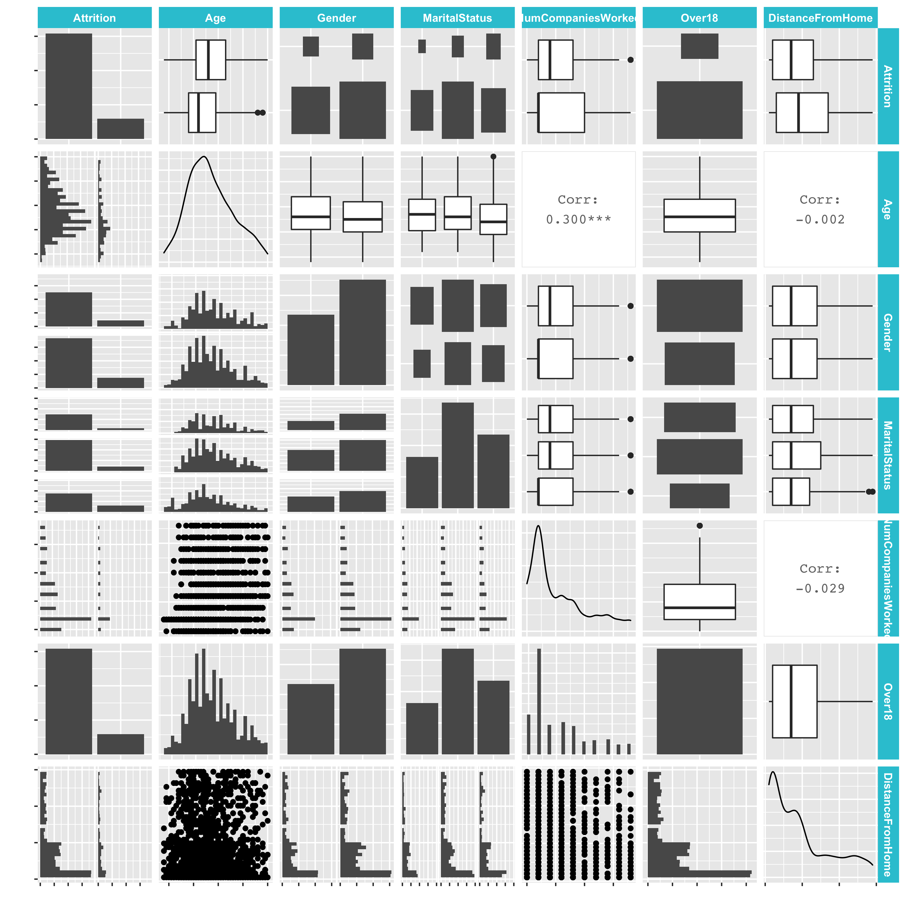
Take a look at the data. There are already a lot of insights.
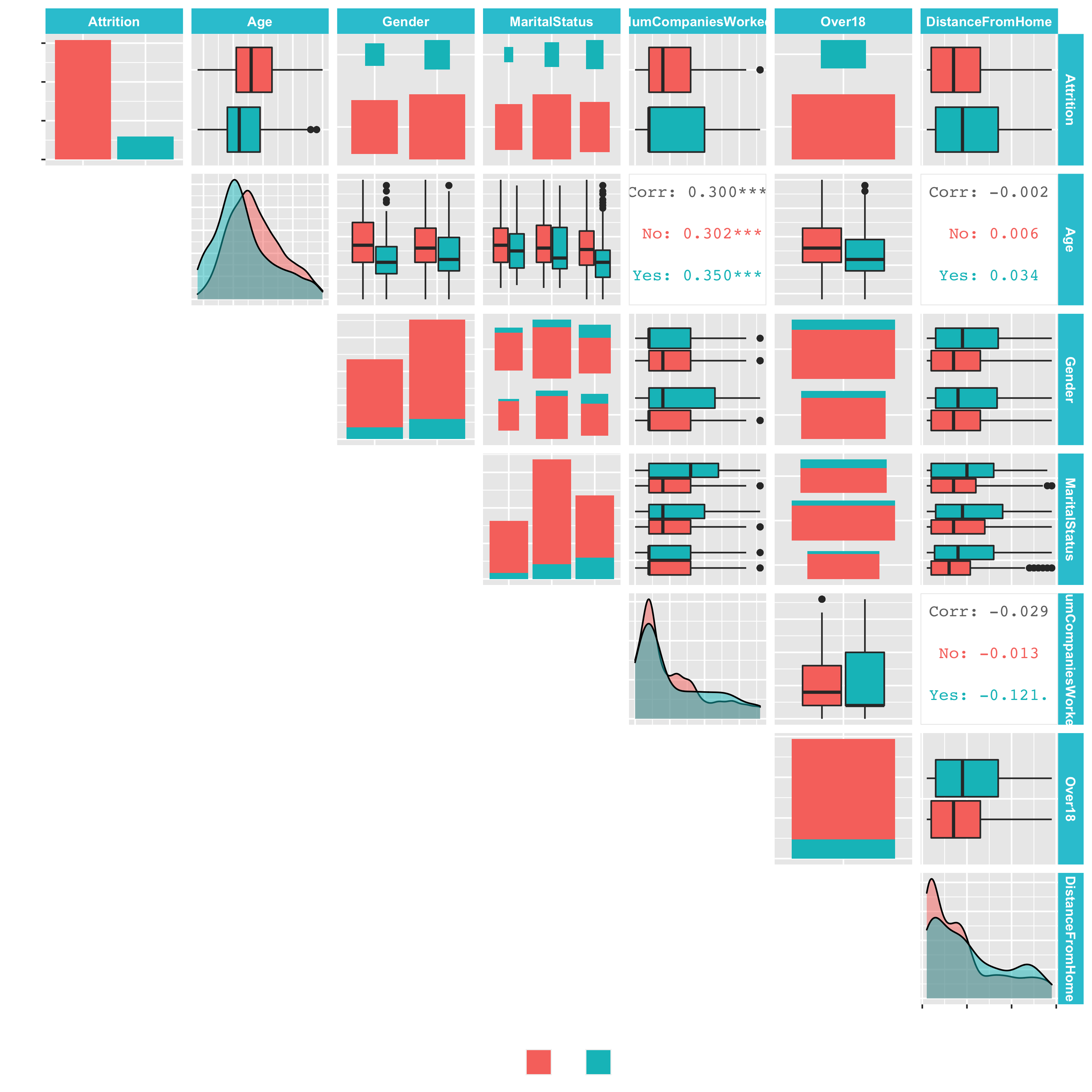
Let’s customize the ggpairs() function to make it more meaningful:
employee_attrition_tbl %>%
    select(Attrition, Age, Gender, MaritalStatus, NumCompaniesWorked, Over18, DistanceFromHome) %>%
    ggpairs(aes(color = Attrition), lower = "blank", legend = 1,
            diag  = list(continuous = wrap("densityDiag", alpha = 0.5))) +
    theme(legend.position = "bottom")
Let’s take that one step further and create a custom plotting function:
rlang::quo_is_null()returns TRUE if the quosure contains a NULL value
# Create data tibble, to potentially debug the plot_ggpairs function (because it has a data argument)
data <- employee_attrition_tbl %>%
    select(Attrition, Age, Gender, MaritalStatus, NumCompaniesWorked, Over18, DistanceFromHome)

plot_ggpairs <- function(data, color = NULL, density_alpha = 0.5) {

    color_expr <- enquo(color)

    if (rlang::quo_is_null(color_expr)) {

        g <- data %>%
            ggpairs(lower = "blank")

    } else {

        color_name <- quo_name(color_expr)

        g <- data %>%
            ggpairs(mapping = aes_string(color = color_name),
                    lower = "blank", legend = 1,
                    diag = list(continuous = wrap("densityDiag",
                                                  alpha = density_alpha))) +
            theme(legend.position = "bottom")
    }

    return(g)

}

employee_attrition_tbl %>%
    select(Attrition, Age, Gender, MaritalStatus, NumCompaniesWorked, Over18, DistanceFromHome) %>%
    plot_ggpairs(color = Attrition)
Visual data analysis with GGally: Let’s explore several of the feature categories with the function, which we’ve just created. These will be needed to answer the questions in the challenge.
contains(),starts_with(),ends_with(): Tidy select functions that eneable selecting features by the text matching.
# Explore Features by Category

#   1. Descriptive features: age, gender, marital status
employee_attrition_tbl %>%
    select(Attrition, Age, Gender, MaritalStatus, NumCompaniesWorked, Over18, DistanceFromHome) %>%
    plot_ggpairs(Attrition)

#   2. Employment features: department, job role, job level
employee_attrition_tbl %>%
    select(Attrition, contains("employee"), contains("department"), contains("job")) %>%
    plot_ggpairs(Attrition)

#   3. Compensation features: HourlyRate, MonthlyIncome, StockOptionLevel
employee_attrition_tbl %>%
    select(Attrition, contains("income"), contains("rate"), contains("salary"), contains("stock")) %>%
    plot_ggpairs(Attrition)

#   4. Survey Results: Satisfaction level, WorkLifeBalance
employee_attrition_tbl %>%
    select(Attrition, contains("satisfaction"), contains("life")) %>%
    plot_ggpairs(Attrition)

#   5. Performance Data: Job Involvment, Performance Rating
employee_attrition_tbl %>%
    select(Attrition, contains("performance"), contains("involvement")) %>%
    plot_ggpairs(Attrition)

#   6. Work-Life Features
employee_attrition_tbl %>%
    select(Attrition, contains("overtime"), contains("travel")) %>%
    plot_ggpairs(Attrition)

#   7. Training and Education
employee_attrition_tbl %>%
    select(Attrition, contains("training"), contains("education")) %>%
    plot_ggpairs(Attrition)

#   8. Time-Based Features: Years at company, years in current role
employee_attrition_tbl %>%
    select(Attrition, contains("years")) %>%
    plot_ggpairs(Attrition)
Challenge
Use your learning from descriptive features and plot_ggpairs() to further investigate the features. Run the functions above according to the features needed. Answer the following questions. Most of the time, you will only need the images from diagonal.
1. Compensation Features
What can you deduce about the interaction between Monthly Income and Attrition?
- Those that are leaving the company have a higher Monthly Income
- That those are staying have a lower Monthly Income
- Those that are leaving have a lower Monthly Income
- It's difficult to deduce anything based on the visualization
2. Compensation Features
What can you deduce about the interaction between Percent Salary Hike and Attrition?
- Those that are leaving the company have a higher Percent Salary Hike
- Those that are staying have a lower Percent Salary Hike
- Those that are leaving have lower Percent Salary Hike
- It's difficult to deduce anything based on the visualization
3. Compensation Features
What can you deduce about the interaction between Stock Option Level and Attrition?
- Those that are leaving the company have a higher stock option level
- Those that are staying have a higher stock option level
- It's difficult to deduce anything based on the visualization
4. Survey Results
What can you deduce about the interaction between Environment Satisfaction and Attrition?
- A higher proportion of those leaving have a low environment satisfaction level
- A higher proportion of those leaving have a high environment satisfaction level
- It's difficult to deduce anything based on the visualization
5. Survey Results
What can you deduce about the interaction between Work Life Balance and Attrition
- Those that are leaving have higher density of 2's and 3's
- Those that are staying have a higher density of 2's and 3's
- Those that are staying have a lower density of 2's and 3's
- It's difficult to deduce anything based on the visualization
6. Performance Data
What Can you deduce about the interaction between Job Involvement and Attrition?
- Those that are leaving have a lower density of 3's and 4's
- Those that are leaving have a lower density of 1's and 2's
- Those that are staying have a lower density of 2's and 3's
- It's difficult to deduce anything based on the visualization
7. Work-Life Features
What can you deduce about the interaction between Over Time and Attrition?
- The proportion of those leaving that are working Over Time are high compared to those that are not leaving
- The proportion of those staying that are working Over Time are high compared to those that are not staying
8. Training and Education
What can you deduce about the interaction between Training Times Last Year and Attrition
- People that leave tend to have more annual trainings
- People that leave tend to have less annual trainings
- It's difficult to deduce anything based on the visualization
9. Time-Based Features
What can you deduce about the interaction between Years At Company and Attrition
- People that leave tend to have more working years at the company
- People that leave tend to have less working years at the company
- It's difficult to deduce anything based on the visualization
10. Time-Based Features
What can you deduce about the interaction between Years Since Last Promotion and Attrition?
- Those that are leaving have more years since last promotion than those that are staying
- Those that are leaving have fewer years since last promotion than those that are staying
- It's difficult to deduce anything based on the visualization
Rohan Jain, Ali Shahid, Sehrish Saud, Julian Ramirez ↩︎