Performance Measures
This session is a continuation of the last one, Modeling Churn with H2O. In this session, we take the H2O models we’ve developed and show you how to inspect, visualize, and communicate performance. In this chapter, you will learn:
- How to visualize the
H2O leaderboard - How to generate and work with H2O Performance objects using
h2o.performance() - How to analyze the models using
ROC PlotsandPrecision vs Recall Plots, which are essential for data science model selection - How to communicate the model benefits using
Gain and Lift Plots, which are essential for executive communication - How to make a
Model Diagnostic Dashboardusing the cowplot package
Business case
Leaderboard Vizualization
In this section we are going to visualize the leaderboard. Why do we want to visualize it? If we take a look at our leaderboard, we see the following (remember that your leaderboard might be different). Since the “leader model” is the model which has the “best” score on the leaderboard, the leader may change if you change this metric. Visualizing might help to understand it.
automl_models_h2o@leaderboard %>%
              as_tibble() %>%
              select(-c(mean_per_class_error, rmse, mse))
## # A tibble: 32 x 4
##    model_id                                              auc logloss aucpr
##    <chr>                                               <dbl>   <dbl> <dbl>
##  1 DeepLearning_grid__1_AutoML_20200826_112031_model_1 0.863   0.291 0.631
##  2 GLM_1_AutoML_20200826_112031                        0.859   0.287 0.650
##  3 StackedEnsemble_AllModels_AutoML_20200826_112031    0.859   0.294 0.619
##  4 StackedEnsemble_BestOfFamily_AutoML_20200826_112031 0.850   0.292 0.615
##  5 GBM_5_AutoML_20200826_112031                        0.846   0.311 0.522
##  6 XGBoost_grid__1_AutoML_20200826_112031_model_1      0.846   0.373 0.505
##  7 GBM_grid__1_AutoML_20200826_112031_model_6          0.845   0.317 0.508
##  8 DeepLearning_1_AutoML_20200826_112031               0.844   0.377 0.553
##  9 GBM_grid__1_AutoML_20200826_112031_model_4          0.838   0.310 0.524
## 10 XGBoost_grid__1_AutoML_20200826_112031_model_7      0.836   0.312 0.522
## # … with 22 more rows
Evaluation model metrics
H2O provides a variety of metrics that can be used for evaluating models:
AUC (Are under the ROC curve): It’s a way of measuring the performance of a binary classifier by comparing the False Positive Rate (FPR x-axis) to the True Positive Rate (TPR y-axis). An AUC of 1 indicates a perfect classifier, while an AUC of .5 indicates a poor classifier, whose performance is no better than random guessing. This is the default measure for the leaderboard.Logloss: Logarithmic loss. Measures the performance of a classifier by comparing the class probability to actual value (1 or 0). Unlike AUC which looks at how well a model can classify a binary target, logloss evaluates how close a model’s predicted values (uncalibrated probability estimates) are to the actual target value. Logloss can be any value greater than or equal to 0, with 0 meaning that the model correctly assigns a probability of 0% or 100%.AUCPR (Area under the Precision-Recall curve): This model metric is used to evaluate how well a binary classification model is able to distinguish between precision recall pairs or points. The main difference between AUC and AUCPR is that AUC calculates the area under the ROC curve and AUCPR calculates the area under the Precision Recall curve. The Precision Recall curve does not care about True Negatives.- Evaluation metrics for regression models (rmse, mse, …) are also calculated for classification problems.
Stopping model metrics
Stopping metric parameters are specified in conjunction with a stopping tolerance and a number of stopping rounds:
- Mean-per-class-error: The model will stop building after the mean-per-class error rate fails to improve.
- …
Because the auc and the logloss are the most important to us, let’s create a function to visualize those for each model.
Steps for the data preparation:
as_tibble():Get the leaderboard into a tibble so that working with it will get easier.str_extract(): Split out the underlying algorithm of model_id columnslice(): Limit nubmer of rowsrownames_to_column(): Add Ids to the rowsas_factor(),as.factor(),reorder(): Change character data data to factors and order by auc
as.factor() reorders the factors alphanumerically by default, which is not desirable in many cases. as_factor() factors using the order that levels appear in the data, which is required for the situation you refer to.
pivot_longer(): convert the data to long format
To take advantage of ggplot2 color and group aestethics, we need data in long format. Long format has each faceting values stacked on top of eachother, mkaing the data frame long rather than wide. So for facets to work properly the data must be in long format.
paste0(): Combine the model_id column
# Visualize the H2O leaderboard to help with model selection
data_transformed_tbl <- automl_models_h2o@leaderboard %>%
        as_tibble() %>%
        select(-c(aucpr, mean_per_class_error, rmse, mse)) %>%
        mutate(model_type = str_extract(model_id, "[^_]+")) %>%
        slice(1:15) %>%
        rownames_to_column(var = "rowname") %>%
        # Visually this step will not change anything
        # It reorders the factors under the hood
        mutate(
          model_id   = as_factor(model_id) %>% reorder(auc),
          model_type = as.factor(model_type)
          ) %>%
          pivot_longer(cols = -c(model_id, model_type, rowname),
                       names_to = "key",
                       values_to = "value",
                       names_transform = list(key = forcats::fct_inorder)
                       ) %>%
        mutate(model_id = paste0(rowname, ". ", model_id) %>% as_factor() %>% fct_rev())
Now we can plot the data. The scales argument of facet_wrap() has to be set to free_x, because the scales vary across the row.
data_transformed_tbl %>%
        ggplot(aes(value, model_id, color = model_type)) +
        geom_point(size = 3) +
        geom_label(aes(label = round(value, 2), hjust = "inward")) +

        # Facet to break out logloss and auc
        facet_wrap(~ key, scales = "free_x") +
        labs(title = "Leaderboard Metrics",
             subtitle = paste0("Ordered by: ", "auc"),
             y = "Model Postion, Model ID", x = "") +
        theme(legend.position = "bottom")
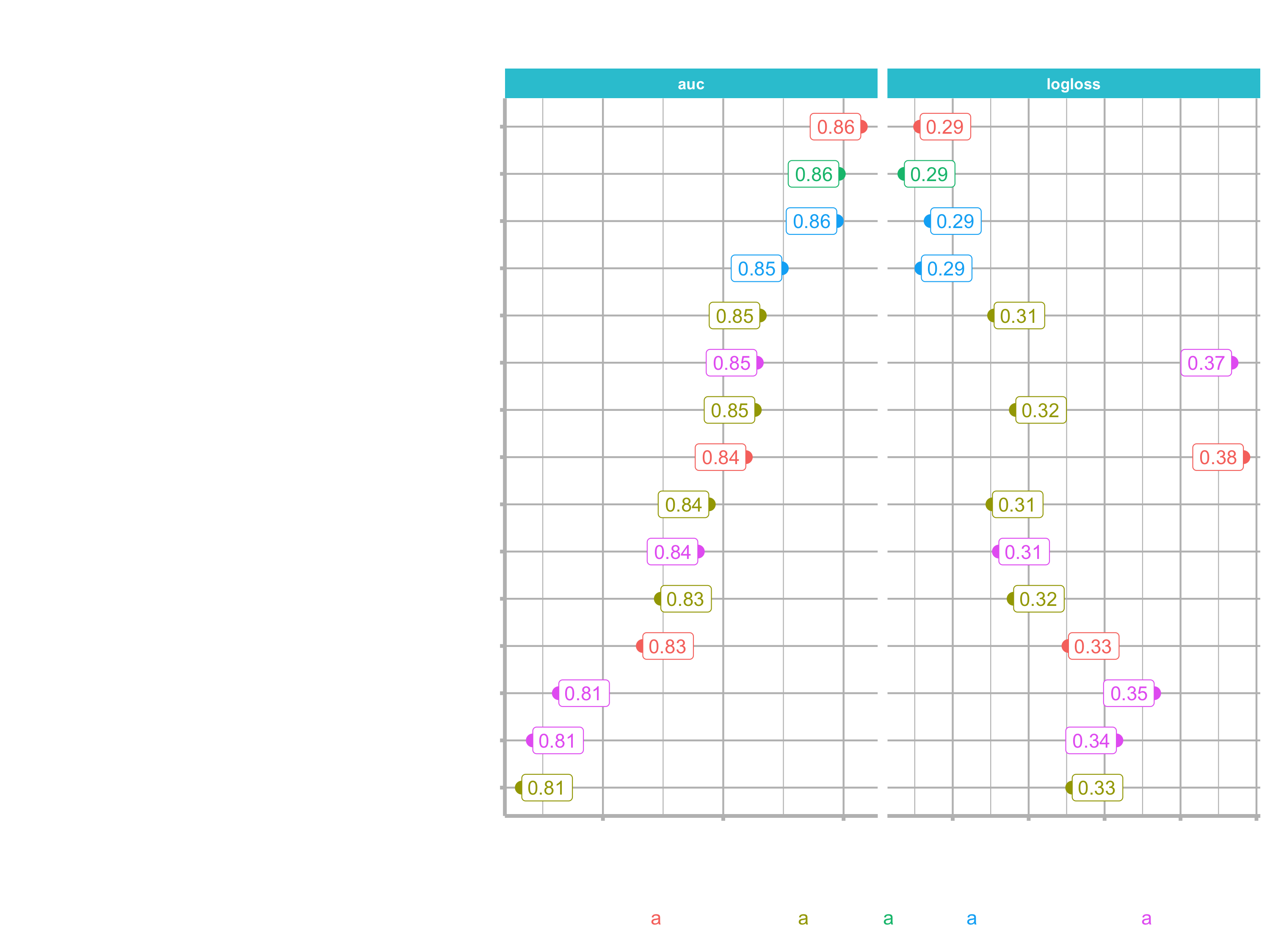
You can see that the auc metrics does not behave in the same fasion as the logloss metric. Let’s turn that code into a plotting function, that let’s us choose by which metric we want to order the plot.
The function will provide the following opportunities:
- can be ordered by auc or logloss
- set the number of models
- aestethics like setting size and toggling labels
These are the arguments we will be using:
plot_h2o_leaderboard <- function(h2o_leaderboard, order_by = c("auc", "logloss"),
                                 n_max = 20, size = 4, include_lbl = TRUE) { ... }
Try for yourselves.
plot_h2o_leaderboard <- function(h2o_leaderboard, order_by = c("auc", "logloss"),
                                 n_max = 20, size = 4, include_lbl = TRUE) {

    # Setup inputs
    # adjust input so that all formats are working
    order_by <- tolower(order_by[[1]])

    leaderboard_tbl <- h2o_leaderboard %>%
        as.tibble() %>%
        select(-c(aucpr, mean_per_class_error, rmse, mse)) %>%
        mutate(model_type = str_extract(model_id, "[^_]+")) %>%
        rownames_to_column(var = "rowname") %>%
        mutate(model_id = paste0(rowname, ". ", model_id) %>% as.factor())

    # Transformation
    if (order_by == "auc") {

        data_transformed_tbl <- leaderboard_tbl %>%
            slice(1:n_max) %>%
            mutate(
                model_id   = as_factor(model_id) %>% reorder(auc),
                model_type = as.factor(model_type)
            ) %>%
                pivot_longer(cols = -c(model_id, model_type, rowname),
                       names_to = "key",
                       values_to = "value",
                       names_transform = list(key = forcats::fct_inorder)
                       )

    } else if (order_by == "logloss") {

        data_transformed_tbl <- leaderboard_tbl %>%
            slice(1:n_max) %>%
            mutate(
                model_id   = as_factor(model_id) %>% reorder(logloss) %>% fct_rev(),
                model_type = as.factor(model_type)
            ) %>%
            pivot_longer(cols = -c(model_id, model_type, rowname),
                       names_to = "key",
                       values_to = "value",
                       names_transform = list(key = forcats::fct_inorder)
                       )

    } else {
        # If nothing is supplied
        stop(paste0("order_by = '", order_by, "' is not a permitted option."))
    }

    # Visualization
    g <- data_transformed_tbl %>%
        ggplot(aes(value, model_id, color = model_type)) +
        geom_point(size = size) +
        facet_wrap(~ key, scales = "free_x") +
        labs(title = "Leaderboard Metrics",
             subtitle = paste0("Ordered by: ", toupper(order_by)),
             y = "Model Postion, Model ID", x = "")

    if (include_lbl) g <- g + geom_label(aes(label = round(value, 2),
                                             hjust = "inward"))

    return(g)

}
There is a little bit of repeated code (in the two if statements). We could probably simplify it, but for the time being we just do it this way.
stop()generates an error, stopping the function in its tracks and outputing an error message if supplied.
Grid Search
In this section we will show you how to possibly increase your modeling performance. Let’s take an actual model that was produced by AutoML and tune it to get even better performacnce. First we have to grab on of our models, which we have saved. I am going to use a Deep Learning model, but you can use any model that you like to tune.
The advantage of using a Deep Learning model is that you can follow along with the steps I am doing, but you can also equally do this with GLM, GBM, StackedEnsembles etc. It does not matter. You can apply the same methodology to any model type.
h2o.performance()creates an H2O performance object using new data.
deeplearning_h2o <- h2o.loadModel("04_Modeling/h20_models/DeepLearning_grid__1_AutoML_20200826_112031_model_1")

# Take a look for the metrics on the training data set
# For my model the total error in the confusion matrix is ~15 %
deeplearning_h2o

# We want to see how it performs for the testing data frame
test_tbl

# Make sure to convert it to an h20 object
# Accuracy of the confusion matrix shows ~85 % accuracy
h2o.performance(deeplearning_h2o, newdata = as.h2o(test_tbl))
Let’s see if we can do better thant that using grid search. Take a look at he grid search arguments: ?h2o.grid()
The main arguments we are focusing on are the hyper_parameters, which you are going to be chaning or modifying to get various grids. It has two different search methods (explained at the search_critera argument):
- Method 1: Cartesian Grid Search (generates combinations of hyper paramters. If one hyperparamter contains 3 states and another contains 3 states, then a total of 3x3=9 models will be tested)
- Method 2: Random Grid Search
For more information on both strategies, go to this tutorial from Arno Candel: h2o-gbm-tuning-tutorial-for-r
We will be focusing on the cartesian method.
As you may be aware, Deep Learning models are highly tunable. And this means that there are a lot of different combinations we can use. Because of the modeling aproach that AutoML uses, it may take a long time in order to find the best models for specifically deep learning. It may never find the best models. So you may be able to even do a better job. Rember, that we only ran the AutoML for 30 seconds. You may want to run it much longer than that (up to an hour for an example). That will certainly help to improve the model performance.
If you don’t want to do that and want to tune it yourself, using grid search is the way to do. In this example I will tune the variables epochs and hidden
epochs:are just the numbers of times that each batch in a deep learning model is trained (we will discuss deep learning in detail in on of the next sessions)hidden:The hidden layers’ job is to transform the inputs into something that the output layer can use
We can adjust the hyper parameters by adding random values to lists or vectors:
deeplearning_grid_01 <- h2o.grid(

    # See help page for available algos
    algorithm = "deeplearning",

    # I just use the same as the object
    grid_id = "deeplearning_grid_01",

    # The following is for ?h2o.deeplearning()
    # predictor and response variables
    x = x,
    y = y,

    # training and validation frame and crossfold validation
    training_frame   = train_h2o,
    validation_frame = valid_h2o,
    nfolds = 5,

    # Hyperparamters: Use deeplearning_h2o@allparameters to see all
    hyper_params = list(
        # Use some combinations (the first one was the original)
        hidden = list(c(10, 10, 10), c(50, 20, 10), c(20, 20, 20)),
        epochs = c(10, 50, 100)
    )
)
Now we can examine the results. It ranked them on logloss. The best model might be again the same, that AutoML has produced.
deeplearning_grid_01
## H2O Grid Details
## ================
##
## Grid ID: deeplearning_grid_01
## Used hyper parameters:
##   -  epochs
##   -  hidden
## Number of models: 9
## Number of failed models: 0
##
## Hyper-Parameter Search Summary: ordered by increasing logloss
##               epochs       hidden                    model_ids             logloss
## 1 10.365557923108037 [10, 10, 10] deeplearning_grid_01_model_1 0.33035583249032535
## 2   51.9742643187486 [20, 20, 20] deeplearning_grid_01_model_8  0.3609416218808988
## 3  51.98310649009041 [10, 10, 10] deeplearning_grid_01_model_2  0.3729219565666169
## 4 10.397065329504699 [50, 20, 10] deeplearning_grid_01_model_4  0.3839386467283343
## 5 10.430087305168497 [20, 20, 20] deeplearning_grid_01_model_7 0.40220394925658515
## 6  52.09156117196342 [50, 20, 10] deeplearning_grid_01_model_5  0.4499589323308538
## 7 105.57317439776207 [50, 20, 10] deeplearning_grid_01_model_6 0.45248123968758147
## 8 104.00793532077053 [10, 10, 10] deeplearning_grid_01_model_3  0.4721820318758456
## 9 103.95335266454256 [20, 20, 20] deeplearning_grid_01_model_9    0.50241632901637
To sort by a different metric use h2o.getGrid():
h2o.getGrid(grid_id = "deeplearning_grid_01", sort_by = "auc", decreasing = TRUE)
## H2O Grid Details
## ================
##
## Grid ID: deeplearning_grid_01
## Used hyper parameters:
##   -  epochs
##   -  hidden
## Number of models: 9
## Number of failed models: 0
##
## Hyper-Parameter Search Summary: ordered by decreasing auc
##               epochs       hidden                    model_ids                auc
## 1 10.365557923108037 [10, 10, 10] deeplearning_grid_01_model_1 0.8299115032831508
## 2 10.430087305168497 [20, 20, 20] deeplearning_grid_01_model_7 0.8104706064476179
## 3 10.397065329504699 [50, 20, 10] deeplearning_grid_01_model_4 0.8074970651599004
## 4   51.9742643187486 [20, 20, 20] deeplearning_grid_01_model_8 0.8045106234761408
## 5 105.57317439776207 [50, 20, 10] deeplearning_grid_01_model_6 0.7981442780293355
## 6  51.98310649009041 [10, 10, 10] deeplearning_grid_01_model_2 0.7904878929783145
## 7 104.00793532077053 [10, 10, 10] deeplearning_grid_01_model_3 0.7789484887186036
## 8 103.95335266454256 [20, 20, 20] deeplearning_grid_01_model_9 0.7786453294116129
## 9  52.09156117196342 [50, 20, 10] deeplearning_grid_01_model_5 0.7662222480230143
To see if on of the model performs better on the test set pull that model out with h2o.getModel():
deeplearning_grid_01_model_1 <- h2o.getModel("deeplearning_grid_01_model_1")

deeplearning_grid_01_model_1 %>% h2o.auc(train = T, valid = T, xval = T)
##     train     valid      xval
## 0.9093134 0.7922078 0.8299115

# We can tell the model is overfitting because of the huge difference between training AUC and the validation / cross validation AUC

# Run it on the test data
deeplearning_grid_01_model_1 %>%
    h2o.performance(newdata = as.h2o(test_tbl))
# error is ~9.5 %
Grid Search can help with highly tunable models (e.g. GBM, Deeplearning). We just increased accuracy on test set from 85% to 90,5% in my case. However, further improvements should be taken to make sure overfitting is not an issue. We want models that generalize to new data.
It does have some benefits using that model, if you are purely concerned with accuracy. But often times we are not solely concerned with that metric, we are more concerned with precision and recall when it comes to making sure that we are not missing people who are actually going to leave.
H2O Performance
We will go over several methods to measure and to communicate classifier performance. Let’s load a few models:
# 4. Assessing Performance ----
stacked_ensemble_h2o <- h2o.loadModel("04_Modeling/h2o_models/StackedEnsemble_AllModels_AutoML_20200826_112031")
deeplearning_h2o     <- h2o.loadModel("04_Modeling/h2o_models/DeepLearning_grid__1_AutoML_20200826_112031_model_1")
glm_h2o              <- h2o.loadModel("04_Modeling/h2o_models/GLM_1_AutoML_20200826_112031")
h2o.performance()makes an H2O performance object by providing a model and newdata
Create a performance object:
performance_h2o <- h2o.performance(stacked_ensemble_h2o, newdata = as.h2o(test_tbl))

typeof(performance_h2o)
performance_h2o %>% slotNames()

# We are focusing on the slot metrics. This slot contains all possible metrics
performance_h2o@metrics
AUC: Stands for Area Under the Curve, referring to a Receiver Operating Characteristics (ROC) plot. This measures true positive rate (TPR) vs false positive rate (FPR). AUC is one of the main performance metrics that data scientists use to select a model. However, it’s not always the best.Log Loss: compares the prediction class probability to the 1/0 actual value computing the mean error. This is a great way to measure the true performance of a classifier.
To quickly assess some of that information, you can use the following functions:
h2o.auc()retrieve the area under the curce (AUC) from a Receiver Operating Characteristics (ROC) ploth2o.giniCoef()retreive the Gini Coefficient. AUC=(GiniCoeff+1)/2 (rather rarely used)h2.logloss()retrieve the Log Loss, a metric that measures the class probability from the model against actual value in binary format(0,1)h2o.confusionMatrix()generates a confusion matrix for a performance object
# Classifier Summary Metrics

h2o.auc(performance_h2o, train = T, valid = T, xval = T)
## [1] 0.8588763

# Caution: "train, "val", and "xval" arugments only work for models (not performance objects)
h2o.auc(stacked_ensemble_h2o, train = T, valid = T, xval = T)
##     train     valid      xval
## 0.9892475 0.8219522 0.8383290

h2o.giniCoef(performance_h2o)
## [1] 0.7177527
h2o.logloss(performance_h2o)
## [1] 0.2941769

# result for the training data
h2o.confusionMatrix(stacked_ensemble_h2o)
## Confusion Matrix (vertical: actual; across: predicted)  for max f1 @ threshold = 0.358554294328892:
##         No Yes    Error      Rate
## No     871  20 0.022447   =20/891
## Yes     23 151 0.132184   =23/174
## Totals 894 171 0.040376  =43/1065

# result for the hold out set
h2o.confusionMatrix(performance_h2o)
## Confusion Matrix (vertical: actual; across: predicted)  for max f1 @ threshold = 0.498049256506051:
##         No Yes    Error     Rate
## No     179   9 0.047872   =9/188
## Yes     14  18 0.437500   =14/32
## Totals 193  27 0.104545  =23/220
Tip: Learn to read a confusion matrix. Focus on understanding the Threshold, Precision & Recall. These are critical to a business analysis.
- Top Row: Prediction (P)
- Left Column: Actual (A)
Quadrants contain
- True Negative (P=N, A=N)
- False Positive (P=Y, A=N)
- False Negative (P=N, A=Y)
- True Positive (P=Y, A=Y)
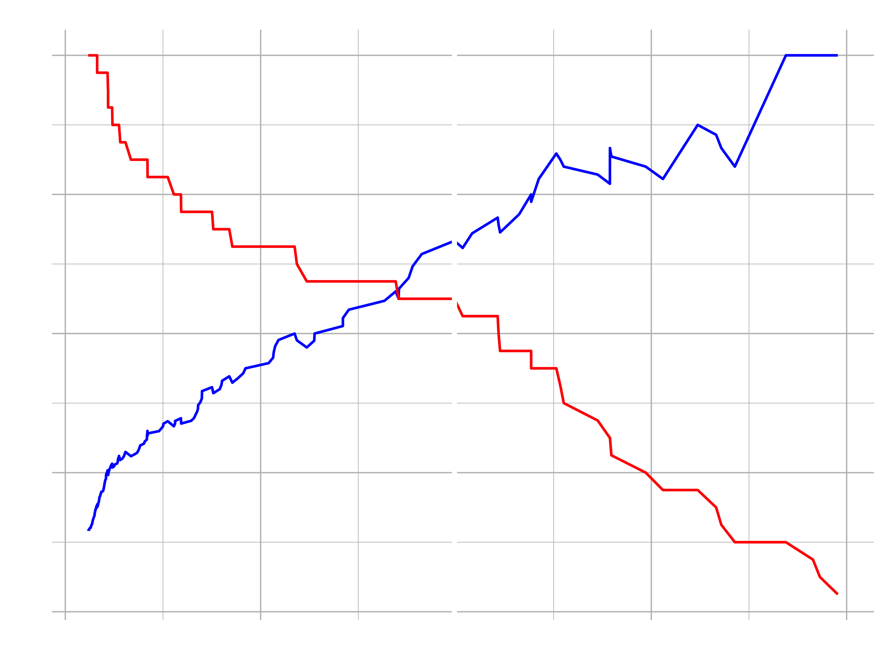
The value that determines which class probability is a 0 or 1 (i.e. employee stays vs. leaves) is called Threshold. We need to understand how these models change wit the threshold. We do that by using the function h2o.metric(). It converts a performance object into a series of metrics (e.g. prcision, recall, f1, etc.) that vary by the threshold.
Important measures that vary by threshold:
F1: Optimal balance between precision and recall. Typically the threshold that maximizes F1 is used as threshold/ cutoff for turning class probability into 0/1. However, this is not always the best case! An expected value optimization is required when costs of false positives and false negatives are known.precision: Measures false positives (e.g. predicted to leave but actually stayed)recall: Measures false negatives (e.g. predicted to stay but actually left)- ture positives (tps), true negative (tns), false positives (fps) and false negatives (fns): Often converted to rates to understand the cost/benefit of a classifier. The rates are included as tpr, tnr, fpr and fnr.
# Precision vs Recall Plot

# This is on the test set
performance_tbl <- performance_h2o %>%
    h2o.metric() %>%
    as.tibble()

performance_tbl %>%
  glimpse()
Precision, Recall, F1 & Effect of Threshold
… in other words, it detects how frequently your algorithm over-picks the Yes class. Precision indicates how often we incorrectly say people will leave when they actually will stay.
… in other words, it providews a metric for under-picking Yes. Recall indicates how often we muss poeple that will leave by incorrectly predicting they will stay.
Recall is typically more important than precision in the busness context. We would rather give up some false positives (inadvertently target stayers) to gain false negatives (accurately predict quiters).
… in other words, it provides a metric for balancing precision vs. recall.
Max F1 Threshold: Threshold that optimizes the balance between precions and recall.
While F1 optimizes the balance between Precision and Recall, it’s not always the best choice for threshold. Why?
Because there are different costs associated with false negatives and false positives. Typically false negatives cost the company more. This is where Expected Value (EV) comes into play (might be covered later).
Let’s visualize the trade of between the precision and the recall and the optimal threshold.
Before, save our theme, so that we don’t have to type it out every single time we are going to use it:
theme_new <- theme(
      legend.position  = "bottom",
      legend.key       = element_blank(),,
      panel.background = element_rect(fill   = "transparent"),
      panel.border     = element_rect(color = "black", fill = NA, size = 0.5),
      panel.grid.major = element_line(color = "grey", size = 0.333)
      )
h2o.find_threshold_by_max_metric()You can supply a metric to maximize (e.g. f1), and the function returns the threshold that maximizes this metric.
performance_tbl %>%
    filter(f1 == max(f1))

performance_tbl %>%
    ggplot(aes(x = threshold)) +
    geom_line(aes(y = precision), color = "blue", size = 1) +
    geom_line(aes(y = recall), color = "red", size = 1) +

    # Insert line where precision and recall are harmonically optimized
    geom_vline(xintercept = h2o.find_threshold_by_max_metric(performance_h2o, "f1")) +
    labs(title = "Precision vs Recall", y = "value") +
    theme_new
Performance Chart for scientists
After measuring the performance of a single classifier, which is based on the precision, recall and the F1 metric (balance between the precision and the recall), we want to measure the performance of multiple models. We do that using the ROC curce and the area under the curve (AUC).
Let’s compare the three models, which have loaded earlier, with the custom function load_model_performance_metrics():
# ROC Plot

path <- "04_Modeling/h2o_models/StackedEnsemble_AllModels_AutoML_20200826_112031"

load_model_performance_metrics <- function(path, test_tbl) {

    model_h2o <- h2o.loadModel(path)
    perf_h2o  <- h2o.performance(model_h2o, newdata = as.h2o(test_tbl))

    perf_h2o %>%
        h2o.metric() %>%
        as_tibble() %>%
        mutate(auc = h2o.auc(perf_h2o)) %>%
        select(tpr, fpr, auc)

}

model_metrics_tbl <- fs::dir_info(path = "04_Modeling/h2o_models/") %>%
    select(path) %>%
    mutate(metrics = map(path, load_model_performance_metrics, test_tbl)) %>%
    unnest(cols = metrics)
- ROC Curve: pits the True Positive Rate (TPR, y-axis) against the False Positive Rate (FPR, x-axis)
- TPR: Rate at which people are correctly identified as leaving
- FPR: Rate at which peple that stay are incorrectly identified as leaving
Info: converting numeric data to factor requires an intermediate step of converting to character
model_metrics_tbl %>%
    mutate(
        # Extract the model names
        path = str_split(path, pattern = "/", simplify = T)[,3] %>% as_factor(),
        auc  = auc %>% round(3) %>% as.character() %>% as_factor()
        ) %>%
    ggplot(aes(fpr, tpr, color = path, linetype = auc)) +
    geom_line(size = 1) +

    # just for demonstration purposes
    geom_abline(color = "red", linetype = "dotted") +

    theme_new +
    theme(
      legend.direction = "vertical",
      ) +
    labs(
        title = "ROC Plot",
        subtitle = "Performance of 3 Top Performing Models"
    )
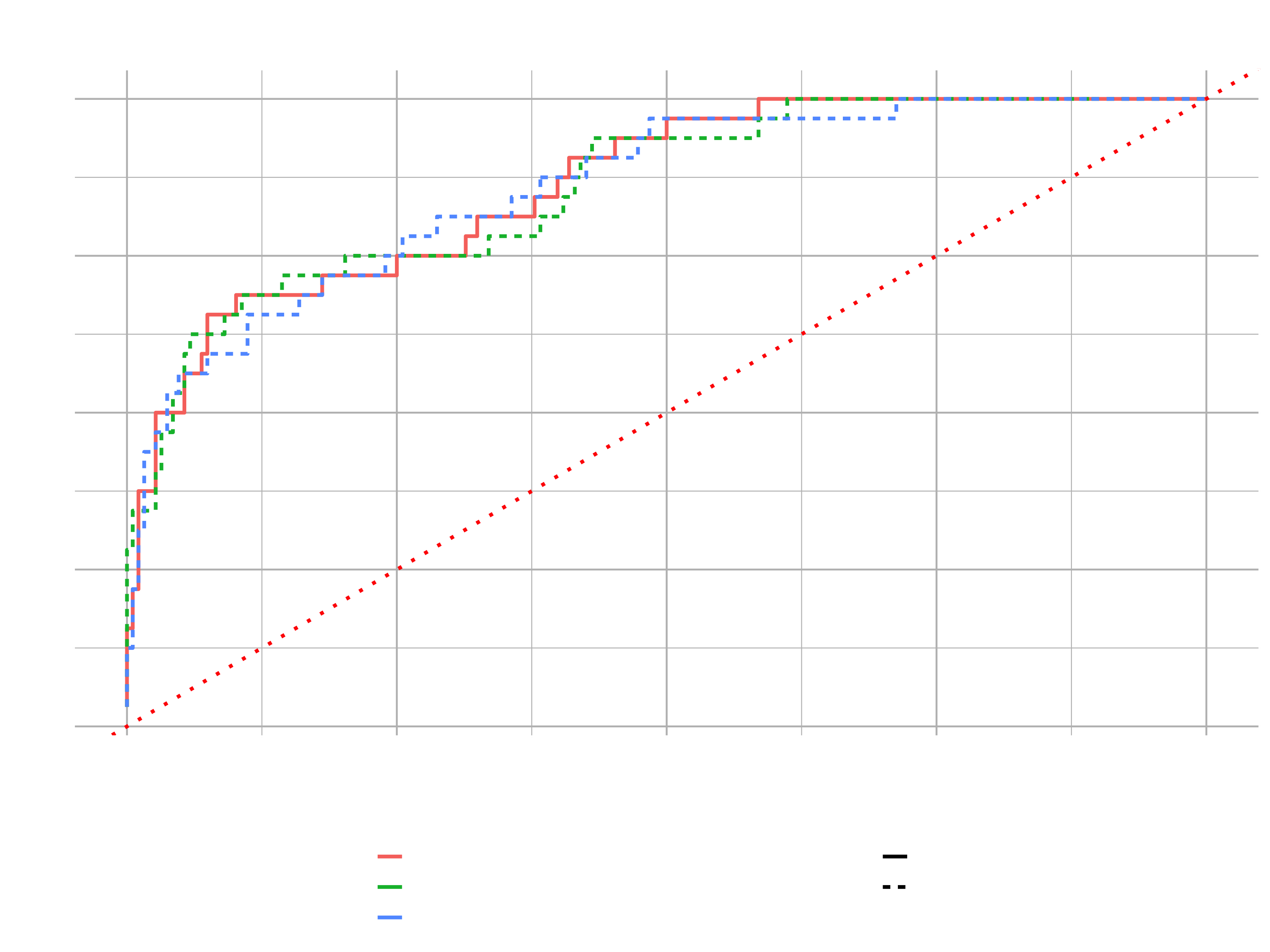
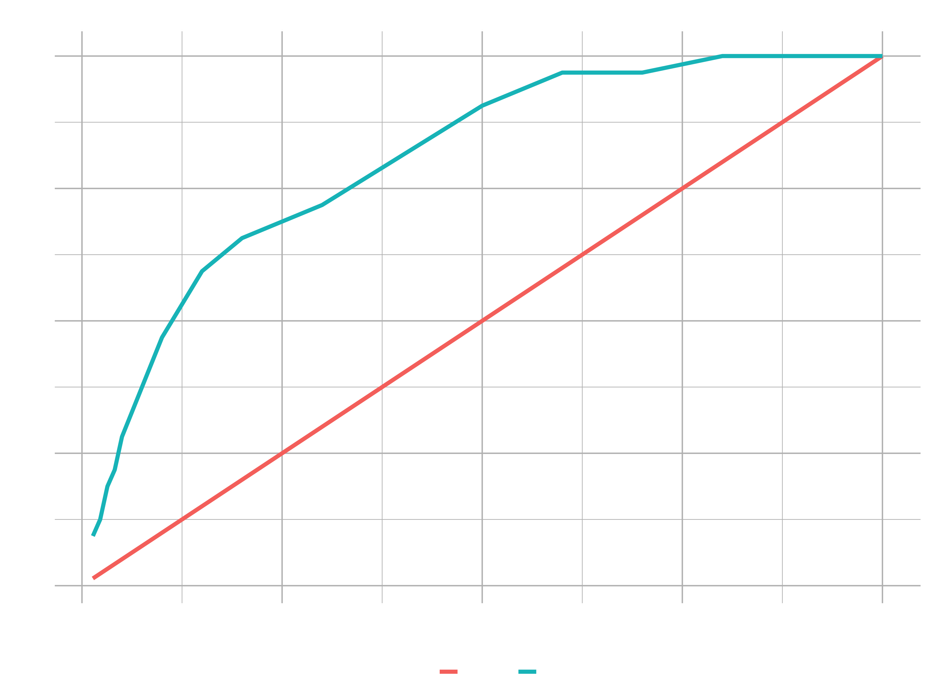
We got our false positive rate on the bottom and the true positive on the left. We can see how the true positives change (people correctly identified as leaving) as false positive (poeple falsely identified as leaving) increases.
High performing models should stay as close as possible to the upper left corner (1.00 would be perfection). The dotted red line reflects an average model with no predictive power.
Area under the curve refers to the area below the ROC plot line for a given model. For a classifier, a perfect model has an AUC of 1 and an average model with no predictive power has an AUC of 0.5.
The next steo is to turn the precision/ recall tradeoff into a performance plot. Let’s add precision and recall to the select statement of the function above.
# Precision vs Recall

load_model_performance_metrics <- function(path, test_tbl) {

    model_h2o <- h2o.loadModel(path)
    perf_h2o  <- h2o.performance(model_h2o, newdata = as.h2o(test_tbl))

    perf_h2o %>%
        h2o.metric() %>%
        as_tibble() %>%
        mutate(auc = h2o.auc(perf_h2o)) %>%
        select(tpr, fpr, auc, precision, recall)

}

model_metrics_tbl <- fs::dir_info(path = "04_Modeling/h2o_models/") %>%
    select(path) %>%
    mutate(metrics = map(path, load_model_performance_metrics, test_tbl)) %>%
    unnest(cols = metrics)

model_metrics_tbl %>%
    mutate(
        path = str_split(path, pattern = "/", simplify = T)[,3] %>% as_factor(),
        auc  = auc %>% round(3) %>% as.character() %>% as_factor()
    ) %>%
    ggplot(aes(recall, precision, color = path, linetype = auc)) +
    geom_line(size = 1) +
    theme_new +
    theme(
      legend.direction = "vertical",
      ) +
    labs(
        title = "Precision vs Recall Plot",
        subtitle = "Performance of 3 Top Performing Models"
    )
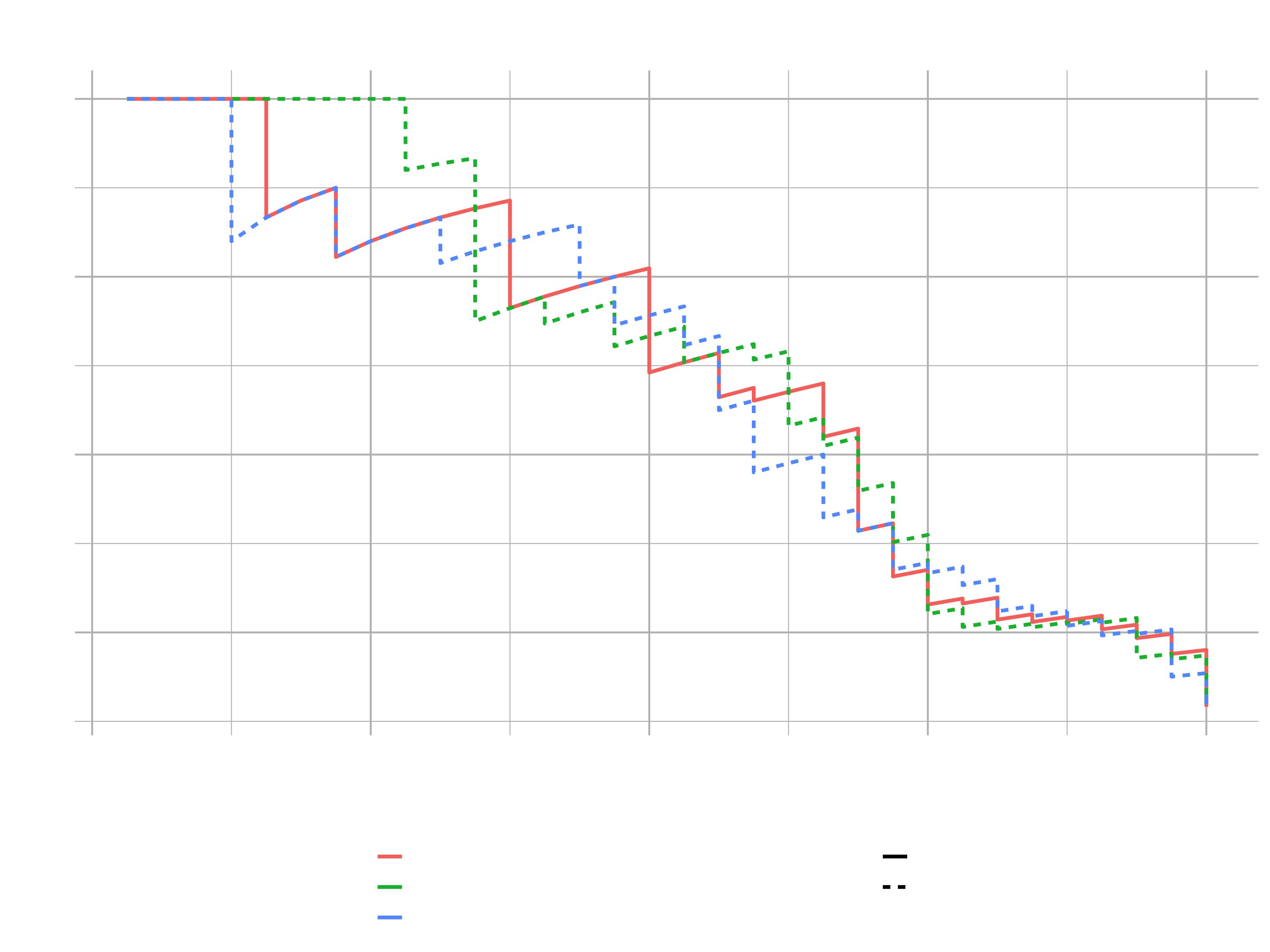
The Precision vs. Recall plot is a way to pit effect of false positive rate (fpr) against false negative rate (fnr). Precision iundicates how susceptible models are to FP’s (e.g. predicting employees to leave but they actually stay). Recall indicates how susceptible model is to FN’s (e.g. predicting employee to stay but they acutally leave). The better models tend to be farther towards the upper right quadrant (models have better balance between FP’s & FN’s). The lower they are, the less precision for given recall they have. Because the three lines are not well separated, it is difficult to tell which one would be the best in this case.
This is just another way to take a look at different models and to determine which ones are going to be the best for particular needs. In our case, we want to reduce the under-predictions (employees predicted to stay that acutally leave).
For Business Applications in general, False Negatives (FN) are what we typically care most about. Recall indicates susceptibility to FN’s (lower recall, more susceptible). In other words, we want to accurately predict which employees will leave (lower FN’s) at the expense of over prediciting employees to leave (FPs). The precision vs recall curve shows us which models will give up less FP’s as we optimize the threshold for FN’s.
Performance Charts For Business People
The last section was about how a data scientist can understand the quality of a classifier. But the executives just want to know who is going to leave and how is that model going to help them. That is the job of the Gain & Lift plots. Gain & Lift are results-based metrics and can help communicate modeling results in terms everyone understands and cares about. The charts are used to evaluate performance of a classification model. They measure how much better one can expect to do with the predictive model comparing without a model.
For that, we need the predictions_tbl from the last session.
# Gain & Lift

ranked_predictions_tbl <- predictions_tbl %>%
    bind_cols(test_tbl) %>%
    select(predict:Yes, Attrition) %>%
    # Sorting from highest to lowest class probability
    arrange(desc(Yes))
## # A tibble: 220 x 4
##    predict     No   Yes Attrition
##    <fct>    <dbl> <dbl> <fct>
##  1 Yes     0.0113 0.989 Yes
##  2 Yes     0.0342 0.966 Yes
##  3 Yes     0.0431 0.957 Yes
##  4 Yes     0.0777 0.922 Yes
##  5 Yes     0.143  0.857 No
##  6 Yes     0.160  0.840 Yes
##  7 Yes     0.167  0.833 Yes
##  8 Yes     0.191  0.809 Yes
##  9 Yes     0.235  0.765 No
## 10 Yes     0.257  0.743 Yes
## # … with 210 more rows
In the first 10 rows, we had 90% accuracy (9 of 10 people). Without a model, we’d only expect the global attrition rate (16%) for first ten rows (1.6 people). The global attrition rate is the overall attrition rate for the organization for the population we are evaluating in the course. If you combine the training and test sets and calculate the attrition rate (Number of Employees Leaving / Total Number of Employees), you will get 16%. The comparison is made to the Gain, because if we sampled 10 random people we’d expect 1.6 people to leave. However, with our Gain example, we sort descending by probability of leaving, our algorithm predicts the 9 of the 10 highest probability cases correctly. Therefore we gain a benefit of using the algorithm because of the prediction being highly accurate for the first 10 cases high probability cases.
For our test data the total number of expected quiters is 220 * 0.16 = 35.
Gain: If 35 people expected to quit, we gained 9 of 35 or 25.7% in first 10 casesLift: If expectation is 1.6 people, we beat the expectation by 9 / 1.6 = 5.6X in first 10 cases.
Gain and Lift Calculations
Yes is the Class probability for churn, or how likely the employee is to churn. Attrition is the Response, or what acutally happened. By ranking by class probablity of Yes, we assess the models ability to truly detect someone that is leaving. Grouping into cohorts of most likely to least likely groups is as the heart of the Gain/Lift Chart. The steps of a Gain / Lift Analysis are:
- Randomly split data into two samples: e.g. 80% = training sample, 20% = validation sample.
- Score (predicted probability) the validation sample using the response model under consideration.
- Rank the scored file, in descending order by estimated probability
- Split the ranked file into 10 sections (deciles)
- Number of observations in each decile
- Number of actual events in each decile
- Number of cumulative actual events in each decile
- Percentage of cumulative actual events in each decile. It is called Gain Score.
- Divide the gain score by % of data used in each portion of 10 bins. For example, in second decile, divide gain score by 20.
ntile()breaks continuois value into “n” buckets or groups. This allows us to group the response (attrition) based on the ntile column.
ranked_predictions_tbl %>%
    mutate(ntile = ntile(Yes, n = 10)) %>%
    group_by(ntile) %>%
    summarise(
        cases = n(),
        responses = sum(Attrition == "Yes")
    ) %>%
    arrange(desc(ntile))
## `summarise()` ungrouping output (override with `.groups` argument)
## # A tibble: 10 x 3
##    ntile cases responses
##    <int> <int>     <int>
##  1    10    22        15
##  2     9    22         6
##  3     8    22         2
##  4     7    22         3
##  5     6    22         3
##  6     5    22         2
##  7     4    22         0
##  8     3    22         1
##  9     2    22         0
## 10     1    22         0
Example: 10th Decile. This group had the highes class probability for leaving. 15 of 22 actually left.
Continuing on with the calculation …
calculated_gain_lift_tbl <- ranked_predictions_tbl %>%
    mutate(ntile = ntile(Yes, n = 10)) %>%
    group_by(ntile) %>%
    summarise(
        cases = n(),
        responses = sum(Attrition == "Yes")
    ) %>%
    arrange(desc(ntile)) %>%

    # Add group numbers (opposite of ntile)
    mutate(group = row_number()) %>%
    select(group, cases, responses) %>%

    # Calculations
    mutate(
        cumulative_responses = cumsum(responses),
        pct_responses        = responses / sum(responses),
        gain                 = cumsum(pct_responses),
        cumulative_pct_cases = cumsum(cases) / sum(cases),
        lift                 = gain / cumulative_pct_cases,
        gain_baseline        = cumulative_pct_cases,
        lift_baseline        = gain_baseline / cumulative_pct_cases
    )

calculated_gain_lift_tbl
## # A tibble: 10 x 10
##    group cases responses cumulative_responses pct_responses  gain cumulative_pct_cases  lift gain_baseline lift_baseline
##    <int> <int>     <int>                <int>         <dbl> <dbl>                <dbl> <dbl>         <dbl>         <dbl>
##  1     1    22        15                   15        0.469  0.469                  0.1  4.69           0.1             1
##  2     2    22         6                   21        0.188  0.656                  0.2  3.28           0.2             1
##  3     3    22         2                   23        0.0625 0.719                  0.3  2.40           0.3             1
##  4     4    22         3                   26        0.0938 0.812                  0.4  2.03           0.4             1
##  5     5    22         3                   29        0.0938 0.906                  0.5  1.81           0.5             1
##  6     6    22         2                   31        0.0625 0.969                  0.6  1.61           0.6             1
##  7     7    22         0                   31        0      0.969                  0.7  1.38           0.7             1
##  8     8    22         1                   32        0.0312 1                      0.8  1.25           0.8             1
##  9     9    22         0                   32        0      1                      0.9  1.11           0.9             1
## 10    10    22         0                   32        0      1                      1    1              1               1
- Gain: Think of this as what we gained by using the model. For example, if we focused on the first 2 groups, we gain ability to target 65 % of our quiters using our model.
- Lift: Think of this as a multiplier between what we gained divided by what we expected to gain with no model. For example, if we focused on the first 2 decile groups, we gained ability to target 68 % of our quiters but we only expected to be able to target 20% of the quiters in 2 decile groups. Lift = 65.6 % / 20 % = 3.28X. Meaning model is 3.28X better targeting ability than random.
Calculating Gain & Lift manually was rather for understanding the concept. Of course H2O can do the calculation for us.
h2o.gainsLift()returns the Gain & Lift table from a performance object. H2O groups into 16-ntiles with the first being the most likely to be in the minority (Yes) class.Cumulutive Capture Rateis the “Cumulutive Percentage Gain” that we will use.
gain_lift_tbl <- performance_h2o %>%
    h2o.gainsLift() %>%
    as.tibble()

## Gain Chart

gain_transformed_tbl <- gain_lift_tbl %>%
    select(group, cumulative_data_fraction, cumulative_capture_rate, cumulative_lift) %>%
    select(-contains("lift")) %>%
    mutate(baseline = cumulative_data_fraction) %>%
    rename(gain     = cumulative_capture_rate) %>%
    # prepare the data for the plotting (for the color and group aesthetics)
    pivot_longer(cols = c(gain, baseline), values_to = "value", names_to = "key")

gain_transformed_tbl %>%
    ggplot(aes(x = cumulative_data_fraction, y = value, color = key)) +
    geom_line(size = 1.5) +
    labs(
        title = "Gain Chart",
        x = "Cumulative Data Fraction",
        y = "Gain"
    ) +
    theme_new
Explaining data science to non-technical people can be a challenge. To be effective, we need to focus on what they care about: RESULTS.
Imagine that this plot was a marketing example and the goal was to send marketing communication to have customers sign up. Is targeting everyone the right strategy or might using a statistical model help to decide which ones are more receptive to that marketing campaign. This gain chart helps to answer this question.
Randomly targeting 25% of potential customers should yield 25% of potential positive responses (see diagonal line). Strategically targeting (if we sectioned or organized our data by the model) 25% of high probability customers should yield 75 % of potential positive responses.
Always explain in terms of what they are interested in:
- More customers
- Less churn
- Better quality
- Reduced lead times
- Anything they care about …
The Lift plot tells basically the same. It shows the distance from the baseline to the model. The difference we are gaining. From 25% (baseline) to ~70% (model) is euquivalent to from 1X (baseline) to 3X (model). Gain & Lift go hand in hand. The two charts work together to show the results of using the modeling approach versus just targeting people at random. Lift is a multiplier. How many positive responses would you get at random X How many you would get with the model .
## Lift Plot

lift_transformed_tbl <- gain_lift_tbl %>%
    select(group, cumulative_data_fraction, cumulative_capture_rate, cumulative_lift) %>%
    select(-contains("capture")) %>%
    mutate(baseline = 1) %>%
    rename(lift = cumulative_lift) %>%
    pivot_longer(cols = c(lift, baseline), values_to = "value", names_to = "key")

lift_transformed_tbl %>%
    ggplot(aes(x = cumulative_data_fraction, y = value, color = key)) +
    geom_line(size = 1.5) +
    labs(
        title = "Lift Chart",
        x = "Cumulative Data Fraction",
        y = "Lift"
    ) +
    theme_new
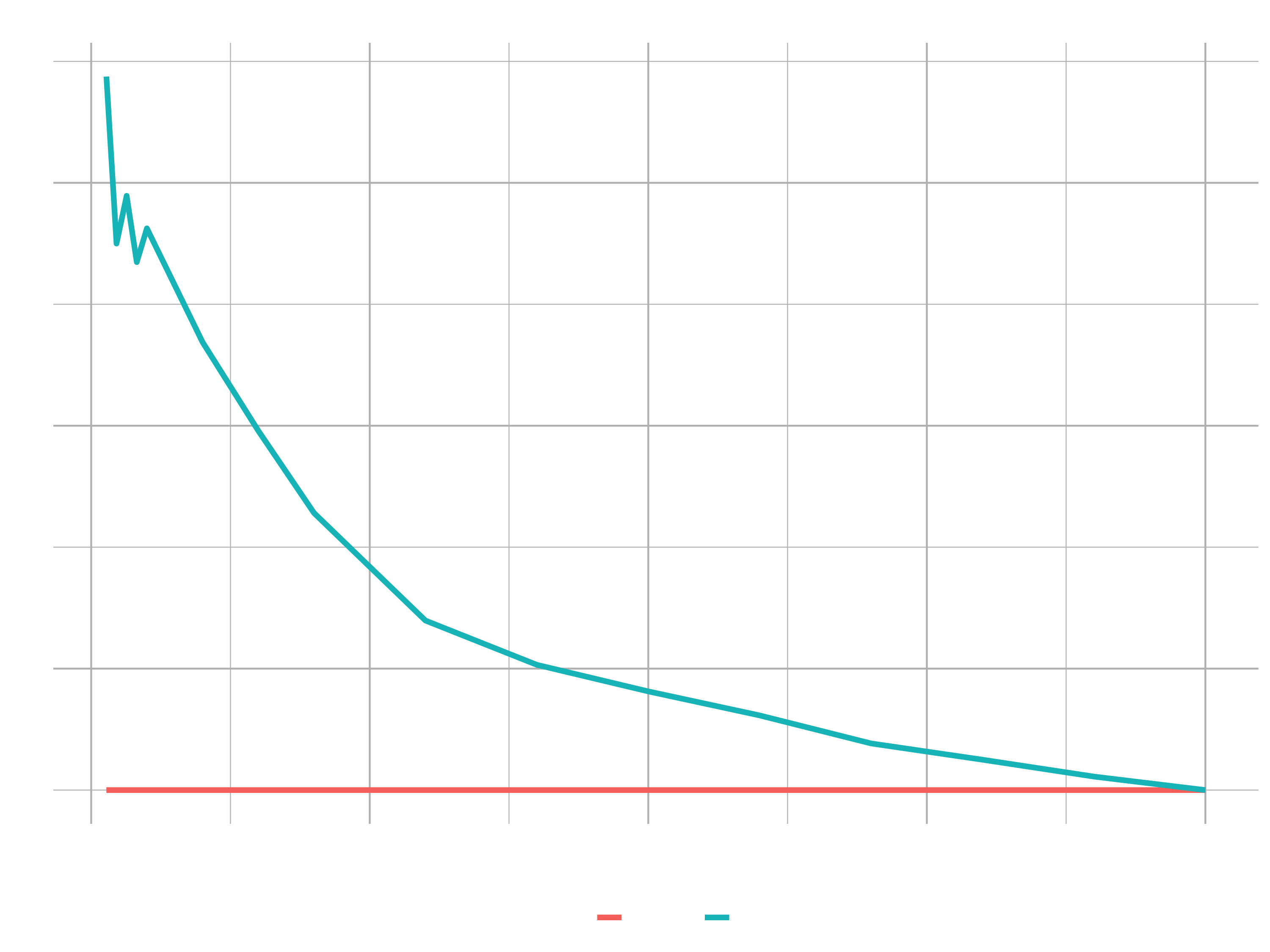
How does Lift apply to Attrition? Example: Providing stock options strategically to high performers that are high risk. You Could strategically focus on those in the high risk category that are working overtime. Example Communicating to executives: If 35 people are expected to quit, we can obtain ~70 % by targeting the top 25 % of high risk people. This reduces costs by 1/3rd versus random selection, because we only need to offer stock options to high risk candidates.
Now we have gone through different ways of evaluating the performance of a classifier, both from the standpoint of a data scientist getting the best model performance but then also from the executive/business standpoint to be able to convey the value of these models to business people.
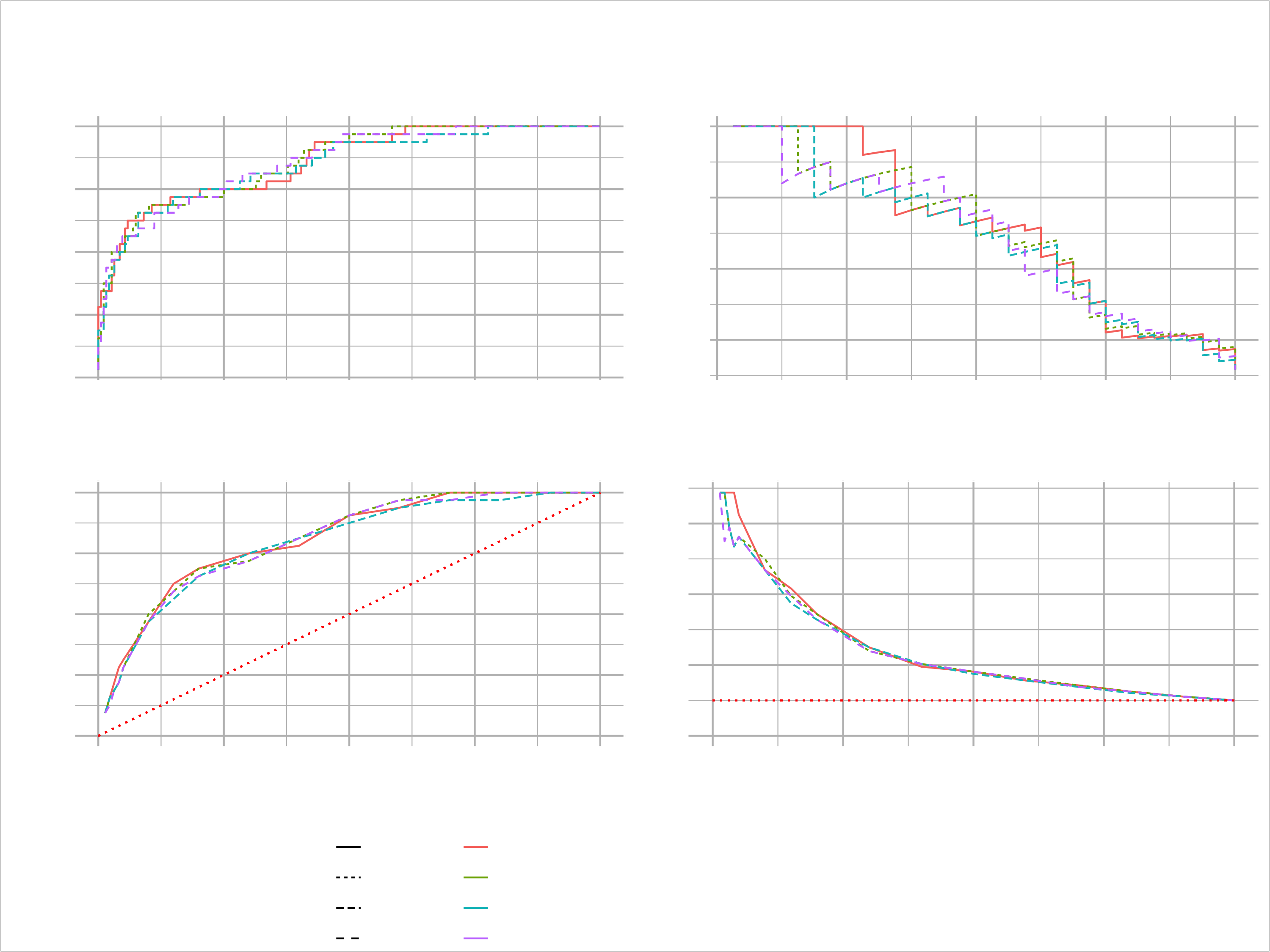
Now we want to bring that all together in a model metrics dashboard, that evaluates multiple models to see strengths & weaknesses. For that we will write a quite lengthy function. Don’t be intimidated. Just try to follow along. Basically we just create the four plots, we have discussed and combine them using the cowplot package.
# 5. Performance Visualization ----
library(cowplot)
library(glue)


# set values to test the function while building it
h2o_leaderboard <- automl_models_h2o@leaderboard
newdata <- test_tbl
order_by <- "auc"
max_models <- 4
size <- 1

plot_h2o_performance <- function(h2o_leaderboard, newdata, order_by = c("auc", "logloss"),
                                 max_models = 3, size = 1.5) {

    # Inputs

    leaderboard_tbl <- h2o_leaderboard %>%
        as_tibble() %>%
        slice(1:max_models)

    newdata_tbl <- newdata %>%
        as_tibble()

    # Selecting the first, if nothing is provided
    order_by      <- tolower(order_by[[1]])

    # Convert string stored in a variable to column name (symbol)
    order_by_expr <- rlang::sym(order_by)

    # Turn of the progress bars ( opposite h2o.show_progress())
    h2o.no_progress()

    # 1. Model metrics

    get_model_performance_metrics <- function(model_id, test_tbl) {

        model_h2o <- h2o.getModel(model_id)
        perf_h2o  <- h2o.performance(model_h2o, newdata = as.h2o(test_tbl))

        perf_h2o %>%
            h2o.metric() %>%
            as.tibble() %>%
            select(threshold, tpr, fpr, precision, recall)

    }

    model_metrics_tbl <- leaderboard_tbl %>%
        mutate(metrics = map(model_id, get_model_performance_metrics, newdata_tbl)) %>%
        unnest(cols = metrics) %>%
        mutate(
          model_id = as_factor(model_id) %>%
                      # programmatically reorder factors depending on order_by
                      fct_reorder(!! order_by_expr,
                                  .desc = ifelse(order_by == "auc", TRUE, FALSE)),
          auc      = auc %>%
                      round(3) %>%
                      as.character() %>%
                      as_factor() %>%
                      fct_reorder(as.numeric(model_id)),
          logloss  = logloss %>%
                      round(4) %>%
                      as.character() %>%
                      as_factor() %>%
                      fct_reorder(as.numeric(model_id))
        )


    # 1A. ROC Plot

    p1 <- model_metrics_tbl %>%
        ggplot(aes(fpr, tpr, color = model_id, linetype = !! order_by_expr)) +
        geom_line(size = size) +
        theme_new +
        labs(title = "ROC", x = "FPR", y = "TPR") +
        theme(legend.direction = "vertical")


    # 1B. Precision vs Recall

    p2 <- model_metrics_tbl %>%
        ggplot(aes(recall, precision, color = model_id, linetype = !! order_by_expr)) +
        geom_line(size = size) +
        theme_new +
        labs(title = "Precision Vs Recall", x = "Recall", y = "Precision") +
        theme(legend.position = "none")


    # 2. Gain / Lift

    get_gain_lift <- function(model_id, test_tbl) {

        model_h2o <- h2o.getModel(model_id)
        perf_h2o  <- h2o.performance(model_h2o, newdata = as.h2o(test_tbl))

        perf_h2o %>%
            h2o.gainsLift() %>%
            as.tibble() %>%
            select(group, cumulative_data_fraction, cumulative_capture_rate, cumulative_lift)

    }

    gain_lift_tbl <- leaderboard_tbl %>%
        mutate(metrics = map(model_id, get_gain_lift, newdata_tbl)) %>%
        unnest(cols = metrics) %>%
        mutate(
            model_id = as_factor(model_id) %>%
                fct_reorder(!! order_by_expr,
                            .desc = ifelse(order_by == "auc", TRUE, FALSE)),
            auc  = auc %>%
                round(3) %>%
                as.character() %>%
                as_factor() %>%
                fct_reorder(as.numeric(model_id)),
            logloss = logloss %>%
                round(4) %>%
                as.character() %>%
                as_factor() %>%
                fct_reorder(as.numeric(model_id))
        ) %>%
        rename(
            gain = cumulative_capture_rate,
            lift = cumulative_lift
        )

    # 2A. Gain Plot

    p3 <- gain_lift_tbl %>%
        ggplot(aes(cumulative_data_fraction, gain,
                          color = model_id, linetype = !! order_by_expr)) +
        geom_line(size = size,) +
        geom_segment(x = 0, y = 0, xend = 1, yend = 1,
                     color = "red", size = size, linetype = "dotted") +
        theme_new +
        expand_limits(x = c(0, 1), y = c(0, 1)) +
        labs(title = "Gain",
             x = "Cumulative Data Fraction", y = "Gain") +
        theme(legend.position = "none")

    # 2B. Lift Plot

    p4 <- gain_lift_tbl %>%
        ggplot(aes(cumulative_data_fraction, lift,
                          color = model_id, linetype = !! order_by_expr)) +
        geom_line(size = size) +
        geom_segment(x = 0, y = 1, xend = 1, yend = 1,
                     color = "red", size = size, linetype = "dotted") +
        theme_new +
        expand_limits(x = c(0, 1), y = c(0, 1)) +
        labs(title = "Lift",
             x = "Cumulative Data Fraction", y = "Lift") +
        theme(legend.position = "none")


    # Combine using cowplot

    # cowplot::get_legend extracts a legend from a ggplot object
    p_legend <- get_legend(p1)
    # Remove legend from p1
    p1 <- p1 + theme(legend.position = "none")

    # cowplot::plt_grid() combines multiple ggplots into a single cowplot object
    p <- cowplot::plot_grid(p1, p2, p3, p4, ncol = 2)

    # cowplot::ggdraw() sets up a drawing layer
    p_title <- ggdraw() +

        # cowplot::draw_label() draws text on a ggdraw layer / ggplot object
        draw_label("H2O Model Metrics", size = 18, fontface = "bold",
                   color = "#2C3E50")

    p_subtitle <- ggdraw() +
        draw_label(glue("Ordered by {toupper(order_by)}"), size = 10,
                   color = "#2C3E50")

    # Combine everything
    ret <- plot_grid(p_title, p_subtitle, p, p_legend,

                     # Adjust the relative spacing, so that the legends always fits
                     ncol = 1, rel_heights = c(0.05, 0.05, 1, 0.05 * max_models))

    h2o.show_progress()

    return(ret)

}

automl_models_h2o@leaderboard %>%
    plot_h2o_performance(newdata = test_tbl, order_by = "logloss",
                         size = 0.5, max_models = 4)
Challenge
Apply all the steps you have learned in this session on the dataset from challenge of the last session (Product Backorders):
- Leaderboard visualization
- Tune a model with grid search
- Visualize the trade of between the precision and the recall and the optimal threshold
- ROC Plot
- Precision vs Recall Plot
- Gain Plot
- Lift Plot
- Dashboard with cowplot