Reporting Tools
Theory Input
We are using the bike data again, but please use the following updated dataset:
Data
I. RMarkdown
R Markdown provides an authoring framework for data science. You can use a single R Markdown file to both
- save and execute code
- generate high quality reports that can be shared with an audience
R Markdown documents are fully reproducible and support dozens of static and dynamic output formats. You are using them already to build your journal. This 1-minute video provides a quick tour of what’s possible with R Markdown:
The cheat sheet for Rmarkdown can be reached in RStudio via: File > Help > Cheatsheets > R Markdown Cheat Sheet
I have provided a complete .Rmd file with the most important information for you. You need to download the zip file called reporting_rmarkdown.zip. The file contains a .Rmd file and an image folder with an image.
After placing it there, open the .Rmd file by clicking it. If you want, open the outline by clicking the outline button ![]() in the upper right corner. In the following we are going through each of the containing pieces.
in the upper right corner. In the following we are going through each of the containing pieces.
Very important: If you want to create PDFs you need to install LaTex. The easiest way to install is with the tinytext package:
install.packages("tinytex")
tinytex::install_tinytex()
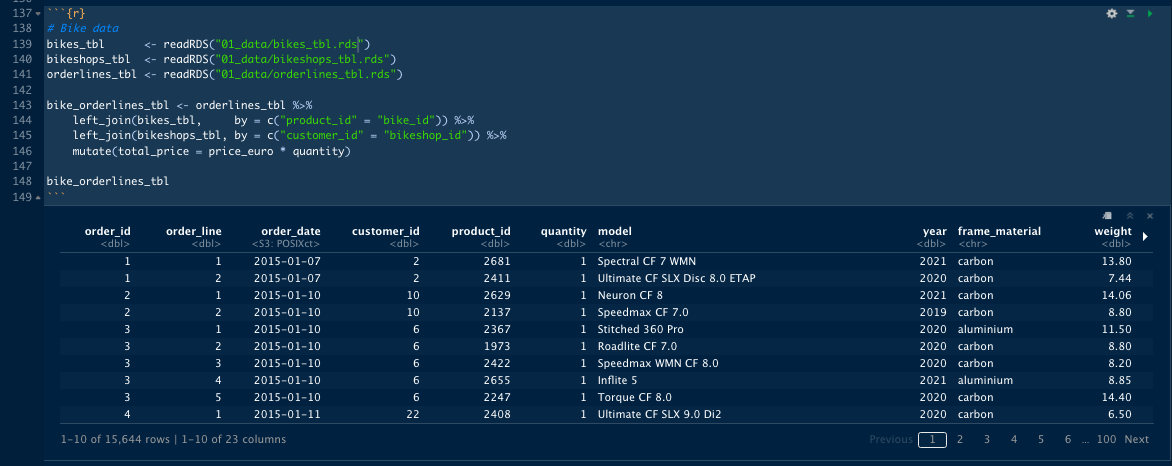
Now click the play button ![]() in line 35 to load the necessary libraries. Then go to line 139-141 and update the path. You should get an output like this:
in line 35 to load the necessary libraries. Then go to line 139-141 and update the path. You should get an output like this:
Now you should be able to create a HTML file by clicking on the arrow next to the knit button ![]() and by clicking on
and by clicking on Knit to HTML. If you click Knit to PDF you should get an error message:
Error: Functions that produce HTML output found in document targeting latex output.
This is because PDF will only work with static plots like the one from ggplot2. To resolve that error you have to comment out line 202. ggplotly() converts a ggplot into an interactive plot (will be discussed in the next section).
Let’s go through the .Rmd file and see how it’s broken up and see what options are available to you.
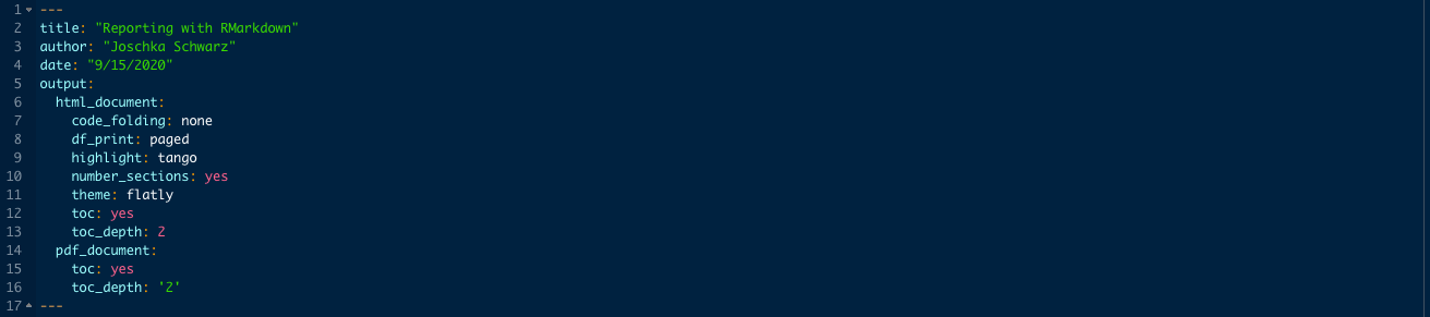
The upper part (the header) between the dashes is the YAML section, that controls your document properties. There is the information like title, author and date and some output information. If you create a rmd document (New File -> R Markdown), it may not look like this with all of these options put in here. I have reformatted these outputs based on what I want to produce. Right now it is set up to produce a pdf document (whatever is first in the outputs is going to be produced). Many of those options are listed on the R Markdown cheat sheet on page 2, depending on the output:
code_folding: Can be set to show, hide, none. Know your audience: This option should be set depening on whether you send the document to technical audiences (e.g. data scientists) or to non-technical audiences (e.g. business leaders).df_print: default, kable, tibble, paged. For large datasets creating a pageable table might be a good idea.highlight: Specifies the syntax highlighting style. Supported styles include default, tango, pygments, kate, monochrome, espresso, zenburn, haddock, breezedark, and textmate. Pass null to prevent syntax highlighting.number_sections: Add section numbering to headerstheme: Specifies the Bootstrap theme to use for the page (themes are drawn from the Bootswatch theme library). Valid themes include default, cerulean, journal, flatly, darkly, readable, spacelab, united, cosmo, lumen, paper, sandstone, simplex, and yeti. Pass null for no theme (in this case you can use the css parameter to add your own styles).toc: Add a table of contents (TOC)toc_depth: Specify the depth of headers that it applies to
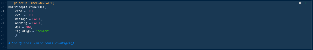
The second part is what we call a code chunk. This is one is a special code chunk because it is the set up. All of your rmarkdown documents run this part first to set up the socalled chunk options. This is just another way to control your document. Global options can be changed inside knitr::opts_chunk$set(), Local options can be changed inside each code chunk (you can see that in the second code chunk: {r, echo=FALSE}).
echo: Whether to echo (show) the source code in the output document (someone may not prefer reading your smart source code but only results). Tip: Use echo = FALSE globally when sending reports to Non-technical peopleeval: Whether to evaluate a code chunk. Toggles whether or not to run the code.results: When set to ‘hide’, text output will be hidden; when set to ‘asis’, text output is written “as-is”. Toggles whether or not to show output (text, tables, plots, etc.).
There are many more options you can control than we have not covered here. You can get them by running knitr::opts_chunk$get() in the console.
Information about how to format text, insert headers, text, lists and images can be found in the provided .Rmd file.
You can organize content using tabs by applying the .tabset class attribute to headers within a document (HTML). This will cause all sub-headers of the header with the .tabset attribute to appear within tabs rather than as standalone sections. Tabsets are great for building interactive reports with multiple plots. For example:
## Quarterly Results {.tabset}

### By Product

(tab content)

### By Region

(tab content)
You can also specify two additional attributes to control the appearance and behavior of the tabs. The .tabset-fade attribute causes the tabs to fade in and out when switching between tabs. The .tabset-pills attribute causes the visual appearance of the tabs to be “pill” rather than traditional tabs. For example:
## Quarterly Results {.tabset .tabset-fade .tabset-pills}
II. Plotly
Let’s switch gears and move on to Plotly. Plotly’s R graphing library takes ggplot-plots a step further and converts them into dynamic, interactive and publication-quality graphs. Examples are line plots, scatter plots, area charts, bar charts, error bars, box plots, histograms, heatmaps, subplots, multiple-axes, and 3D (WebGL based) charts. It enables us to really investigate the data much easier than with a static plot.
In this section we are showing you how to create a custom interactive plotting function, that can adjust aggregation (sales trend: weekly, monthly, quarterly). It will be powered by plotly, that turns static ggplots into dynamic plots.
1. Preparing data for plotting
Let’s start by loading and joining the data. This time we are not using the stock information but some made up sales data (orderlines):
# INTERACTIVE PLOTS ----

# GOAL: DEVELOP INTERACTIVE PLOTS FOR A SALES REPORT

# LIBRARIES & DATA ----

# Main
library(tidyverse)
library(lubridate)

# Visualization
library(plotly)

bikes_tbl      <- readRDS("bikes_tbl.rds")
bikeshops_tbl  <- readRDS("bikeshops_tbl.rds")
orderlines_tbl <- readRDS("orderlines_tbl.rds")

bike_orderlines_tbl <- orderlines_tbl %>%
    left_join(bikes_tbl,     by = c("product_id" = "bike_id")) %>%
    left_join(bikeshops_tbl, by = c("customer_id" = "bikeshop_id")) %>%

    # Add the total price
    mutate(total_price = price_euro * quantity)
Let’s create two functions for the EURO formatting. We can use the scales::dollar and scales::dollar_format functions, but we have to adjust them to the euro format:
format_to_euro <- function(x, suffix = " €") {

  scales::dollar(x,
                 suffix       = suffix,
                 prefix       = "",
                 big.mark     = ".",
                 decimal.mark = ",")
}

euro_format <- function(scale        = 1,
                        prefix       = "",
                        suffix       = " €",
                        big.mark     = ".",
                        decimal.mark = ",") {

  scales::dollar_format(suffix       = suffix,
                        prefix       = prefix,
                        big.mark     = big.mark,
                        decimal.mark = decimal.mark,
                        scale        = scale)

}
After loading the data, we can bring it in the right format for plotting with ggplot. We only need the date and the total_price column. With those we can summarize the data to visualize the total sales by year, month, week etc. To do that we create a new feature date_rounded with the function floor_date() to round down the dates to month. To round them up, we can use ceiling_date().
For each datapoint we create a label, that contains the sales number in a currency format and the date in a readable way. This is going to be the hover text in the interactive plot. We can do that using the str_glue function. Remember, that everything in curved brackets is R code while concatenating.
# 1.0 TOTAL SALES BY MONTH ----

# 1.1 Preparing Time Series Data ----
# Monthly

total_sales_m_tbl <- bike_orderlines_tbl %>%

  select(order_date, total_price) %>%

  mutate(date_rounded = floor_date(order_date, unit = "month")) %>%

  group_by(date_rounded) %>%
  summarise(total_sales = sum(total_price)) %>%
  ungroup() %>%

  mutate(label_text = str_glue("Sales: {format_to_euro(total_sales)}
                                 Date: {date_rounded %>% format('%B %Y')}"))

total_sales_m_tbl
To explain the format() function go to
devhints.io/strftime. strftime stands for string format times and is a very common way to express dates. You can think of it like RegEx.
Try it out (as_datetime() converts character string to date-time format):
?format
# Scroll down to Details and go to to date-times (click format.POSIXct)
# All Abbreviations are listed here as well

"2011-01-01 00:00:00" %>% as_datetime() %>% format("%B %Y")
## [1] "January 2011"
Above we are using single quotes, because the entire expression is already wrapped into double quotes.
2. Create a static plot
Now that we have the date formatted in the way appropriate for our interactive plotting, we can create the code for the plot. The first step is the same as always. You will see, interactive plots are really easy if you know how to create ggplots.
# 1.2 Interactive Plot ----

# Step 1: Create ggplot with text feature

g1 <- total_sales_m_tbl %>%
  ggplot(aes(x = date_rounded, y = total_sales)) +

  # Geoms
  geom_point() +
  geom_smooth(method = "loess", span = 0.2) +

  # Formatting

  # Convert scale to euro format
  scale_y_continuous(labels = euro_format()) +

  # Make sure 0 will always be shown (even if the data is far away)
  expand_limits(y = 0) +

  labs(
    title = "Total Sales",
    y = "Revenue (EUR)",
    x = ""
  )

g1
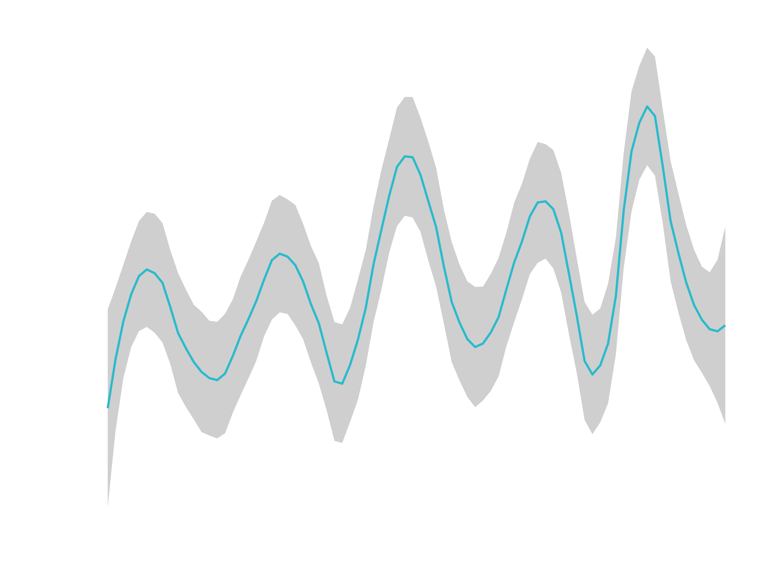
3. Create a dynamic plot
Make the static plot dynamic is pretty easy. Just put the plot into ggplotly() and hit enter. You will see as you hover over each of the points it’s got the date_rounded and the total_sales information.
# Step 2: Use ggplotly()
ggplotly(g1)
The only issue is that the hover text is not showing the way that we want. We want to show the label text, which we have created earlier. Setting up the hover text is easy. Just set aes(text = label_text) in ggplot then set tooltip = “text” in ggplotly. In short, we have to replace the geom_point() line with geom_point(aes(text = label_text)). You will get a warning (Ignoring unknown aesthetics: text). You can ignore that.
ggplotly(g1, tooltip = "text")
To make it more flexible, let’s wrap it into a custom time series function:
# 1.3 Plot Total Sales Function ----

plot_total_sales <- function(unit = "month", date_format = "%B %Y", interactive = TRUE) {

  # Handle Data
  data_tbl <- bike_orderlines_tbl %>%

    select(order_date, total_price) %>%

    mutate(date_rounded = floor_date(order_date, unit = unit)) %>%

    group_by(date_rounded) %>%
    summarise(total_sales = sum(total_price)) %>%
    ungroup() %>%

    mutate(label_text = str_glue("Sales: {format_to_euro(total_sales)}
                                 Date: {date_rounded %>% format(date_format)}"))

  # Make Plot
  g1 <- data_tbl %>%
    ggplot(aes(x = date_rounded, y = total_sales)) +

    # Geoms
    geom_point(aes(text = label_text), color = "#2C3E50") +
    geom_smooth(method = "loess", span = 0.2) +

    # Formatting
    scale_y_continuous(labels = euro_format()) +
    expand_limits(y = 0) +
    labs(
      title = "Total Sales",
      y = "Revenue (Euro)",
      x = ""
    )

  # Static vs Interactive Logic
  if (interactive) {
    return(ggplotly(g1, tooltip = "text"))
  } else {
    return(g1)
  }

}
# 1.4 Test Our Function ----

plot_total_sales(unit = "weekly", date_format = "%B %d, %Y", interactive = TRUE)

plot_total_sales(unit = "monthly", date_format = "%B %Y", interactive = TRUE)
Exercise
Reproduce this function, but this time make a faceted plot, that visualizes the sales by category 2
Step 1: Prepare the data. Next to order_date and total_price, we need category_1 and category_2. Watch out how to group the data.
Hint 1.1 (Factoring the category_2 column)
For the faceted plot, the category_2 column has to be factored and reordered by date_rounded first and then total_sales second.
mutate(category_2 = as_factor(category_2) %>%
           fct_reorder2(date_rounded, total_sales))
Hint 1.2 (Complete data preparation):
# 2.0 CATEGORY 2 SALES BY MONTH ----
# 2.1 Preparing Time Series Data ----
category_2_sales_m_tbl <- bike_orderlines_tbl %>%
  select(order_date, category_1, category_2, total_price) %>%
  mutate(date_rounded = floor_date(order_date, unit = "month")) %>%
  group_by(date_rounded, category_1, category_2) %>%
  summarise(total_sales = sum(total_price)) %>%
  ungroup() %>%
  mutate(label_text = str_glue("Sales: {format_to_euro(total_sales)}
                                 Date: {date_rounded %>% format('%B %Y')}")) %>%
  mutate(category_2 = as_factor(category_2) %>%
           fct_reorder2(date_rounded, total_sales))
Step 2: Make a faceted plot and use ggplotly().
Hint 2:
# 2.2 Interactive Plot ----
# Step 1: Create ggplot
g2 <- category_2_sales_m_tbl %>%
  ggplot(aes(x = date_rounded, y = total_sales, color = category_2)) +
  # Geoms
  geom_point(aes(text = label_text)) +
  geom_smooth(method = "loess", span = 0.2) +
  facet_wrap(~ category_2, scales = "free_y", ncol = 3) +
  # Formatting
  expand_limits(y = 0) +
  theme(legend.position = "none",
        # Change the height so the text looks less squished
        strip.text.x = element_text(margin = margin(5, 5, 5, 5, unit = "pt"))) +
  scale_y_continuous(labels = euro_format(scale = 1e-3, suffix = "K €")) +
  labs(
    title = "Sales By Category 2",
    y = "", x = ""
  )
# Step 2: Use ggplotly()
ggplotly(g2, tooltip = "text")
Step 3: Make it a function, which is really flexible in terms of inputs. You can use these default arguments as a starting point:
plot_categories <- function(category_1 = "All", category_2 = "All",
                            unit = "month", date_format = "%B %Y",
                            ncol = 1, scales = "free_y",
                            interactive = TRUE) { }

# Examples of running the function (Use | as an OR operator)
plot_categories(category_1 = "All",
                category_2 = "(Gravel|Cyclo|Fat)",
                unit = "month",
                ncol = 1,
                scales = "free_y",
                date_format = "%Y-%m-%d")

plot_categories(category_1 = "All",
                category_2 = "Endurance",
                unit = "day",
                ncol = 1,
                scales = "free_y",
                date_format = "%Y-%m-%d")

plot_categories(category_1 = "(Gravel|Mountain)",
                category_2 = "All",
                unit = "quarter",
                ncol = 2,
                scales = "free_y",
                date_format = "%Y-%m-%d")
Hint 3.1: Handling inputs for category_1 and category_2
# Handle Inputs
  cat_1_text <- str_to_lower(category_1)
  cat_2_text <- str_to_lower(category_2)
  # Create Filter Logic
  if (cat_1_text != "all") {
    data_tbl <- data_tbl %>%
      filter(category_1 %>%
               str_to_lower() %>%
               str_detect(pattern = cat_1_text))
  }
  if (cat_2_text != "all") {
    data_tbl <- data_tbl %>%
      filter(category_2 %>%
               str_to_lower() %>%
               str_detect(pattern = cat_2_text))
  }
Hint 3.2: Complete Function
# 2.3 Plot Categories Function ----
plot_categories <- function(category_1 = "All", category_2 = "All",
                            unit = "month", date_format = "%B %Y",
                            ncol = 1, scales = "free_y",
                            interactive = TRUE) {
  # Handle Data
  data_tbl <- bike_orderlines_tbl %>%
    select(order_date, category_1, category_2, total_price) %>%
    mutate(date_rounded = floor_date(order_date, unit = unit)) %>%
    group_by(date_rounded, category_1, category_2) %>%
    summarise(total_sales = sum(total_price)) %>%
    ungroup() %>%
    mutate(label_text = str_glue("Sales: {format_to_euro(total_sales)}
                                 Date: {date_rounded %>% format(date_format)}")) %>%
    mutate(category_2 = as_factor(category_2) %>%
             fct_reorder2(date_rounded, total_sales))
  # Handle Inputs
  cat_1_text <- str_to_lower(category_1)
  cat_2_text <- str_to_lower(category_2)
  # Create Filter Logic
  if (cat_1_text != "all") {
    data_tbl <- data_tbl %>%
      filter(category_1 %>%
               str_to_lower() %>%
               str_detect(pattern = cat_1_text))
  }
  if (cat_2_text != "all") {
    data_tbl <- data_tbl %>%
      filter(category_2 %>%
               str_to_lower() %>%
               str_detect(pattern = cat_2_text))
  }
  # Make Plot
  g2 <- data_tbl %>%
    ggplot(aes(x = date_rounded, y = total_sales, color = category_2)) +
    # Geoms
    geom_point(aes(text = label_text), color = "#2c3e50") +
    geom_smooth(method = "loess", span = 0.2) +
    facet_wrap(~ category_2, scales = scales, ncol = ncol) +
    # Formatting
    expand_limits(y = 0) +
    theme(legend.position = "none",
          strip.text.x = element_text(margin = margin(5, 5, 5, 5, unit = "pt"))) +
    scale_y_continuous(labels = euro_format(scale = 1e-3, suffix = "K €")) +
    labs(
      title = "Sales By Category 2",
      y = "", x = ""
    )
  # Static Vs Interactive Logic
  if (interactive) {
    return(ggplotly(g2, tooltip = "text"))
  } else {
    return(g2)
  }
}
A way to save your functions:
# 3.0 SAVE FUNCTIONS ----
# 3.1 Create a file
fs::file_create("00_scripts/plot_sales.R")

# 3.2 Save funtions to the file
dump(list = c("plot_total_sales", "plot_categories", "format_to_euro", "euro_format"), file = "00_scripts/plot_sales.R")
III. Flexdashboard
Dashboards are particularly common in business-style reports. They can be used to highlight brief and key summaries of a report. The layout of a dashboard is often grid-based, with components arranged in boxes of various sizes.
With the flexdashboard package, you can
- Use R Markdown to publish a group of related data visualizations as a dashboard.
- Embed a wide variety of components including HTML widgets, R graphics, tabular data, gauges, value boxes, and text annotations.
- Specify row or column-based layouts (components are intelligently re-sized to fill the browser and adapted for display on mobile devices).
- Create story boards for presenting sequences of visualizations and related commentary.
- Optionally use Shiny to drive visualizations dynamically.
Everything you need to know can be found here:
Learning Objectives
- Gain familiarity with flexdashoboard
- Make a chloropleth map using plotly (Chloropleth map: Maps that cover geographic boundaries)
Before you start you have to install the package:
install.packages("flexdashboard")
We are going to create a basic flexdashboard app for our sales analysis. To author a dashboard, you can create a document from within RStudio using the File -> New File -> R Markdown dialog, and choosing a “Flex Dashboard” template.
Make sure to save the template, that you have just openend. You can hit the knit button to see what happens. It will just open the basic framework for flexdashboard. You can also pop it out to view it in you browser. Flexdashboard is just a layout / container for an app. A way of organizing the information we want to display. That layout is built using RMarkdown. User inputs are added with Shiny (will talk about it down the road).
The basic template comes with 3 Charts. You can add as many as you want (by adding columns and charts) and control their sizing with the orientation argument in the header and the data-height / data-width values in the columns. Orientation can be set to either rows or columns. If you set vertical_layout: fill, the data-heights are applied proportionally. If it is set to scroll, the exact numbers of pixels are applied. Charts can be stacked by adding .tabset to the curved brackets after Column (e.g. {data-heigth=650 .tabset}). .tabset .tabset-fade does work as well. Using multiple pages is another way of organizing the data in your dashboard.
Just check out the following example to see which commands control which options. This is a template for a multi-page app structure with Side Bar.
Let’s start to create an one page app, that is going to be a sales dashboard. At this point we will be using only flexdashboard together wit plotly. But eventually we will be integrating shiny and other technologies on top of it, that will really build a functioning app.
Step 1: Initialize the layout
Initiliaze a new Rmarkdown file with the following header:
---
title: "Sales Dashboard"
output:
  flexdashboard::flex_dashboard:
    orientation: columns
    vertical_layout: fill
---
Step 2: Load the libraries
Next to the mandatory flexdashboard package and the known packages tidyverse and plotly, we need raster and sf to be able to plot polygons. The goal is to visualize the states of Germany to show which states generate the biggest revenue.
Additionally, we need to load the function format_to_euro() to display the values in a euro format. We can do that by sourcing the R script, which we have saved earlier.
```{r setup, include=FALSE}
library(flexdashboard)

# Core
library(tidyverse)

# Interactive Visualizations
library(plotly)

# Spatial Data
library(raster)
library(sf)

# Currency formatting
source("00_scripts/plot_sales.R")
```
Step 3: Code preparation
You can knit the document already at this point, but because we didn’t put anything into it, you will only see the canvas with the title. Let’s create some input. Load and join the bike data (Joins can take a long time with large data, and therefore should not be performed inside your Web App. It would be better to have a database backend and perform the joins there. But for now, we can do it inside the App). Watch out to adjust your pathes. After that we are loading and transforming the spatial data for Germany.
```{r}
# Bike data
bikes_tbl      <- readRDS("01_data/bikes_tbl.rds")
bikeshops_tbl  <- readRDS("01_data/bikeshops_tbl.rds")
orderlines_tbl <- readRDS("01_data/orderlines_tbl.rds")

bike_orderlines_tbl <- orderlines_tbl %>%
    left_join(bikes_tbl,     by = c("product_id" = "bike_id")) %>%
    left_join(bikeshops_tbl, by = c("customer_id" = "bikeshop_id")) %>%
    mutate(total_price = price_euro * quantity)

# German spatial data
germany_sp <- getData('GADM', country='DE', level=1)
# Convert SpatialPolygonsDataFrame to an sf dataframe
germany_sf <- st_as_sf(germany_sp) %>%
                  # Add english names
                  mutate(VARNAME_1 = ifelse(is.na(VARNAME_1), NAME_1, VARNAME_1))
```
Step 4: Wrangle and plot data in a new section
Take a look at the germany_sf object. It has already all the information to plot the map. But we still need the revenue information aggregated per state so that we can see the information as we hover over a state. We just need to group and summarize the bike data, join it with the geographic data and create labels for the hover texts. The wrangled data can then be plotted with the plot_ly() function. In the arguments of plot_ly() we use the ~ to specify which column to use. Plotly can use Brewer color palettes for the color schemes (e.g. “Blues”).
Column {data-width=1000}
---------------------------------------------------------------

### By State
```{r}
geo_plot_tbl <- bike_orderlines_tbl %>%
                  group_by(state) %>%
                  summarise(total_revenue = sum(total_price)) %>%
                  ungroup() %>%
                  right_join(germany_sf, by = c("state" = "VARNAME_1")) %>%
                  mutate(total_revenue = ifelse(is.na(total_revenue), 0, total_revenue)) %>%
                  mutate(label_text = str_glue("State: {state}
                                         Revenue: {format_to_euro(total_revenue)}")) %>%
                  # Convert back to an sf object, that can be plotted
                  st_as_sf()
```

```{r}
plot_ly(geo_plot_tbl,
        split      = ~NAME_1,
        color      = ~total_revenue,
        colors     = "Blues",
        stroke     = I("black"),
        hoverinfo  = 'text',
        text       = ~label_text,
        hoveron    = "fills",
        showlegend = FALSE)
```
The final script:
In the following section we’ll see how we can integrate further functionalities and reactivity to our dashboard using shiny.
IV. Shiny
Shiny is an R package that makes it easy to build interactive web apps straight from R. You can host standalone apps on a webpage or embed them in R Markdown documents or build dashboards. You can also extend your Shiny apps with CSS themes, htmlwidgets, and JavaScript actions.
A Shiny app is mainly two components:
- a user interface component (UI) defining the front end of the app. It’s responsible of displaying components on the web page. Components may be inputs (slider, dropdown menus, buttons, check boxes, text, …) or outputs (graphs, tables, text, …). Interactions with input components are detected and may modify outputs via the server component.
- a server component playing the role of the back end of the app. It’s responsible of preparing data and generating graphs reflecting user interactions.
Resources
- Cheatsheet: shiny-cheatsheet.pdf
- Shiny Widget Gallery / User Interface components:
widget-gallery
- You can get the code for each of these UI Components, which makes it really easy to copy and paste components
- Additional shiny widgets: dreamrs.github.io/shinyWidgets/index.html
- HTML Widgets: htmlwidgets for R
- shinyjs: shinyjs
Let’s start with a shiny tutorial. To get a first impression download the following file:
The first thing to mention is: there is an additional piece of code in the YAML: runtime: shiny. This enables using the shiny server to power your flexdashboard app (as opposed to rmarkdown rendering as HTML). That enables viewers to change underlying parameters and see the results immediately.
---
title: "Shiny Tutorial"
output:
  flexdashboard::flex_dashboard:
    orientation: columns
    vertical_layout: fill
runtime: shiny
---
If you want you can hit the Run Document Button. It will show you how the document will look like. We will fill the empty boxes in the next steps. Note that RMarkdown tab is “spinning”. This is because Shiny is running as a server process. Click the stop button if you want to stop it.
The steps required to add Shiny components to a flexdashboard are as follows:
- Add
runtime: shinyto the options declared at the top of the document (YAML front matter). - Add the
{.sidebar}attribute to the first column of the dashboard to make it a host for Shiny input controls (note this step isn’t strictly required, but many Shiny based dashboards will want to do this). - Add Shiny inputs and outputs as appropriate.
- When including plots, be sure to wrap them in a call to
renderPlot(). This is important not only for dynamically responding to changes but also to ensure that they are automatically re-sized when their container changes.
Before we start, let’s create some random data (code is already present in the document):
```{r}
# Make data
set.seed(123)
sales_data_tbl <- tibble(
  date  = seq.Date(from = ymd("2018-01-01"), to = today(), length.out = 90),
  class = sample(c("marketing", "sales", "research"), size = 90, replace = TRUE),
  sales = runif(n = 90, min = 1, max = 100)
)
```
1. Checkbox Input
To create a Checkbox group we are using the function checkboxGroupInput(). It creates a UI (User Interface) Checkbox Component that users can toggle on an off for multiple choices.
The Shiny package makes available a wide variety of functions for creating inputs, a few of them include:
| R Function | Input Type |
|---|---|
| selectInput | A box with choices to select from |
| sliderInput | A slider bar |
| radioButtons | A set of radio buttons |
| textInput | A field to enter text |
| numericInput | A field to enter numbers |
| checkboxInput | A single check box |
| dateInput | A calendar to aid date selection |
| dateRangeInput | A pair of calendars for selecting a date range |
| fileInput | A file upload control wizard |
In our case for the checkboxGroupInput, we need the arguments
inputId: A unique ID that we use to refer to the input typically as intput$inputId.label: Display label for the controlchoices: List of values to show checkboxes for. If elements of the list are named then that name rather than the value is displayed to the user.selected: The values that should be initially selected, if any.
h4() converts text into an h4 header.
We want the checkbox to filter down on the class column of our generated data above (the unique choices are marketing, research and sales). Place the following code below the first column, that includes the {.sidebar} attribute:
```{r}
# Inputs
checkboxGroupInput(inputId = "checkbox_group",
                   label   = h4("Checkbox Group"),
                   choices = c("Marketing" = "marketing",
                               "R&D"       = "research",
                               "Sales"     = "sales"),
                   selected = c("marketing", "research", "sales"))
```
That has generated the UI component. Next we need to do something with that component. When you use Shiny within a flexdashboard you’ll be making use of both input elements (e.g. sliders, checkboxes, etc.) and output elements (plots, tables, etc.). Input elements are typically presented within the sidebar and outputs within flexdashboard content panes (it’s also possible to combine inputs and outputs in a single pane).
Outputs react to changes in input by running their render code and displaying updated output. The Shiny package also includes a wide variety of render functions, including:
| R Function | Output Type |
|---|---|
| renderPlot | R graphics output |
| renderPrint | R printed output |
| renderTable | Data frame, matrix, other table like structures |
| renderText | Character vectors |
Let’s output the selection in the pane Checkbox Output. To do that, we have to fill out the code chunk and link it to our checkbox group. To output the selection, we can use renderPrint(). It renders the printed output generated from a reactive expression.
input is a special object (list) that keeps track of all UI components. input allows us to refer to them in render functions using the format: input$inputId.
The checkboxGroupInput call makes a checkbox input named “checkbox_group” available. The renderPrint() function is then able to access the values of the “checkbox_group” input via the expression input$checkbox_group.
Column {data-width=500}
-----------------------

### Section - Checkbox Output

```{r}
renderPrint(input$checkbox_group)
```
If you run the document now, you should be able to see the output. We don’t only want to see the output. We want to return the output, to be able to do something with it. Typically for a checkbox input is filtering some data.
output is a special object (list) that keeps track of all rendered objects. output allows us to refer to them in Output functions using the format: output$Id
Let’s assign the rendered values in the output and give them the Id checkbox_values. This is done via the $ sign. After that we can do stuff with it. E.g. printing it again with textOutput().
Column {data-width=500}
-----------------------

### Section - Checkbox Output

```{r}
output$checkbox_values <- renderPrint(input$checkbox_group)

textOutput(outputId = "checkbox_values")
```
2. Date range Input
Ok, now let’s try a different type of input. A data range input. We can put the code in the input section and use the following arguments:
inputId: Id to acces the value.label: Display label for the control.start: The initial start date.end: The initial end date.min: The minimum allowed date, the user can input. We can just apply the minum date in our data.max: The maximum allowed date, the user can input. We can just apply the maximum date in our data.startview: The date range shown when the input object is first clicked. Can be “month” (the default), “year”, or “decade”.
dateRangeInput(inputId = "date_range",
               label   = h4("Date Range"),
               start   = "2018-01-01",
               end     = today(),
               min     = min(sales_data_tbl$date),
               max     = max(sales_data_tbl$date),
               startview = "year")
The output is very similar to last time.
### Section - Date Range

```{r}
output$date_range_values <- renderPrint(input$date_range)

textOutput(outputId = "date_range_values")
```
3. Slider Input
For the next input below the date range input we are using sliderInput(). This generates a UI component for a Slider or Slider Range, with which we can filter or sales values.
sliderInput(inputId = "slider_input",
            label   = h4("Slider Range"),
            min     = 1,
            max     = 100,
            value   = c(40, 60), # Initial values of the slider
            step    = 1, # Interval between each selectable value
            round   = TRUE, # Round to the nearest integer
            pre     = "$")
For the slider output we follow the same pattern that we have done before:
### Section - Slider Output

```{r}
output$slider_values <- renderPrint(input$slider_input)

textOutput(outputId = "slider_values")
```
4. Reactive Output
Now you have a good understanding of the reactivity from just utilizing the inputs. But what we next need to learn is how to actually use these inputs to modify our data in some way. We want to be able to apply a reactive output that filters our data.
reactive()turns a normal expression (e.g. modifying data with the tidyverse) into a reactive expression (one that changes over time as the user uses the input). Use brackets {} to tell R that the function argument will need to go on multiple lines.filter()filters row-wise by providing an expression that can be evaluated as TRUE/FALSE.%in%determines which values are in a vector of values, returning TRUE/FALSE if the value is in or not in the vector of values.between()is used to return a logical value if the data is between to values. Great for filtering by a date range.ymd()transforms dates stored in character and numeric vectors to Date objects
Column {data-width=750}
-----------------------

```{r}
# Reactive Filter
sales_data_filtered <- reactive({

  sales_data_tbl %>%
    filter(class %in% input$checkbox_group) %>%
    filter(date %>% between(left  = ymd(input$date_range[1]),
                            right = ymd(input$date_range[2]))) %>%
    filter(sales %>% between(left  = input$slider_input[1],
                             right = input$slider_input[2]))
})

```
We can use renderPrint(), renderTable() (renders a dataframe or tibble as a basic HTML table) or renderDataTable() (renders a dataframe or tibble as a JavaScript Data Table) from the DT package to display the reactive output. Reactive Outputs must have parenthesis. This is a major source of errors, forgetting to use parenthesis (e.g. sales_data_filtered()).
We could just add DT::renderDataTable(expr = sales_data_filtered() ) to our code and we would get an output. But we are not able to scroll down in the app. To add a scrollbar, we have to modify the options argument of the function. Check ?renderDataTable or
rstudio.github.io/DT/options.html for further information. We can also modify the output with a mutate function, because it is basically just a dataframe. Let’s format the numbers to dollar values in this step.
Even though it’s not always necessary, it’s a good idea to get in the habbit of saving rendered output as output$outputId. DTOutput() outputs a rendered data table using it’s unique outputId.
### Section - Reactive Output

```{r}
#  renderPrint( sales_data_filtered() )

output$dt_output_1 <- DT::renderDataTable(expr = {

  sales_data_filtered() %>%
    mutate(sales = scales::dollar(sales))

}, options = list(scrollY = "250px"))

DTOutput(outputId = "dt_output_1")
```
Try for yourself to add another DT output to the Section “Reactive Summary”. It should show the summarized sales for each department.
### Section - Reactive Summary
```{r}
output$dt_output_2 <- DT::renderDataTable(expr = {
  sales_data_filtered() %>%
    group_by(class) %>%
    summarise(total_revenue = sum(sales)) %>%
    ungroup() %>%
    mutate(total_revenue = scales::dollar(total_revenue))
}, options = list(scrollY = "250px"))
DTOutput(outputId = "dt_output_2")
```
5. Reset Button
Here we show you how to create a reset button to toggle back all these user inputs to the defaults. We can create a button that when pressed does something by using the function actionButton(). We just need to give it an inputId and a label. We can also include an icon with the icon() function. The function connects to the Font Awesome Library and Glyphicons Library. Use ?icon to check how you can see a lists of available icons.
```{r}
# Reset Button
actionButton(inputId = "reset",
             label   = "Reset",
             icon    = icon("sync"))
```
To trigger a reaction when the button is pressed, we use the function observeEvent(). It responds to “events” (e.g. Button Clicks). The response goes to the handlerExpr argument and the inputId to the eventExpr argument.
Every UI Input has an updateInput() function (e.g. sliderInput() has updateSliderInput()). With those functions we can set the input to the default values. The session argument is always session, the inputId argument corresponds to the Id of the object, which we are changing, and the others change the values. You can put the following code underneath the actionButton.
observeEvent(eventExpr = input$reset, handlerExpr = {

  updateCheckboxGroupInput(session  = session,
                           inputId  = "checkbox_group",
                           selected = c("marketing", "research", "sales"))

  updateDateRangeInput(session = session,
                       inputId = "date_range",
                       start   = "2018-01-01",
                       end     = today())

  updateSliderInput(session = session,
                    inputId = "slider_input",
                    value   = c(40, 60))


})
That’s it. Now you are ready for your last challenge!
Challenge
RMarkdown
Create a Rmd document, that can generate a pdf and a html output. The generated pdf report should look like this …
… and the html report like this:
Shiny
Take the flexdashboard, which we have created in this session (with the German map), make it reactive and add shiny components to it. It does not necessarily has to look like the following, but it should have a selection function for the Bike Type (category_1) and for the Bike Family (category_2) and a date range slider. For the bike selection tools, I have used shinyWidgets::checkboxGroupButtons(), shinyWidgets::pickerInput(). Check
dreamrs.github.io/shinyWidgets/index.html
to see the code. Using the shinyWidgets package is optional, you can also use the built in checkboxes. Use renderPlotly() and plotlyOutput() to plot the map reactively. Don’t forget to put runtime: shiny at the top of the Rmarkdown file.
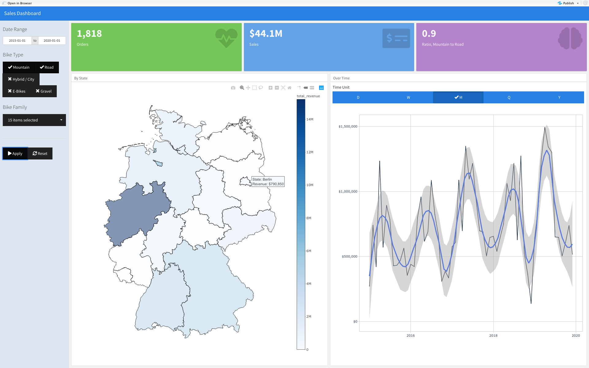
The other functions, that I have used were: shinyWidgets::radioGroupButtons() and renderValueBox().