Explaining Black-Box Models With LIME
Despite widespread adoption, machine learning models remain mostly black boxes. Understanding the reasons behind predictions is, however, quite important in assessing trust, which is fundamental if one plans to take action based on a prediction, or when choosing whether to deploy a new model. In this session, we take the H2O models we’ve developed and show you how to explain localized prediction results using a special technique called LIME (Local Interpretable Model-Agnostic Explanations).
In this short session, you will learn:
- How to make an explainer using the
lime()function for single and multiple employees - How to make an explanation using the
explain()function for single and multiple employees - How to visualize model explanations using
plot_features()(one or a small number of observations) andplot_explanations()(for many observations)
Theory Input
Machine learning models are often considered “black boxes” due to their complex inner-workings. More advanced ML models such as random forests, gradient boosting machines (GBM), artificial neural networks (ANN), among others are typically more accurate for predicting nonlinear, faint, or rare phenomena. Unfortunately, more accuracy often comes at the expense of interpretability, and interpretability is crucial for business adoption, model documentation, regulatory oversight, and human acceptance and trust. Luckily, several advancements have been made to aid in interpreting ML models.
Moreover, it’s often important to understand the ML model that you’ve trained on a global scale, and also to zoom into local regions of your data or your predictions and derive local explanations. Global interpretations help us understand the inputs and their entire modeled relationship with the prediction target, but global interpretations can be highly approximate in some cases. Local interpretations help us understand model predictions for a single row of data or a group of similar rows.
This session demonstrates how to use the lime package (install.packages("lime")) to perform local interpretations of ML models. This session will not focus on the theoretical and mathematical underpinnings but, rather, on the practical application of using lime.
The following video gives a good explanation of lime:
Business case
We are still working with our attrition data. Let’s load a H2O model from the alst time.
# LIME FEATURE EXPLANATION ----

# 1. Setup ----

# Load Libraries

library(h2o)
library(recipes)
library(readxl)
library(tidyverse)
library(tidyquant)
library(lime)

# Load Data
employee_attrition_tbl <- read_csv("datasets-1067-1925-WA_Fn-UseC_-HR-Employee-Attrition.csv")
definitions_raw_tbl    <- read_excel("data_definitions.xlsx", sheet = 1, col_names = FALSE)

# Processing Pipeline
source("00_Scripts/data_processing_pipeline.R")

employee_attrition_readable_tbl <- process_hr_data_readable(employee_attrition_tbl, definitions_raw_tbl)

# Split into test and train
set.seed(seed = 1113)
split_obj <- rsample::initial_split(employee_attrition_readable_tbl, prop = 0.85)

# Assign training and test data
train_readable_tbl <- training(split_obj)
test_readable_tbl  <- testing(split_obj)

# ML Preprocessing Recipe
recipe_obj <- recipe(Attrition ~ ., data = train_readable_tbl) %>%
                step_zv(all_predictors()) %>%
                step_mutate_at(c("JobLevel", "StockOptionLevel"), fn = as.factor) %>%
                prep()

recipe_obj

train_tbl <- bake(recipe_obj, new_data = train_readable_tbl)
test_tbl  <- bake(recipe_obj, new_data = test_readable_tbl)

# 2. Models ----

h2o.init()

automl_leader <- h2o.loadModel("04_Modeling/h20_models/StackedEnsemble_BestOfFamily_AutoML_20200903_144246")
automl_leader
Let’s move to the LIME section. To use lime we need our predictions.
h2o.predict()generates predictions using an H2O model and newdata as an H2O Frame.bind_cols()binds two data frames together column-wise (makes wider).
# 3. LIME ----

# 3.1 Making Predictions ----

predictions_tbl <- automl_leader %>%
    h2o.predict(newdata = as.h2o(test_tbl)) %>%
    as.tibble() %>%
    bind_cols(
        test_tbl %>%
            select(Attrition, EmployeeNumber)
    )

predictions_tbl
## # A tibble: 220 x 5
##    predict    No    Yes Attrition EmployeeNumber
##    <fct>   <dbl>  <dbl> <fct>              <dbl>
##  1 Yes     0.363 0.637  Yes                    1
##  2 No      0.863 0.137  No                    15
##  3 No      0.963 0.0374 No                    20
##  4 No      0.868 0.132  No                    21
##  5 No      0.952 0.0483 No                    38
##  6 No      0.808 0.192  No                    49
##  7 No      0.930 0.0696 No                    54
##  8 Yes     0.559 0.441  No                    61
##  9 Yes     0.412 0.588  No                    62
## 10 No      0.936 0.0640 No                    70
## # … with 210 more rows
Let’s investigate the 1st employee, that did indeed leave the company:
slice()selects specific rows by rownumber.
test_tbl %>%
    slice(1) %>%
    glimpse()
Lime for single explanation, Part 1:
LIME is used to determine which features contribute to the prediction (& by how much) for a single observation (i.e. local). h2o, keras & caret R packages have been integrated into lime. If you ever need to use an unintegrated package, you can do so by creating special functions: model_type(), predict_model(). Using Lime is is a 2 steps process:
- Build an explainer with
lime()(“recipe” for creating an explanation. It contains the ML model & feature distributions (bins) for the training data.) - Create an explanation with
explain()
lime()creates an “explainer” from the training data & the model object. The returned object contains the ML model and the feature distributions for the training data.First we have to remove the target feature: The H2O model does not use the
Attritioncolumn within the prediction set.Use
bin_continuousto bin the features. It makes it easy to detect what causes the continuous feature to have a high feature weight in the explanation.Use
n_binsto tell how many bins you want. Usually 4 or 5 is sufficient to describe a continuous feature.Use
quantile_binsto tell how to distribute observations with the bins. IfTRUE, cuts will be selected to evenly distribute the total observations within each of the bins.
# 3.2 Single Explanation ----

explainer <- train_tbl %>%
    select(-Attrition) %>%
    lime(
        model           = automl_leader,
        bin_continuous  = TRUE,
        n_bins          = 4,
        quantile_bins   = TRUE
    )

explainer
What is inside the explainer object?
- 1st argument is model. Passes model to the explain() function.
- 2nd set of arguments are selections for:
- bin_continuous
- n_bins
- quantile_bins
- use_density
- bin_cuts: stores the cuts for every feature that is “continuous” (numeric in feature_type)
Lime For Single Explanation, Part 2: Making an explaination with explain()
LIME Algorithm 6 Steps:
- Given an observation, permute it to create replicated feature data with slight value modifications.
- Compute similarity distance measure between original observation and permuted observations.
- Apply selected machine learnign model to predict outcomes of permuted data.
- Select m number of features to best describe predicted outcomes.
- Fit a simple model to the permuted data, explaining the complex model outcome with m features from the permuted data weighted by its similarity to the original observation.
- Use the resulting feature weights to explain local behaviour.
The data argument must match the format that the model requires to predict. Since h2o.predict() requires “x” to be without the target variable, we must remove.
Use lime::explain() since explain() is a common function used in other packages. You will get errors if the incorrect explain() function is used.
kernel_width: Affects the lime linear model fit (R-squared value) and therefore should be tuned to make sure you get the best explanations.
?lime::explain

explanation <- test_tbl %>%
    slice(1) %>%
    select(-Attrition) %>%
    lime::explain(

        # Pass our explainer object
        explainer = explainer,
        # Because it is a binary classification model: 1
        n_labels   = 1,
        # number of features to be returned
        n_features = 8,
        # number of localized linear models
        n_permutations = 5000,
        # Let's start with 1
        kernel_width   = 1
    )

explanation
In my case the R-squared value (model_r2) is a little bit low. This is what you want to look at for lime. This is how you investigate your lime models. You want those values as high as possible and you can adjust that using your kernel_width (0.5 or 1.5 gave me better results).
Let’s select the columns, that are important to us.:
explanation %>%
    as.tibble() %>%
    select(feature:prediction)
Because we have selected 8 features, the data lists the top 8 features. feature_value are the values, that were actually used when it ran the model (for example: Overtime is 2 and 2 would be yes. NumCompaniesWorked is 8 and 8 is the numeric value that the employee has worked and so on … ). feature_weight: Magnitude indicates importance. + / - indicates support or contradict. feature_desc is basically just a readable version of the feature importance. The last two columns contain the data that was used.
Visualizing feature importance for a single explanation
Let’s visuale it using plot_features():
g <- plot_features(explanation = explanation, ncol = 1)
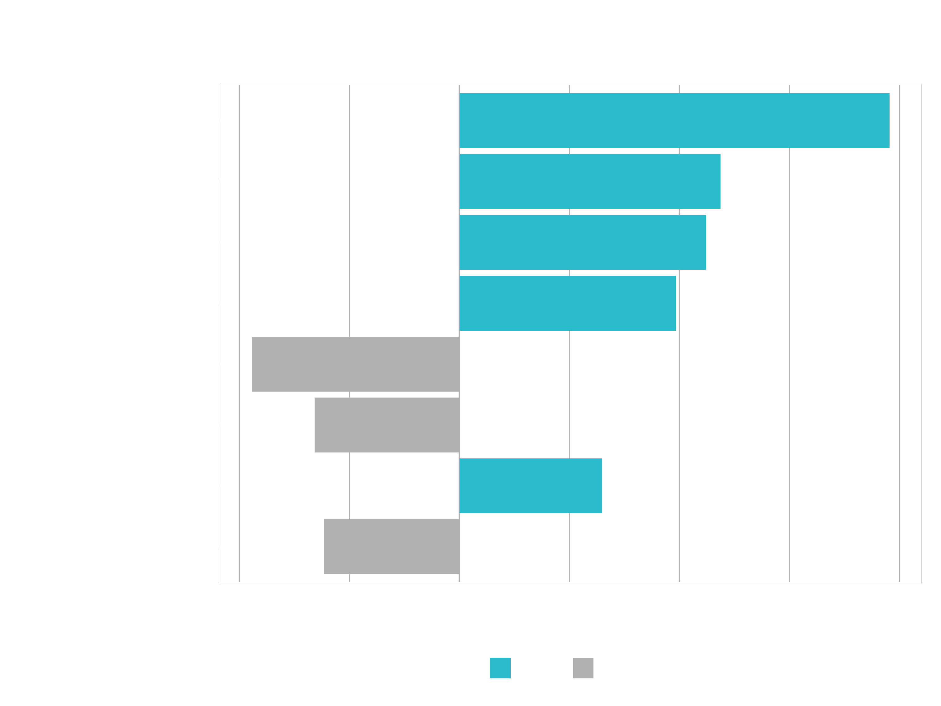
Info: 4 < NumCompaniesWorked Note that this label is the result of the continuous variable binning strategy. One of the cuts is at 4, which is how we get this label.
Visualizing Feature Importance For Multiple Explanations
Now we want to scale it up, because often times you are going to be looking at more than one feature that you want to try to explain. If you can do a single explanation, multiple explanations are not much more difficult. Just copy the code frome above and change the slice value:
# 3.3 Multiple Explanations ----

explanation <- test_tbl %>%
    slice(1:20) %>%
    select(-Attrition) %>%
    lime::explain(
        explainer = explainer,
        n_labels   = 1,
        n_features = 8,
        n_permutations = 5000,
        kernel_width   = 0.5
    )

explanation %>%
    as.tibble()

plot_features(explanation, ncol = 4)
The plot will be pretty messy. You can change that a little bit by expanding it. But it will still be a little bit messy and tough to read. It’s too much information to be reported for 20 different cases. If we did only 3 or 4 cases, we could analyze it that way. But for more cases we need a better method to analyze it. That’s why the next function comes into play plot_explanations():
plot_explanations(explanation)
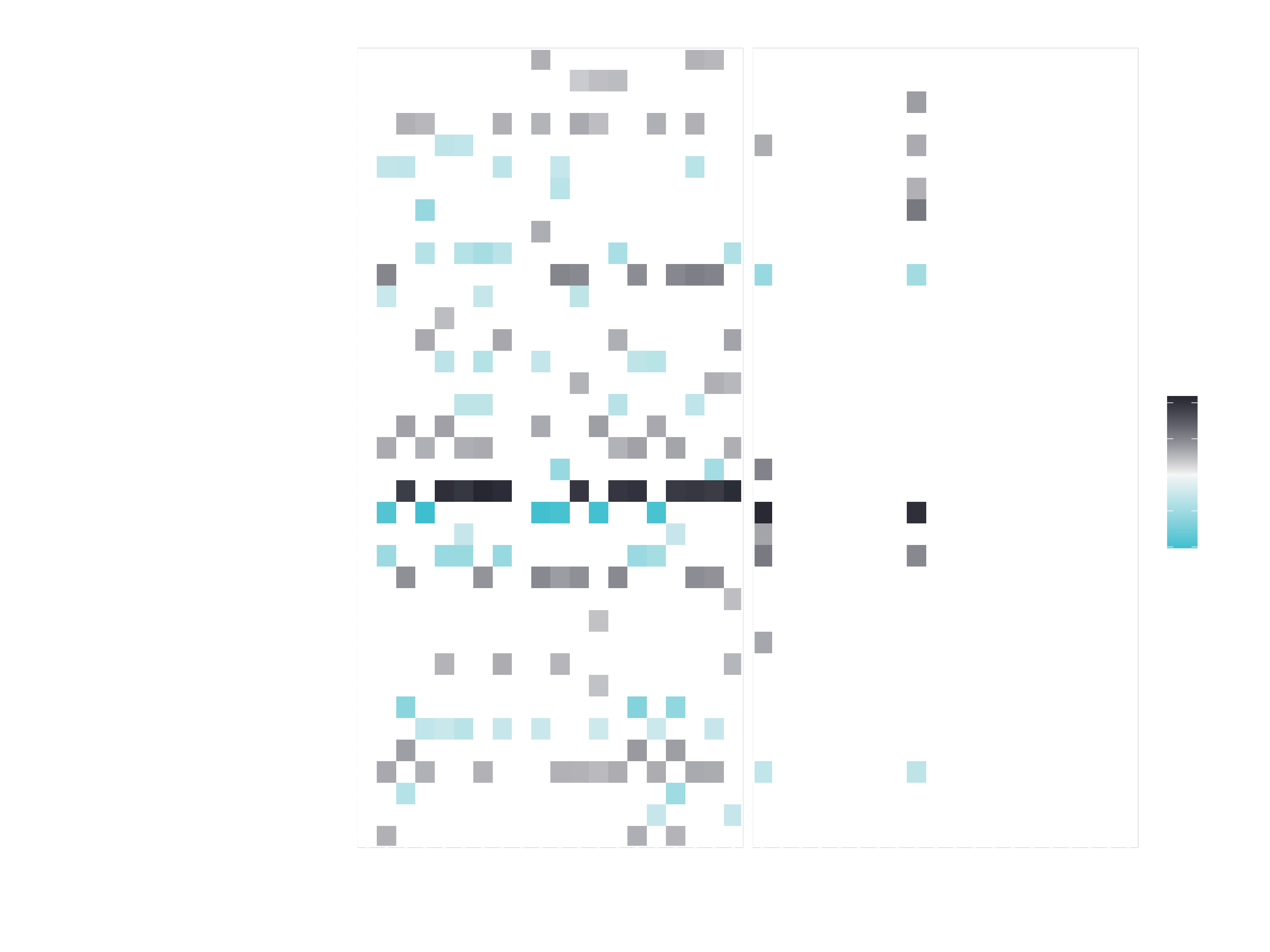
Can you read this plot?
Challenge
This is a two part challenge:
Part 1: Recreate plot_features(). Take the explanation data and use the first case to create a plot similar to the output of plot_features().
explanation %>%
  as.tibble()

case_1 <- explanation %>%
    filter(case == 1)

case_1 %>%
    plot_features()
You will need at least the layers geom_col() and coord_flip().
Bonus Objectives:
- Get your custom plot_features() function to scale to multiple cases
- Use theme arguments to modify the look of the plot
Part 2: Recreate plot_explanations():
Take the full explanation data and recreate the second plot.
You will need at least the layers geom_tile() and facet_wrap().
HINTS:
If you do get stuck on this challenge, because this is actually a rather difficult challenge, I highly recommend checking out the library lime from Thomas Pedersens’ github page
https://github.com/thomasp85/lime. All of the R code is in the folder R. Check that out if you got stuck. You will be able to find some hints in there as to how Thomas did it when he coded the lime package. When coding in the wild, your best friend is GitHub. Use other people’s code as an advantage. Learn from what they do.