Automated Machine Learning with H20 (II)
In this chapter, we shift gears into the third CRISP-DM Step: Data Preparation. We are making our transition into modeling with H2O. In this chapter, you will learn:
- How to create a preprocessing pipeline to iteratively combine data into a human readable format
- How to use the recipes package for preparing the data in a machine readable format (recap)
- How to perform a Correlation Analysis, which helps make sure we have good features before spending time on modeling
- How to make predictions with H2O Automated Machine Learning (primary modeling package and function that we implement in this session)
There is no theory section in this session. Everything is explained at the appropriate place.
Business case
Data processing
Let’s create a processing pipeline for the data from the last session. We want to get the data ready for people and for machines.
# Load data
library(tidyverse)
library(readxl)

employee_attrition_tbl <- read_csv("datasets-1067-1925-WA_Fn-UseC_-HR-Employee-Attrition.csv")
definitions_raw_tbl    <- read_excel("data_definitions.xlsx", sheet = 1, col_names = FALSE)
View(definitions_raw_tbl)
The definitions table has to columns:
...1= Feature Name...2= Feature Code + Feature Description
These are actually multiple non-tidy data sets stored in one file!
1. Make data readable (for people readibiltiy)
If you plot Education for example, you only see the numbers from 1-5:
employee_attrition_tbl %>%
        ggplot(aes(Education)) +
        geom_bar()
That means we have to merge both data sets and make them tidy.
Merging Data Part 1: Tidying the data
fill()replaces missing values (NAs) with the closest entry (previous if .direction = “down” or next if. direction = “up”)
# Data preparation ----
# Human readable

definitions_tbl <- definitions_raw_tbl %>%
  fill(...1, .direction = "down") %>%
  filter(!is.na(...2)) %>%
  separate(...2, into = c("key", "value"), sep = " '", remove = TRUE) %>%
  rename(column_name = ...1) %>%
  mutate(key = as.numeric(key)) %>%
  mutate(value = value %>% str_replace(pattern = "'", replacement = ""))
definitions_tbl
Merging Data Part 2: Mapping over lists
These are actually multiple data sets stored in one data frame. These need to be integrated separately into the training and testing data sets.
split()splits a data frame into multiple data frames contained within a list. Supply a column name as a vector (meaning .$column_name)
# DATA PREPARATION ----
# Human readable ----

definitions_list <- definitions_tbl %>%

  # Mapping over lists

  # Split into multiple tibbles
  split(.$column_name) %>%
  # Remove column_name
  map(~ select(., -column_name)) %>%
  # Convert to factors because they are ordered an we want to maintain that order
  map(~ mutate(., value = as_factor(value)))

# definitions_list[[1]]
definitions_list[["Education"]]
## # A tibble: 5 x 2
##     key value
##   <dbl> <fct>
## 1     1 Below College
## 2     2 College
## 3     3 Bachelor
## 4     4 Master
## 5     5 Doctor
Instead of the column names key and value we want to have something like Education and Education_value to merge it with our data. We can use a for loop to iterate over the data (to configure the column names)
seq_alonggenerates a numeric sequence (e.g. 1, 2, 3, …) along the length of an object.
# Rename columns
for (i in seq_along(definitions_list)) {
  list_name <- names(definitions_list)[i]
  colnames(definitions_list[[i]]) <- c(list_name, paste0(list_name, "_value"))
}

definitions_list[["Education"]]
## # A tibble: 5 x 2
##   Education Education_value
##       <dbl> <fct>
## 1         1 Below College
## 2         2 College
## 3         3 Bachelor
## 4         4 Master
## 5         5 Doctor
Merging Data Part 3: Iterative Merge With Reduce
Goal: Iterateively join the data frames within the definitions list with the main data frame
list()creates a list that contains objects. Lists are a great way to store objects that relate to each other. They can also be iterated over using various functions in the purrr packageappend()adds elements to a vector or listreduce()iteratively applies a user specified function to successive binary sets of objects. For example, a three element vector would have a function applied to the first two elements, and that output would then have the function applied with the third element.one_of()select helper for programmatically selecting variables.sort()arranges vectors alphanumerically
data_merged_tbl <- list(HR_Data = employee_attrition_tbl) %>%

        # Join everything
        append(definitions_list, after = 1) %>%
        reduce(left_join) %>%

        # Remove unnecessary columns
        select(-one_of(names(definitions_list))) %>%

        # Format the "_value"
        set_names(str_replace_all(names(.), pattern = "_value", replacement = "")) %>%

        # Resort
        select(sort(names(.)))
We still have some data that is in character format. We need to factor the data.
Example character data:
# Return only unique values of BusinessTravel
data_merged_tbl %>%
  distinct(BusinessTravel)
Mutate to factors:
data_merged_tbl %>%
        mutate_if(is.character, as.factor) %>%
        glimpse()
Inspect the levels. We can inspect the order of our factor variables by mapping the levels() function:
data_merged_tbl %>%
        mutate_if(is.character, as.factor) %>%
        select_if(is.factor) %>%
        glimpse()

data_merged_tbl %>%
        mutate_if(is.character, as.factor) %>%
        select_if(is.factor) %>%
        map(levels)
## $Attrition
##[1] "No"  "Yes"
##
## $BusinessTravel
## [1] "Non-Travel"        "Travel_Frequently" "Travel_Rarely"
## ...
The factors for attrition seem to be fine, but the order for Business Travel does not. Travel_Rarely and Travel_Frequently should be flip-flopped. Also, the order of MartitalStatus could be changed. Reordering with fct_relevel() allows moving of factor levels, which helps with getting factors in the right order.
data_processed_tbl <- data_merged_tbl %>%
        mutate_if(is.character, as.factor) %>%
        mutate(
            BusinessTravel = BusinessTravel %>% fct_relevel("Non-Travel",
                                                            "Travel_Rarely",
                                                            "Travel_Frequently"),
            MaritalStatus  = MaritalStatus %>% fct_relevel("Single",
                                                           "Married",
                                                           "Divorced")
        )

data_processed_tbl %>%
  select_if(is.factor) %>%
  map(levels)
Let’s turn that into a processing pipeline (create a function), so we would be able to process new data the same way:
process_hr_data_readable <- function(data, definitions_tbl) {

    definitions_list <- definitions_tbl %>%
        fill(...1, .direction = "down") %>%
        filter(!is.na(...2)) %>%
        separate(...2, into = c("key", "value"), sep = " '", remove = TRUE) %>%
        rename(column_name = ...1) %>%
        mutate(key = as.numeric(key)) %>%
        mutate(value = value %>% str_replace(pattern = "'", replacement = "")) %>%
        split(.$column_name) %>%
        map(~ select(., -column_name)) %>%
        map(~ mutate(., value = as_factor(value)))

    for (i in seq_along(definitions_list)) {
        list_name <- names(definitions_list)[i]
        colnames(definitions_list[[i]]) <- c(list_name, paste0(list_name, "_value"))
    }

    data_merged_tbl <- list(HR_Data = data) %>%
        append(definitions_list, after = 1) %>%
        reduce(left_join) %>%
        select(-one_of(names(definitions_list))) %>%
        set_names(str_replace_all(names(.), pattern = "_value",
                                            replacement = "")) %>%
        select(sort(names(.))) %>%
        mutate_if(is.character, as.factor) %>%
        mutate(
            BusinessTravel = BusinessTravel %>% fct_relevel("Non-Travel",
                                                            "Travel_Rarely",
                                                            "Travel_Frequently"),
            MaritalStatus  = MaritalStatus %>% fct_relevel("Single",
                                                           "Married",
                                                           "Divorced")
        )

    return(data_merged_tbl)

}
process_hr_data_readable(employee_attrition_tbl, definitions_raw_tbl) %>%
  glimpse()
2. Make data readable (for machine readibiltiy)
Now that we have the data ready for humans, we need to make a machine readable script (Data preparation with recipes)
# DATA PREPARATION ----
# Machine readable ----

# libraries
library(rsample)
library(recipes)

# Processing pipeline
# If we had stored our script in an external file
source("00_scripts/data_processing_pipeline.R")

# If we had our raw data already split into train and test data
train_readable_tbl <- process_hr_data_readable(train_raw_tbl, definitions_raw_tbl)
test_redable_tbl   <- process_hr_data_readable(test_raw_tbl, definitions_raw_tbl)

employee_attrition_readable_tbl <- process_hr_data_readable(employee_attrition_tbl, definitions_raw_tbl)

# Split into test and train
set.seed(seed = 1113)
split_obj <- rsample::initial_split(employee_attrition_readable_tbl, prop = 0.85)

# Assign training and test data
train_readable_tbl <- training(split_obj)
test_readable_tbl  <- testing(split_obj)
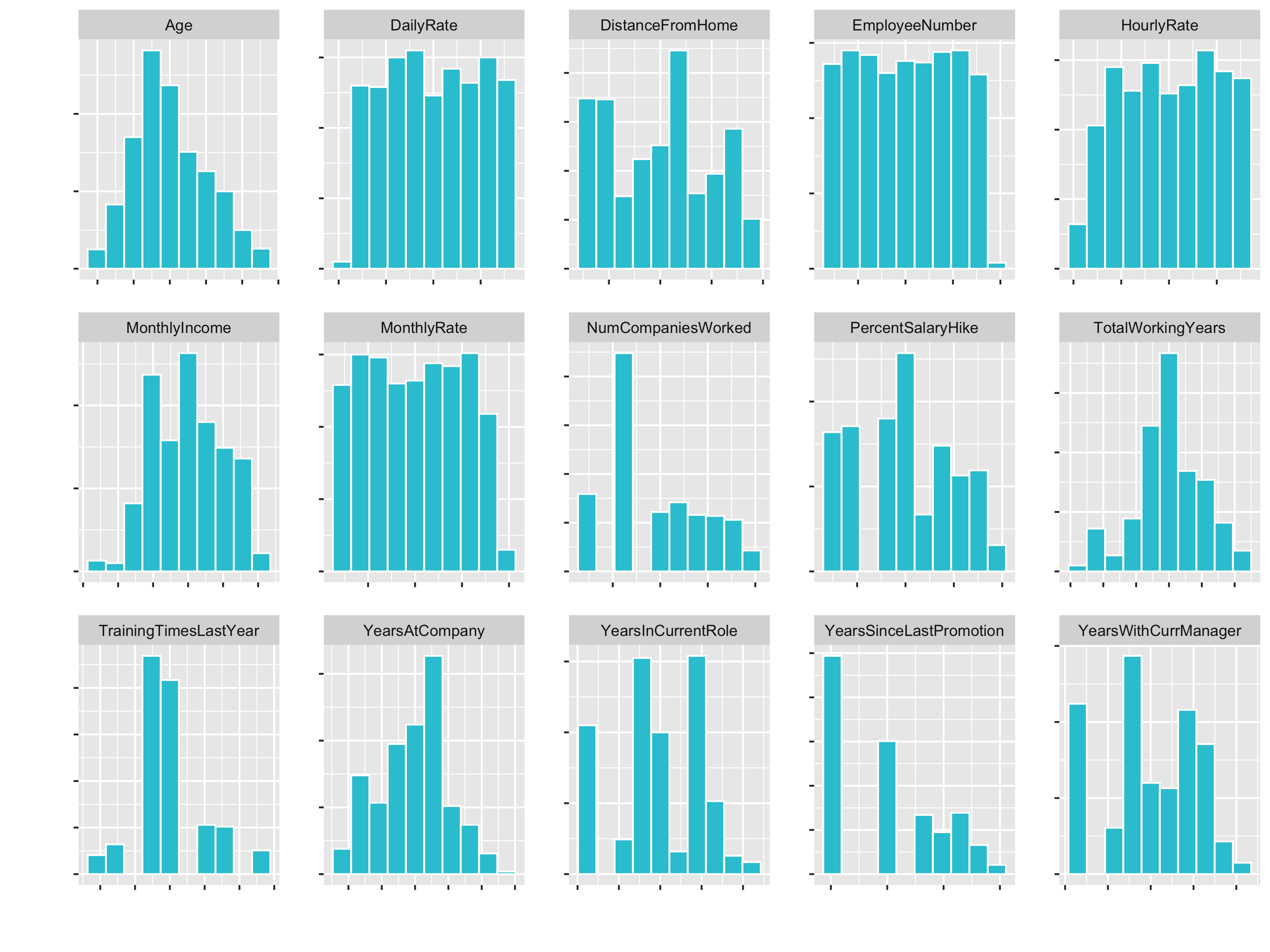
Next, we are going to create a custom faceted histogram function called plot_hist_facet(). This is going to help us to inspect some of the features to check out the skewness and to see what things we might need to do in order to get them properly formatted for a correlation analysis.
- Changing data to character with
as.character(), then factor withas.factor()arranges factors alphabetically (see if fct_reorder) geom_histogram()enables visualization of a single continuous variable by dividing the x-axis into bins and counting the number of observations with bins. Be default, displayed with counts.facet_wrap()splits the data into multiple graphs by a categorical column ( or set of columns). Use a functional format to specify facets (e.g. ~ key).
# Plot Faceted Histgoram function

# To create a function and test it, we can assign our data temporarily to data
data <- train_readable_tbl

plot_hist_facet <- function(data, fct_reorder = FALSE, fct_rev = FALSE,
                            bins = 10, fill = "#2dc6d6", color = "white",
                            ncol = 5, scale = "free") {

    data_factored <- data %>%

        # Convert input to make the function fail safe
        # (if other content might be provided)
        mutate_if(is.character, as.factor) %>%
        mutate_if(is.factor, as.numeric) %>%

        # Data must be in long format to make facets
        pivot_longer(cols = everything(),
                     names_to = "key",
                     values_to = "value",
                     # set key = factor() to keep the order
                     names_transform = list(key = forcats::fct_inorder))

    if (fct_reorder) {
        data_factored <- data_factored %>%
            mutate(key = as.character(key) %>% as.factor())
    }

    if (fct_rev) {
        data_factored <- data_factored %>%
            mutate(key = fct_rev(key))
    }

    g <- data_factored %>%
        ggplot(aes(x = value, group = key)) +
        geom_histogram(bins = bins, fill = fill, color = color) +
        facet_wrap(~ key, ncol = ncol, scale = scale)

    return(g)

}

# Example calls
train_readable_tbl %>% plot_hist_facet()
train_readable_tbl %>% plot_hist_facet(fct_rev = T)

# Bring attirtion to the top (alt.: select(Attrition, everything()))
train_readable_tbl %>%
  relocate(Attrition) %>%
  plot_hist_facet()
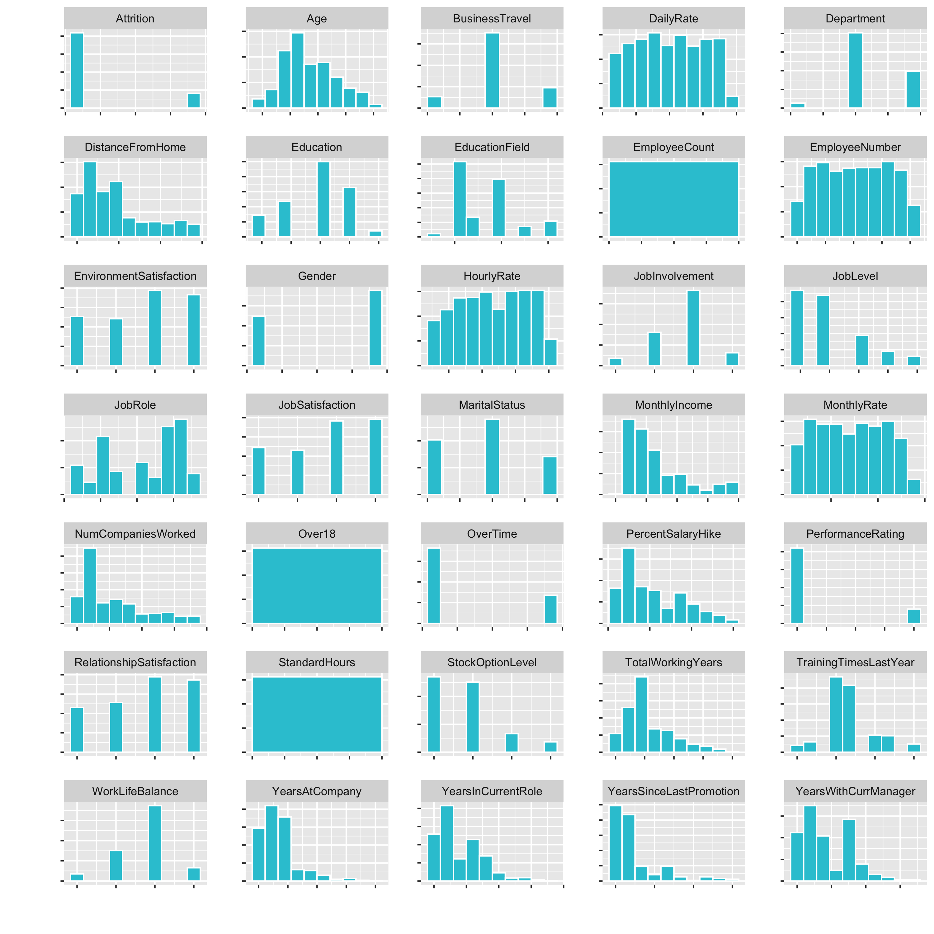
Now we have a small histogramm for all of the variables plotted. This is nice, because it allows us to inspect the data pretty well. It is a great way to visualize a lot of feature at once.
Examples of what we cann see directly:
DistanceFromHomeis pretty skewedEmployeeCount,Over18,StandardHoursonly have one feature- …
We have used the recipes package already. This is just a little recap:
recipe()creates a template assigning roles to the variables within the data. The recipe template is always based on training data.step_*()step functions add preprocessing steps to the recipe as “instructions” in a sequential orderall_predictors()enables selecting by specific roles assigned by the recipe() function. See also:all_outcomes()for outcomesall_numeric()for numeric dataall_nominal()for factor data
prep()prepares the recipe by calculating the transformations. It does not modify the data set.bake()performs the prepared recipe on the data. This is what actually transforms data. Note that it must be performed on both the training and testing data. The previous steps only create and prepare the recipe. Bake applies the recipe and transformes the data into a format that can be digested by machine learning algorithms.
This is a good documentation of the recipes functions: https://recipes.tidymodels.org/reference/index.html
While your project’s needs may vary, here is a suggested order of potential steps that should work for most problems https://recipes.tidymodels.org/articles/Ordering.html:
- Impute
- Individual transformations for skewness and other issues
- Discretize (if needed and if you have no other choice)
- Create dummy variables
- Create interactions
- Normalization steps (center, scale, range, etc)
- Multivariate transformation (e.g. PCA, spatial sign, etc)
These guidelines are useful in creating a generic checklist for preprocessing data for ML. But these guidelines are generic. The combination of your data and ML algorithm is what you need to think about when developing a preprocessing plan.
Steps explained in detail (not the same order like the steps above):
Imputation: The act of filling in missing values within features. Common methods include:- filling by recency (tidyr::fill())
- filling by similarity (knn impute)
Outlier Handling: Outliers are extremes. Sometimes outliers should be removed if clearly an error in data collection. Otherwise, extreme events may be reality and possibly should be kept. Outliers are unfortunately very difficult to deal with. My recommendation is don’t remove unless necessary. Rather, select an algorithm that is more resistant to outliers.Zero Variance features: Feautures that have no variance and therefore lend nothing to the predictive quality of the model.Normality: Normality is when the distribution of the data has a bell-shaped curve. This is a requirement for linear models that depend on correlation (e.g. correlation analysis, linear regression, logistic regression, etc.). Non linear models (e.g. random forest, decision trees, etc.) can handle non-normal distributions because these depend more on how the data can be segregated from other data.Skewness: Data often is skewed, which is when the majority of observations lie within a relatively small range, but the minority have a very wide spread. Data that is skewed is often said to have a “long” or “fat” tail.Discretize: The act of making a continuous variable discrete. Think of turning a variable like age into cohorts of less than 20 years, 20-30, 30-40, etc. Caution: Discretization can hurt correlations. It’s often best not to discretize unless there is a specific need to do so (like explaining the difference between what “millenials” do versus Gen X’ers)Normalization: Not to be confused with removing skew! Normalization is getting the data onto a consistent scale. Some machine learning algorithms (e.g. PCA, KNN, Deep Learning, etc.) depend on the data to all have the same scale.Dummy variables: Turning categorical data into separate columns of zeros and ones. This is important for machine learning algorithms to detect patterns in unordered data.Interaction variables: When two features have a relationship to each other they are said to “interact”. An example is when the ratio of height and weigth of a person is related to obesity. Heigt and weight are said to interact. Some advanced modeling algorithms such as deep learning can detect interactions automatically. However, it’s often difficutl to tell what the interaction is, which may not help the business case although it will improve the accuracy of the model.Multivariate Transformations: Examples include Principal Component Analysis (PCA), which is a dimensionality reduction algorithm. It’s useful in cases where the data is very wide and can be susceptible to overfitting. PCA allows us to get the essence of the data by reducing the width into principle components.
A correlation analysis is a great way to dertermine if your are getting good features prior to modeling. Let’s apply the 3-Part recipes process to be able to do a correlation analysis:
I. create the instructions with recipes and steps. II. prepare the recipe III. bake new data
1. Zero Variance Features
formula = Attrition ~:The formula uses a tilde (~) to separate the outcome from the predictors. Using a dot (.) is R shorthand telling the function to select all variables except Attrition as the predictors.
# Data Preprocessing With Recipes ----

# Plan: Correlation Analysis

# 1. Zero Variance Features ----

recipe_obj <- recipe(Attrition ~ ., data = train_readable_tbl) %>%
    step_zv(all_predictors())

recipe_obj %>%
      prep()
2. Transformation / Skewness
It could be done visually or programmatically to identifdy which features have a hihgh skewness. Visually you see in your plots that
- DistanceFromHome
- JobLevel (factor levels, we don’t want to cahnge that, no transformations)
- Monthly income and so on …
.. are skewed.
Alternatively, there are functions, that help us detecting skeweness:
skewness()from thePerformanceAnalyticspackage computes the skewness of a univariate distribution. Highly skewed features have either high positive or high negative values depending on the direction of the skew. If it is high, it has a fat tail on the right side. If it is low (very negative), it has a fat tail on the left side.map_df()performs map() and then attempts to convert the results to a tibble.
Let’s get the skewed features:
# 2. Transformations ---- (for skewed features)
library(PerformanceAnalytics)  # for skewness

skewed_feature_names <- train_readable_tbl %>%
    select(where(is.numeric)) %>%
    map_df(skewness) %>%
    pivot_longer(cols = everything(),
                 names_to = "key",
                 values_to = "value",
                 names_transform = list(key = forcats::fct_inorder)) %>%
    arrange(desc(value)) %>%

    # Let's set the cutoff value to 0.7 (beccause TrainingTimesLastYear does not seem to be that skewed)
    filter(value >= 0.7) %>%
    pull(key) %>%
    as.character()

train_readable_tbl %>%
    select(all_of(skewed_feature_names)) %>%
    plot_hist_facet()
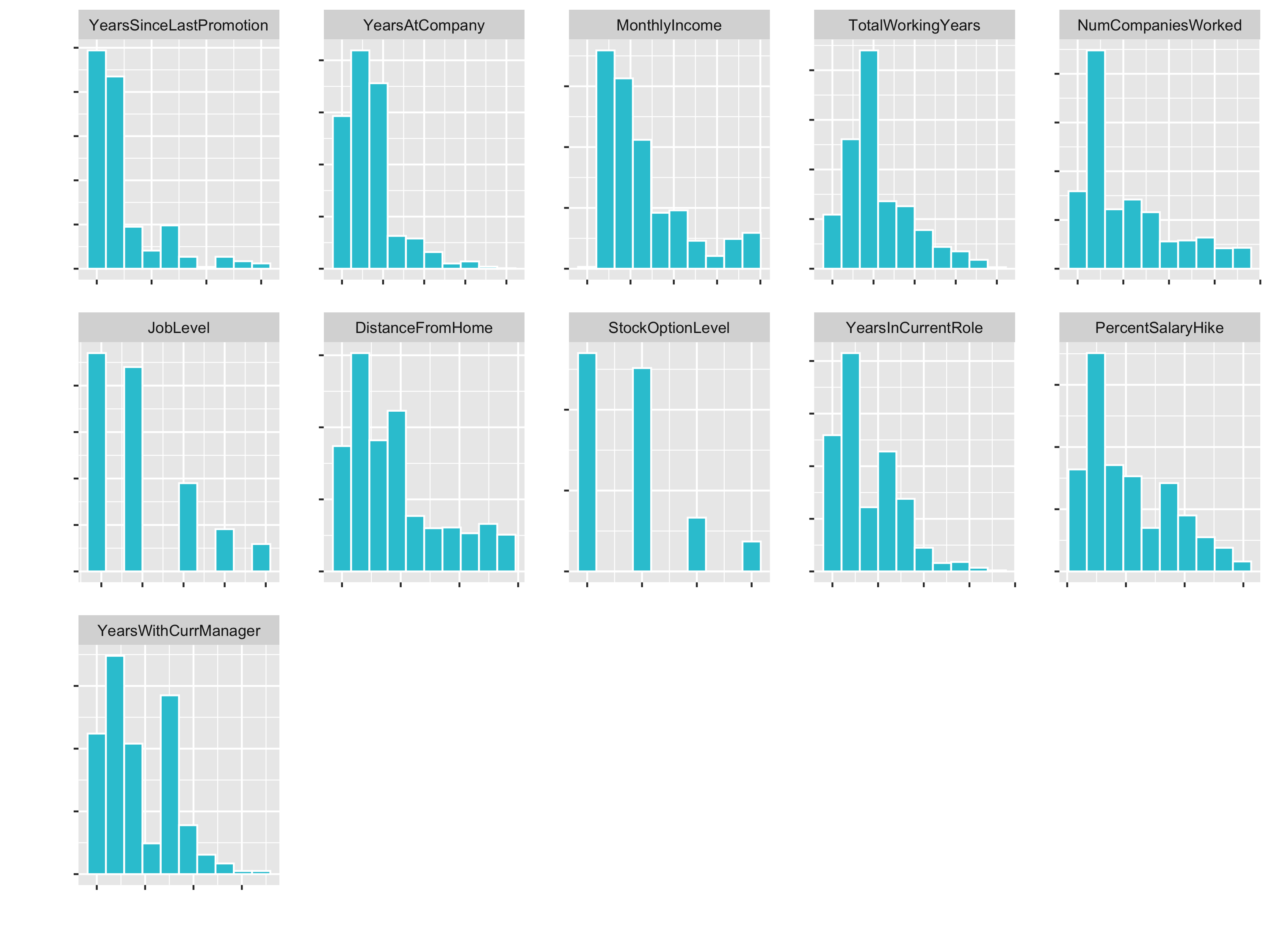
JobLevel and StockOptionLevel are factors and should not be transformed. We handle those later with a dummying process.
!skewed_feature_names %in% c("JobLevel", "StockOptionLevel")

skewed_feature_names <- train_readable_tbl %>%
    select(where(is.numeric)) %>%
    map_df(skewness) %>%
    pivot_longer(cols = everything(),
                 names_to = "key",
                 values_to = "value",
                 names_transform = list(key = forcats::fct_inorder)) %>%
    arrange(desc(value)) %>%
    filter(value >= 0.7) %>%
    filter(!key %in% c("JobLevel", "StockOptionLevel")) %>%
    pull(key) %>%
    as.character()

# We need to convert those columns to factors in the next step
factor_names <- c("JobLevel", "StockOptionLevel")
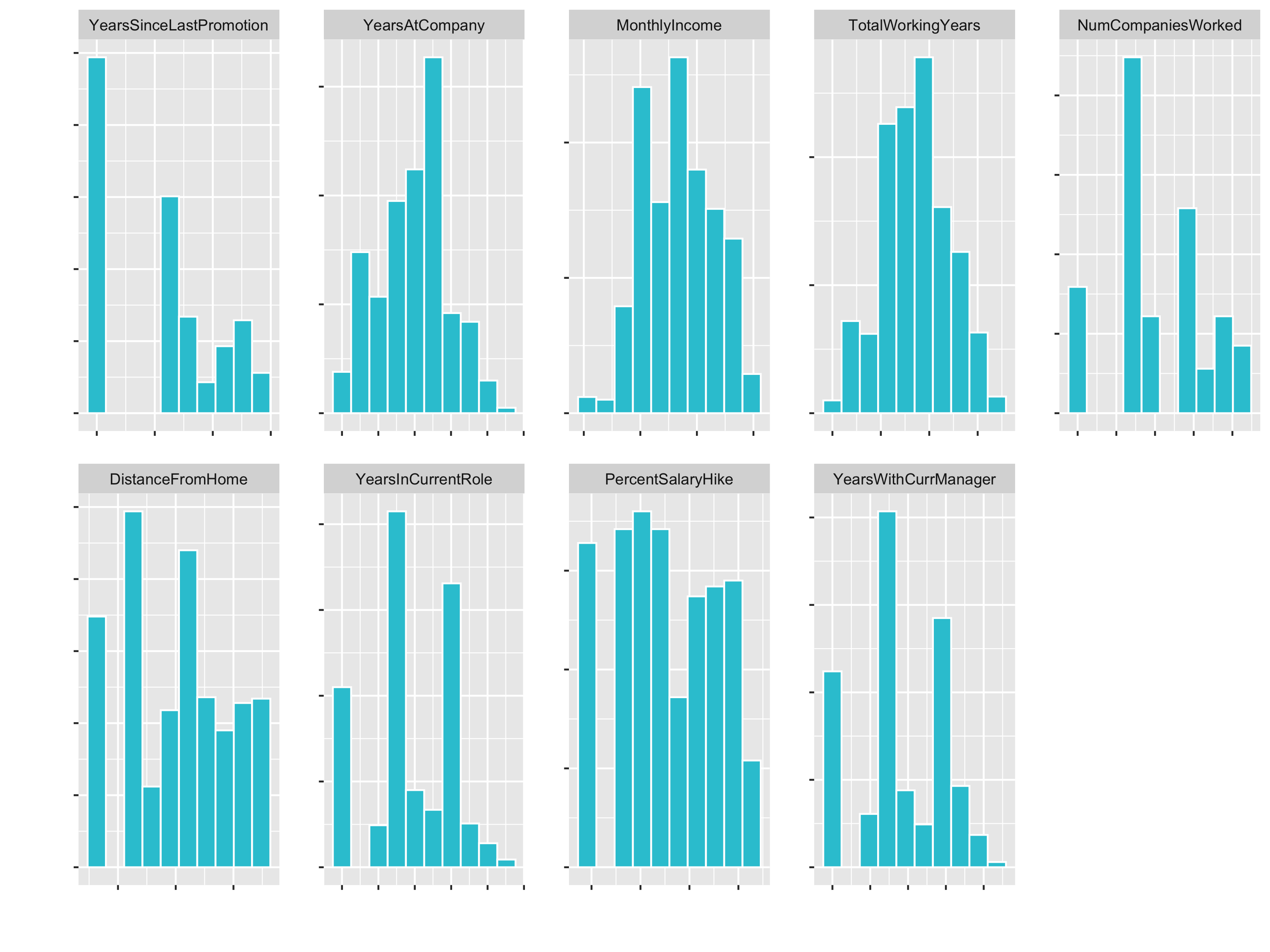
Let’s fix the skewness (with step_YeoJohnson()) and the factor columns:
recipe_obj <- recipe(Attrition ~ ., data = train_readable_tbl) %>%
    step_zv(all_predictors()) %>%
    step_YeoJohnson(skewed_feature_names) %>%
    step_mutate_at(factor_names, fn = as.factor)

recipe_obj %>%
    prep() %>%
    bake(train_readable_tbl) %>%
    select(skewed_feature_names) %>%
    plot_hist_facet()
3. Centering & Scaling
Centering & Scaling converts numeric data in different scales to be on the same scale.
Algorithms that require feature scaling:
- kmeans
- Deep Learning
- PCA
- SVMs
Can’t remember which algo’s need it? When in doubt, center & scale. It won’t typically hurt your predictions.
# 3. Center and scale

# Plot numeric data
train_readable_tbl %>%
  select(where(is.numeric)) %>%
  plot_hist_facet()
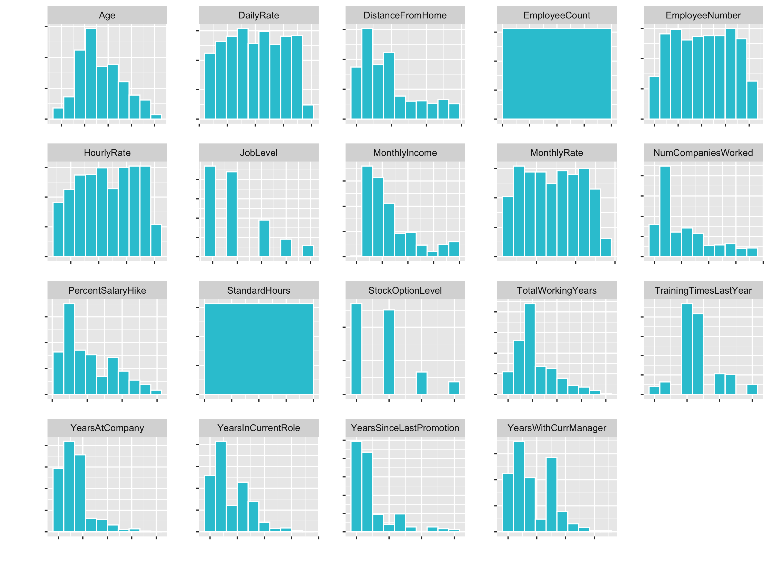
You see that variables like Age (goes until 60) and DailyRate (goes until 1600) have different Ranges. So for some algorithms the DailyRate would totally dominate the age feature.
Make sure you always center before you scale.
recipe_obj <- recipe(Attrition ~ ., data = train_readable_tbl) %>%
    step_zv(all_predictors()) %>%
    step_YeoJohnson(skewed_feature_names) %>%
    step_mutate_at(factor_names, fn = as.factor) %>%
    step_center(all_numeric()) %>%
    step_scale(all_numeric())

# You can compare the means attribute before and after prepping the recipe
recipe_obj$steps[[4]] # before prep
prepared_recipe <- recipe_obj %>% prep()
prepared_recipe$steps[[4]]

prepared_recipe %>%
    bake(new_data = train_readable_tbl) %>%
    select(where(is.numeric)) %>%
    plot_hist_facet()
4. Dummy variables
Dummy variables: expanding categorical features into multiple columns of 0’s and 1’s. If a factor has 3 levels, the feature is expanded into 2 columns (1 less than total number of levels)
# 4. Dummy variables ----

recipe_obj <- recipe(Attrition ~ ., data = train_readable_tbl) %>%
    step_zv(all_predictors()) %>%
    step_YeoJohnson(skewed_feature_names) %>%
    step_mutate_at(factor_names, fn = as.factor) %>%
    step_center(all_numeric()) %>%
    step_scale(all_numeric()) %>%
    step_dummy(all_nominal()) %>%

    # prepare the final recipe
    prep()
To finalize this process, bake the train & test data
train_tbl <- bake(recipe_obj, new_data = train_readable_tbl)

train_tbl %>% glimpse()

test_tbl <- bake(recipe_obj, new_data = test_readable_tbl)
Correlation Analysis
Without good features we won’t be able to make good predictions regardless of using advanced techniques. The most effective way to build a good model is to get good features that correlate to the problem. A correlation analysis is a way of reviewing features in our data to let us know if we are on the right track before we are going to modeling. This saves time.
If we don’t have any features exhibiting correlation this is an immediate sign that we shouldn’t attempt modeling yet. We need to either collect different data or inform our boss that the analysis is not going to be beneficial.
If we do have features exhibiting correlation, we can immediately report these findings as potential areas to focus on, which helps stakeholders to begin thinking of strategies to improve decision making.
Correlation analysis only wirks with numeric data. You will get an error if you try to run a correlation on a factor or character data type. cor() returns a square correlation data frame, correlating every column (feature) in the data frame against all of others. The return is a square meaning the number of rows = number of columns. use = "pairwise.complete.obs" is an argument of cor(). It is not the default (for some reason), but is almost always what you want to do. If you use use = "everything" (default), then you run the risk of getting errors from missing values.
Prior versions of dplyr allowed you to apply a function to multiple columns in a different way: using functions with _if, _at, and _all() suffixes. These functions solved a pressing need and are used by many people, but are now superseded by the use of across(). That means that they’ll stay around (I have used them above), but won’t receive any new features and will only get critical bug fixes. Instead of using mutate_if(is.character, as.factor), it is recommended to use mutate(across(where(is.character), as.factor)).
Let’s do the correlation analysis:
?stats::cor

train_tbl %>%

        # Convert characters & factors to numeric
        mutate(across(where(is.character), as.factor)) %>%
        mutate(across(where(is.factor), as.numeric)) %>%

        # Correlation
        cor(use = "pairwise.complete.obs") %>%
        as_tibble() %>%
        mutate(feature = names(.)) %>%
        select(feature, Attrition_Yes) %>%

        # Filter the target, because we now the correlation is 100%
        filter(!(feature == "Attrition_Yes")) %>%

        # Convert character back to factors
        mutate(across(where(is.character), as_factor))
Try to make it a general function with the following arguments. Remember the tidy eval framework with enquo().
get_cor <- function(data, target, use = "pairwise.complete.obs",
                    fct_reorder = FALSE, fct_rev = FALSE)
As a general function:
get_cor <- function(data, target, use = "pairwise.complete.obs",
                    fct_reorder = FALSE, fct_rev = FALSE) {
    feature_expr <- enquo(target)
    feature_name <- quo_name(feature_expr)
    data_cor <- data %>%
        mutate(across(where(is.character), as.factor)) %>%
        mutate(across(where(is.factor), as.numeric)) %>%
        cor(use = use) %>%
        as.tibble() %>%
        mutate(feature = names(.)) %>%
        select(feature, !! feature_expr) %>%
        filter(!(feature == feature_name)) %>%
        mutate_if(is.character, as_factor)
    if (fct_reorder) {
        data_cor <- data_cor %>%
            mutate(feature = fct_reorder(feature, !! feature_expr)) %>%
            arrange(feature)
    }
    if (fct_rev) {
        data_cor <- data_cor %>%
            mutate(feature = fct_rev(feature)) %>%
            arrange(feature)
    }
    return(data_cor)
}
Let’s plot the correlation:
data_cor <- train_tbl %>%

  # Correlation
  get_cor(target = Attrition_Yes, fct_reorder = T, fct_rev = T) %>%

  # Create label text
  mutate(feature_name_text = round(Attrition_Yes, digits = 2)) %>%

  # Create flags so that we can change the color for poitive and negative
  mutate(Correlation = case_when(
    (Attrition_Yes) >= 0 ~ "Positive",
    TRUE                   ~ "Negative") %>% as.factor())

data_cor %>%
  ggplot(aes(x = Attrition_Yes, y = feature, group = feature)) +
  geom_point(aes(color = Correlation), size = 2) +
  geom_segment(aes(xend = 0, yend = feature, color = Correlation), size = 1) +
  geom_vline(xintercept = 0, color = "black", size = 0.5) +
  expand_limits(x = c(-1, 1)) +
  scale_color_manual(values = c("red", "#2dc6d6")) +
  geom_label(aes(label = feature_name_text), hjust = "outward")
Make it a generic function:
plot_cor <- function(data, target, fct_reorder = FALSE, fct_rev = FALSE,
                     include_lbl = TRUE, lbl_precision = 2,
                     lbl_position = "outward",
                     size = 2, line_size = 1, vert_size = 0.5,
                     color_pos = "#2dc6d6", color_neg = "red") {

  feature_expr <- enquo(target)

  # Perform correlation analysis
  data_cor <- data %>%
    get_cor(!! feature_expr, fct_reorder = fct_reorder, fct_rev = fct_rev) %>%
    mutate(feature_name_text = round(!! feature_expr, lbl_precision)) %>%
    mutate(Correlation = case_when(
      (!! feature_expr) >= 0 ~ "Positive",
      TRUE                   ~ "Negative") %>% as.factor())

  # Plot analysis
  g <- data_cor %>%
    ggplot(aes(x = !! feature_expr, y = feature, group = feature)) +
    geom_point(aes(color = Correlation), size = size) +
    geom_segment(aes(xend = 0, yend = feature, color = Correlation), size = line_size) +
    geom_vline(xintercept = 0, color = "black", size = vert_size) +
    expand_limits(x = c(-1, 1)) +
    scale_color_manual(values = c(color_neg, color_pos)) +
    theme(legend.position = "bottom")

  if (include_lbl) g <- g + geom_label(aes(label = feature_name_text), hjust = lbl_position)

  return(g)

}
plot_cor(data = train_tbl, target = Attrition_Yes, fct_reorder = T, fct_rev = T)
Example for the feature JobRole:
train_tbl %>%
  select(Attrition_Yes, contains("JobRole")) %>%
  plot_cor(target = Attrition_Yes, fct_reorder = T, fct_rev = T)
You can see that for example Sales Representative is a highly correlated feature. Conversively, Manufacturing Director is highly correlated in a negative fashion. That means that people in this position are less likely to leave the company.
Correlation Evaluation
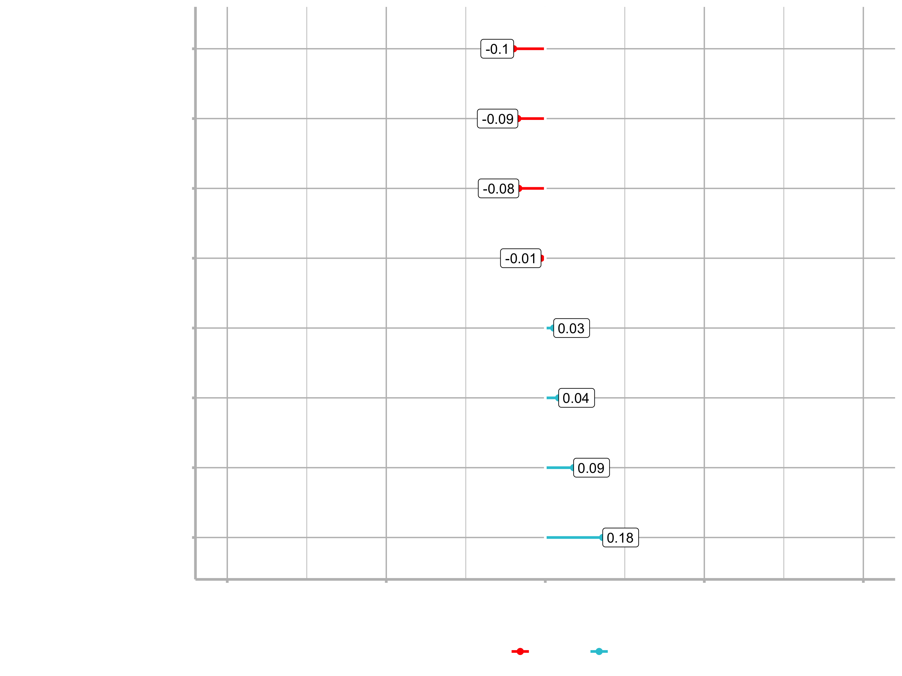
Let’s evaluate the correlation according to the feature categories, which we have defined last session. To do that, we only have to get the code from the data understanding section and adjust it a little bit. We just have to use contains() for some of the categorical data, because we now have more columns (one for each factor).
# Correlation Evaluation ----

#   1. Descriptive features: age, gender, marital status
train_tbl %>%
    select(Attrition_Yes, Age, contains("Gender"),
           contains("MaritalStatus"), NumCompaniesWorked,
           contains("Over18"), DistanceFromHome) %>%
    plot_cor(target = Attrition_Yes, fct_reorder = T, fct_rev = F)
We are comparing Attrition_Yes to each of the descriptive features. Now we can go through the features and really understand which ones are contributing or don’t have an effect on Attrition. Neagtive values are actually good in this case. As age increases, it has a negative effect on attrition. So, somebody that is 40 has a less probablitiy of leaving the company as somebody in their early twenties. Conversily, DistanceFromHome has a positive correlation. It’s not overly positive, but there is definitely a relationship between attrition and the distance the employee has to commute. More likely to leave if they live further away.
The other categories:
#   2. Employment features: department, job role, job level
train_tbl %>%
     select(Attrition_Yes, contains("employee"), contains("department"), contains("job")) %>%
     plot_cor(target = Attrition_Yes, fct_reorder = F, fct_rev = F)

#   3. Compensation features: HourlyRate, MonthlyIncome, StockOptionLevel
train_tbl %>%
    select(Attrition_Yes, contains("income"), contains("rate"), contains("salary"), contains("stock")) %>%
    plot_cor(target = Attrition_Yes, fct_reorder = F, fct_rev = F)

#   4. Survey Results: Satisfaction level, WorkLifeBalance
train_tbl %>%
    select(Attrition_Yes, contains("satisfaction"), contains("life")) %>%
    plot_cor(target = Attrition_Yes, fct_reorder = F, fct_rev = F)

#   5. Performance Data: Job Involvment, Performance Rating
train_tbl %>%
    select(Attrition_Yes, contains("performance"), contains("involvement")) %>%
    plot_cor(target = Attrition_Yes, fct_reorder = F, fct_rev = F)

#   6. Work-Life Features
train_tbl %>%
    select(Attrition_Yes, contains("overtime"), contains("travel")) %>%
    plot_cor(target = Attrition_Yes, fct_reorder = F, fct_rev = F)

#   7. Training and Education
train_tbl %>%
    select(Attrition_Yes, contains("training"), contains("education")) %>%
    plot_cor(target = Attrition_Yes, fct_reorder = F, fct_rev = F)

#   8. Time-Based Features: Years at company, years in current role
train_tbl %>%
    select(Attrition_Yes, contains("years")) %>%
    plot_cor(target = Attrition_Yes, fct_reorder = F, fct_rev = F)
Correlation analysis is a linear style of modeling. It only detects linear relationships (e.g. exponential relations can not be detected. Non-linear functions such as a random Forest would pick that up). So it is a good paramter, but possibly not the best way of detecting whether or not the features are going to be an impctful variable.
Exercise
1. Employment Features
Which 3 Job Roles are the least likely to leave?
- Sales Representative, Laboratory Technician, Human Resources
- Research Scientist, Sales Executive, Manager
- Research Director, Manufacturing Director, Manager
- Research Scientist, Manufacturing Director, Sales Executive
2. Employment Features
Employees in which Job Level have the lowest likelihood of leaving?
- 1
- 2
- 3
- 4
- 5
3. Employment Features
Which feature is irrelevant for modeling (i.e. offers little predictive value)?
- Job Involvement
- Department
- Job Satisfaction
- Employee Number
4. Compensation Features
Employees with higher Hourly Rate are more likely to?
- Stay
- Leave
- Irrelevant Feature
5. Compensation Features
Employees with greater monthly income are more likely to:
- Stay
- Leave
- Irrelevant Feature
6. Survey Results
Employees with Work-Life Balance of which level are most likely to leave?
- Good
- Better
- Best
7. Survey Results
Employees with which Job Satisfaction level are most likely to stay?
- Medium
- High
- Very High
8. Performance Data
Employees with “Excellent” Performance Rating are most likely to:
- Stay
- Quit
- Irrelevant Feature
9. Performance Data
What effect does high Job Involvement seem to have on employee attrition?
- As job involvement increases, attrition tends to increase
- As job involvement increases, attrition tends to decrease
- Irrelevant Feature
10. Work-Life Features
As Over Time increases:
- Attrition tends to decrease
- Attrition tends to increase
- Irrelevant Feature
11. Training & Education Features
Which Education level is most likely to leave?
- College
- Bachelor
- Master
- Doctor
12. Training & Education Features
Employees with increased training tend to:
- Leave
- Stay
- Irrelevant Feature
13. Training & Education Features
As employee tenure increases, what happens to the likelihood of turnover?
- It increases
- It decreases
- Irrelevant Feature
14. Overall
If you could reduce one feature to lessen turnover, which would you reduce?
- Monthly income
- Total working years
- Training Times Last year
- Overtime
Automated machine learning with h2o
Now it is time to model churn using Automated Machine learning with h2o. Please make sure you install a Java version that is supported.
In this section, we learn H2O, an advanced open source machine learning tool available in R. The algorithm we focus on is Automated Machine Learning (AutoML). You will learn:
- How to generate high performance models using h2o.automl()
- What the H2O Leaderboard is and how to inspect its models visually
- How to select and extract H2O models from the leaderboard by name and by position
- How to make predictions using the H2O AutoML models
Now we are movin into the 4th phase of CRISP-DM: Modeling / Encode algorithms
AutoML is a function in H2O that automates the process of building a large number of models, with the goal of finding the “best” model without any prior knowledge or effort by the Data Scientist. The current version of AutoML trains and cross-validates a default Random Forest, an Extremely-Randomized Forest, a random grid of Gradient Boosting Machines (GBMs), a random grid of Deep Neural Nets, a fixed grid of GLMs, and then trains two Stacked Ensemble models at the end. It can be used to do binary classifaction or regression.
The H2O AutoML algorithm is a low maintenance algorithm. It handles factor & numeric data. It also performs preprocessing internally for us and reduces the proprocessing burden on the data scientists. This means we don’t need to go through all the machine learning steps, that we did for the correlation analyisis. All we need to do is to get the data into a readable format (numeric and factor data). H20 handles things like dummy variables and transformations.
# H2O modeling
library(h2o)

employee_attrition_tbl          <- read_csv("datasets-1067-1925-WA_Fn-UseC_-HR-Employee-Attrition.csv")
definitions_raw_tbl             <- read_excel("data_definitions.xlsx", sheet = 1, col_names = FALSE)
employee_attrition_readable_tbl <- process_hr_data_readable(employee_attrition_tbl, definitions_raw_tbl)
set.seed(seed = 1113)
split_obj                       <- rsample::initial_split(employee_attrition_readable_tbl, prop = 0.85)
train_readable_tbl              <- training(split_obj)
test_readable_tbl               <- testing(split_obj)

recipe_obj <- recipe(Attrition ~., data = train_readable_tbl) %>%
    step_zv(all_predictors()) %>%
    step_mutate_at(JobLevel, StockOptionLevel, fn = as.factor) %>%
    prep()

train_tbl <- bake(recipe_obj, new_data = train_readable_tbl)
test_tbl  <- bake(recipe_obj, new_data = test_readable_tbl)
as.h2o()imports a data frame to an h2o cloud and produces an h2o frame.h2o.splitFrame()splits an H2O Frame object into multiple data setssetdiff()returns the different items from two sets passed as vector
# Modeling
h2o.init()

# Split data into a training and a validation data frame
# Setting the seed is just for reproducability
split_h2o <- h2o.splitFrame(as.h2o(train_tbl), ratios = c(0.85), seed = 1234)
train_h2o <- split_h2o[[1]]
valid_h2o <- split_h2o[[2]]
test_h2o  <- as.h2o(test_tbl)

# Set the target and predictors
y <- "Attrition"
x <- setdiff(names(train_h2o), y)
- Training Frame: Used to develop model
- Validation Frame: Used to tune hyperparamters via grid search
- Leaderbord Frame: Test set completely held out from model training & tuning
Use the argument max_runtime_secs to minimize modeling time initially. Once the results look promising, increase the run tume to get more models with highly tuned paramters. The argument nfolds is a parameter for K-Fold Cross validation. Cross-validation is a resampling procedure used to evaluate machine learning models on a limited data sample. The parameter called k refers to the number of groups that a given data sample is to be split into. We can just set it to 5.
The following computation will take around 30-60 seconds (depending on your machine).
?h2o.automl

automl_models_h2o <- h2o.automl(
  x = x,
  y = y,
  training_frame    = train_h2o,
  validation_frame  = valid_h2o,
  leaderboard_frame = test_h2o,
  max_runtime_secs  = 30,
  nfolds            = 5
)
Inspecting the leaderboard
That’s it. Now we can inspect the leaderboard to check which algorithm performs the best on our data. The result of the calculation is a S4 class. S4 is a special data type in R, that has socalled slots. slotnames() returns the names of slots in an S4 class object. S4 objects use the @ symbol to select slots. Slots are like entries in a list.
The leaderboard is a summary of the models produced by H2O AtoML. All performance metrics (AUC, logloss, etc.) in leaderboard are based on the leaderboard frame, which is held out during modeling. The leaderboard performance is representative of unseen data. The leader is the first model of the leaderboard.
typeof(automl_models_h2o)
## "S4"

slotNames(automl_models_h2o)
## [1] "project_name"   "leader"         "leaderboard"    "event_log"      "modeling_steps" "training_info"

automl_models_h2o@leaderboard
##                                              model_id       auc   logloss     aucpr mean_per_class_error      rmse        mse
## 1 StackedEnsemble_BestOfFamily_AutoML_20200820_190823 0.8585439 0.2992854 0.5869929            0.2406915 0.2978416 0.08870964
## 2          GBM_grid__1_AutoML_20200820_190823_model_3 0.8494016 0.3137896 0.5165541            0.2386968 0.3098134 0.09598435
## 3 DeepLearning_grid__1_AutoML_20200820_190823_model_1 0.8479056 0.3066365 0.6154288            0.2583112 0.3071528 0.09434283
## 4      XGBoost_grid__1_AutoML_20200820_190823_model_5 0.8439162 0.3057109 0.5299331            0.2061170 0.3071419 0.09433613
## 5    StackedEnsemble_AllModels_AutoML_20200820_190823 0.8425864 0.3211612 0.5205591            0.2539894 0.3107399 0.09655928
## 6      XGBoost_grid__1_AutoML_20200820_190823_model_6 0.8257979 0.3211936 0.5009608            0.2536569 0.3111129 0.09679122
##
## [30 rows x 7 columns]

automl_models_h2o@leader
- Training results: These are the results during the modeling process, which are not representative of new data.
- Validation results: These are the results during the tuning process, which are not representative of new data. Training and validation data are using a feedback loop to tune the alogrithms.
- Cross validation results: These are the results during the 5-fold cross validation performed on the trainind data.
Important: None of these performance outputs are on hold out data!. The leaderboard is what you need to use to compare models.
Extracting models from the leaderboard
How to get models if it is not the leader?
h2o.getModel()connects to a model when given a Model ID (which you can get from the leaderboard)message()generates a message that is printed to the screen while the function runs- verbose: Many functions include a “verbose” argument that can toggled on/off display of informative information. This can be a good practice in function development if a user may need information about the function.
# Depending on the algorithm, the output will be different
h2o.getModel("DeepLearning_grid__1_AutoML_20200820_190823_model_1")

# Extracts and H2O model name by a position so can more easily use h2o.getModel()
extract_h2o_model_name_by_position <- function(h2o_leaderboard, n = 1, verbose = T) {

    model_name <- h2o_leaderboard %>%
        as.tibble() %>%
        slice(n) %>%
        pull(model_id)

    if (verbose) message(model_name)

    return(model_name)

}

automl_models_h2o@leaderboard %>%
  extract_h2o_model_name_by_position(6) %>%
  h2o.getModel()
Saving & Loading H2O models
h2o.saveModel()saves an H2O model for future use in a directory provided by the user. The first argument (object) takes the result fromh2o.getModel(). That is why we can pipe the functions.h2o.loadModel()loads a previously saved H2O Model
h2o.getModel("DeepLearning_grid__1_AutoML_20200820_190823_model_1") %>%
  h2o.saveModel(path = "04_Modeling/h20_models/")

h2o.loadModel("04_Modeling/h20_models/DeepLearning_grid__1_AutoML_20200820_190823_model_1")
Making predictions
h2o.predict()generates predictions using an H2O Model and new data
Because we did a Binary classification, the H2O predictions are 3 columns:
- Class prediction
- 1st class probability
- 2nd class probability
# Choose whatever model you want
stacked_ensemble_h2o <- h2o.loadModel("04_Modeling/h20_models/StackedEnsemble_BestOfFamily_AutoML_20200820_190823")
stacked_ensemble_h2o

predictions <- h2o.predict(stacked_ensemble_h2o, newdata = as.h2o(test_tbl))

typeof(predictions)
## [1] "environment"

predictions_tbl <- predictions %>% as_tibble()
## # A tibble: 220 x 3
##    predict    No    Yes
##    <fct>   <dbl>  <dbl>
##  1 No      0.676 0.324
##  2 No      0.863 0.137
##  3 No      0.951 0.0492
##  4 No      0.832 0.168
##  5 No      0.948 0.0521
##  6 No      0.862 0.138
##  7 No      0.849 0.151
##  8 No      0.823 0.177
##  9 Yes     0.553 0.447
## 10 No      0.936 0.0638
## # … with 210 more rows
If you wanted to recreate the model and/or tune some values, use the slot @allparameters:
deep_learning_h2o <- h2o.loadModel("04_Modeling/h20_models/DeepLearning_grid__1_AutoML_20200820_190823_model_1")

# To see all possible parameters
?h2o.deeplearning

# to get all paramteres
deep_learning_h2o@allparameters
Next session:
- Visualizing The Leaderboard
- Grid Search In H2O
- Assessing H2O Performance
- Explaining Black-Box Models With LIME
Challenge
For the challenge, we shall be working with a Product Backorders dataset. The goal here is to predict whether or not a product will be put on backorder status, given a number of product metrics such as current inventory, transit time, demand forecasts and prior sales. It’s a classic Binary Classification problem. The dataset can be accessed from here:
Steps:
- Load the training & test dataset
- Specifiy the response and predictor variables
- run AutoML specifying the stopping criterion
- View the leaderboard
- Predicting using Leader Model
- Save the leader model